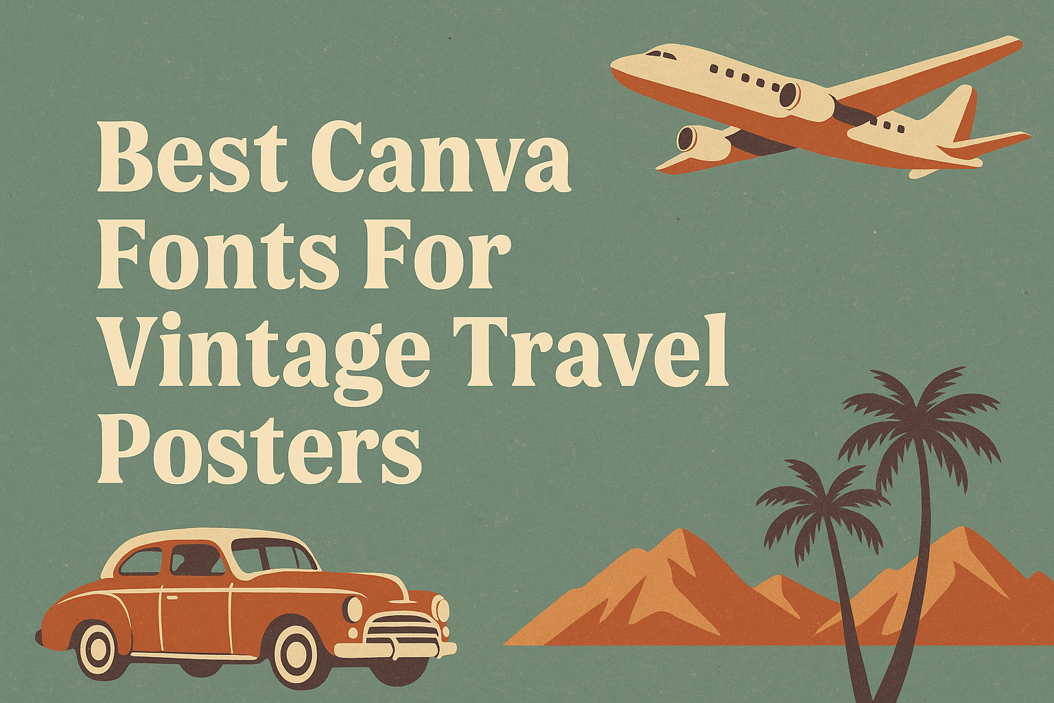
Creating the perfect vintage travel poster starts with choosing the right fonts that capture the spirit of adventure and nostalgia. The best Canva fonts for vintage travel posters combine classic styles with a touch of retro charm, making your design stand out while evoking feelings of past explorations. These fonts help bring old travel ads and posters back to life with an authentic, timeless look.
Designers can find fonts on Canva that range from bubbly 70s letters to elegant vintage typefaces. Using these carefully selected fonts, anyone can create posters that look like they belong in a mid-century travel brochure or an old roadside sign.
Whether it’s for a fun project or professional work, picking the right vintage fonts on Canva adds character and style. This guide will highlight the top choices to make vintage travel posters visually appealing and full of nostalgic energy. For more in-depth font options, check out the collection of best retro Canva fonts.
Top Canva Fonts for Vintage Travel Posters
Vintage travel posters need fonts that capture the charm of past eras while remaining clear and stylish. The right font sets the tone, whether it’s bold and flashy or elegant and classic. Some fonts stand out for their popularity, nostalgic feel, or how well they pair with others.
Most Popular Vintage Travel Poster Fonts
Many designers using Canva choose fonts that balance old-school style and readability. Metropolis is a favorite for its clean, art deco shapes, perfect for luxury or classic travel themes. Another popular choice is Limelight, which offers bold, dramatic letters that draw attention on posters.
Oleo Script adds a friendly, handwritten vibe that works well for warm, inviting travel destinations. For a sporty, varsity feel, Track is often used to mimic old-school team lettering, good for posters related to adventure or outdoor travel.
These fonts are all easy to find in Canva’s free or Pro versions, helping create authentic vintage travel designs with minimal hassle.
Standout Retro and Nostalgic Font Choices
Some Canva fonts bring a strong nostalgic touch to travel posters. Bright Retro with its bubbly 70s style letters adds a playful and joyful feeling. It pairs well with vibrant color palettes typical of vintage ads.
Retropix is great for an 80s pixel-style look, ideal for tech or fun-themed travel posters. It conveys a vintage yet quirky feel. Roller Coaster Serif stands out for its wavy, dynamic letters that add motion and energy to the design.
These fonts are perfect when designers want to evoke a specific time period, adding personality and making the poster memorable.
Recommended Font Pairings for Classic Poster Looks
Pairing fonts in Canva can bring balance and style to vintage travel posters. A classic combo is using TAN Ashford, a serif font with elegant curves, alongside Lucidity Condensed for a clean, modern twist. This mix works great for formal travel ads or boutique destinations.
For a casual, fun look, Candice with its 70s groovy curves can pair well with a simple sans serif. Adding a script like Oleo Script beneath a bold font like Rig Solid Medium Fill makes headlines pop while keeping the design readable.
Choosing font pairs depends on the project’s mood but focusing on contrast between bold and simple fonts often gives the best results on Canva posters.
How to Choose the Right Vintage Font Style
Choosing the right vintage font depends on the style of travel and the mood the poster wants to create. It’s important to think about how the font matches both the era and the theme of the travel destination. The font should work well with other design elements to create a clear and attractive message.
Understanding Vintage Travel Aesthetic
Vintage travel posters often reflect a specific era, such as the 1920s or 1950s. Fonts from these times carry certain feelings—sometimes elegant, sometimes playful. A font with gentle curves might evoke luxury train travel, while bold, block letters could suggest adventure and exploration.
Colors and illustrations matter too. Combining fonts with old-fashioned color schemes helps make the design feel authentic. Choosing fonts that mirror vintage signs, advertisements, or postcards enhances the travel vibe on the poster.
Serif vs Sans-Serif for Travel Posters
Serif fonts have small lines or strokes at the ends of letters, giving them a classic and timeless look. They work well for vintage travel posters aiming for an elegant or historic feel. Serif fonts often appear in old magazines or luxury travel ads.
Sans-serif fonts lack these small lines and look cleaner and more modern. Some vintage posters, especially those from mid-century times, use bold sans-serif fonts to create a strong and fun look. They are especially good for readable text on web design and digital versions of posters.
Using a mix of serif and sans-serif fonts can balance old-style charm with modern clarity, especially when designing for Canva fonts or online displays.
Matching Fonts with Poster Themes
Different travel themes call for different font styles. For tropical or beach travel, fonts with a relaxed, casual feel often work best. Think rounded letters or scripts that suggest warmth and fun.
For mountain or adventure themes, stronger fonts that look solid and bold fit better. Blocky or vintage-inspired stencil fonts can show strength and excitement.
City or cultural travel posters might use elegant scripts or decorative fonts to show sophistication and history. Pairing these fonts with matching colors and imagery creates a fully immersive look.
Using Canva fonts allows easy testing of font combinations to find what fits a poster theme perfectly.
Design Tips for Eye-Catching Vintage Travel Posters
Creating a vintage travel poster means blending the right fonts and design choices to bring a sense of adventure and nostalgia. Effective use of typography and balancing strong headings with elegant details will make the poster stand out and capture the spirit of travel.
Using Typography to Evoke Wanderlust
Typography sets the mood for a vintage travel poster. Using fonts that remind people of old travel ads or postcards helps create a feeling of wanderlust. Retro fonts from the 70s with bubbly, rounded shapes or classic serif fonts with art deco style can make text look authentic and inviting.
Mixing different font styles can work well, but it’s key to keep readability clear. For example, pairing a bold headline font like Retropix with a softer script font gives contrast and focus. Choosing colors that match vintage themes, like muted sepia or warm pastels, also supports the nostalgic vibe.
Balancing Bold Headlines and Elegant Details
Strong headlines draw attention, so they should be big and easy to read. Fonts like Bright Retro or Track work well for bold titles. These fonts carry energy while fitting vintage styles perfectly. Placing these headlines against simple backgrounds keeps the message clear.
At the same time, the smaller text or details benefit from elegant, clean fonts like TAN Ashford or Della Respira. These add a touch of refinement without creating clutter. Using Canva’s layering tools allows designers to place text and graphics in a balanced way, combining bold and subtle elements smoothly. This balance helps the poster feel eye-catching yet classy.
For a professional look, Canva users can adjust spacing and alignment carefully, ensuring every word fits the vintage travel theme.
Mixing and Matching Canva Fonts for Creative Results
Choosing the right fonts in Canva can bring vintage travel posters to life. It’s about pairing styles that create balance and catch the eye. Thoughtful font combinations add character while keeping the design clear and readable.
Combining Script and Decorative Fonts
Script fonts bring a hand-crafted feel that fits well with vintage themes. They add elegance and movement but should be used sparingly to avoid clutter. Pairing a flowing script with a bold decorative font creates a nice contrast.
Decorative fonts often feature unique shapes or vintage details perfect for headlines. When paired with scripts, the decorative font can hold attention while the script offers softer accents. For example, a strong serif or slab serif decorative font can balance a delicate, cursive script.
In Canva, it helps to choose fonts that differ in weight and style but share a vintage vibe. Using bold styles for titles and scripts for smaller text sections makes the design easier to read and visually appealing.
Blending Modern and Retro Typefaces
Mixing modern and retro fonts can bring both freshness and nostalgia to a design. Modern sans-serif fonts work well for clear body text and contrast nicely with vintage display fonts. This contrast keeps the layout clean and dynamic.
For vintage travel posters, modern fonts like Montserrat or Oswald in Canva pair nicely with retro styles like Broadway or Old Standard TT. The modern typefaces provide structure while retro fonts add personality.
Using this blend, a designer can highlight key points with classic styling and keep supporting text simple. This approach keeps the poster readable but still full of vintage charm. It’s important to maintain balance so that neither font style overwhelms the other.
Optimizing Fonts for Print and Digital Posters
Choosing the right font size, weight, and spacing can make a big difference in how vintage travel posters look on paper and screens. Balancing style with clear readability is essential. Adjustments in colors and contrast also help fonts remain striking in different settings.
Ensuring Readability Across Media
For print, font size should be large enough to read from a distance, typically 24 points or higher for main text. Serif fonts like Garamond or Cinzel often work well in print because their details add character without sacrificing clarity.
Spacing between letters and lines must be comfortable. Tight spacing can make text hard to read, especially when printed small.
In digital posters, screen resolution varies. Fonts like Sego or Gotham stay sharp on displays and keep vintage style intact. Testing the font in both light and dark modes improves visibility.
Web Design Best Practices for Vintage Posters
When vintage travel posters appear online, they must load quickly. Using standard Canva fonts that are web-safe ensures consistent display across browsers.
Fonts with simple shapes, like Futura, balance nostalgia with modern web needs. Combining a bold header font such as Impact with a cleaner body font increases visual hierarchy and guides viewers.
It’s important to check responsiveness so text adjusts smoothly on phones and tablets. Using clear contrast between font colors and background improves reading comfort, especially for older designs with detailed backgrounds.
Must-Know Canva Features for Vintage Typography
Using vintage fonts in Canva is easier when you know how to find the right fonts and use design tools effectively. This helps create authentic vintage travel posters with sharp, stylish text that fits the old-school vibe.
Accessing Premium and Free Fonts
Canva offers many vintage fonts through both free and Pro plans. Users can explore fonts by typing keywords like “vintage,” “retro,” or specific decades to find styles that suit their poster’s theme.
Free fonts are plenty and good for most projects. Pro fonts, marked with a small crown icon, add more unique choices and often come with better design quality or variety.
Canva’s 30-day free trial of Pro is a good way to test premium fonts. All Canva fonts, including premium ones, can be used commercially, which is important for business projects involving travel posters.
Utilizing Canva’s Design Tools for Posters
In Canva, users can adjust font size, spacing, and color to mimic vintage typography styles. Features like letter spacing and line height help create the spaced-out look seen in many travel posters.
The background remover tool in Canva Pro lets users isolate design elements, making it easier to layer text over images without clutter.