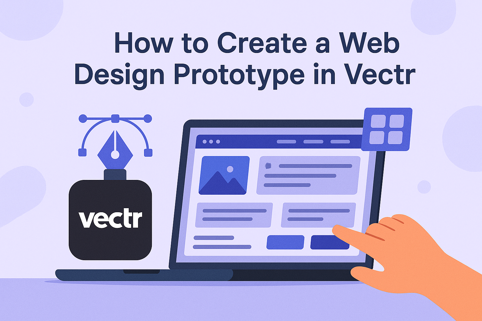
Creating a web design prototype is an exciting step in bringing a digital idea to life. With Vectr, users can easily design and visualize their projects, ensuring they have a solid blueprint before diving into actual coding.
This intuitive tool allows anyone, regardless of their design skill level, to craft visually appealing interfaces.
Getting started is simple.
He or she can begin by exploring the features Vectr offers, from easy image uploads to customizable templates that streamline the design process.
As they navigate through these capabilities, they will find that prototyping can be both fun and rewarding.
By the end of the process, they will have a clear and interactive prototype that can serve as a foundation for web development. The possibilities with Vectr are endless, making it a great choice for anyone looking to enhance their web design skills.
Getting Started with Vectr
Getting started with Vectr is simple and user-friendly. Users can quickly set up their accounts, learn about the workspace, and navigate through the interface with ease.
Setting Up Your Account
To begin using Vectr, the first step is to create an account.
Users can sign up using an email address or link their Google account for quicker access. After logging in, they will be greeted by a dashboard that displays important options.
Once logged in, users can immediately start creating their designs.
The tool is free to use, making it accessible for everyone. This means no fees are needed to explore and utilize the platform’s features.
Understanding the Workspace
After setting up the account, users will enter the Vectr workspace. This is where all designs come to life. The workspace consists of several key areas: the menu bar, side panel, and the main canvas.
The menu bar at the top contains essential options like creating new files or exporting designs. The side panel includes tools for shapes, text, and layers.
Users can drag and drop elements onto the canvas, making it easy to start building their prototype.
Navigating the Interface
Navigating Vectr’s interface is straightforward.
Users can find tools to the left side of the screen. These tools include options for lines, rectangles, and other shapes.
Clicking on any icon reveals additional settings and customization options.
At the bottom of the screen, a status bar shows useful information like zoom levels and layer options.
Users can also undo or redo actions easily using the shortcuts.
Creating Your First Prototype
Starting a web design prototype in Vectr is an exciting process. By focusing on the right dimensions, layers, and text, anyone can create a visually appealing and functional prototype. Here are the key areas to consider as one begins this journey.
Selecting the Right Dimensions
Choosing the right dimensions is crucial for a successful prototype. Designers must consider the type of device their design will be viewed on. For example, standard sizes include:
- Desktop: 1440 x 1024 pixels
- Tablet: 768 x 1024 pixels
- Mobile: 375 x 667 pixels
Vectr allows for custom dimensions too.
One can easily adjust the canvas size to fit the needs of their project. It’s always good to start with a dimension that matches the target device. This helps in visualizing how the final product will look.
Working with Layers and Objects
Layers play an important role in organizing elements within a prototype. Vectr uses a simple layering system to help keep everything in order.
Each object can be placed on a separate layer, making it easier to edit or hide them as needed.
To manage layers:
- Add a New Layer: Click on “Add Layer” in the toolbar.
- Name Layers: Give each layer a clear name for easy identification.
- Adjust Layer Order: Drag layers up or down to change their stacking order.
Proper management of layers allows for a neat workspace and helps avoid confusion as the design evolves.
Adding Text and Typography
Text is vital in any prototype. It communicates the message and design intent. Vectr offers different font styles and sizes to enhance the design.
When adding text, consider these tips:
- Choose Readable Fonts: Selecting fonts that are easy to read will enhance user experience.
- Set Font Size: Use sizes that are appropriate for the target device. For mobile, 14-16 pixels is often ideal.
- Use Contrast: Ensure that the text color contrasts well with the background to enhance visibility.
By focusing on these text elements, designers can create a more engaging prototype that clearly communicates their ideas.
Design Techniques and Tips
Creating an effective web design prototype in Vectr involves using thoughtful design techniques. Focusing on color, images, and responsive design helps ensure clarity and engagement.
Utilizing Color and Gradients
Color plays a vital role in web design. It can evoke emotions and guide users’ actions. Designers should choose a color palette that reflects the brand and enhances user experience.
Using gradients can add depth and dimension. For example, a soft gradient background can make buttons pop, drawing attention to them. Tools in Vectr make it easy to apply gradients.
Designers can start with a base color and create variations by adjusting opacity. This technique can help create a cohesive and harmonious look throughout the prototype.
Incorporating Images and Icons
Images and icons can enhance visual storytelling. High-quality images give a professional touch, while icons help convey information quickly.
It’s important to select images that align with the content and purpose.
Vectr allows easy incorporation of images. Designers can import and customize images directly within the tool. With icons, less is often more. A few well-placed icons can make key points stand out.
Using a consistent style for both images and icons ensures a unified appearance. This consistency reinforces brand identity and makes the interface feel polished.
Achieving Responsive Design
Responsive design ensures that a website looks good on all devices. Designers must think about how layouts will adapt to different screen sizes. Vectr offers helpful tools for testing responsiveness.
To achieve this, using fluid grids and flexible images is essential.
Designers can set maximum widths for elements. This prevents stretching and keeps the layout intact.
Additionally, breakpoints must be defined. Designers should decide at which widths the layout should change for better usability. By prioritizing responsive design, they create better user experiences across devices.
Sharing and Exporting
Vectr provides simple ways to share designs and export them for use on the web. Users can collaborate in real-time and easily export their projects to bring their ideas to life.
Collaborating with Team Members
Sharing designs with team members in Vectr is easy and efficient.
Users can generate a shareable link by clicking the link icon in the workspace. This link allows others to view the design and watch real-time edits.
To enhance collaboration, Vectr supports commenting directly on designs. Team members can leave feedback, ask questions, and suggest changes.
This feature helps streamline the design process and keeps everyone on the same page.
For effective teamwork, it’s helpful to establish clear communication channels. This ensures that all members can contribute their ideas and insights. Proper organization can lead to better project outcomes and a smoother workflow.
Exporting Your Design for Web
Once the design is ready, exporting it from Vectr is straightforward.
Users can choose to export their project in various formats, such as PNG or SVG. These formats are widely used for web applications and ensure clarity in graphics.
To export a design, users simply click on the export option and select their desired format.
They can also adjust settings like resolution to suit their needs.
After exporting, the design is ready to use on websites or in presentations. This flexibility makes Vectr a powerful tool for both designers and developers.