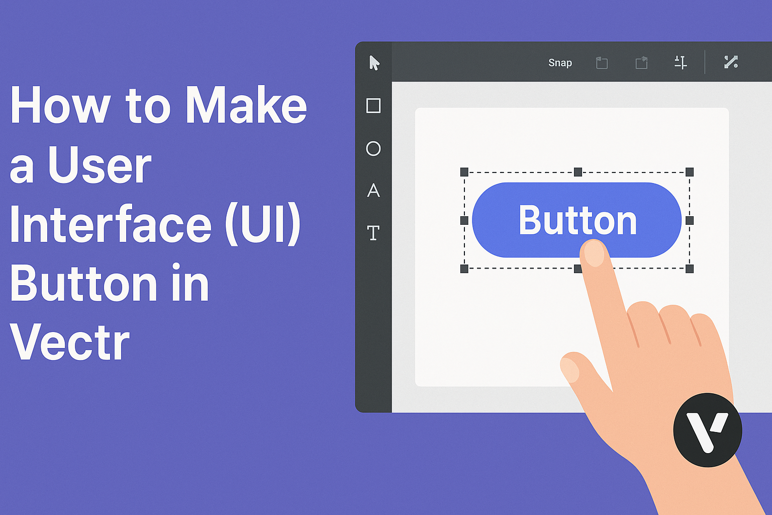
Creating a user interface (UI) button in Vectr is a straightforward process that opens up many design possibilities. With the right steps, anyone can design sleek and functional buttons that enhance their projects.
This guide will cover everything from choosing the right shape to adding interactive elements.
Vectr provides a user-friendly platform for both beginners and experienced designers. They can easily navigate tools to customize the appearance of buttons, making it simple to match any design style.
By following the steps outlined, users can create buttons that not only look great but also improve user engagement.
Whether for a website or an app, a well-designed UI button can make all the difference. Readers will discover tips on colors, sizes, and text that can elevate the effectiveness of their buttons.
Get ready to transform simple designs into captivating elements that draw users in!
Getting Started With Vectr
Starting with Vectr is easy and straightforward. This section highlights how to download and install Vectr, as well as the layout of its workspace.
Downloading and Installing Vectr
To get started, users can visit the Vectr website. There, they will find options to download the software for various platforms, including Windows, Mac, and Linux.
Users may also access Vectr as a web app, which requires no installation. This is a great option for those who prefer not to download software.
After downloading, click on the installation file and follow the prompts. Once installed, Vectr launches automatically, and users can begin creating designs right away.
Understanding the Vectr Workspace
When Vectr opens, the workspace is divided into several important areas.
The menu bar at the top provides access to file options like creating or opening files.
On the left side, users will find the tool sidebar, which contains several tools for creating and editing designs.
The canvas is the central area where users draw and arrange elements.
To the right, the properties panel shows options for modifying selected items, such as colors and styles.
Familiarizing oneself with these areas will help users navigate Vectr more efficiently, leading to a smoother design process.
Designing Your First UI Button
Creating a user interface button in Vectr involves several steps. First, a new project is set up, followed by designing the basic shapes. Then, colors and gradients are applied to give visual appeal. Finally, adding text and styling fonts completes the button design.
Setting Up a New Project
To begin, open Vectr and create a new project. The user can choose the canvas size that suits their design needs. A common choice is 800×600 pixels, which provides ample space for button design.
Users can select a blank canvas or use a template. Names for saved projects should be clear to keep designs organized.
After setting the canvas, a grid can be enabled for better alignment. This makes it easier to position elements accurately.
Creating Basic Shapes for Buttons
The next step is to create basic shapes that define the button’s appearance. For a standard button, a rectangle or rounded rectangle works well. Users can select the Rectangle Tool from the toolbar.
By clicking and dragging on the canvas, they can draw the shape. Adjusting the corner radius gives the button a softer look, which is often preferred.
To ensure the button is the right size, users can input specific dimensions in the properties panel. This feature helps in maintaining consistent sizes across multiple buttons.
Applying Colors and Gradients
Colors bring a button to life. In the Fill settings, users can choose a solid color or a gradient effect. Vectr allows for a seamless transition between colors, which adds depth.
For a more engaging design, users may use a gradient. Selecting two or more colors creates a stylish look. The angle of the gradient can also be adjusted to fit the design’s style.
Users should consider color contrast too. A well-contrasted button ensures good visibility and improves user interaction.
Adding Text and Styling Fonts
Text is crucial in conveying the button’s purpose. Using the Text Tool, users can click on the button shape to add text. Colors can be chosen to match or contrast with the button’s fill.
Selecting a clear, readable font is important. Users can customize the font size and style in the properties panel. Bold fonts often work better for buttons as they grab attention.
Finally, placing the text centered within the button shape gives it a polished look. Proper alignment helps in creating a visually appealing button design.
Advanced UI Button Techniques
Creating a visually appealing button goes beyond basic shapes. Advanced techniques like layering, adding shadows, and implementing hover states can significantly enhance the design and user experience.
Utilizing Layering for Complex Designs
Layering involves stacking multiple elements to create depth and interest in the button design. Using different shapes, colors, and textures, designers can build unique buttons that stand out.
For example, a base shape can be complemented with an inner shadow or an overlay. The use of transparency in top layers adds a modern touch.
In Vectr, designers can easily manage layers using the layers panel. Organizing layers properly ensures that adjustments are seamless and efficient. With practice, layering can transform simple buttons into eye-catching elements.
Adding Shadows and Highlights for Depth
Shadows and highlights are essential techniques for creating a three-dimensional feel. A well-placed shadow can give the appearance of elevation, making the button seem interactive.
To achieve this in Vectr, designers can use the shadow effect tool. A soft shadow under the button can enhance visibility against diverse backgrounds.
Adding highlights on the button’s upper edge can simulate light reflection. This technique gives the button a polished and vibrant look, inviting users to click.
Careful attention to the shadow color and opacity is crucial for maintaining a sleek design.
Implementing Hover States and Interactive Elements
Hover states are key to providing feedback during user interactions. They inform users that a button is clickable and help improve usability.
In Vectr, designers can define hover states by changing color or adding slight animations. This approach keeps users engaged while using the interface.
Interactive elements, such as tooltips or icons, can also be integrated into buttons. These features clarify the button’s function without cluttering the design.
Utilizing these techniques can make a button feel dynamic and user-friendly, enhancing the overall design experience.