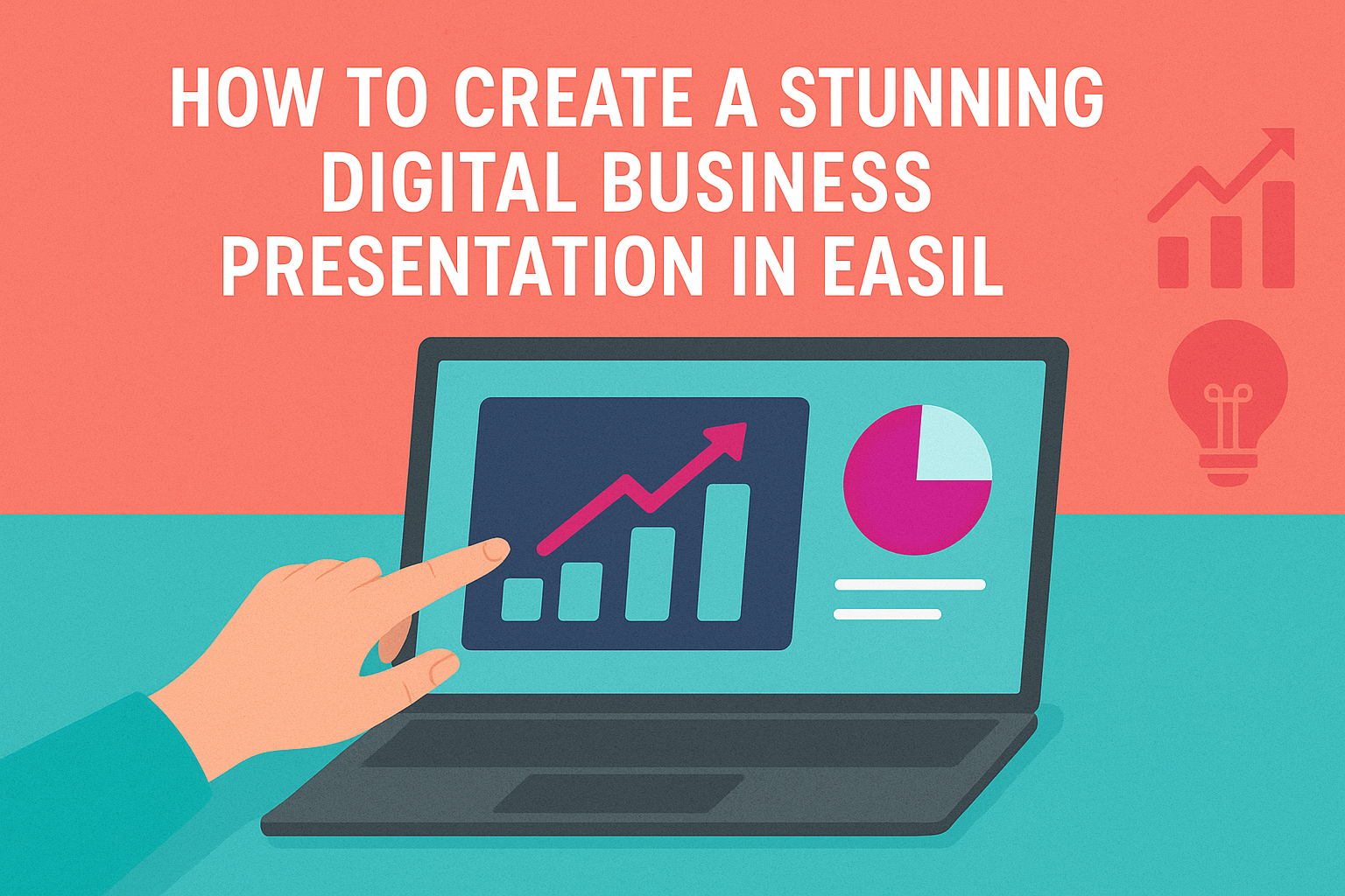
Creating a visually appealing graphic for a business partnership can greatly enhance its impact and engagement.
Easil offers user-friendly tools that make it easy to design eye-catching graphics tailored to any brand. With a variety of templates and customization options, anyone can turn their ideas into stunning visuals without needing advanced design skills.
In the fast-paced world of business, standing out is crucial. Engaging graphics can help convey professionalism and attract attention.
By utilizing Easil’s features, users can seamlessly integrate their brand colors, logos, and messaging to create standout partnership visuals that resonate.
Whether it’s for social media, presentations, or marketing materials, designing an effective partnership graphic is straightforward and enjoyable in Easil.
With just a few clicks, individuals can create a design that not only captures the essence of their collaboration but also leaves a lasting impression.
Understanding the Basics of Partnership Graphics
Partnership graphics play a vital role in conveying collaboration between businesses. Knowing how to create effective designs helps communicate the partnership’s goals and benefits clearly.
Key aspects include understanding the purpose behind the graphic and incorporating essential elements that attract attention.
The Role of Partnership Graphics in Business
Partnership graphics serve as visual representations of collaboration. They help inform the audience about joint ventures, co-branding, or strategic alliances. A well-designed graphic can generate interest and excitement, showcasing how each partner benefits from the collaboration.
These graphics are useful in various settings, such as social media, websites, and presentations. They create a cohesive image that enhances brand recognition for both partners.
A strong graphic can spark conversations, encourage engagement, and attract new customers.
Key Elements of a Compelling Graphic
Several important elements contribute to an effective partnership graphic. First, color is crucial; it should reflect both brands’ identities. Using complementary colors enhances visual appeal and ensures recognition.
Second, imagery helps tell a story. Including logos, relevant images, or icons can evoke emotions and convey messages quickly.
Third, typography matters. Choosing clear and legible fonts is essential for communication. The text should highlight key points about the partnership without overwhelming the viewer.
Lastly, maintaining a clean and balanced layout promotes easy reading. Organizing information logically helps audiences grasp the main ideas quickly.
Design Principles for Eye-Catching Graphics
Creating an eye-catching graphic involves understanding key design principles. These principles help convey the right message and attract attention effectively. A focus on color theory, typography, and space can elevate a design from ordinary to extraordinary.
Color Theory and Branding
Color plays a crucial role in branding and graphic design. Different colors evoke specific emotions and associations. For instance, blue often represents trust, while red can signify passion.
A well-chosen color palette can enhance brand identity. Using two to three main colors can maintain consistency.
It’s beneficial to create contrast with a complementary color to highlight essential elements.
Tools like color wheels can help in selecting harmonious color schemes. For businesses, ensuring brand colors are prominent in their graphics is vital. This approach not only captures attention but also reinforces brand recognition.
Typography and Readability
Typography affects how information is perceived. The right fonts enhance readability and set the tone of the graphic. Sans-serif fonts are generally easier to read for digital content, while serif fonts can add a touch of elegance.
Choosing a font size that’s easy to read is important. Titles should be larger and bolder, while body text should be clear and legible.
It’s advised to limit the number of different fonts to two or three to maintain visual coherence.
Highlighting key phrases with bold or italic styles can guide the viewer’s eye. Consistent font usage across a design fosters professionalism. Therefore, careful typography choices can significantly improve graphic effectiveness.
Utilizing Space Effectively
Effective use of space, or white space, can make a graphic more appealing. White space allows the design to breathe, making elements stand out without clutter. It helps the audience focus on important information and reduces visual overload.
Arranging elements with enough spacing creates a balanced look. Grouping related items together can lead to a clear structure. This organization helps in guiding the viewer’s journey through the graphic.
Using grids can assist in maintaining alignment and proportion. Consistent margins and padding ensure that every element feels connected. Attention to space can greatly enhance the overall impact of the graphic.
Creating Your Graphic in Easil
Designing an eye-catching business partnership graphic in Easil is simple and fun. By using templates, customizing graphics, and adding specific content, users can create unique visuals that effectively communicate their brand’s message.
Starting with a Template
Easil offers a variety of templates designed specifically for partnership graphics. Users can browse through options that fit their style and needs.
- Choose a Layout: Selecting the right layout is key. Options range from modern to classic designs.
- Preview: Users should take time to preview different templates to see which one resonates best with their message.
By starting with a template, users can save time and ensure their graphic has a professional look right from the start.
Customizing Your Graphic
Once a template is chosen, customization is the next important step. Easil allows users to make their graphic stand out through various features.
- Brand Colors: Users can easily incorporate their brand colors into the design. This creates a consistent look and feel.
- Fonts: Selecting specific fonts that align with the businesses’ branding will enhance readability and professionalism.
- Images and Icons: Adding relevant images or icons can illustrate the partnership visually. Users can upload their own images or choose from Easil’s library.
Customizing a graphic ensures that it aligns with the brand’s identity.
Adding Partnership-Specific Content
To make the graphic truly unique, partnership-specific content needs to be added. This is where the graphic can convey the essence of the partnership.
- Logos: Including both partnerships’ logos is essential. This reinforces brand recognition for both entities.
- Taglines or Messages: Short and catchy taglines can enhance the graphic’s impact. They should showcase the purpose or benefits of the partnership.
- Contact Information: Adding contact details is crucial for follow-ups. Users should ensure that this information is clear and accessible.
By thoughtfully adding partnership-specific content, the graphic becomes a powerful tool for communication.
Best Practices for Sharing and Distribution
Sharing and distributing a business partnership graphic effectively is crucial for maximizing reach and engagement. Choosing the right platforms and timing the release can significantly influence the success of the graphic.
Choosing the Right Platforms for Your Graphic
When selecting platforms, it’s essential to consider where the target audience spends their time.
Popular social media platforms like Facebook, Instagram, and LinkedIn each serve different demographics and purposes.
- Facebook is great for broader outreach and community engagement.
- Instagram focuses on visuals, making it perfect for eye-catching graphics.
- LinkedIn is ideal for professional content.
Using analytics tools can help understand audience behavior. This insight can guide decisions on which platforms to prioritize for distribution. Engaging with followers through comments and shares can further boost visibility and reach.
Timing Your Release for Maximum Impact
Timing can greatly affect how well a graphic is received.
Research shows that specific days and times can lead to higher engagement rates.
- Weekdays are usually better for professional content, especially during lunch hours and late afternoons.
- Weekends can work well for consumer-focused graphics.
Utilizing tools like social media scheduling apps helps plan posts.
This allows for consistent sharing and maximizes chances of reaching the audience when they are most active.
Monitoring analytics can also provide valuable feedback for future timing strategies.