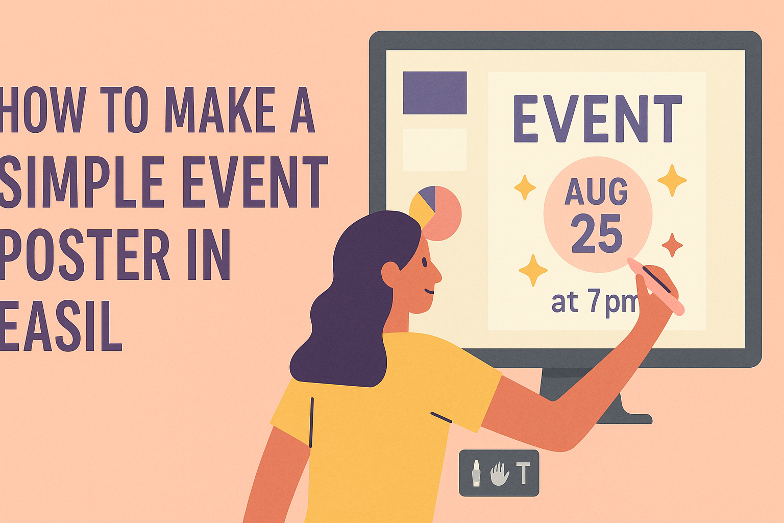
Creating an eye-catching event poster can seem daunting, but it doesn’t have to be. With Easil, anyone can design a simple yet professional-looking poster in just a few steps.
Whether it’s for a concert, fundraiser, or community event, Easil offers fantastic tools and templates to make the process easy and fun.
Getting started is a breeze, even for beginners. They can choose from thousands of pre-designed templates and customize them to fit their event’s theme, which saves time and effort.
Once they’ve picked a template, they can easily adjust colors, fonts, and images to make their poster unique. Easil empowers users to transform their ideas into beautiful designs without needing advanced graphic design skills.
Getting Started with Easil
Easil is a user-friendly design tool that makes creating event posters easy. From signing up to choosing the right template, each step is simple and designed for everyone.
Signing Up and Account Creation
To start using Easil, a user must create an account.
This process begins by visiting the Easil website and clicking on the sign-up option. Users can sign up using their email address or through social media accounts like Google or Facebook.
After filling out the required fields, they will receive a confirmation email. Clicking on the link in the email activates the account. Once activated, users can log in to access a world of design templates and tools. It’s quick and straightforward!
Navigating the Easil Interface
Once logged in, navigating the Easil interface is simple. The dashboard welcomes users with a clean layout featuring various options.
On the left, there are sections for templates, projects, and design assets.
Users can explore the extensive library of templates for different events. The main workspace allows for easy editing and is where users can drag and drop elements. Familiarizing oneself with the tools takes only a bit of time and exploration.
Selecting the Right Template
When it comes to selecting a template, Easil offers a vast selection.
Users can browse through categories, such as food events, corporate gatherings, or fundraisers.
Each template is professionally designed, making it easy to find one that resonates with their vision. Upon finding a suitable template, they can click to customize it. They can change text, colors, and images directly within the template.
Choosing the right template sets the foundation for an attractive event poster. Thus, it’s an essential step in the design process.
Designing Your Poster
Creating a visually appealing poster requires careful attention to text, images, and color. These elements work together to capture attention and convey a clear message.
Adding Text and Typography Tips
Text is vital for communicating information on the poster. It’s important to choose fonts that are easy to read from a distance.
A combination of a bold heading font and a simpler body font often works well.
Keep the text concise. Using bullet points or short phrases can help keep the information clear.
Hierarchy matters too. Make the most important information stand out by using larger font sizes or different colors.
Always consider the placement of text to ensure it doesn’t overcrowd the design. Too much text in one space can make it hard to read.
Incorporating Images and Graphics
Images and graphics add visual interest to any poster. When selecting images, they should be relevant and high-quality.
Using icons or illustrations can make the poster more engaging. They can also help communicate the message more effectively.
Layout is essential—ensure images are balanced with text. A cluttered design can overwhelm viewers.
Using a mix of images and graphics can help separate different sections of information, guiding the viewer’s eye naturally.
Don’t forget about image captions. These can provide context and enhance understanding.
Color Schemes and Branding
Color is more than just decoration; it’s crucial for brand identity.
Selecting a color scheme that aligns with the event or brand is important.
Use contrasting colors to ensure text stands out against the background. This makes information easier to read.
Limit the color palette to three or four colors to avoid visual chaos. This can create a polished and professional look.
Consider using colors that evoke specific feelings related to the event. For example, warm colors can convey excitement, while cool colors can suggest calm.
Finally, maintaining consistency with existing branding helps reinforce brand recognition.
Fine-Tuning and Customization
Fine-tuning and customizing a poster can enhance its appeal and effectiveness. By adjusting layouts, utilizing layers, and applying filters, users can create a unique design that stands out.
Adjusting Layouts and Alignment
Getting the layout right is crucial for any poster design.
Users can start by selecting a grid or framework that suits their message. Easil offers drag-and-drop features that make rearranging elements easy.
It’s important to ensure that text and images are well-aligned. Proper alignment enhances readability and draws attention to key information.
Users can use guides and snap features within Easil to help with this process.
Experimenting with different layouts can lead to discovering what looks best. Changing the size and position of elements can also add impact to the poster.
Using Layers and Elements
Layers offer flexibility when designing a poster. They allow users to stack images, text, and other design elements without disrupting the overall composition. Easil makes it easy to move layers up or down as needed.
Moreover, users can customize elements like shapes and icons. Changing colors, sizes, or even adding shadows can create depth and dimension. This is great for emphasizing particular areas of the poster.
Keeping layers organized helps in the editing process. Users can name layers for better clarity, making it easier to return to specific elements later.
Applying Filters and Effects
Filters and effects can greatly enhance a poster’s visual appeal.
Easil provides various options that can be applied to images and backgrounds to create unique looks.
Using filters can unify the color scheme of a poster. A consistent color palette lends professionalism to the design. Users can adjust brightness, contrast, and saturation to achieve the desired effect.
Additionally, adding subtle effects like drop shadows or glows can make text stand out. However, moderation is key to prevent overwhelming the audience. Filters can be a powerful tool when used wisely.
Finalizing and Sharing Your Poster
Before sharing a poster, it is essential to thoroughly review its design and make necessary adjustments. After finalizing the design, considering the best ways to share it helps ensure it reaches the intended audience effectively.
Previewing and Revising
Previewing the poster allows the designer to catch any mistakes or areas for improvement.
This involves checking spelling, alignment, and overall layout. It’s helpful to view the poster in different sizes to see how it will look both online and in print.
Revising any mistakes is crucial in this stage. Utilizing tools like zoom and grid lines can enhance precision. Collaborating with others for feedback can also uncover issues the designer might overlook.
Exporting Options
Once satisfied with the design, exporting the poster is the next step.
Easil offers several formats, including JPG, PNG, and PDF. Choosing the right format depends on the purpose; for instance, PDFs are excellent for printing, while PNGs are great for sharing online.
It’s essential to select the correct resolution.
For print, an image should have a minimum of 300 DPI to ensure clarity. For social media, lower resolutions suffice, typically around 72 DPI, which allows faster loading times without sacrificing quality.
Sharing on Social Media and Print Tips
Sharing the poster on social media requires visual appeal and attention to the audience.
Using vibrant colors and engaging headlines will capture more interest.
Tagging relevant accounts or using popular hashtags increases visibility.
For print, choosing the right paper and size is important.
Glossy paper enhances colors, while matte paper reduces glare.
It’s also wise to distribute physical posters in high-traffic areas, ensuring the target audience will see them.