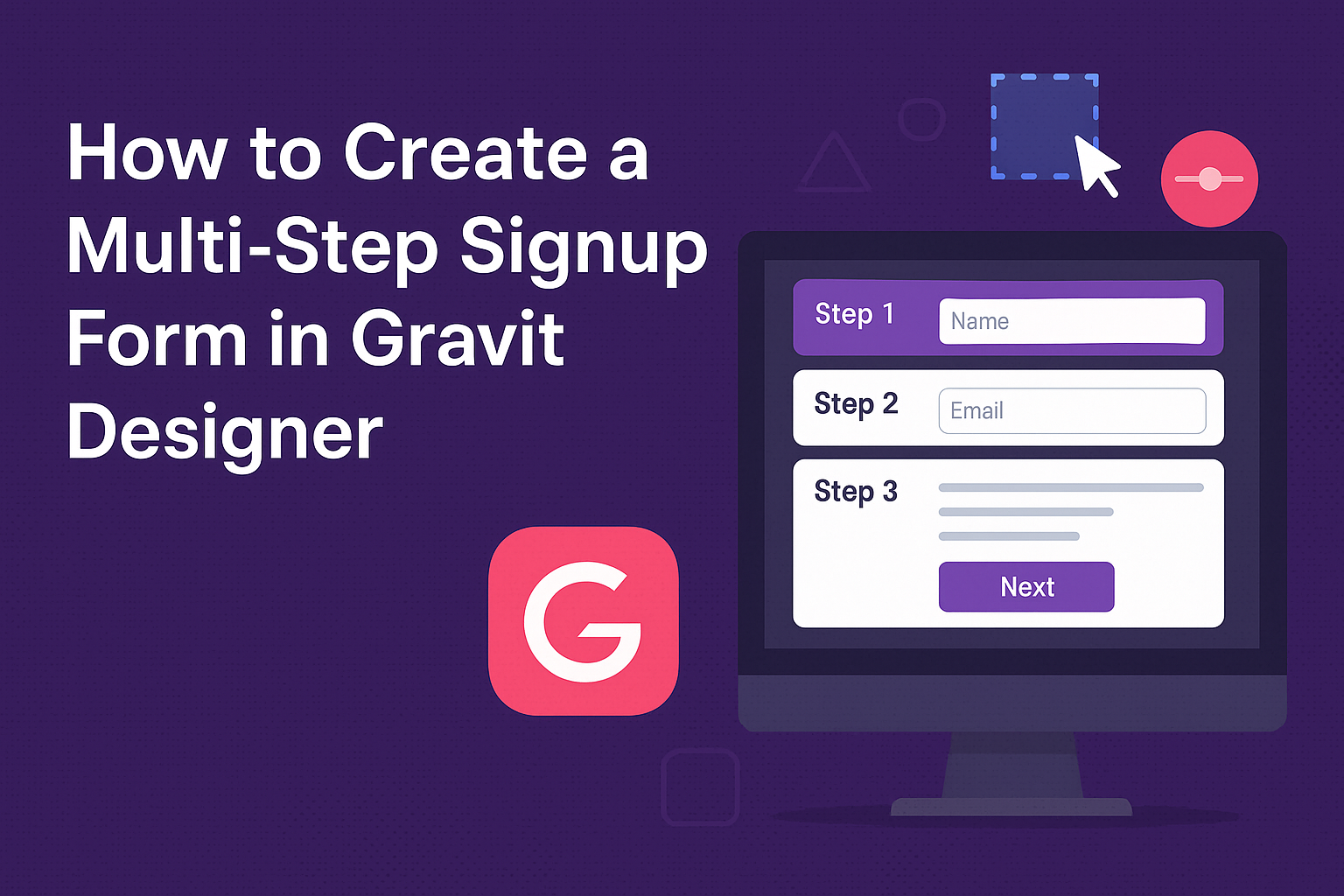
Creating a multi-step signup form in Gravit Designer can greatly enhance the user experience on a website. This type of form breaks down the signup process into smaller, manageable steps, making it less overwhelming for users. By guiding users through each stage, it can help increase completion rates and gather essential information effectively.
With the right approach, anyone can design a multi-step form that looks professional and functions smoothly. From setting up the layout to choosing the right elements, each decision plays a role in how inviting the form will be.
Learning these techniques can empower individuals to customize their signup process to suit their unique needs.
As users navigate through the steps, the visual appeal and ease of use will keep them engaged. They will appreciate the clarity and organization that a multi-step signup form provides.
Getting Started with Gravit Designer
Gravit Designer is a versatile tool that allows users to create stunning graphics easily. Understanding its features and how to set up the workspace is crucial for beginners.
Overview of Gravit Designer
Gravit Designer is a free vector graphics editor that works across different platforms. It offers essential tools for designing, such as shapes, pen tools, and text options.
You can create everything from logos to complex illustrations.
Key features include:
- Multi-page support: Helps in organizing projects easily.
- Export options: Users can export designs in various formats like PDF, SVG, JPEG, and PNG.
This flexibility makes it a great choice for both beginners and experienced designers.
Setting Up Your Workspace
To get started, users should set up their workspace effectively. Gravit Designer provides a clean interface that can be customized.
Steps to set up:
- Open Gravit Designer: Launch the application on your device.
- Choose a new document: Start with a blank canvas or select from templates.
- Organize panels: Move the toolbar, layers panel, and properties panel to preferred positions.
Users can also adjust grid settings and guides to help align elements perfectly.
Customizing the workspace enhances the design experience and helps maintain focus on the project at hand.
Designing the Form Layout
Creating an effective multi-step signup form requires careful planning and layout design. This section discusses how to build the form structure, add essential fields, and style the form for an appealing look.
Creating the Form Structure
The structure of the form sets the foundation for a smooth user experience. Begin by organizing the steps logically. Each step should only contain a few fields to avoid overwhelming the user.
For example, the first step might ask for basic details like name and email. Following steps can gather additional information, such as preferences or account settings.
Using a clear progress bar at the top can guide users. Make it easy for them to see how far they’ve come and how much is left to complete.
Adding Form Fields
When adding form fields, focus on clarity and necessity. Each field should have a clear label so users know what information is required.
Examples of essential fields include:
- Name
- Email Address
- Password
Always include helpful hints or placeholders within the fields. This extra guidance can reduce errors and improve completion rates.
Where possible, use drop-downs or checkboxes for common options. This can save time and make it easier for users.
Styling Your Form
The visual aspect of the form plays a big role in user engagement. It should match the overall branding of the website or app.
Use a consistent color scheme that reflects the brand. Ensure the font is readable and the button designs stand out.
Incorporate white space to avoid a cluttered appearance. Users should feel comfortable as they fill out the form.
Lastly, responsive design is crucial. The form should look good on all devices, whether a computer, tablet, or smartphone. This flexibility enhances the overall experience for users.
Implementing Multi-Step Functionality
Creating a multi-step signup form in Gravit Designer involves careful organization of form sections, effective navigation between these steps, and the ability to save user progress. Each part plays a significant role in enhancing user experience.
Dividing the Form into Sections
To effectively divide the form, start by identifying the main components of the signup process. For example, typical sections might include personal information, account details, and preferences.
Use rectangle shapes to outline each section clearly. This helps users understand where they are in the process. In Gravit Designer, layers can be utilized to group related fields.
Consider using a progress bar at the top of the form. This gives users a visual cue of how many steps are left.
Example Sections:
- Personal Information
- Account Setup
- Preferences
Navigation Between Steps
Navigation is essential for a smooth experience. Use buttons like “Next” and “Back” to allow users to move through the form seamlessly.
In Gravit Designer, these buttons can be created with simple shapes and text.
It’s important to disable the “Next” button* until all required fields in the current section are filled.* This encourages users to complete each part before proceeding.
Consider adding a “Skip” option for non-essential fields. It can help prevent frustration and keep the process light. Consistency in navigation design enhances familiarity, making the process easier.
Saving Progress
Enabling users to save their progress is essential for any multi-step form. This feature allows users to return without losing their entered data.
In Gravit Designer, it’s not just about form design; it also involves backend support. Use local storage or a database to save input data.
Provide users with a clear “Save” button. This can restore their progress when they revisit the form.
A message can confirm that their progress has been saved. This reassurance increases user confidence and minimizes drop-off rates.
Final Touches and Testing
Before launching a multi-step signup form, it’s essential to focus on enhancing the user experience and ensuring the form works across different browsers. These steps will help to create a smooth and functional process for users.
Enhancing User Experience
Making the signup process enjoyable is crucial. Simple changes can have a big impact. Here are some effective techniques:
-
Clear Instructions: Each step should provide clear directions. Use concise language and bullet points to keep it simple.
-
Progress Indicators: Adding a progress bar helps users see how far they’ve come. This feature reduces frustration and keeps users engaged.
-
Feedback Mechanisms: Use messages to inform users if they’ve made errors. Friendly prompts can guide them to fix issues quickly.
-
Responsive Design: Ensure the form looks good on all devices, whether it’s a phone, tablet, or computer. This improves accessibility and user satisfaction.
These enhancements invite users to complete the form, leading to higher conversion rates.
Cross-Browser Testing
Testing the signup form across multiple browsers is important to ensure everyone can use it smoothly.
Conducting these tests can save time and headaches later.
-
Popular Browsers: Test on major browsers such as Chrome, Firefox, Safari, and Edge. Each may render the form differently.
-
Responsive Checks: Verify how the form adjusts to different screen sizes and resolutions. This ensures users have a consistent experience.
-
Functionality Testing: Interact with the form features in each browser. For instance, check dropdowns, buttons, and validation messages.
-
User Feedback: Involve users during testing. Gathering their insights can highlight any issues missed during initial tests.