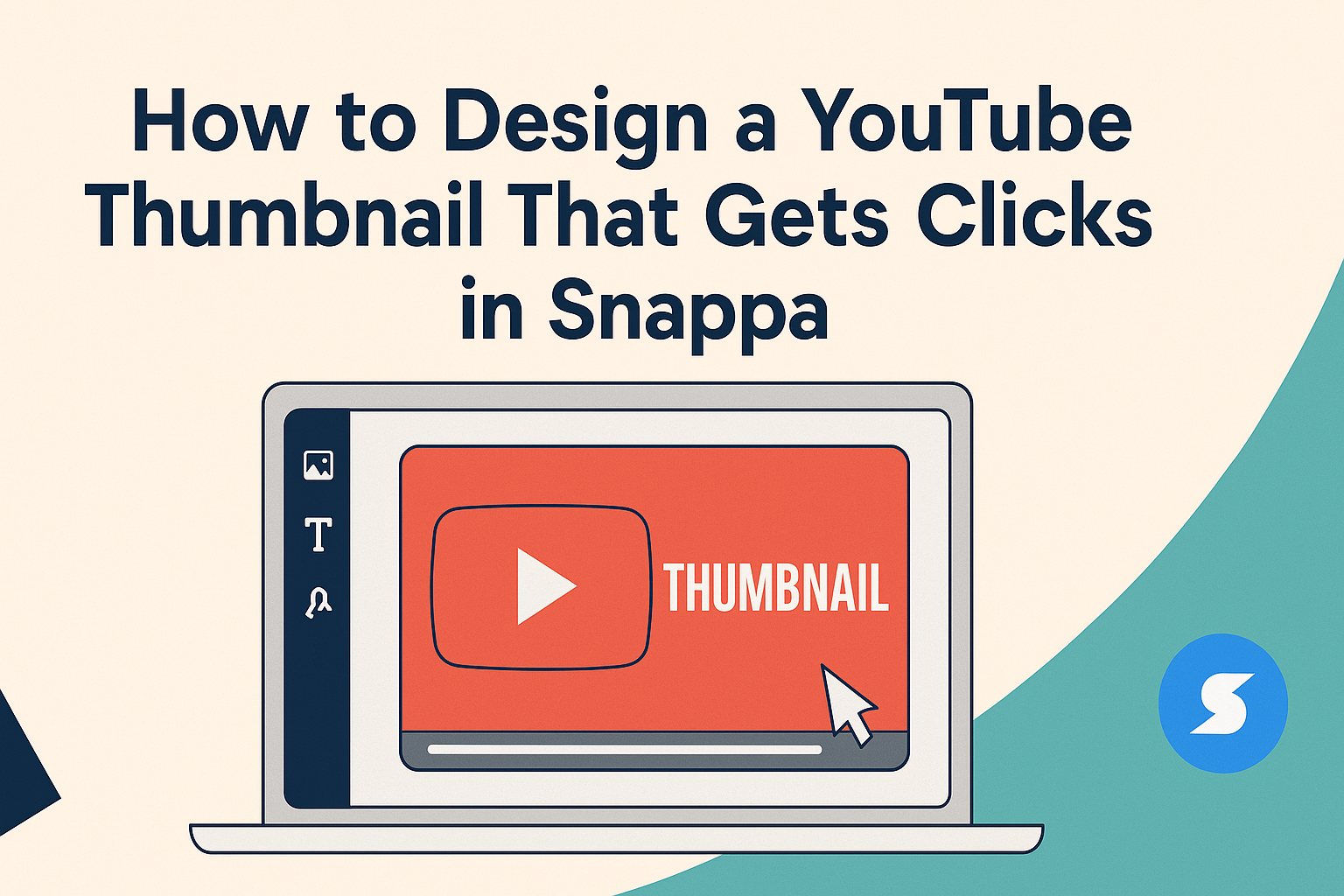
Designing a YouTube thumbnail that attracts viewers is essential for video success. A well-crafted thumbnail can significantly increase click-through rates and ensure the video reaches a larger audience.
Using tools like Snappa makes this process simple and effective, allowing creators to focus on what they do best—making great content.
Many creators struggle with creating eye-catching thumbnails. Fortunately, Snappa offers a range of customizable templates that are professionally designed for maximum impact.
By leveraging these resources, anyone can create visually appealing thumbnails without having advanced design skills.
In this article, readers will learn how to utilize Snappa to design a thumbnail that stands out in a crowded marketplace. With the right techniques, they can enhance their video’s appeal and boost engagement.
It’s time to turn boring thumbnails into attention-grabbing visuals!
Understanding What Makes a Thumbnail Effective
Creating an effective YouTube thumbnail is crucial for attracting viewers. It involves combining strong visuals, color psychology, and lessons from successful thumbnails to engage the audience effectively.
The Role of Visuals in Viewer Engagement
Visuals are the first thing viewers notice. An eye-catching image or graphic can draw attention and entice viewers to click.
Thumbnails should feature the main subject prominently, so it stands out.
Using clear, high-resolution images helps maintain professionalism. To further capture attention, adding fun elements like stickers or text can enhance the thumbnail’s appeal.
It’s also important to keep the design clean and uncluttered. Too many distractions can confuse viewers.
Striking a balance between vibrant visuals and simplicity is key to effective viewer engagement.
The Psychology of Color and Typography
Colors evoke emotions and can influence viewers’ decisions. For example, red often grabs attention, while blue can create a sense of trust.
Selecting the right color scheme for a thumbnail can attract the intended audience.
Typography plays a vital role too. The choice of font should be easy to read, even in small sizes. Bold, sans-serif fonts often work best for clarity.
Contrast between the text and background is important to ensure readability. For example, white text on a dark background can stand out well.
Using consistent color and font styles across thumbnails helps build brand identity.
Analyzing Successful YouTube Thumbnails
Looking at successful thumbnails provides valuable insights. Many effective ones feature vibrant colors, clear subject images, and minimal text.
Creating a unique style that resonates with an audience can help improve click-through rates. Noticing trends can also guide future designs.
For inspiration, platforms like YouTube can be explored to find popular channels. Observing the elements used in these thumbnails provides practical ideas that might be adapted.
Ultimately, combining visual strategies with audience preferences can lead to thumbnails that effectively attract clicks.
Step-By-Step Guide to Creating a Thumbnail in Snappa
Creating an eye-catching YouTube thumbnail in Snappa is a simple process. By following specific steps, anyone can design an appealing thumbnail that attracts viewers’ attention.
The guide below covers the essential parts of using Snappa to create great thumbnails.
Setting Up Your Snappa Account
To start, users need to create a Snappa account. This can be done by visiting the Snappa website and clicking the “Sign Up” button.
Users can sign up using their email address or through a Google account for convenience.
After signing up, a confirmation email will be sent. Clicking the link in that email will activate the account.
Once the account is active, users can log in and explore the dashboard, which will provide access to various design tools and templates.
Navigating the Snappa Interface
Once logged in, users will see a user-friendly interface. The dashboard displays multiple options for creating designs, including social media graphics and YouTube thumbnails.
Users can choose the “YouTube Thumbnail” option, which ensures the correct dimensions are set.
On the left side of the screen, there are tabs for templates, graphics, and text. Familiarizing oneself with these settings will make the design process smoother and quicker.
Choosing the Right Template
Snappa offers a rich selection of customizable templates for YouTube thumbnails. Users should take time to browse through these templates to find one that fits their video’s theme.
Snappa categorizes templates by topics, making it easy to find relevant designs. Once a suitable template is chosen, it can be clicked on to start customizing. This step helps ensure that the thumbnail aligns well with the video content.
Customizing With Images, Text, and Graphics
After selecting a template, users can begin customizing their thumbnail. They can add images directly from Snappa’s library, which includes high-resolution photos.
Uploading personal images is also possible by clicking the upload button.
Next, users can edit text to convey the video’s message clearly. Adjusting font size, color, and style is simple and allows for a personal touch.
Additionally, graphics such as shapes and icons can enhance visual interest.
Finalizing and Saving Your Design
Once customization is complete, users should take a moment to review their design. Checking for clarity and ensuring the text is readable at smaller sizes is important.
To save the design, users can click the “Download” button, selecting the desired file format. Snappa offers options like PNG and JPG, which are ideal for YouTube.
After saving, the thumbnail is ready to upload alongside the video on YouTube, completing the design process.
Best Practices for YouTube Thumbnails
Creating effective YouTube thumbnails can significantly increase click rates. Key elements include maintaining consistency, using branding elements, and optimizing for different devices.
Maintaining Consistency Across Thumbnails
Consistency across thumbnails helps viewers instantly recognize a creator’s content. This means using similar colors, fonts, and layouts for each thumbnail.
For example, an artist might use a specific color palette that reflects their style. Matching styles creates a cohesive look, making the channel feel professional and organized.
Using the same font allows for easy readability and recognition. When viewers see certain colors or styles, they can quickly identify who created the video. This consistency builds trust and encourages viewers to click.
Incorporating Branding Elements
Branding elements are crucial for standing out on YouTube. This can include logos, specific color schemes, or unique design features.
A logo placed in a corner of the thumbnail can make it memorable. It reinforces the creator’s identity and assures viewers they are getting content from a trusted source.
Additionally, using bold colors or eye-catching images can draw in viewers. Incorporating these elements consistently will strengthen the brand recognition over time.
Optimizing for Different Devices
Thumbnails should look great on various devices, from smartphones to large screens. YouTube recommends a resolution of 1280 x 720 pixels since this ensures clarity.
Creators should check how their thumbnails appear on multiple device types. Text should be large enough to read on smaller screens. Tiny details might get lost on mobile devices.
It’s also wise to avoid cluttered designs. A simple and clear thumbnail works better across all formats as it captures attention immediately. A clean look will help viewers understand the video topic at a glance.
Leveraging A/B Testing to Maximize Clicks
Using A/B testing for YouTube thumbnails can help creators understand what works best for their audience. By comparing different designs, they can increase their click-through rate and grow their channels more effectively.
Understanding A/B Testing Basics
A/B testing involves comparing two versions of a thumbnail to see which one performs better. Each version is shown to a separate group of viewers. The goal is to identify which design leads to more clicks.
Key components include the hypothesis, where a creator defines what change they think will have an impact. For example, altering the color, text size, or image can serve as a test. Data is then collected based on viewer interactions.
Understanding metrics is crucial. Creators should focus on click-through rate (CTR) as the main indicator of success. A high CTR means more viewers are interested in the video.
Setting Up Thumbnail A/B Tests
Setting up a successful A/B test requires careful planning. Creators should start by choosing key variables to test. Common elements include color, text, and imagery.
Using tools like Snappa, they can easily create different versions of thumbnails. After creating the designs, they can upload them to YouTube.
Next, it’s important to set a reasonable time frame for the test. A week or two is usually enough for meaningful data. This timeframe allows creators to gather feedback from a diverse audience.
Finally, ensure that the audience used in the test is similar. If viewers are different, results may vary and mislead the creator.
Interpreting A/B Testing Results
Interpreting the results of A/B tests involves analyzing the performance of each thumbnail.
Creators should compare the CTR from both versions.
Tools provided by YouTube can help visualize the data.
It’s important to look for patterns that reveal what design elements worked best.
Additionally, consider the feedback from viewer comments and likes.
Qualitative data can provide insights into why one thumbnail stood out over another.
If one thumbnail performs significantly better, creators should adopt that style for future designs.
Testing should be an ongoing process.
Regularly switching up thumbnails can keep content fresh and appealing.