Typography is an essential part of design that can transform words into art. In Gravit Designer, users can explore various tools and features to create stunning typography designs that stand out.
By following a few simple steps, anyone can develop a unique set of typography designs that not only enhance their projects but also showcase their personal style.
With its user-friendly interface and versatile tools, Gravit Designer makes it easy for both beginners and experienced designers to experiment with text.
From selecting fonts to adjusting spacing and adding effects, there are endless possibilities to explore.
This blog post will guide readers through the essential techniques to master typography in Gravit Designer.
Whether someone is designing a logo, poster, or social media graphics, unique typography can make all the difference.
By the end of this article, readers will have the knowledge needed to create eye-catching typography designs that elevate their work and grab attention.
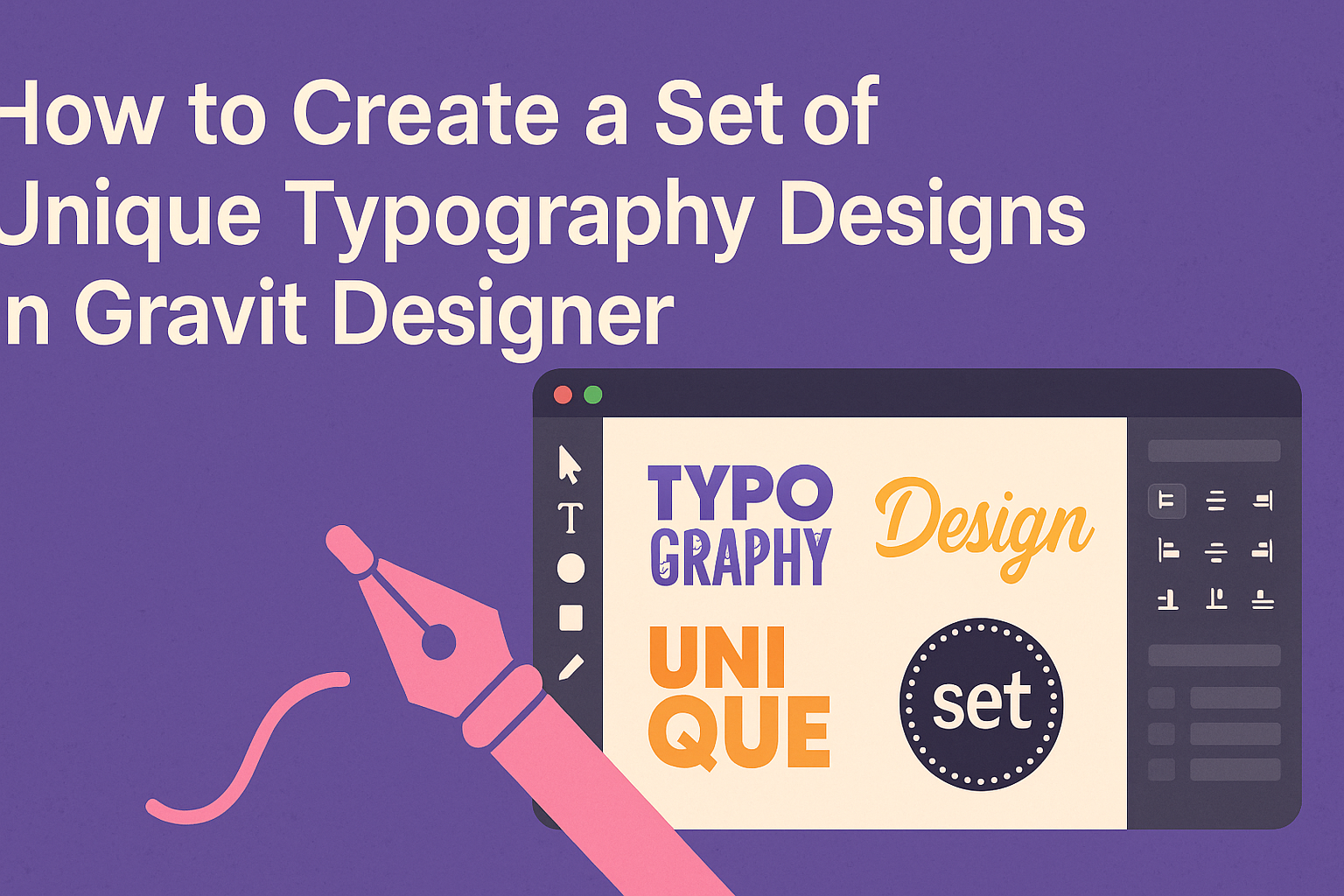
Getting Started with Gravit Designer
Gravit Designer is a powerful tool for creating unique typography designs. Understanding its interface and setting up the canvas properly are essential first steps for achieving great results.
Understanding the Interface
When first opening Gravit Designer, the user is greeted by a clean and organized interface. The main components include the toolbar, design canvas, and inspector panel.
- Toolbar: Contains essential tools such as selection, shape tools, and text options.
- Design Canvas: The area where all designs come to life.
By familiarizing oneself with these areas, the user can easily navigate.
The inspector panel on the right allows for adjustments to properties like colors, fonts, and styles, making it vital for typography work.
They can customize their workspace by rearranging panels or hiding unnecessary tools, creating a personalized design environment.
Setting Up Your Canvas
Setting up a canvas in Gravit Designer is straightforward. The user starts by selecting the File menu and clicking on New Design.
Here are some key settings to consider:
- Size: Choose the dimensions that fit the project. Common sizes include A4 and custom sizes.
- Units: Select from pixels, inches, or centimeters based on preference.
After the setup, they can use the grid and guides to align text elements neatly.
It is beneficial to enable these from the View menu to assist in precise placement.
This organized approach helps in achieving clean and professional typography designs.
Designing Unique Typography
Creating unique typography involves careful selection of fonts, manipulation of text shapes, and the addition of effects and textures. Each of these elements plays a vital role in making typography stand out and communicate effectively.
Choosing the Right Fonts
Selecting the right fonts is crucial for unique typography. She can start by choosing 2-3 typefaces that complement each other. One could use a bold font for headings and a simpler one for body text.
Next, consider the mood or theme of the design. Fonts can convey various emotions. A playful font works well for kids’ designs, while a sleek, modern font suits corporate projects.
It’s also essential to look for unique fonts that aren’t widely used. Websites like Google Fonts or Adobe Fonts offer a wide selection.
Experimenting with different styles can lead to fresh and original designs that capture attention.
Manipulating Text Shapes
Text shape manipulation is another way to create unique typography. This involves bending, warping, or altering the text in creative ways.
In Gravit Designer, she can use the “Path” tool to convert text into shapes. This lets her adjust curves and angles freely.
Distorted text can produce exciting results and add a personal touch to designs.
Additionally, playing with letter spacing can make text feel more dynamic. Kerning adjustments help to achieve a clean and polished look.
She can also layer text for a 3D effect, enhancing visual interest.
Adding Effects and Textures
Adding effects and textures can elevate typography designs. Simple shadows can create depth, while gradients add color and dimension.
Using images as textures can produce a unique look. For example, overlaying a wood texture can make the text feel earthy.
Gravit Designer allows for easy application of these effects. Adjusting opacity and blending modes creates intriguing styles.
It’s important to maintain readability while adding these touches. A balance between creativity and clarity ensures that the design communicates effectively.
Advanced Typography Techniques
Creating unique typography designs involves advanced techniques that enhance creativity and precision. Mastering layers and paths can take designs to the next level, ensuring that each letter is distinct and visually appealing.
Working with Layers and Groups
Layers are essential for organizing typography designs. They allow designers to separate different elements, making it easier to edit or adjust parts of the design without affecting others.
Using groups can further streamline this process. By grouping related layers, a designer can manage complex designs more efficiently.
For instance, a designer can group all elements of a logo’s text, allowing for quick adjustments to size or color without having to select each element individually.
It’s also helpful to use layer styles for quick changes. Applying effects like shadows or outlines can enhance readability and style.
Moreover, adjusting layer opacity can create interesting visual effects and depth.
Using Paths for Custom Letters
Paths are a powerful feature in Gravit Designer. They enable customization of letter shapes, allowing for creativity beyond standard fonts.
By converting text to paths, a designer can manipulate each point of a letter for unique results. This method is perfect for creating logos or unique headings.
Designers can stretch, rotate, or curve letters to fit specific design needs. Using the path tool, they can also combine multiple shapes to create entirely new letters.
Ultimately, using paths enhances typography’s visual appeal. Designers can experiment with styles, enabling them to create eye-catching designs that stand out. Custom letters provide a personal touch that standard fonts simply cannot achieve.