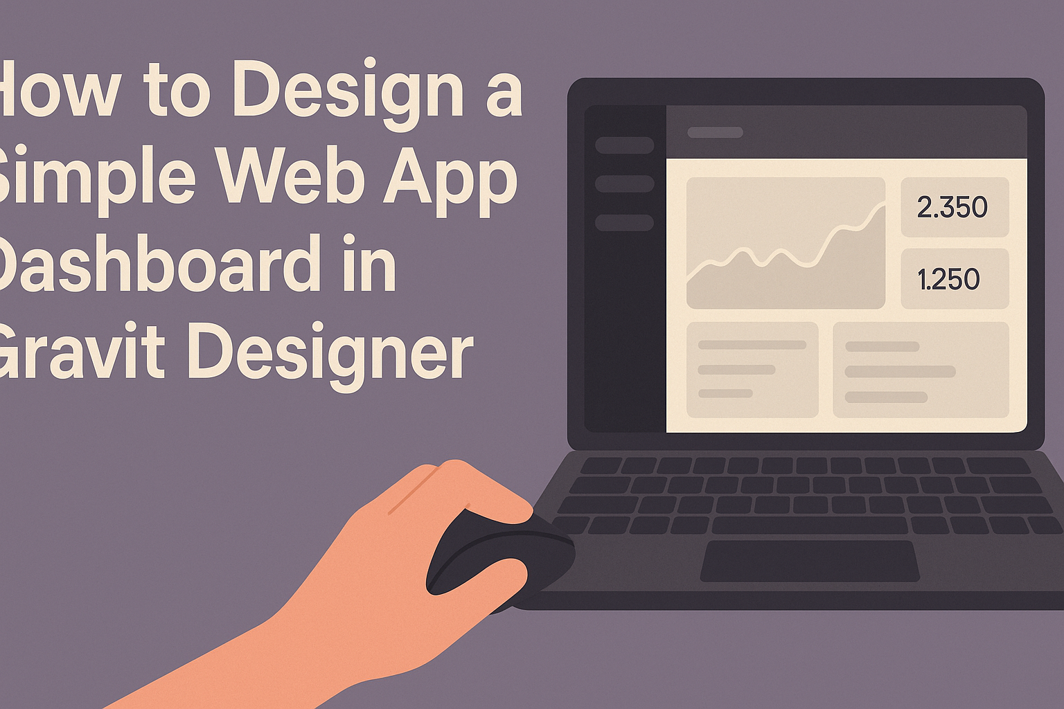
Designing a simple web app dashboard can seem challenging, but it doesn’t have to be. Gravit Designer makes this process easy with its user-friendly tools and features that anyone can learn to use.
With a few basic steps, anyone can create an eye-catching and functional dashboard that meets their needs.
In this blog post, readers will discover how to effectively use Gravit Designer to build an engaging dashboard.
The tutorial will cover essential design principles while offering tips to ensure clarity and usability. Whether someone is a beginner or has experience in design, they will find valuable insights to enhance their skills.
By the end of the article, he or she will be ready to create a dashboard that not only looks great but also provides a smooth user experience. Each step will guide them toward achieving a professional design that communicates information effectively.
This journey into web app dashboard design promises to be both informative and enjoyable.
Getting Started with Gravit Designer
Gravit Designer is a versatile tool for graphic design, particularly useful for creating web app dashboards. Learning how to effectively set up and use Gravit Designer is essential for anyone looking to design visually appealing interfaces.
Overview of Gravit Designer
Gravit Designer is a free, browser-based design tool suitable for creating various graphics, including web app dashboards.
It offers a user-friendly interface with a range of design features. Users can find tools for vector graphics, text editing, and layering, making it easy to craft a polished look.
The platform is available on multiple operating systems, including Windows, Mac, Linux, and Chrome OS, which adds to its accessibility. Users can choose between desktop versions or work directly in their browsers. This flexibility ensures that designers can work from anywhere.
Setting Up Your Project
To begin a project in Gravit Designer, users should first launch the application and choose a suitable canvas size.
It’s recommended to select the “Web” option when creating a new design. This ensures the workspace is optimized for web interfaces.
After selecting the canvas, users can customize their layout as needed. They can access various shapes, icons, and other design elements from the toolbar.
To enhance workflow, layers can be organized, locked, or grouped. This feature keeps the project tidy and manageable.
For those new to design, Gravit Designer’s tutorials and community resources are invaluable for a smoother learning experience. He or she can quickly grasp essential tools and tips for effective dashboard design.
Designing the Dashboard Layout
Creating an effective dashboard layout is crucial for ensuring that users can quickly understand and navigate the information presented. This involves careful selection of colors, organization through grids, and effective navigation design.
Creating a Color Scheme
A color scheme sets the mood and enhances usability.
Start by selecting a primary color that reflects the brand or theme of the web app. This color can be complemented with two or three secondary colors for buttons, icons, and highlights.
Contrast is key. Use light colors for backgrounds and darker tones for text to ensure readability. Tools like Adobe Color or Coolors can help in creating harmonious color palettes. Consistency in colors across the dashboard helps users easily find what they need.
Establishing Grids and Guides
Grids and guides are essential for organizing layout elements. They provide a structured framework, making it easier for users to navigate the dashboard.
A common approach is to divide the layout into columns, often using a 12-column grid system.
Margins and padding also play important roles. They ensure that elements are spaced evenly, preventing the dashboard from feeling cluttered. Aligning components to the grid lines creates a clean and professional appearance, enhancing the user experience.
Designing the Navigation
Navigation is how users will interact with the dashboard, so it needs to be intuitive.
A top navigation bar is often effective for primary options, with dropdown menus for more choices.
Using clear labels for each section helps users know where they are. Icons can also enhance understanding, particularly when paired with text. Keep the navigation consistent across all screens to reduce confusion.
Consider adding a search feature for users to quickly find information. Remember, the goal is to make navigation seamless and efficient, allowing users to focus on their tasks without unnecessary obstacles.
Adding Elements to Your Dashboard
Creating a visually appealing dashboard in Gravit Designer requires careful attention to the elements used. Key aspects include text, icons, images, and the overall style. Each element plays a vital role in enhancing user experience and conveying information effectively.
Working with Text and Typography
When adding text to a dashboard, clarity is crucial. Choose fonts that are easy to read and visually appealing. It’s best to stick to two or three font styles to maintain consistency throughout the design.
Font Size and Weight: Use larger font sizes for headings and subheadings. This helps users quickly identify important information.
Text Alignment: Left-align most text for easy reading. Highlight key points using bold or italic styles to draw attention.
Utilizing text hierarchy ensures that users can scan the dashboard and find information without confusion.
Inserting Icons and Images
Icons and images can enhance the visual appeal of a dashboard. They provide quick visual cues for users.
When selecting icons, ensure they are intuitive and fit the overall design theme.
Consistency: Use a consistent style for all icons, whether they are line drawings or filled. This creates a unified look.
Image Quality: Always use high-quality images. Blurry or pixelated images can detract from the dashboard’s professionalism.
Incorporating relevant images can also provide context and help users understand data at a glance.
Using Components and Styles
Gravit Designer allows for the use of predefined components to streamline the design process. These components include buttons, graphs, and charts.
Customization: Users can customize these components to fit the dashboard’s style. Adjust colors, sizes, and labels to align with the overall theme.
Styles: Establishing a style guide in Gravit Designer can help maintain design consistency. This includes setting standard colors, sizes, and typography rules.
Using components and styles efficiently can save time and provide a polished appearance to the final dashboard design.
Final Touches and Exporting
At this stage, the design is almost complete. It’s time to apply final edits and get ready for exporting. These steps will help in refining the dashboard and preparing it for presentation or use.
Applying Final Edits
Before exporting, it’s essential to review the design closely. Check for alignment, color consistency, and font choices. This ensures everything looks professional and cohesive.
Consider using Gravit Designer’s alignment tools to help position elements perfectly. This can improve the overall appearance. Also, double-check text for typos or inconsistent styles.
Changing the opacity of certain elements can add depth. Use bold colors for key data points to make them stand out.
Take a moment to make any necessary adjustments to shadow effects or borders to enhance visibility.
Lastly, preview the design in full screen. This helps in identifying any layout issues that might not be apparent in the regular workspace view.
Exporting Your Design
Once satisfied with the final edits, it’s time to export. Gravit Designer makes this easy with various formats available.
To export, go to the File menu and select Export.
Choose the preferred file type, such as PNG or JPEG for images, or SVG for scalable graphics.
Adjust the resolution based on the intended use. Higher resolutions are ideal for print, while lower ones suit digital displays.
Before clicking export, ensure all layers are visible. This will ensure that nothing important is left out.
After exporting, it’s good practice to double-check the exported file.
This guarantees that all elements appear as expected, ready for use in presentations or web integration.