Creating a modular website layout can seem challenging, but it doesn’t have to be. With Gravit Designer, anyone can easily design a flexible and organized layout that enhances user experience. This tool offers features that simplify the process while allowing creativity to flourish.
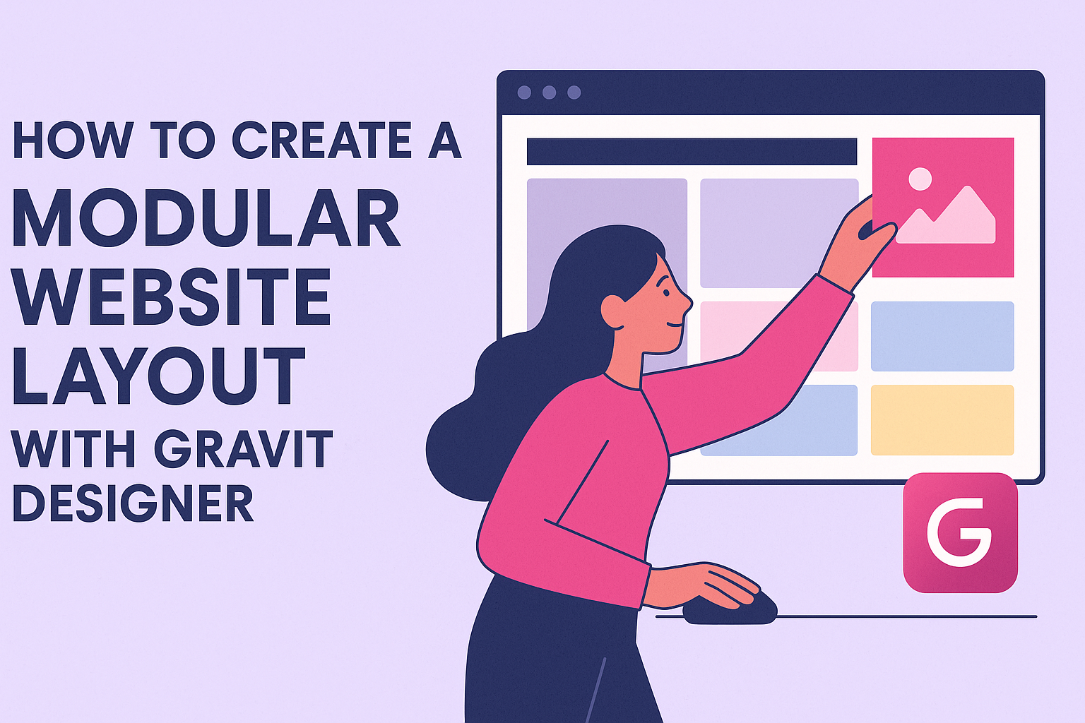
A modular design breaks a website into manageable sections, making it easy for users to navigate.
Gravit Designer provides grids and guides, which help in aligning and spacing elements perfectly. This not only saves time but also ensures that the final product is visually appealing and functional.
Whether designing a portfolio, blog, or business site, knowing how to use Gravit Designer effectively can elevate any project. Readers will discover step-by-step methods to create their layouts, making their websites stand out in a crowded online space.
Getting Started with Gravit Designer
Gravit Designer offers a clean, user-friendly interface that makes it easy for anyone to start designing. Understanding its layout and setting up a canvas appropriately are essential first steps.
Understanding the Interface
The interface of Gravit Designer includes several key areas: the toolbar, the design panel, and the canvas itself.
-
Toolbar: Located at the top, it provides quick access to essential tools like select, shapes, pen, and text. Users can easily switch between tools to create various designs.
-
Design Panel: On the right side, this panel includes options for properties and layers. It allows users to modify shapes, colors, and other design elements.
-
Canvas: The central workspace where designs come to life. Users can zoom in and out, and pan around to focus on different design areas.
Familiarizing oneself with these sections enables efficient navigation and productivity.
Setting Up Your Canvas
To create a new design, users need to set up their canvas correctly. First, go to the “File” menu and select “New.” This opens a dialog box.
-
Dimensions: Users can choose specific dimensions or opt for preset sizes like A4 or web resolution.
-
Units: Selecting units like pixels or inches is also important to ensure accuracy.
Once the canvas is set:
-
Adjust the background color or make it transparent according to the design needs.
-
Utilize grid lines or guides for precise alignment.
Selecting the right settings from the start helps create a smooth workflow as users dive into their creative projects.
Designing Modular Components
Creating modular components involves focusing on flexibility and reusability. This section covers essential elements like navigation bars, content blocks, and footer components, which are vital for a structured and cohesive website.
Creating a Navigation Bar
The navigation bar is crucial as it guides users through the website. It should be simple, intuitive, and consistent across all pages.
- Structure: Use a horizontal layout with clear categories. Ensure the text is easy to read, typically using larger fonts.
- Interactivity: Include hover effects to enhance user experience.
- Responsiveness: Design for different screen sizes by stacking items vertically on mobile devices.
Keep the number of menu items limited to enhance usability. Aim for no more than five to seven items. This helps users find what they need quickly.
Building a Content Block
Content blocks are key to organizing information clearly. They should be visually appealing and easy to digest.
- Grid Layout: Use a grid system to align elements. This helps maintain consistency across the site.
- Typography: Choose clear fonts and sizes. Use headings to break content into sections.
- Images: Incorporate images that relate to the text. Ensure they are optimized for fast loading times.
Each content block should have a specific purpose. Whether it’s for articles, services, or testimonials, defining this keeps the site organized.
Designing Footer Elements
Footers provide valuable information and navigation options at the bottom of a page. They should complement the overall design.
- Essential Information: Include contact details, social media links, and a site map. This aids visitors in finding important resources.
- Visual Design: Use contrasting colors to make the footer stand out. This separates it from the body content.
- Legal Information: Add links to privacy policies and terms of service for credibility.
A well-designed footer can improve user engagement and trust. It serves as a final touchpoint for visitors before they leave the site.
Arranging Layout Modules
Arranging layout modules is essential for creating an effective and user-friendly website. This process involves using alignment and spacing techniques, along with ensuring the layout is responsive on different devices.
Using Alignment and Spacing
Proper alignment can make a layout visually appealing and easy to navigate. Designers often use grid lines to align elements consistently. This can help in achieving balance.
Spacing is equally important. It helps to separate different sections and elements, which can enhance readability.
Designers usually apply margins and padding to create ample space around text and images.
A helpful tip is to use a consistent unit for spacing throughout the design. For instance, if a designer chooses to use 10 pixels as a base unit, they should stick to that for all spacing adjustments.
Implementing Responsiveness
Responsiveness ensures that a website looks good across various devices.
Designers should use fluid grids that adjust automatically based on screen size. This means using percentages instead of fixed widths.
Media queries can also play a vital role. They allow different styles to be applied based on the device’s characteristics, such as screen width. Utilizing frameworks can offer built-in responsiveness, making it easier to implement.
Designers should test the layout on multiple devices. Checking how modules stack or rearrange helps make necessary adjustments. This approach can lead to a better user experience and keep visitors engaged.
Tips and Tricks
Mastering Gravit Designer can greatly improve the website layout process. Here are some useful tips that will help users create stunning designs efficiently.
Using Shared Styles
Shared styles are a powerful feature in Gravit Designer. They allow users to apply consistent styles across multiple elements with ease.
To create a shared style, select an element and go to the Style panel. Click Save as Style to store it. This is helpful for typography, colors, and effects.
When changes are made to the shared style, all elements using that style automatically update. This not only saves time but also ensures design consistency.
Using shared styles streamlines the process, especially in modular designs where similar components are repeated throughout the layout.
Exporting Assets Effectively
Exporting assets properly can make a big difference in how a layout looks in the final product.
Gravit Designer offers several formats to choose from, including PNG, SVG, and PDF.
To export an asset, select it, then navigate to the File menu and choose Export.
Users should select the format that best fits their needs.
For web use, PNG and SVG are popular choices because they maintain quality at different sizes.
It’s also important to check the Export Settings to compress images without losing quality.
Organizing exported assets in properly labeled folders can help keep everything tidy, making it easier to work on the project in the future.