Designing a book cover can be an exciting process for any author or designer. Gravit Designer offers a simple and effective way to create stunning visuals that capture the essence of a story.
With its intuitive tools, anyone can learn how to craft an eye-catching book cover that stands out on any bookshelf.
In this blog post, readers will discover step-by-step techniques for creating a professional-looking cover using Gravit Designer. From choosing the right colors to arranging elements harmoniously, these tips will help bring your vision to life.
With a little creativity and some guidance, anyone can design a cover that not only attracts readers but also reflects the content inside.
Whether you’re new to graphic design or looking to refine your skills, this article provides valuable insights. These practical strategies will empower creators to produce book covers that make a lasting impression.
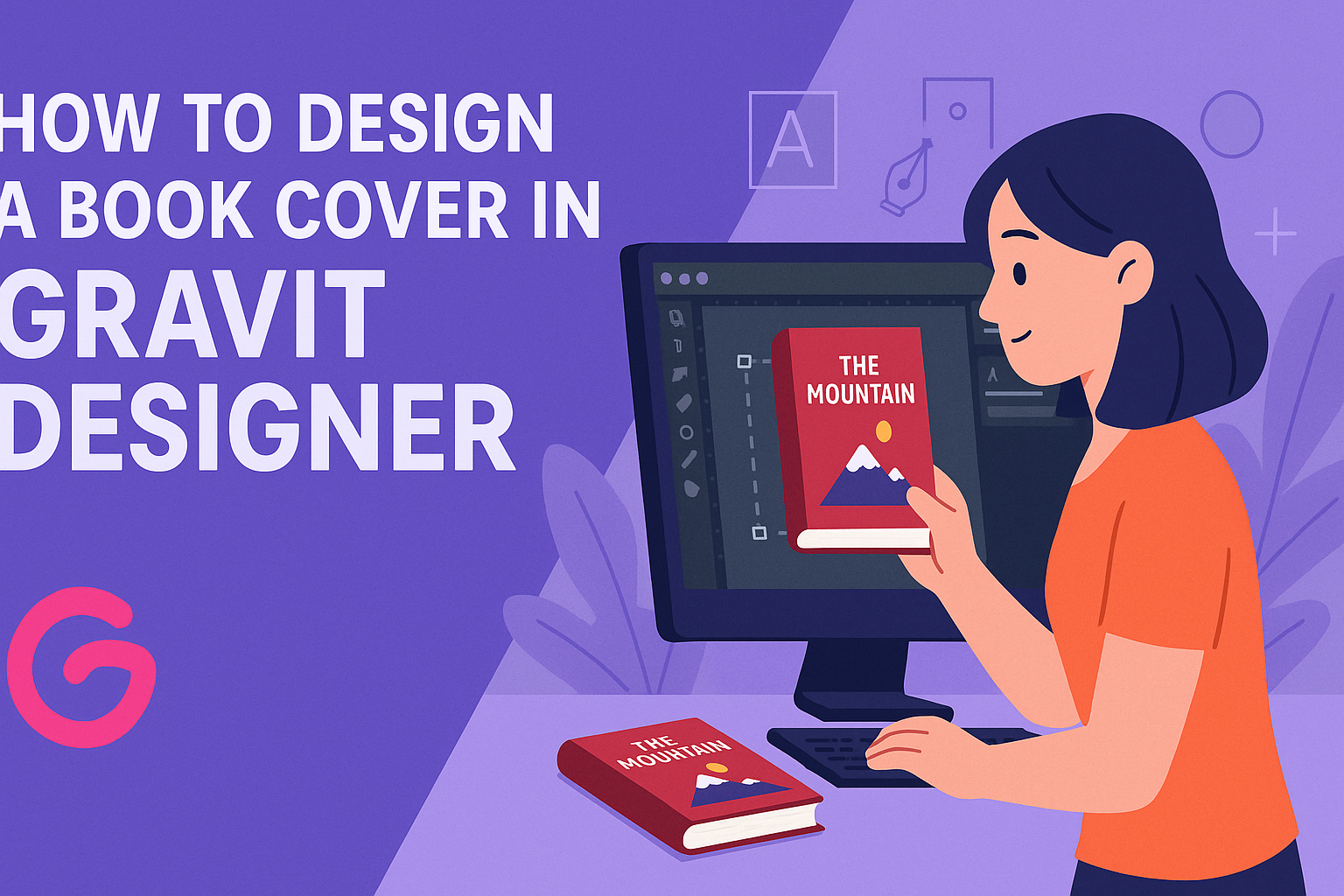
Understanding Gravit Designer
Gravit Designer is a user-friendly tool for creating stunning designs, including book covers. It offers a range of features and a simple interface, making it accessible for both beginners and experienced designers.
Overview of Interface
When users first open Gravit Designer, they are greeted with a clean interface. The main parts include the canvas, toolbars, and panel areas.
- The canvas is where all the design action takes place. Users can click and drag to create and manipulate shapes, texts, and images.
- Toolbars at the top hold essential tools for editing, drawing, and layout adjustments.
- The panel on the right side provides options for layers, styles, and properties.
Navigating through these elements is intuitive, allowing users to focus on creativity without overwhelming distractions.
Setting Up Your Canvas
Setting up a canvas for a book cover is a simple process in Gravit Designer. First, users need to create a new document through the file menu.
Here are the important steps:
- Select Size: Choose a custom size that fits your book cover dimensions, typically using standard measurements like 6″ x 9″.
- Orientation: Opt for portrait or landscape layout based on the design needs.
- Background Color: Setting a background color early can help visualize the design better.
Once set up, users can easily zoom in and out, making adjustments as they create their book cover.
Exploring the Toolset
Gravit Designer offers a variety of tools to help with book cover design.
Key tools include:
- Shape Tools: These allow users to create basic geometric shapes and customize them.
- Text Tool: This tool helps in adding titles, authors, and descriptions with various font choices.
- Export Options: Once the design is complete, users can export their work in different formats like PNG or PDF.
Each tool is equipped with specific features and properties that users can tweak. By becoming familiar with these tools, users can enhance their designs and produce captivating book covers.
Design Fundamentals
Creating an appealing book cover involves understanding key design concepts. Knowing how to use color, typography, and layout effectively can make a significant impact on the overall design.
Color Theory
Color theory is essential in book cover design. Colors evoke emotions and set the tone for the book. For instance, blue often represents calmness, while red can signify excitement or danger.
When selecting colors, consider the psychology behind them. Using a color wheel can help he choose complementary colors that work well together. A simple palette of 2-3 main colors can create a clean look.
It’s also important to ensure good contrast between the text and background. High contrast improves readability, which is crucial for attracting potential readers.
Typography Basics
Typography plays a vital role in book cover design. The style, size, and placement of text can draw attention or convey a message. Using a mix of fonts is common, but it’s important to limit them to 2-3 for a cohesive look.
Serif fonts are often used for traditional or serious themes. In contrast, sans-serif fonts work well for modern, clean designs. The size of the title and author name should be balanced, ensuring they are easy to read at a distance.
Kerning, or the space between letters, can also affect the design. Adjusting this can enhance legibility and style.
Layout and Composition
Layout and composition involve how elements are arranged on the cover. A well-structured design guides the viewer’s eye and keeps their attention.
He should follow the principles of alignment, balance, and hierarchy. For instance, a focal point, like the book title, should be immediately noticeable.
Utilizing grids can help create a structured layout. This method ensures that elements are placed evenly, creating harmony on the cover.
White space is also important. It allows the design to breathe and prevents it from feeling cluttered. Proper use of white space enhances visual appeal and keeps the viewer focused on key details.
Creating Your Book Cover
Creating a book cover involves a few important steps. It’s essential to apply design principles, incorporate fitting images, and add text that stands out. Each aspect works together to craft a cover that captures attention.
Applying Design Principles
Design principles are the foundation of a successful book cover. They help ensure that the cover is visually appealing and communicates the right message. Key principles include balance, contrast, and alignment.
Balance: He or she should aim for an equal distribution of visual weight. This could mean balancing images with text to create harmony.
Contrast: Using contrasting colors can make elements pop. For example, a dark background with white text draws the eye and enhances readability.
Alignment: Aligning elements creates a clean look. Ensuring that titles and images are properly lined up can make the design feel organized and professional.
Incorporating Images and Illustrations
Choosing the right images and illustrations is crucial. Images can evoke emotion and set the tone for the book. It’s important to select images that relate to the content and target audience.
He or she can use royalty-free images or original illustrations to avoid copyright issues. Platforms like Unsplash and Pixabay offer free images that can be effective.
When placing images, consider using a focal point. This draws the viewer’s eye to the most important aspect of the cover. Cropping and layering images creatively can add depth and interest.
Adding Text and Titles
Text and titles communicate the book’s content and attract potential readers. A clear and engaging title is essential. It should be prominent and easy to read.
When choosing fonts, he or she should consider readability. Using bold fonts for titles helps them stand out against the background. Pairing it with a simpler font for the author’s name can create visual interest.
It’s also important to choose colors that complement the design. High contrast between text and background makes information clear. He or she should avoid overcrowding the cover with too much text, keeping it simple yet impactful.
Exporting Your Design
Exporting a book cover design properly is essential for achieving the right look and quality. It involves choosing the right file format and ensuring the resolution meets industry standards.
Choosing the Right File Format
Selecting the right file format is crucial when exporting a book cover. For digital covers, JPG and PNG are common choices, as they support high-quality images and are widely accepted on online platforms.
For print, PDF is often preferred. This format preserves vector quality and is suitable for high-resolution prints.
It’s important to ask the designer for both formats to cover all publishing needs.
When exporting, Gravit Designer allows users to choose these formats easily. They can also export assets in multiple formats at once, which saves time during the design process.
Resolution and Scaling
Resolution significantly affects the clarity and quality of the book cover. The standard resolution for print designs is 300 DPI (dots per inch), which ensures sharp images and fine details.
For eBooks, 72 DPI is often suitable, but higher resolutions can help with clarity on various devices.
When setting up your design, always keep in mind the final size of the cover. If the cover will be 6 x 9 inches when printed, the canvas should reflect that size while maintaining proper scaling.
This ensures that images and text do not become pixelated during export.