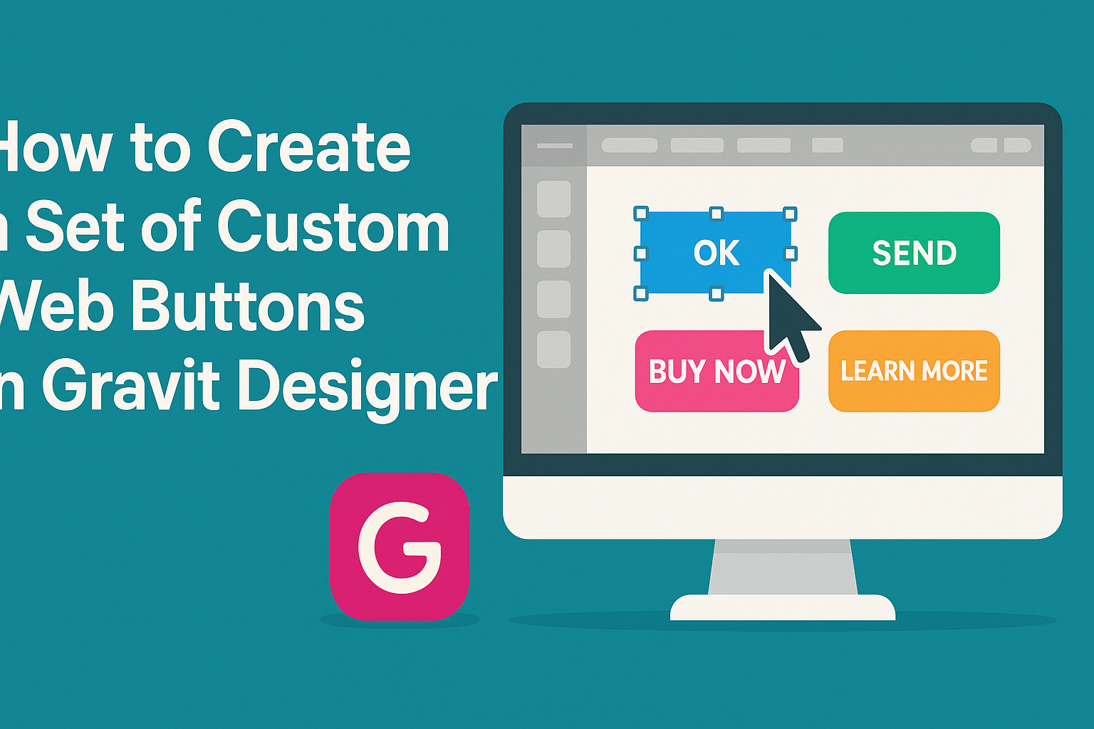
Creating custom web buttons can significantly enhance the look and feel of a website. In Gravit Designer, users can easily design unique buttons that reflect their site’s style and functionality. This skill not only improves visual appeal but also helps engage visitors effectively.
With its user-friendly interface and powerful tools, Gravit Designer makes the design process both simple and enjoyable.
Designers can experiment with various shapes, colors, and effects to create buttons that stand out.
Exploring these features can unlock a world of creative possibilities.
Whether for personal projects or professional websites, having custom buttons adds a personal touch. Readers will discover step-by-step techniques to create buttons that are both beautiful and functional. This blog post will guide them through the journey of button design in Gravit Designer.
Getting Started with Gravit Designer
Gravit Designer offers a range of tools for creating custom web buttons.
To begin, it’s important to familiarize oneself with the interface and set up the canvas properly. Understanding the toolbar will also enhance the design process.
Overview of the Interface
The Gravit Designer interface is user-friendly and designed for ease of navigation. When opened, users will notice various panels, including the design area, layers panel, and toolbar.
The main workspace in the center is where designs come to life.
On the left side, the Layers Panel helps manage different elements. Users can easily add, delete, or organize shapes and buttons.
On the right, the Properties Panel allows for precise adjustments, such as colors, effects, and sizes.
A clean layout ensures users can focus on their designs without distractions. Familiarity with these panels will speed up the creation process.
Setting up Your Canvas
Setting up the canvas is a crucial step for designing custom buttons. Gravit Designer allows users to choose their canvas size using different units like pixels or millimeters. This flexibility helps accommodate various design needs.
To set up the canvas, users click the Create button on the dashboard. A dialog box appears, allowing them to enter the desired width and height.
Leaving these fields blank gives the option for an infinite canvas.
You can also choose orientation to suit the project better. A correctly set canvas saves time and makes the workflow smoother.
Understanding the Toolbar
The toolbar in Gravit Designer is equipped with essential tools for creating and editing designs. It is located at the top of the interface and contains features for selection, shapes, text, and more.
Key tools include the Selection Tool for moving and resizing elements, the Shape Tools for creating buttons, and the Text Tool for adding text to designs. Every tool serves a specific purpose, making it easy to achieve desired effects.
Users can hover over each icon for tooltips, which provide helpful hints. Mastering the toolbar functionalities will greatly aid users in bringing their design ideas to reality.
Designing Your Web Buttons
Creating effective web buttons involves careful consideration of shape, color, and typography. Each design choice contributes to the button’s functionality and visual appeal.
Choosing a Shape and Size
The shape and size of a button are fundamental to its design. Common shapes include rectangles, rounded rectangles, and circles. Each shape serves a different visual purpose.
Size is also crucial. A button should be large enough to stand out but not so large that it overwhelms the surrounding elements. A good rule of thumb is to make buttons at least 44 pixels in height for touch-friendly designs.
Experimenting with different shapes can help find the right fit for the webpage. Consider using a grid to keep the size consistent across all buttons used on the site.
Applying Color and Gradients
Color plays a significant role in attracting user attention. Choosing a color that contrasts with the website’s background is important. For example, a bright orange button on a blue background draws the eye effectively.
Gradients can add depth and interest to a button’s design. A subtle gradient can make a button appear more three-dimensional. However, it’s best to keep gradients simple to ensure they do not distract from the button’s text.
Using color psychology can also influence user interaction. Warm colors like red or yellow can evoke emotions and create urgency. Always make sure the color scheme aligns with the website’s brand.
Adding Text and Typography
Text on a button should be clear and direct. Use concise phrases like “Sign Up” or “Learn More” to convey purpose. Clear action words help guide users.
Font choice is also important. A legible sans-serif font often works best for web buttons. The text size should be proportional to the button size, typically around 16-20 pixels.
Consider using bold text to create emphasis. Ensure there’s sufficient contrast between the text color and button background to enhance readability.
Incorporating these design elements will help create buttons that are not only attractive but also functional.
Enhancing Button Designs
Improving button designs can significantly impact user experience and engagement. By adding elements like icons, using layers, and creating hover states, designers can make buttons more appealing and functional.
Incorporating Icons and Logos
Adding icons and logos to buttons can enhance their visual appeal and improve usability. An icon can quickly convey the button’s purpose, making it easier for users to understand its function at a glance.
For instance, using a shopping cart icon on a purchase button helps users identify it instantly. Designers should choose icons that align with the overall design and brand identity.
It’s essential to keep icon size consistent with the button dimensions. Placing an icon next to text can also create a clean and organized look.
Using Layers and Effects
Layers and effects add depth and personality to buttons. By stacking different shapes and colors, designers can create unique button styles that stand out.
Shadows, gradients, and highlights can give the illusion of three-dimensionality. For example, a soft shadow can make a button appear raised, encouraging interaction.
Using Layer Styles in Gravit Designer allows for quick adjustments and experimentation with different effects.
Creating Hover States
Hover states provide feedback to users, enhancing interactivity.
They can indicate that a button is clickable and ready for action.
Designers can change the button’s color, increase its size, or apply a subtle animation when the cursor hovers over it.
This effect attracts attention and encourages clicks.
Utilizing Gravit Designer, they can easily set up hover states for buttons.
Keeping hover changes minimal ensures that users still focus on the button’s primary function.