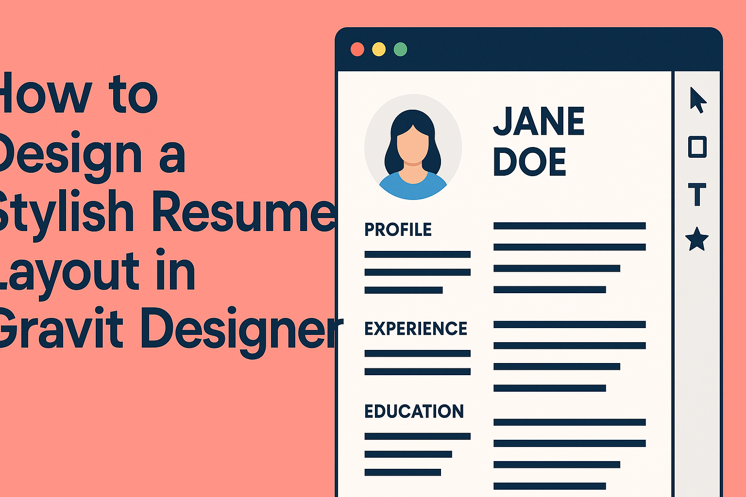
Creating a resume that stands out is essential in today’s competitive job market.
Using Gravit Designer, anyone can design a stylish resume layout that showcases skills and experiences in a visually appealing way.
With its user-friendly features and flexibility, Gravit Designer offers many tools that can help craft a unique resume.
He can start by selecting a template or creating a design from scratch, allowing for creativity and personal touch.
By incorporating custom colors, fonts, and layouts, she can ensure her resume not only looks professional but also reflects her personality.
Armed with tips and tricks from this blog post, anyone will be ready to impress potential employers with a resume that captures attention and communicates professionalism.
Transforming a simple document into a stylish presentation is just a few clicks away!
Getting Started with Gravit Designer
Gravit Designer is user-friendly and great for creating stylish designs. This section will guide the reader through the interface and how to set up a new document to start designing effectively.
Exploring the Interface
When starting with Gravit Designer, the first step is getting familiar with the interface. The workspace consists of different sections including the canvas, toolbar, and properties panel.
The canvas is where designs come to life. The toolbar holds tools for creating shapes, text, and more. Users can quickly find options like selection, pen, and rectangle tools.
The properties panel allows for adjustments to be made to selected elements. Here, users can change colors, sizes, and effects. Understanding these components helps in navigating the software smoothly.
Setting Up a New Document
To create a new document, users should click on “File” in the top menu, then select “New.” A dialog box will appear, prompting them to choose a document size. They can pick from preset sizes, or customize dimensions according to their needs.
After selecting a size, they can define the dpi (dots per inch), especially if printing the resume. Additionally, users can select the background color here.
Once the document setup is complete, clicking “Create” will open the new project. This is the perfect canvas for crafting a stylish resume layout!
Design Principles for Resumes
Creating a stylish resume requires attention to several design principles. These principles help ensure that the resume is not only visually appealing but also effective in communicating information.
Choosing the Right Color Scheme
A well-chosen color scheme can enhance a resume’s appeal. It’s important to select colors that complement each other and reflect the industry.
Neutral colors such as gray, black, and white provide a clean background.
Accent colors can be used for headings or key sections, but they should be limited to avoid overwhelming the reader.
For example, a blue accent against a gray background can create a professional look.
Using a color palette tool can help in choosing harmonious colors.
Balancing Text and White Space
Finding the right balance between text and white space is key in resume design. White space helps guide the reader’s eye and makes the resume easier to digest.
Too much text can clutter the layout, while too little can leave the resume feeling empty.
Using headers and bullet points effectively can create separation and clarity.
A one-inch margin around the document creates a clean edge and helps with readability.
Ensuring that sections are clearly defined provides a structured appearance.
Typography Essentials
Selecting the right font is crucial for a resume. The fonts should be easy to read and professional.
Sans-serif fonts like Arial or Helvetica are often recommended for a modern look.
Font sizes should vary: 14-16 points for headings and 11-12 points for body text.
Mixing fonts can be useful but should be done sparingly.
Using bold for important information can draw attention, while italics can be used for emphasis.
Avoid overly decorative fonts, as they can distract from the content.
Creating a Custom Layout
A custom resume layout helps stand out. Using grids for alignment, styling text, and adding icons can enhance visual appeal and clarity.
Using Grids for Alignment
Grids are essential for creating a balanced layout. They help place elements in a structured way, ensuring everything is aligned properly.
To set up a grid in Gravit Designer, select the ‘Grid’ option in the properties panel. This allows the user to add horizontal and vertical lines, guiding the placement of text and images.
The Snap to Grid feature makes it easier to position elements precisely. It helps avoid misalignment and keeps the design neat. An organized layout attracts attention and improves readability.
Adding and Styling Text
Text plays a crucial role in any resume. It conveys important information, so it needs to be legible and visually appealing.
Choose fonts that reflect professionalism yet match personal style. Gravit Designer offers a variety of font choices. Mixing sizes and weights can highlight key sections.
When styling text, consider using bold for headings and sections. This helps these areas stand out. Consistent spacing between lines and paragraphs also aids readability. It is important to keep text sizes uniform to avoid a chaotic look.
Incorporating Icons and Shapes
Icons and shapes add character to a resume. They guide the reader’s eye and can break up text.
In Gravit Designer, users can access a range of icons to represent skills or hobbies. For instance, a laptop icon might symbolize tech skills. Placing these near relevant sections can enhance understanding.
Shapes can be used to create sections or backgrounds. A subtle rectangle behind text can make information pop. Using colors that complement the overall palette enhances visual appeal too.
Exporting and Sharing Your Resume
Once the resume design is complete, the next steps involve exporting the file in a suitable format and sharing it with potential employers. This process is essential for ensuring that the resume retains its style and is accessible for easy viewing.
Exporting as PDF or Image
To ensure the best quality, it is recommended to export the resume as a PDF. This format preserves layout, fonts, and images, making it look professional on any device.
In Gravit Designer, he can easily do this by selecting “Export” from the menu, then choosing the PDF format. For online portfolios or social media, he might want to save it as an image like PNG or JPEG. This can also be done through the “Export” options, allowing for clear visuals suitable for digital sharing.
When exporting, it’s a good idea to check the final file for any discrepancies before sending it out.
Tips for Online Submission
When submitting a resume online, it’s important to follow specific guidelines to ensure a smooth process.
First, always read the job description for any file format requirements. If they request a PDF, deliver a PDF. This shows attention to detail.
He should also rename the file appropriately, using a format like “FirstName_LastName_Resume.pdf”. This makes it easy for recruiters to find the document.
Additionally, if submitting through an application system, ensure that attachments are completely uploaded.
A quick check can prevent frustrating concerns for both the applicant and the employer.