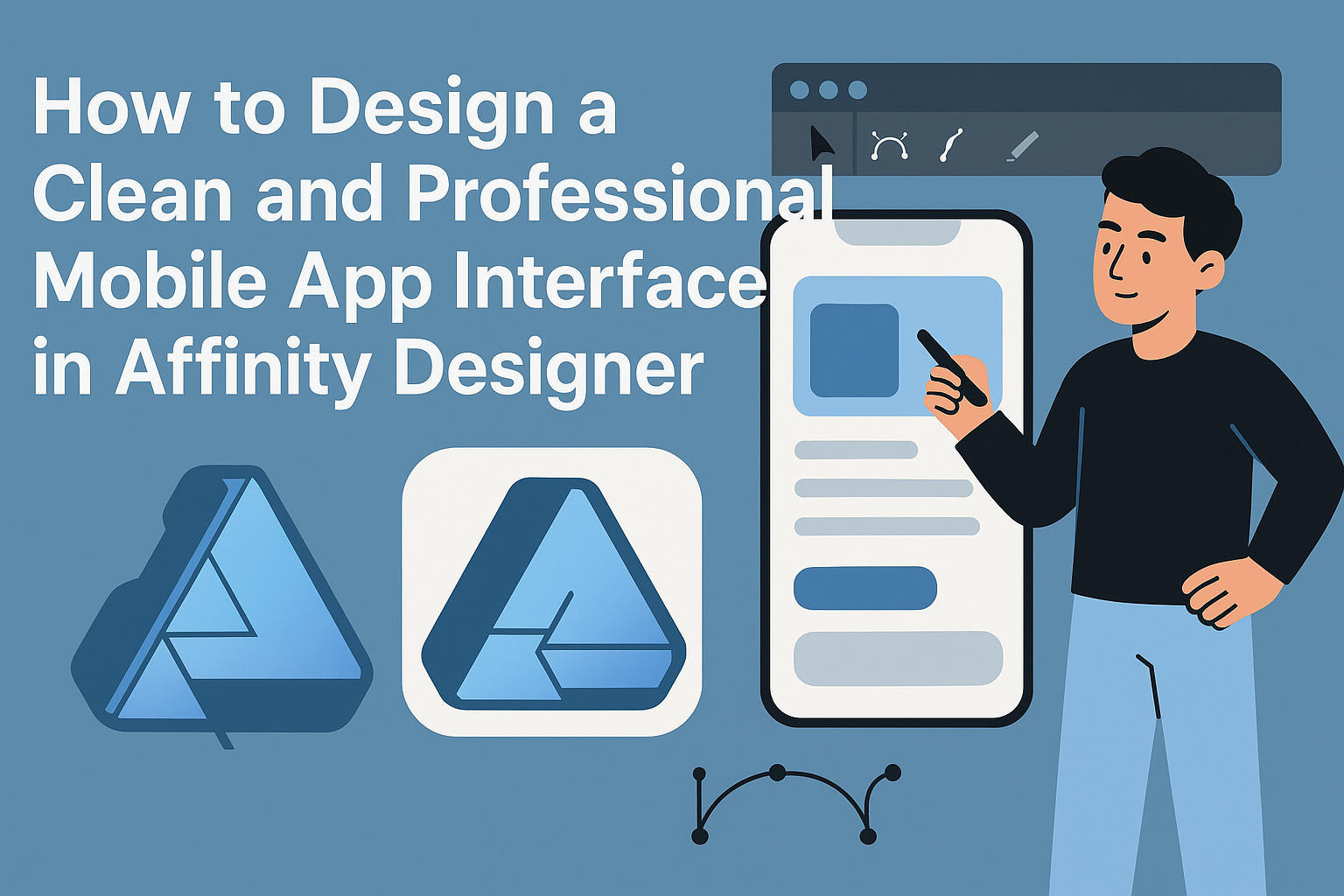
Creating a clean and professional mobile app interface can seem daunting, but with the right tools and approach, it becomes much more manageable. Using Affinity Designer allows designers to easily craft sleek interfaces that enhance user experience while maintaining aesthetic appeal.
This tutorial will guide readers through simple steps to achieve a polished look for their mobile apps.
In this article, designers will learn essential techniques to streamline their app layouts, choose appropriate color schemes, and employ modern typography. Each of these elements plays a vital role in making an app both functional and visually pleasing.
By focusing on clarity and simplicity, they can ensure their apps stand out in today’s competitive market.
Readers will also discover helpful tips that can speed up the design process and make adjustments seamless.
Whether one is a seasoned designer or just starting, this guide will provide valuable insights for creating an impressive mobile app interface in Affinity Designer.
Getting Started with Affinity Designer
Before diving into mobile app design, it’s important to become familiar with Affinity Designer’s workspace and tools.
Understanding how to set up your canvas and the various tools available will help in creating a clean and professional interface.
Understanding the Workspace
The workspace in Affinity Designer is designed to be user-friendly. It consists of several key areas:
- Toolbar: Located at the top, it includes tools for selection, drawing, and editing.
- Layers Panel: This allows users to manage different elements of their design. Layers can be adjusted, hidden, or deleted easily.
- Context Toolbar: It shows options based on the current selection. This makes it easier to access specific adjustments.
Becoming familiar with these areas helps streamline the design process.
Setting Up Your Canvas
When setting up your canvas, users must consider the dimensions needed for mobile app design. Here are a few steps to follow:
- Create a New Document: Click on “File” then “New” and choose a preset size, like the dimensions for an iPhone or Android screen.
- Orientation: Decide on a portrait or landscape layout based on the app’s function.
- Grid and Guidelines: Enable grids and guides to help position elements accurately. This aids in maintaining alignment.
Setting these parameters early will save time later in the design process.
Familiarizing with Tools and Panels
Affinity Designer offers a variety of tools that are essential for app design. Important tools include:
- Shape Tool: Perfect for creating buttons and icons quickly.
- Text Tool: Allows adding and styling text for titles, buttons, and descriptions.
- Pen Tool: Ideal for more complex shapes or custom designs.
The layers panel is vital for managing these elements. Understanding how to group and lock layers makes editing more efficient.
Becoming skilled with these tools enhances the ability to create a polished and professional app interface.
Design Fundamentals
A clean and professional mobile app interface relies heavily on design fundamentals. Understanding color theory, typography, grids, and balance is essential for creating visually appealing layouts. Each element plays a vital role in user experience.
Color Theory and Typography
Color sets the mood of an app. It influences user emotions and decisions. Choosing a color palette that complements the app’s purpose is crucial.
Consider a primary color paired with 2-3 accent colors. Use tools like Adobe Color or Coolors to explore color combinations.
Typography is equally important. Different fonts carry different feelings. A clean, sans-serif font is often used for modern apps. Combining fonts should be done carefully to maintain readability.
For consistency, limit font choices to 2-3 styles.
Utilizing Grids and Alignment
Grids help organize content clearly. They guide the placement of buttons, icons, and text. Using a grid system improves consistency across screens.
Alignment is also vital. Left-aligned text is easier to read, while centered text works for titles. Make sure elements have enough spacing around them for a clean look.
Using a 12-column grid is popular in mobile design. It allows for flexibility while keeping everything aligned.
Balancing Elements for Harmony
Balancing elements creates a sense of stability. A well-balanced design guides the user’s eyes where they need to go.
Consider the weight of each design element. Larger images can draw attention, while smaller items may need more spacing to stand out.
Visual hierarchy plays a role here. Use size, contrast, and spacing to show what’s important.
By balancing all elements within the layout, the app feels complete and user-friendly.
Creating the Interface Elements
When designing a mobile app interface, attention to detail in the elements is crucial. This includes creating intuitive icons, using images effectively, and ensuring a seamless navigation experience. Each component plays a role in enhancing user experience.
Designing Icons and Buttons
Icons and buttons are essential for user interaction. They should be simple and easily recognizable. Start by choosing a consistent style that fits the app’s theme.
Tips for Designing Icons:
- Use a grid to maintain balance and proportion.
- Limit the number of colors to create a cohesive look.
- Test icons with users to ensure clarity.
Buttons should be designed for easy clicking. Make them large enough for touch interaction. Use contrasting colors for visibility, and include labels or icons to clarify their purpose.
Working with Images and Graphics
Images can create a rich visual experience in an app. It’s important to choose high-quality graphics that enhance the content.
Best Practices for Using Images:
- Optimize images for mobile to reduce load times.
- Maintain a consistent style that matches the overall interface.
- Use visuals sparingly to avoid overwhelming users.
Incorporating graphics that represent the brand can strengthen identity. They should complement text and not distract from key information.
Implementing Navigation Components
Navigation components guide users through the app. A well-structured layout is essential for keeping users engaged.
Key Navigation Elements:
- Menus: Use a clear hierarchy that allows easy access to different sections.
- Tabs: Useful for switching between related content without losing context.
- Back Buttons: Ensure users can easily return to previous screens.
The design should prioritize usability. Ensure touch targets are appropriately sized and spaced. This thoughtful approach will lead to a more enjoyable user experience, encouraging users to explore the app fully.
Finalizing and Exporting
This stage is crucial for bringing a mobile app design to life. Understanding how to prototype, optimize, and export ensures the design is effective and ready for developers.
Prototyping and Testing
Creating a prototype is an essential step in the design process. It allows designers to visualize the layout and navigation of the app.
In Affinity Designer, prototypes can be built by linking artboards to simulate user interactions.
Testing the prototype with actual users provides valuable feedback. This helps identify any usability issues before the final design is completed. Collecting this feedback is vital for making necessary adjustments.
Using tools like InVision or Marvel can enhance prototyping capabilities. These platforms allow for more dynamic sharing and testing with stakeholders.
Optimizing Assets for Developers
Before exporting, preparing design assets for developers is key. This ensures they can implement the design without confusion.
Here are some steps to follow:
- Organize Assets: Make sure assets are neatly organized in folders according to the component types.
- Create Separate Layers: Designers should create separate layers for icons, buttons, and backgrounds. Naming conventions should be clear and descriptive.
- Prepare Images: When preparing images, using the correct formats is essential. PNG is great for icons with transparency, while JPG works well for photographs. Additionally, ensuring that asset sizes are appropriate for different screen resolutions is important.
Exporting the Final Design
Once everything is prepared, it’s time to export the final design files.
In Affinity Designer, designers can export assets by selecting the layers and using the “Export” option.
Choosing the right file format is vital.
For graphics, PNG or SVG formats are preferred for their quality and scalability. For mockups, high-resolution JPGs are suitable.
Designers should also ensure that they set the correct dimensions for various devices.
This includes exporting for both iOS and Android screen sizes.
Finally, creating a style guide with color codes and typography details helps maintain design consistency during development.