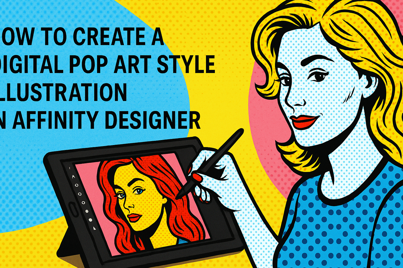
Creating a digital pop art style illustration in Affinity Designer can be an exciting project for artists and designers alike.
By following simple steps, anyone can transform their ideas into vibrant artworks that capture the essence of pop art. This unique style, known for its bold colors and playful themes, offers a great opportunity to experiment with creativity.
Affinity Designer provides a variety of tools that make it easy to create eye-catching designs. Whether one is new to digital art or has experience, the process of turning a concept into a finished piece is accessible and enjoyable.
With some guidance, anyone can create stunning illustrations that stand out and tell a story.
In this blog post, readers will discover essential techniques to bring their pop art visions to life. By exploring tips and tricks, they will learn how to utilize the features of Affinity Designer effectively.
Getting Started with Affinity Designer
Affinity Designer offers a user-friendly environment for creating digital pop art. Understanding the interface, setting up the canvas, and selecting the right tools are essential steps to begin the artistic journey.
Overview of the Interface
The interface of Affinity Designer is designed for ease of use. It features a toolbar on the left, a studio panel on the right, and the canvas in the center.
- The toolbar contains essential tools such as the selection tool, pen tool, and shapes.
- The studio panel provides options for adjusting colors, layers, and other properties.
Users can customize the layout by rearranging panels or adding new ones. This flexibility allows artists to create a workspace that fits their workflow, making it easy to access tools and features needed for pop art projects.
Setting Up Your Canvas
Setting up the canvas is crucial for any digital project. To begin, users can choose a specific document size.
- Open Affinity Designer and click on File > New.
- Select the desired dimensions for the artwork; common sizes for pop art could range from 8×10 inches to larger formats.
It’s also important to set the resolution. For print projects, a resolution of 300 DPI is recommended, while 72 DPI works well for digital displays.
After setting the canvas size, users can create an initial background color by using the color fill tool. This foundation helps in visualizing the overall design as work progresses.
Selecting the Right Tools for Digital Pop Art
Choosing the correct tools is vital for achieving a pop art style. Affinity Designer offers various tools ideal for this art form.
Key tools include:
- Pen Tool: Essential for creating clean lines and curves.
- Shape Tool: Allows the creation of bold shapes that are common in pop art.
- Brush Tool: Useful for adding textures and depth.
Artists should also explore the color palette to find vibrant colors typical of pop art. Utilizing the layer panel helps organize elements effectively and allows for easy adjustments without affecting the entire design.
Creating the Basic Shapes
In digital pop art, the foundation lies in creating simple yet bold shapes. These shapes form the core structure of the illustration, allowing for creativity with colors and patterns later.
Using Vector Tools for Precision
To start, using vector tools in Affinity Designer helps ensure that shapes are clean and sharp. The Pen Tool is ideal for drawing custom shapes. It allows for curves and angles, making it perfect for the playful styles of pop art.
When creating shapes, she can also take advantage of the Shape Tool. It provides options like rectangles, circles, and polygons. This tool can quickly create geometric forms, which are essential in pop art designs.
Tip: Group the shapes as they are created. This makes it easier to scale or move them later without losing their arrangement.
Applying Bold Colors and Patterns
Once the basic shapes are in place, it’s time to apply colors. Bold and vibrant colors are a hallmark of pop art. They should be chosen carefully to create eye-catching contrasts.
Using the Fill Tool, he can apply solid colors to the shapes. Additionally, patterns can be added by selecting textures or gradients that resonate with the pop art theme.
Pro Tip: She might consider using a limited color palette for a cohesive look. Layering patterns can also add depth and interest, making the art come alive.
Adding Details and Textures
To enhance a digital pop art illustration, adding details and textures is crucial. This step introduces depth and visual interest, making the artwork more engaging. Two effective techniques are incorporating pop art effects and utilizing brushes and gradients.
Incorporating Pop Art Effects
Pop art celebrates bold visuals. Adding dots, lines, and patterns can help mimic this style. One common method is to use halftone patterns, which give images that classic pop art appearance.
In Affinity Designer, select the area you want to enhance. Then, apply the halftone filter by going to Filter > Distort > Halftone. Choose the size and color that fits best. Using vibrant colors can also strengthen the pop art feel. Experiment with different line thicknesses or angles to create dynamic effects.
Utilizing Brushes and Gradients
Using brushes can dramatically transform an illustration. Affinity Designer includes various brushes suitable for pop art. For instance, selecting grainy or textured brushes can add a unique flair to elements.
Gradients also play a role in creating depth. To apply a gradient, select the shape and navigate to the Fill Tool. Choose a gradient that complements the colors already in use. Adjust the angle and intensity to achieve a more striking look. Combining these techniques results in a lively and colorful piece.
Finalizing Your Illustration
After developing your pop art illustration, it’s important to make final adjustments to layers and composition. This will enhance the overall appearance and ensure the artwork looks polished. Additionally, exporting the artwork correctly is crucial for maintaining quality across various platforms.
Adjusting Layers and Composition
Adjusting layers is key in creating depth and balance in the illustration.
-
Layer Management: He should organize layers logically. Group related elements together. This makes it easier to manipulate them later.
-
Opacity and Blending: She can change the opacity of some layers or explore blending modes. These techniques can create interesting effects and help certain elements stand out.
-
Composition Techniques: Using the rule of thirds can improve the visual impact. He can reposition key elements to create a more dynamic layout.
Exporting Your Artwork
Exporting is the final step to share artwork effectively.
- Choosing Formats: He should consider the best file format for the intended use.
For print, TIFF or PDF might be best. For online sharing, JPEG or PNG formats are often suitable.
- Resolution Settings: It’s important to set the resolution at 300 DPI for print.
For web use, 72 DPI is typically sufficient. This ensures the quality meets the necessary standards.
- Color Profiles: She should also check color profiles.
Using sRGB for digital artwork is common, while CMYK is ideal for printed materials.