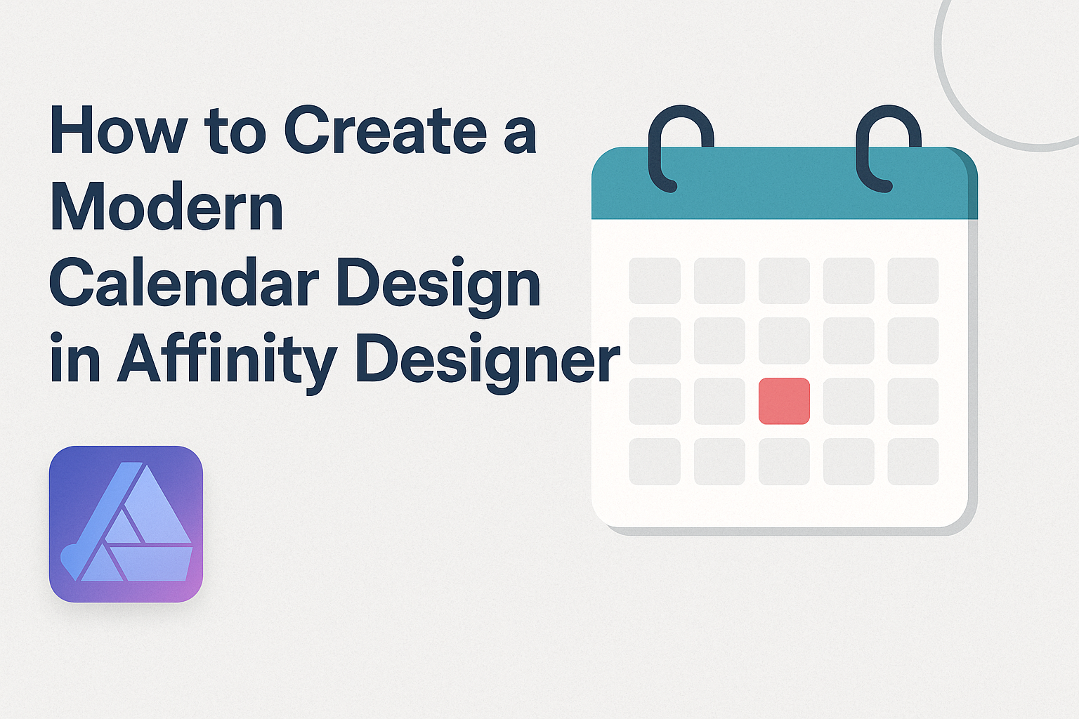
Creating a modern calendar design in Affinity Designer is a rewarding project for anyone interested in graphic design.
By following simple steps and using the right tools, anyone can craft a visually appealing calendar that reflects their style and meets their needs.
This process not only builds design skills but also allows for endless customization.
With its user-friendly interface and versatile features, Affinity Designer makes it easy to experiment with layouts, colors, and typography. Designers can quickly bring their ideas to life, whether for personal use, gifts, or even selling in a digital shop.
Engaging with this creative task helps to enhance both design skills and personal expression.
This blog post will guide you through the essential steps to create a stunning calendar from scratch. Readers will discover practical tips, useful resources, and design techniques that elevate their designs.
Setting Up Your Workspace
Creating a modern calendar design starts with preparing the right workspace. This setup will help in choosing the document size, understanding the interface, and setting up grids and guides efficiently.
Choosing the Right Document Size
When starting a new project, selecting the correct document size is crucial. Affinity Designer allows users to create documents in various sizes.
For a calendar, common sizes include A4, 8.5” x 11”, or custom dimensions based on specific needs.
To set the document size, go to File > New. Here, you can choose a preset size or input custom dimensions.
It’s important to consider the intended use of the calendar. For print, ensure the dimensions suit standard paper sizes. For digital, choose dimensions that fit screens well.
Understanding Affinity Designer Interface
Familiarizing oneself with the Affinity Designer interface increases efficiency. The main elements include the Toolbar, Panels, and Canvas.
The Toolbar at the top contains essential tools like the Move Tool and Shape Tool.
On the right, the Panels hold layers, colors, and other adjustments. They can be customized according to individual preferences.
The Canvas is where designs come to life. Learning to navigate these components will help streamline the design process.
Setting Up Grids and Guides
Setting up grids and guides is essential for alignment and spacing. To create a grid, go to View > Grid and Axis Manager. Here, you can enable a grid and set intervals that match the calendar layout.
For guides, simply drag from the rulers on the top and left of the workspace.
Guides help organize elements neatly. Using both grids and guides ensures that all calendar components align properly, creating a professional appearance.
Building the Basic Structure
Creating a modern calendar design involves setting up a clear and organized layout. This will ensure that the calendar is not only functional but also visually appealing. The following subsections will guide you through the essential steps.
Creating the Calendar Layout
Start by determining the overall size of the calendar. A typical size is 8.5 x 11 inches, which works well for printing.
Next, create a grid layout. Use rectangles to form the basis of each month. Each rectangle can represent a week, while vertical lines can divide the weeks into days.
Utilizing guides can help maintain even spacing. Making each month distinct with spacing or color is a good idea.
This clear structure is important for readability and aesthetics.
Adding Dates and Weeks
Once the layout is set, adding dates is the next step. You can use a text tool to insert numbers into each day’s section. For a clean look, it’s best to center the numbers.
Including the names of the weekdays at the top of each column completes the calendar. You might consider using a bold font for visibility.
Lastly, ensuring that there is enough contrast between the text and the background enhances readability. A simple check ensures that everything aligns perfectly, giving the calendar a polished look.
Designing the Elements
Creating an appealing calendar requires careful thought about its design elements. Each part, from colors to layout, plays a crucial role in the final result. Here’s how to approach these essential aspects.
Choosing a Color Scheme
Selecting the right color scheme is vital for a modern calendar.
Start with a base color that aligns with the calendar’s theme. For example, light pastels create a soft look, while bold colors make a strong statement.
It helps to choose 2-3 main colors that work well together. Use a color wheel for inspiration.
Consider how these colors will impact the readability of text and numbers.
The final choice should balance aesthetics and functionality. Testing colors in various light conditions can also ensure they look appealing both digitally and in print.
Designing Day Blocks
Day blocks need to be clear and functional. Each block should be large enough to write in, yet fit seamlessly into the overall design.
Using grid layouts helps maintain alignment. Incorporating rounded corners can add a modern touch.
You can also consider varying the block sizes for weekends or holidays to highlight them.
Adding subtle background patterns can enhance the design. It’s crucial to maintain enough contrast to keep the text legible. This will make the calendar both stylish and practical.
Styling the Headers
Headers set the tone for each month and should stand out. A bold font choice can enhance readability and add character.
Consider using a larger size for month names. A contrasting color for the headers can make them pop against the day blocks.
Incorporating simple icons or symbols alongside the month name adds a visual element. This can reflect the seasons or holidays, further attracting attention to the header. Keep text alignment consistent to maintain a tidy look.
Incorporating Visual Elements
Visual elements like images or icons transform a basic calendar into an engaging piece.
You can use relevant icons for each month or create a small artwork for every season.
Placement is key. Integrating visuals in margins or corners avoids clutter.
Using transparent images can allow the background colors or patterns to show through.
Adding small illustrations related to holidays, like a pumpkin for October, gives a calendar personality. It makes each page a joy to look at, enriching the user’s experience.
Consider the balance between visuals and text to keep it functional.
Final Touches
Before finalizing a calendar design in Affinity Designer, it’s essential to enhance the visual appeal with effects, ensure proper alignment, and prepare for export. These steps will make the calendar look polished and professional.
Applying Effects and Shadows
Adding effects can elevate the overall design. Designers often use shadows to create depth.
To apply a shadow in Affinity Designer, select the layer, then go to the Effects panel. Here, you can choose “Outer Shadow” and adjust the settings like opacity, blur, and distance. This gives elements a lifted appearance.
In addition to shadows, consider using gradients.
Applying a subtle gradient can add interest and dimension. Use the Gradient Tool to create smooth transitions of color. This adds a modern touch without overwhelming the design.
Aligning and Distributing Elements
Alignment is key for a clean look.
Affinity Designer provides tools to align and distribute elements evenly.
Use the Alignment panel to center or align objects to each other. This ensures everything looks neat and structured.
Distributing elements equally prevents any clutter. Select multiple layers and use the Distribute options to space them consistently.
This is especially useful for calendar dates or images. It creates a balanced layout and helps the viewer’s eye move naturally across the design.
Exporting the Final Design
Once satisfied with the layout, it’s time to export.
Go to File and choose “Export.”
Select your preferred file format, such as PNG or PDF.
Make sure to adjust the resolution for the best quality, especially for print.
Before exporting, double-check the color profile.
If printing, use CMYK for accurate colors. If sharing online, RGB is suitable.
Finally, save a copy of the project file to revisit or edit later.
This ensures the design remains editable for future updates.