Creating eye-catching visuals can make a big difference in presentations. Using PowerPoint’s SmartArt graphics is a great way to turn complex information into simple visuals that engage the audience.
With various designs available, users can easily represent data through diagrams, lists, and processes.
Many people struggle with making their slides visually appealing. SmartArt offers easy-to-use options that take the stress out of design. Whether he or she wants to show a flowchart or an organizational structure, SmartArt provides tools to create polished graphics quickly.
By mastering SmartArt, anyone can enhance their presentations and keep their audience interested. This blog post will guide users through the steps to leverage SmartArt effectively. With a few tips and tricks, they can create stunning visuals that leave a lasting impact.
Understanding SmartArt Graphics
SmartArt graphics are a useful feature in PowerPoint that help transform plain text into engaging visuals. They provide a way to present information clearly and attractively, making it easier for the audience to understand key concepts.
The Basics of SmartArt
SmartArt is a tool in PowerPoint that allows users to create diagrams and visuals from text. When a person selects SmartArt, they can choose from various layouts to match their message.
It organizes information hierarchically or in a flow, making complex ideas easier to grasp. Users can modify colors, shapes, and styles to personalize their graphics.
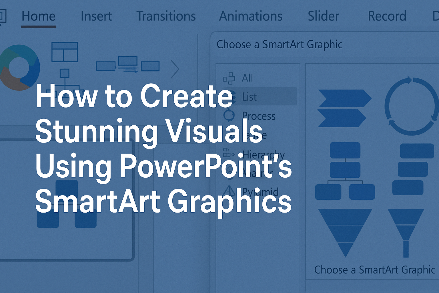
To insert SmartArt, one must navigate to the Insert tab and click on the SmartArt button. This opens a dialog box with options to select various graphic types, each designed for specific content types.
Types of SmartArt Graphics
There are several types of SmartArt graphics to cater to different needs. Here are a few examples:
- List: Useful for displaying items or steps in a process.
- Process: Ideal for showing sequences or workflows.
- Cycle: Great for illustrating ongoing processes or feedback loops.
- Hierarchy: Best for visualizing organizational structures.
Each type serves a unique purpose. Choosing the right one helps communicate the intended message effectively. Users can further customize the graphics by adjusting layouts, colors, and styles, providing a personalized touch.
When to Use SmartArt
SmartArt should be used when presenting content that benefits from visual organization. If the information includes lists, processes, or hierarchies, SmartArt simplifies understanding.
For instance, in a presentation about project steps, using a Process graphic can clarify the sequence involved. It draws attention and aids retention.
Additionally, SmartArt is effective for summarizing complex data and enhancing visual appeal. This keeps audiences engaged and interested throughout the presentation. It transforms static information into dynamic visuals, making the content more relatable.
Getting Started with SmartArt
SmartArt makes it easy to create eye-catching visuals in PowerPoint. By following simple steps, anyone can add graphics that enhance their presentation’s message. This section covers how to insert SmartArt, choose the right layout, and adjust styles to suit personal preferences.
Inserting a SmartArt Graphic
To insert a SmartArt graphic, the user should start by opening their PowerPoint presentation. They can select the slide where they want the graphic to appear.
Next, they should go to the Insert tab on the ribbon. In the Illustrations group, clicking on the SmartArt button will open a menu with various options.
After choosing SmartArt, a window will pop up showcasing different types of graphics to choose from. Simply select a graphic and click OK to add it to the slide.
Choosing the Right Layout
Choosing the right layout is essential for clarity and impact. SmartArt offers multiple categories, such as List, Process, and Cycle. Each category serves a different purpose.
For example, a List layout is ideal for bullet points, while a Process layout works best for showing steps in a sequence.
After selecting a layout, users can further customize it. Consider the message they want to convey and how best to present it visually.
Adjusting SmartArt Styles
Once the graphic is on the slide, users can adjust its style. Select the SmartArt graphic, and the Design tab will appear on the ribbon. Here, users can find various styles that change the graphic’s look.
They can choose colors, shapes, and effects to match their presentation’s theme.
For instance, using a bold color can highlight important information. If they want a cleaner appearance, softer colors may work better. By experimenting with different styles, users can find the perfect match for their content.
Customizing SmartArt Graphics
Customizing SmartArt graphics can greatly enhance the visual appeal of a presentation. By adjusting colors, shapes, and text, one can create engaging and easy-to-understand visuals. Here are the key aspects of customization in SmartArt.
Color Schemes and Effects
Changing color schemes is one of the first steps in customizing SmartArt. PowerPoint offers a variety of color options that allow users to match the graphics with their presentation theme.
To adjust colors:
- Select the SmartArt graphic.
- Go to the Design tab.
- Click on Change Colors.
From here, users can choose from color palettes that best fit their content.
Effects like shadows and reflections can also add depth. Simply click on Format and select desired effects to make the graphic more visually appealing.
Adding and Modifying Shapes
SmartArt allows for the addition and modification of shapes, making it versatile for any information layout.
Users can add new shapes by right-clicking on an existing shape and selecting Add Shape. This can help include more data points or connections.
To modify a shape:
- Click on the shape you want to change.
- Use the Format tab to adjust its size, style, and effects.
Shapes can also be rearranged easily. Dragging them around helps to achieve a clear and organized look. This flexibility allows for better representation of ideas in a structured manner.
Working with Text in SmartArt
Text is crucial in SmartArt and can be customized to enhance clarity.
Users can add text by clicking directly in the shape or by using the Text Pane. The size, font, and color can be adjusted to ensure legibility.
To format text:
- Highlight the text.
- Use the Home tab to change font styles.
Using bullet points or numbered lists can help organize thoughts within the SmartArt graphic. This way, information is presented more clearly, aiding in audience comprehension. Proper text formatting ensures that visuals effectively communicate the intended message.
Advanced SmartArt Techniques
For those looking to enhance their PowerPoint presentations, SmartArt offers powerful tools to create eye-catching visuals. By converting bulleted lists, animating graphics, and understanding potential limitations, users can make their content more engaging and effective.
Converting Bulleted Lists to SmartArt
Transforming bulleted lists into SmartArt can improve visual appeal and clarity. To begin, select the list in PowerPoint, navigate to the “Home” tab, and click “Convert to SmartArt.” This action opens options for various layouts.
Choose a layout that fits the message best. For instance, a process layout works well for sequential steps, while a cycle layout illustrates ongoing processes.
Once selected, PowerPoint converts the text automatically. Users can further customize colors and styles to match their presentation theme. This simple technique can refresh dull lists and provide a professional touch.
Animating SmartArt Graphics
Animating SmartArt can captivate audiences and enhance storytelling.
To add animations, select the SmartArt graphic, then click on the “Animations” tab.
Users can choose from a variety of entrance, emphasis, and exit effects. For example, using a “Wipe” effect can create a clean reveal of each point, while “Fade” can offer a subtle introduction.
Each shape within the SmartArt can be animated individually. This allows for timed reveals, keeping the audience focused.
Timing options can also introduce or emphasize points effectively, making presentations more dynamic.
SmartArt Graphic Limitations and Workarounds
While SmartArt is versatile, there are limitations to be aware of. For instance, it may not allow for extensive text, which can lead to clutter.
To work around this, users can break long texts into separate SmartArt graphics. Another option is to incorporate text boxes alongside the SmartArt for additional explanation.
Additionally, certain layouts may not display as expected when projected. It’s wise to test the presentation on the actual display equipment beforehand to ensure clarity. By being aware of these limitations, users can plan better and present more effectively.
Design Tips for Effective SmartArt
Creating visually appealing SmartArt requires attention to detail and design principles. By understanding how to represent hierarchy, balance text with imagery, and apply alignment and proximity, one can elevate their presentations significantly.
Hierarchy and Relationships in Layouts
Effective SmartArt should demonstrate clear hierarchy. This helps the viewer understand the relationship between different elements.
For instance, using a hierarchical layout can visually show the importance of various components in a process.
One way to emphasize hierarchy is by varying the size and color of shapes. Larger shapes can represent primary concepts, while smaller shapes can indicate sub-points.
Using lines or arrows can also clarify connections between ideas. This visual guide directs the viewer’s attention and enhances understanding.
Balancing Text and Imagery
When using SmartArt, it’s vital to strike a balance between text and visuals. Too much text can overwhelm the audience, making it hard to digest information.
Keeping text concise is helpful. Use bullet points or short phrases to summarize ideas clearly. This way, the visuals can carry the message.
Additionally, images should complement the text. Using relevant icons or illustrations can make the visuals engaging and easier to understand.
Choose images that are simple and directly related to the message being conveyed.
Alignment and Proximity Principles
Alignment is key in SmartArt design. It helps establish order and guides the viewer’s eye through the presentation.
Keeping elements consistently aligned, whether centered or left-justified, creates a cohesive look.
Proximity also plays an important role. Related items should be grouped closely together to show their relationship. This organization makes it easier for viewers to connect ideas.
Using white space effectively can enhance these principles. Adequate spacing allows elements to breathe and helps prevent a cluttered appearance. This attention to detail makes a significant difference in a presentation’s impact.
Integrating SmartArt with Other Features
SmartArt graphics can enhance presentations by linking data and visuals effectively. By integrating SmartArt with other features, users can create more dynamic and engaging slides that catch the audience’s attention.
Linking SmartArt to Excel Data
Linking SmartArt with Excel data enables users to show complex information in a clear format.
To do this, first, create a chart or table in Excel that presents essential data.
Then, copy the relevant information and paste it into PowerPoint. Once pasted, select “Insert SmartArt” to choose a graphic layout that fits the data.
Users can easily connect the SmartArt to the Excel data, allowing for auto-updates if the original Excel file changes.
This method is especially useful for dynamic reports. The visuals can change automatically, helping to maintain accurate and up-to-date presentations without extra effort.
Incorporating Charts and Diagrams
Incorporating other charts and diagrams with SmartArt amplifies its visual impact.
Users can insert a SmartArt graphic alongside traditional charts like pie or bar charts to illustrate trends.
Choose a SmartArt style that complements the chart’s theme.
For instance, using a cycle diagram next to a pie chart can help convey processes clearly.
This combination helps audiences grasp complex ideas faster.
Consider using colors and styles that match to create a cohesive look.
Employ animations to transition between these visuals for an engaging presentation flow.