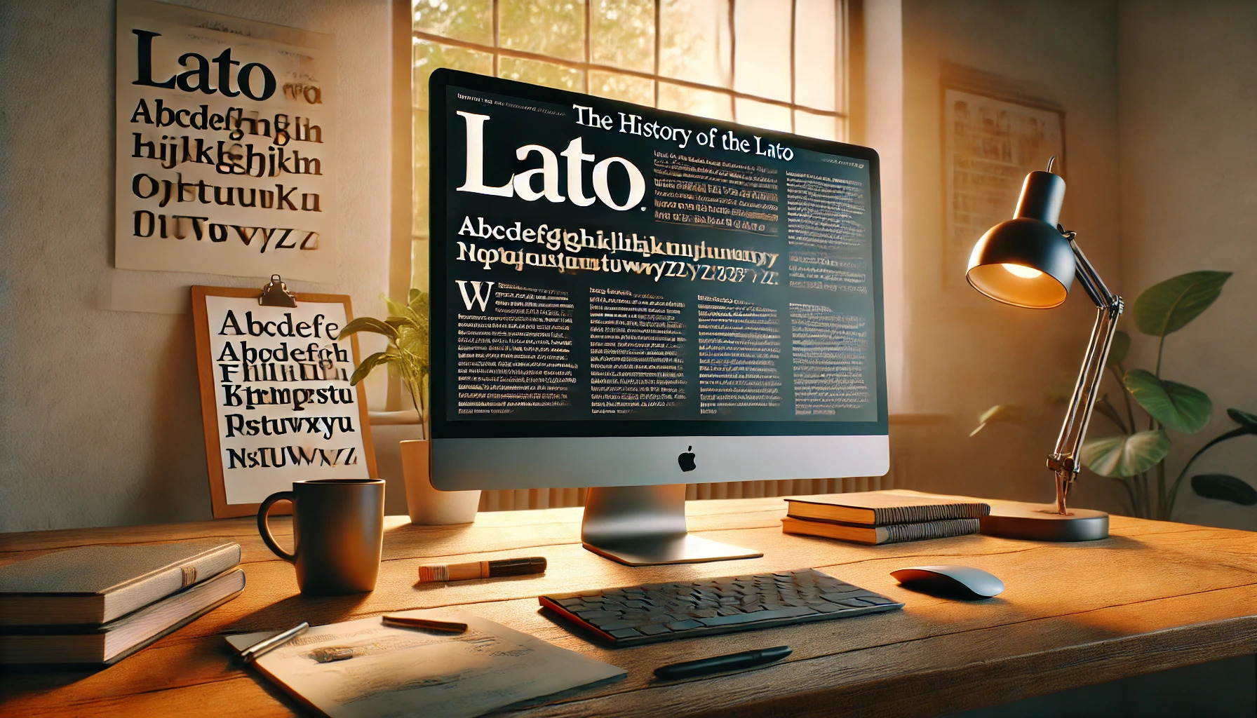
Lato is a typeface that seamlessly blends modern design with readability, making it a favorite among designers and web developers. Created in 2010 by Polish designer Łukasz Dziedzic, Lato initially served as a corporate identity project for a bank. When the bank changed its vision, Dziedzic decided to release the font publicly, and it quickly gained traction in the design community.
Lato means “summer” in Polish, a name that perfectly reflects its warm and engaging style. This font family features 18 distinct styles, offering flexibility for various design needs. It is now one of the most popular sans-serif typefaces, with widespread use across websites and digital projects.
One of Lato’s strongest points is its ability to maintain a humanistic feel while offering a clean and professional look. This balance has made Lato a go-to choice for both personal and commercial projects. Its rise to fame in the digital age is well-documented, with many designers praising its revolutionary impact on typography.
Origin and Design
The Lato font family began its journey in 2010, designed by Łukasz Dziedzic. It was initially created for a specific corporate client but soon gained popularity due to its unique design philosophy and character features.
Łukasz Dziedzic: The Designer
Łukasz Dziedzic, a Warsaw-based designer, crafted the Lato typeface. He worked on this typeface over the summer of 2010. Initially, he designed it for a Polish bank. However, when the bank opted for a different design direction, Dziedzic chose to release Lato to the public.
His intention was to create a font that was both functional and appealing. The name “Lato,” which means “summer” in Polish, reflects the warm and welcoming nature of the typeface. This history plays a crucial role in its ongoing popularity and usage.
Design Philosophy
The design philosophy behind Lato is centered on balance. Dziedzic aimed to blend functionality with a warm, humanistic feel. The result is a typeface that can be both professional and friendly. Its clean lines and open forms make it suitable for a range of applications, from corporate environments to personal projects.
The font’s design is versatile and easy to read. This combination of elements ensures that Lato remains one of the most popular typefaces for digital platforms. Its adaptability allows it to complement various design aesthetics while maintaining a consistent, pleasing look.
Character Features
Lato’s character set is distinct. It features semi-rounded details in letters, giving it a sleek and modern look. Straightforward lines within its structure enable clear visibility on both screens and paper. The letters are crafted to fit well together, enhancing readability.
At its core, Lato embodies a balance between traditional and contemporary design elements. It includes multiple weights and styles, offering flexibility. This feature makes it a favored choice for designers who require a reliable typeface that performs well across different media types. The character features of Lato demonstrate Dziedzic’s commitment to creating a font that harmonizes aesthetics with usability.
Font Family and Variations
The Lato font is well-known for its extensive family of typefaces and a wide range of styles. Each variation provides unique options for different design needs, offering versatility for both digital and print media.
Family Members
Lato’s font family includes several popular members, each crafted for specific design tasks. It quickly became popular, partly due to its inclusion in Google Fonts. As a sans-serif typeface, Lato is appreciated for its clean lines and legibility.
Its family members are diverse, enabling combinations that can suit different projects. For instance, Lato offers styles that range from light to bold, lending flexibility across various applications. This collection of styles makes it a favorite among designers who need an adaptable yet consistent look.
Different Weights and Styles
Lato stands out with its impressive range of weights and styles. Originally, it came with just a few weights, but over time, more variations have been added. Now, the family includes several weights from thin to ultra-bold. Designers can choose from these options based on their specific needs, whether they require a subtle touch or a strong emphasis.
Each weight in the Lato family represents consistency and clarity. These features help make it suitable for everything from logos to whole websites, providing a coherent look no matter the context. This versatility is one reason for its persistent popularity in the design community.
Technical Specifications
Lato, a sans serif typeface, is versatile and widely used in both digital and print applications. It offers support for many languages and comes in various formats, making it user-friendly across different platforms.
File Formats and Compatibility
Lato is available in several file formats to accommodate different design needs. Users can find it in TrueType (TTF), OpenType (OTF), and Web Open Font Format (WOFF). These formats ensure compatibility with most operating systems and applications. TrueType is commonly used for both Windows and Mac platforms, while OpenType is favored for its advanced typographic features. The Web Open Font Format, especially WOFF2, is the preferred choice for web designers, as it allows for faster page loading and efficient font compression.
Language Support
Lato provides extensive language support, making it a popular choice for international use. It supports the Latin alphabet and includes characters for Cyrillic and Greek, accommodating many European languages. This broad support ensures that designers from various regions can use Lato without losing the font’s unique characteristics. The inclusion of diacritics and special characters further enhances its usability, catering to a wide audience and allowing for diverse content creation.
Usage in Web and Print
Lato’s readability and clean design make it ideal for both web and print media. In digital environments, Lato is often used for Google Fonts due to its aesthetic appeal and efficient loading times. It works well for websites, online articles, and apps. For print, the font is suitable for brochures, magazines, and even billboards. Its clarity at various sizes ensures text remains legible, maintaining its appeal across different mediums. Designers value its versatility and modern feel, integrating it seamlessly into numerous projects.
Licensing and Usage Rights
Lato is a widely used sans-serif typeface that offers flexibility through its licensing. Understanding when and how to use Lato, whether commercially or personally, can help users take advantage of its design while respecting its licensing terms.
Commercial vs. Personal Use
Lato can be used for both commercial and personal projects. It allows designers to incorporate it into branding, advertising, or any other project without having to pay for a license. This opens up many opportunities for businesses looking to use an appealing typeface without worrying about legal constraints.
Developers and content creators appreciate this freedom. Whether making print media, websites, or apps, they can use Lato without incurring additional costs. However, they should always ensure that their particular use case adheres to any specific usage restrictions that may apply.
Open Font License
The Open Font License (OFL) covers Lato, allowing it to be freely used, studied, and modified. This license encourages collaboration among designers and developers. It aims to promote the sharing of fonts in a way that benefits the community without requiring payment or restrictive agreements.
This licensing is particularly advantageous for open-source projects, providing ample possibilities for customization. By using fonts like Lato under the OFL, projects can develop unique typographic solutions that can be re-shared with the broader community. The liberation from traditional licensing hurdles allows Lato to be one of the more flexible choices for digital and print design projects alike.
Impact and Reception
Lato has made a significant mark since its release with widespread use across various platforms. It has been widely adopted by designers and brands for its versatility and modern appeal. Notable usage examples highlight its presence in both digital and print media, showcasing its adaptability.
Adoption by Designers and Brands
Designers appreciate Lato for its clean and professional look. It combines a modern style with the warmth of more traditional fonts. This combination makes it a favorite for many projects.
Many companies use Lato in their branding because it reads well on both screens and paper. Its popularity increased significantly when Google added it to their font collection. This move expanded its availability, making it accessible to a broader audience. Organizations often choose it for websites, marketing materials, and product packaging.
Lato’s friendly appearance and wide range of weights make it adaptable for different needs. From a bold, eye-catching header to a readable body text, it fits various purposes seamlessly. The flexibility of Lato allows it to maintain the same visual identity across different platforms.
Notable Usage Examples
Lato has been included in many high-profile digital projects. Websites often use it because it maintains readability across different screen sizes. This trait makes it a reliable choice for responsive web design.
It has also been seen in print media, including brochures and advertisements. Its clean lines and legibility make it a natural choice for publications that want a modern yet approachable feel.
Brands relying on digital presence often use Lato to ensure their content is both stylish and functional. Whether it’s a tech company or a creative agency, its versatility fits various brand identities while maintaining clarity and appeal.
Lato in Digital Media
Lato has gained popularity in digital media due to its clean and modern design. It is frequently used for web fonts and impacts screen readability. These features make it a favorite choice for designers looking to enhance digital content.
Web Fonts and Performance
Lato is widely used in web design due to its adaptability and performance. It is freely available on platforms like Google Fonts, where it can be easily integrated into websites. This accessibility makes it attractive for designers looking to improve user experience.
Its lightweight nature ensures faster page loading times, which is critical for maintaining user engagement. Faster websites often rank better in search results, making Lato a smart choice for SEO-focused projects. The font’s versatility allows it to work well for both headings and body text, offering flexibility in design.
Influence on Screen Readability
The design of Lato emphasizes clarity and readability. It features a humanistic style, which makes text easier to read on digital screens. This aspect is crucial in an era where people spend increasing time on their devices.
Users of platforms like iCollege benefit from this design, as Lato is the main typeface there. It helps in reducing eye strain during prolonged reading sessions, encouraging continued use.
The font’s approachable appearance makes digital content feel more inviting. It blends well with various styles, which further promotes its use across multiple digital applications. This adaptability enhances the effectiveness of the content it presents.
Updates and Future Directions
Lato has seen consistent updates since its first introduction in 2010. Its creator, Łukasz Dziedzic, initially designed it for a Polish bank that eventually chose a different style. He then made Lato available for public use under the SIL Open Font License. Since then, it has become very popular, especially after being added to Google Fonts.
Different Versions and Extensions:
- Lato now comes in multiple weights and styles, including bold, italic, and light options.
- The font family has expanded to offer hundreds of glyphs, making it versatile for different languages.
Integration and Popularity:
Lato is widely used across various platforms. Its clean, professional appearance makes it a favorite for web design and corporate branding. Upon joining Google Fonts, it quickly became one of the most used web fonts.
Looking Ahead:
The ongoing development of Lato shows promising directions. The focus is on enhancing readability and versatility across digital and print media. It’s likely that future updates will include expanded language support and additional stylistic variations to meet diverse design needs. Lato continues to adapt, ensuring its place in the evolving digital landscape.
The font’s community and online presence help inform potential updates, creating an exciting path forward for this beloved typeface.