Creating custom shapes and graphics in PowerPoint can significantly enhance presentations. By using tools within PowerPoint, anyone can easily design unique visuals that capture attention and convey messages clearly. This skill opens a door to more creativity and personalization in presentations, making them stand out.
Whether it is for a business presentation or a school project, knowing how to craft custom shapes can transform ordinary slides into engaging ones. Readers will discover step-by-step methods to create shapes and graphics that fit their specific needs. Embracing these techniques can lead to impressive visual storytelling.
Throughout this article, practical tips will be shared to guide readers on their journey to mastering custom shapes in PowerPoint. With simple actions like editing points and layering shapes, they can produce graphics that are not only functional but also visually appealing. This knowledge will empower anyone to elevate their presentation game.
Getting Started with PowerPoint
When starting with PowerPoint, it’s important to first understand its interface and the basic tools at your disposal. This knowledge will help users to effectively create custom shapes and graphics.
Understanding the Interface
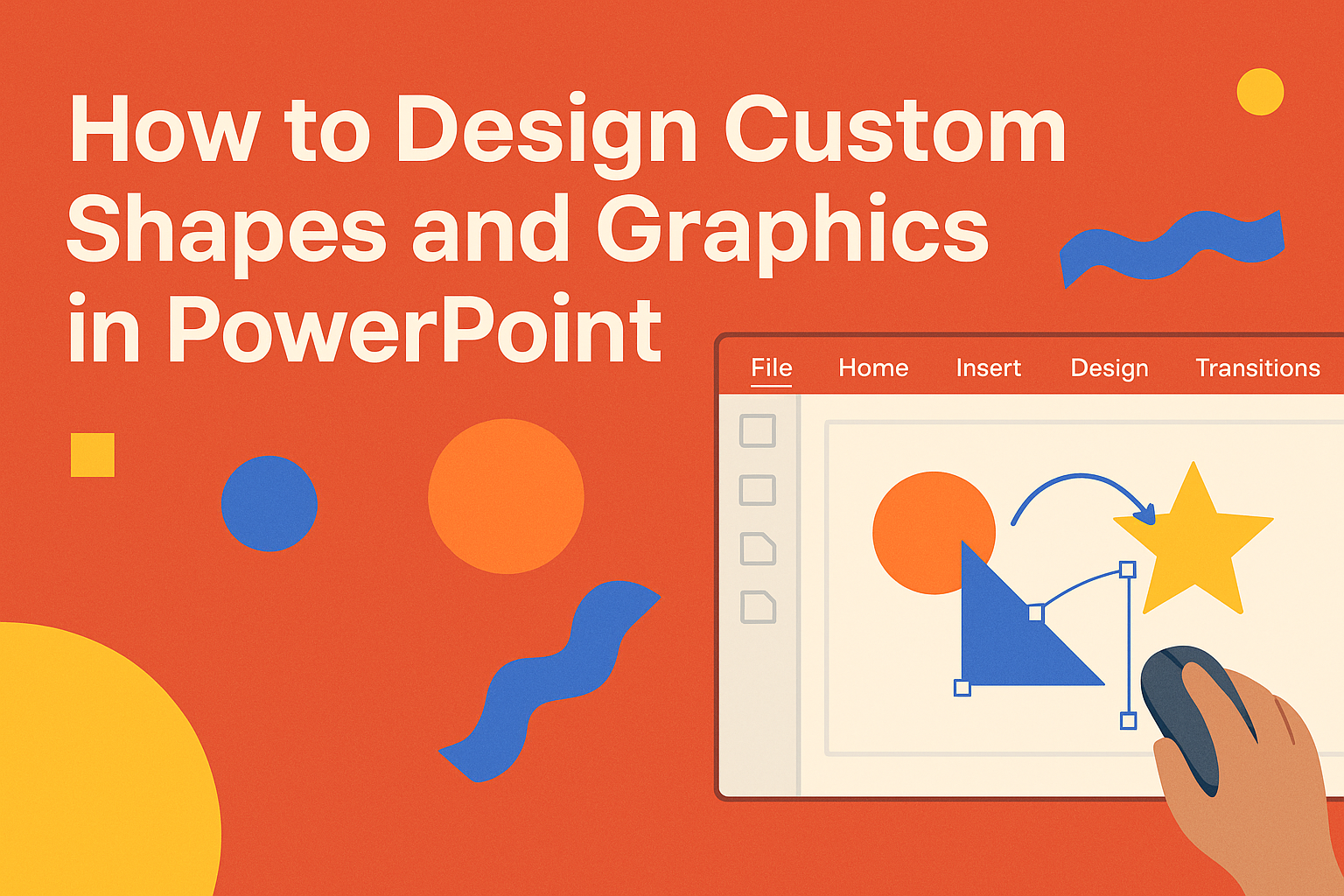
PowerPoint’s interface is user-friendly, designed to help users easily navigate and create presentations. The main components include the ribbon, which is at the top and holds various tabs like Home, Insert, and Design.
On the left, there’s a slide pane that shows all slides in a thumbnail view. The big area in the middle is the slide workspace, where users can create and edit their slides.
Users can also find a status bar at the bottom displaying useful information. Familiarizing oneself with these elements will make it easier to create engaging presentations quickly.
Basic Tools and Functions
PowerPoint offers a range of tools for creating and customizing shapes. The Insert tab is key for adding shapes, text boxes, and images. For custom shapes, users can choose from a variety of pre-set shapes or use the Scribble tool to draw freeform.
Editing tools can be accessed through the Format tab, allowing changes like fill color, outline, and effects. PowerPoint also has the Align and Group functions to help arrange multiple shapes neatly.
Using these basic tools, users can start designing unique graphics that enhance their presentations. Understanding these features will make the design process smoother and more enjoyable.
Design Principles for Effective Graphics
Effective graphics rely on several key principles. Understanding color, balance, and typography can significantly enhance designs in PowerPoint. By applying these principles, users can create visuals that are not only attractive but also easy to understand.
Color Theory and Usage
Color usage plays a crucial role in design. It affects emotions and can guide viewer attention. Designers should consider a color wheel to select complementary colors that work well together.
Tip: Use a limited color palette of 2-4 colors for a clean look.
- Warm colors (red, orange, yellow) evoke energy.
- Cool colors (blue, green, purple) promote calmness.
Understanding color meanings helps in choosing the right shades for messages. Always aim for a contrast between background and text to ensure readability.
Balance and Alignment
Balance ensures that designs feel stable and are visually appealing. There are two types of balance to consider: symmetrical and asymmetrical. Symmetrical balance is equal on both sides, while asymmetrical balance uses different elements that still create harmony.
Alignment is about placing elements in a way that leads the eye naturally. Consistent alignment creates a sense of order.
- Center alignment is effective for titles.
- Left alignment works well for body text.
These principles make graphics cleaner and easier to follow.
Typography and Readability
Typography influences how messages are received. Choosing the right fonts enhances communication. Designers should pick fonts that match the message’s tone.
Common font types include:
- Serif fonts for traditional themes (e.g., Times New Roman).
- Sans-serif fonts for modern and clean look (e.g., Arial).
Readability is vital. It’s best to use a font size of at least 24 points for body text.
Pro Tip: Limit the number of different fonts to two or three to maintain visual coherence. Headers can be bold, while body text remains regular to create contrast.
Creating Custom Shapes
Creating custom shapes in PowerPoint enhances presentations and makes them more visually engaging. This section covers the essential methods for drawing custom shapes, combining and modifying existing shapes, and utilizing the merge shapes feature.
Drawing with the Shape Tools
To begin creating custom shapes, users can utilize PowerPoint’s built-in shape tools. They can access these by navigating to the Insert tab and selecting Shapes. A drop-down menu will appear, showing a variety of basic shapes.
To draw a shape, simply click and drag on the slide. It’s helpful to start with familiar shapes like rectangles or circles.
Once the shape is drawn, it can be resized by dragging the corners or sides.
PowerPoint also allows users to format these shapes. After selecting a shape, the Drawing Tools/Format tab appears. Users can change the outline color, adjust the fill, and modify other style settings to make the shape unique.
Combining and Modifying Shapes
Users can combine and modify shapes to create more complex designs. This process often begins with selecting multiple shapes.
After highlighting the desired shapes, under the Format tab, they can find options like Group to combine them.
Once grouped, users can rotate, scale, or change the color of the entire combination. Adjusting the size of one shape will also affect the overall design.
Shapes can also be modified individually. Right-clicking a shape reveals options to edit points or change the shape type altogether. This feature enables the creation of custom shapes that fit specific presentation needs.
Using the Merge Shapes Feature
The Merge Shapes feature is a powerful tool for advanced users wanting to create intricate designs. Located on the Format tab, this option allows users to combine shapes into one.
There are several merging options available: Union, Combine, Fragment, Intersect, and Subtract. Each option changes how shapes interact with each other.
For example, selecting Union combines all selected shapes into a single shape, while Subtract removes the top shape from those below it. Experimenting with these options can lead to unique designs that enhance the visual appeal of a presentation.
Working with Graphic Elements
Graphic elements enhance presentations, making them more engaging and effective. This section covers how to insert images and icons, apply artistic effects, and manage layering and grouping of objects.
Inserting Images and Icons
To create a visually appealing presentation, he can start by inserting images and icons. This process begins by navigating to the Insert tab on the menu. From there, he clicks on Pictures to add images from his device or Icons for a selection of graphic symbols.
Once an image is placed on the slide, he can resize it by dragging the corners.
Formatting tools allow him to adjust brightness, contrast, and more. Using high-quality images is key to capturing attention, so he should opt for clear visuals that match the presentation’s theme.
Applying Artistic Effects
Artistic effects can transform ordinary images into eye-catching visuals. To add these effects, he selects an image and clicks on the Picture Format tab. Here, various options like Artistic Effects like Blur, Pencil Sketch, and Watercolor are available for use.
These effects can help in emphasizing specific content or creating a cohesive look. He should experiment with different styles to see what best fits the overall tone.
Remember, subtle changes often create a more professional appearance without overwhelming the viewer.
Layering and Grouping Objects
Layering and grouping objects helps in organizing the slide effectively. To layer objects, he can simply drag one object over another. PowerPoint shows which is on top by highlighting it.
Grouping multiple items is also simple. By selecting the desired objects while holding down the Ctrl key, he can right-click and choose Group. This action allows him to move and resize multiple items as a single unit. It streamlines the design process and makes editing easier later on.
Enhancing Visual Impact
Creating visually appealing presentations requires thoughtful design choices that elevate graphics and engage the audience. By using animations, SmartArt, and multimedia elements, presenters can make their slides more interactive and dynamic.
Adding Animations to Graphics
Animations can bring life to any graphic in a PowerPoint presentation. They help draw attention and emphasize key points.
To add animations, the user should first select the graphic, then go to the “Animations” tab. Here, various effects like “Fade,” “Zoom,” or “Fly In” can be chosen.
It is advisable to use animations sparingly. Too many effects can distract viewers and detract from the message.
Using trigger animations can make a presentation more interactive. They allow viewers to click on specific objects to trigger animations, creating a more engaging experience.
Utilizing SmartArt for Data Visualization
SmartArt graphics are perfect for displaying complex information in a clear way. They help organize data visually, making it easier for viewers to comprehend.
To use SmartArt, the individual can navigate to the “Insert” tab and select “SmartArt.” This opens various templates, such as lists, processes, and hierarchies.
Each style can be customized. Users can change colors, shapes, and layouts to suit the message.
Including icons and images within SmartArt can enhance the visual appeal. This combination not only informs but also captivates the audience’s attention effectively.
Incorporating Videos and Multimedia
Including videos and multimedia in a presentation adds another layer of engagement. Videos can illustrate concepts more vividly than text or static images.
To embed a video, one must select the “Insert” tab and click on “Video.” The option to insert from the computer or online sources is available.
It is essential to ensure that videos are relevant and concise. Short clips keep the audience engaged without overwhelming them.
Using background music can also enhance the mood. However, it should not overpower the speaker or distract from the main content. Keeping audio levels balanced is key.
Advanced Graphic Techniques
There are many ways to elevate designs in PowerPoint by focusing on specific graphic techniques. With the right approach, customizing backgrounds, creating infographics, and designing complex diagrams can enhance presentations and effectively convey messages.
Customizing Slide Backgrounds
Customizing slide backgrounds can significantly improve the overall look of a presentation. Users can start by selecting a solid color, gradient, or image. For a more professional touch, consider using a subtle texture instead of a bold image.
To set a custom background, go to the Design tab and click on Format Background. This opens options like Solid Fill, Gradient Fill, and Picture or Texture Fill. Adjusting the transparency can also make text and shapes stand out better.
Think about using complementary colors that match the theme of the presentation for coherence.
Creating Infographics
Infographics are a powerful way to present data visually. They allow viewers to grasp complex information quickly. PowerPoint offers built-in tools to create engaging infographics using shapes and icons.
To start, choose a layout that fits the data. Users can incorporate custom shapes by selecting Insert > Shapes and arranging them meaningfully. Utilizing icons from the Insert > Icons menu can enhance the visual appeal.
Effective use of color and space helps maintain clarity. Highlight important numbers or facts using bold or contrasting colors for emphasis.
Designing Complex Diagrams
Designing complex diagrams helps organize and present information clearly. PowerPoint allows users to create various diagrams like flowcharts and Venn diagrams using shapes.
Begin by selecting a flowchart style from Insert > SmartArt. This feature provides templates for different diagrams. Choose shapes and connect them using arrows for clarity.
Customizing these shapes with fill colors and styles enhances their visual impact. Finally, labeling each section with clear text ensures viewers understand the connections easily.
Tips for Efficient Graphic Creation
Creating custom shapes and graphics can be a fun and rewarding process. By using templates, master slides, and some handy shortcuts, anyone can streamline their graphic design tasks in PowerPoint.
Using PowerPoint Templates
Templates are valuable tools for saving time and ensuring consistency in design. They come with pre-set elements like colors, fonts, and layouts. This way, users can focus more on their content rather than starting from scratch.
To get started, open PowerPoint and select “New” to browse available templates. Choose one that fits the theme of the presentation.
Users can customize the template further by adjusting shapes and images as needed. This method helps in maintaining a professional look throughout the slides.
Leveraging Master Slides
Master slides are powerful for managing design elements across multiple slides.
By editing a master slide, any changes made will automatically update all linked slides. This is especially useful for logos, background images, and font styles.
To access master slides, go to the “View” tab and select “Slide Master.”
Here, users can add graphics or change layouts. It saves time by reducing repetitive tasks and enhances visual harmony in the presentation.
Shortcut Keys and Productivity Hacks
Utilizing shortcut keys can significantly speed up the graphic creation process.
For example, pressing Ctrl + C and Ctrl + V allows for quick copying and pasting of shapes.
Additionally, users can select multiple shapes by holding down the Shift key. This makes it easier to format or move several objects at once.
Keeping a list of frequently used shortcuts can improve efficiency and reduce frustration.
With these tips, creating custom graphics in PowerPoint becomes faster and more enjoyable.