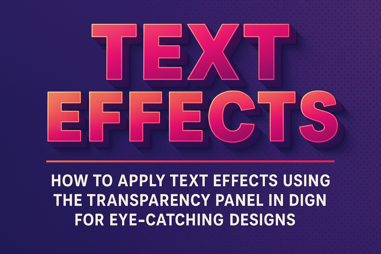
Applying text effects in Adobe InDesign can elevate any design project, making it visually appealing and engaging.
To use the Transparency panel effectively, users can adjust the opacity and blending modes of text, allowing for stunning see-through effects or text overlays.
Mastering this tool will open up new creative possibilities for enhancing graphics and presentations.
Many designers overlook the transparency options available for text, focusing mainly on images and shapes. However, understanding how to manipulate these settings can transform a simple text frame into a standout element in a layout.
With just a few steps, anyone can create professional-looking designs that catch the eye.
In this article, readers will learn practical techniques to apply text effects using the Transparency panel. By exploring these methods, they can unlock the potential to make their text not just readable, but an integral part of their design’s overall aesthetic.
Understanding the Transparency Panel
The Transparency Panel in InDesign allows users to manipulate the visibility and effects of objects and text. It provides various tools for adjusting opacity and creating interesting visual styles in design projects.
Accessing the Transparency Panel
To access the Transparency Panel, users can follow these steps.
First, they need to open their InDesign project. Then, they should go to the menu bar at the top.
Clicking on Window will reveal a dropdown menu. From this menu, they can select Effects. The Transparency Panel will appear within this section.
Additionally, if the panel isn’t visible, users can also use the keyboard shortcut Shift + F10. This panel can float freely or be docked with other panels for easy access during design work.
Overview of Transparency Options
The Transparency Panel offers several important options that can enhance a design. The Opacity slider is the most common feature.
Users can adjust the opacity level anywhere from 0% (completely transparent) to 100% (fully opaque).
Another key feature is the Blending Mode. This allows objects to blend with each other or the background in different ways.
Some common blending modes include Multiply and Screen. Each mode provides a unique visual effect, allowing for creative possibilities based on how colors interact.
Users should also note the importance of Effects like drop shadows and feathering, which add depth and texture to objects. With these options, the Transparency Panel becomes a powerful tool for creating engaging visual elements in InDesign projects.
Applying Basic Transparency Effects
Applying basic transparency effects in InDesign allows users to enhance text visually. Two main elements involved are working with opacity and creating a gradient feather effect. These tools can help make text stand out or blend seamlessly into the background.
Working with Opacity
To adjust the opacity, open the Effects panel by going to Window > Effects.
Select the text or object that needs a transparency effect. Here, the Opacity slider is the key tool.
- Use the slider to set the desired transparency level.
- A value of 100% means fully opaque, while 0% makes it completely transparent.
Users can experiment with different opacity levels. Lowering opacity can create softer visuals, making the text appear lighter or ethereal. This technique is great for layering text over images, ensuring readability without overwhelming the design.
Creating a Gradient Feather
A gradient feather adds depth and smooth transitions to text. To apply this effect, select the text and open the Effects panel. Then, choose the Basic Feather option.
- Adjust the feather amount to control how much the fade extends.
- Set the direction for a more customized look.
For instance, a directional feather can be set to fade from left to right, enhancing visual interest. Users can fine-tune the settings for optimal results. This effect works well for creating a soft edge, making the text feel integrated into the background rather than just placed over it.
Advanced Transparency Techniques
InDesign offers a variety of advanced transparency techniques to enhance design. By utilizing blending modes and applying effects directly to text, users can create visually appealing results that stand out.
Utilizing Blending Modes
Blending modes in InDesign adjust how colors mix between layers, creating unique transparent effects that enhance the overall design.
To use them, select an object, then navigate to the Effects panel.
Here, users can choose from several blending options, such as Multiply, Screen, and Overlay. Each mode interacts differently with layers beneath it.
For example, Multiply darkens the image while Screen lightens it, providing varied visual results. Using blending modes can bring life to backgrounds, images, and text, making them feel integrated and harmonious.
Applying Effects to Text
Applying transparency effects to text is straightforward and impactful.
First, select the text with the Selection tool. Then, access the Effects panel to adjust the Opacity settings.
Text can have different opacity levels to create depth. For instance, setting the opacity to 50% makes the text semi-transparent, allowing background elements to show through.
Beyond opacity, consider using feathering techniques. Basic Feather, Directional Feather, and Gradient Feather provide soft edges that blend text into the background. This technique helps create a more professional look while still conveying information effectively.
Tips for Effective Transparency Use
Using transparency effects can enhance designs, but it’s crucial to maintain clarity and impact. Two key aspects to consider are maintaining readability and managing transparency flattening.
Maintaining Readability
Readability is essential when applying transparency. It’s important to ensure that text remains legible against any background. Here are a few tips:
- Adjust Opacity Wisely: Set the text opacity to around 70-85%. This keeps it readable while allowing for some background interaction.
- Use High-Contrast Colors: Choose colors that stand out against the background. For light backgrounds, dark text works best, and vice versa.
- Consider Font Weight: Thicker fonts may retain readability better when transparency is applied. Thin fonts can easily become hard to read against busy backgrounds.
By paying attention to these details, designers can create attractive text effects without sacrificing clarity.
Managing Transparency Flattening
Transparency flattening happens when a document is exported, potentially altering how effects appear.
Managing this can help maintain design quality. Here’s how to do it:
- Use High-Quality Settings: When exporting, select the highest quality settings to preserve effects.
- Be Aware of Overprints: Understand how overprints will look when flattened.
Test the document before finalizing to see how transparency affects images and text.
- Layering is Key: Keep objects on separate layers when applying transparency.
This helps prevent unwanted effects when flattening occurs.