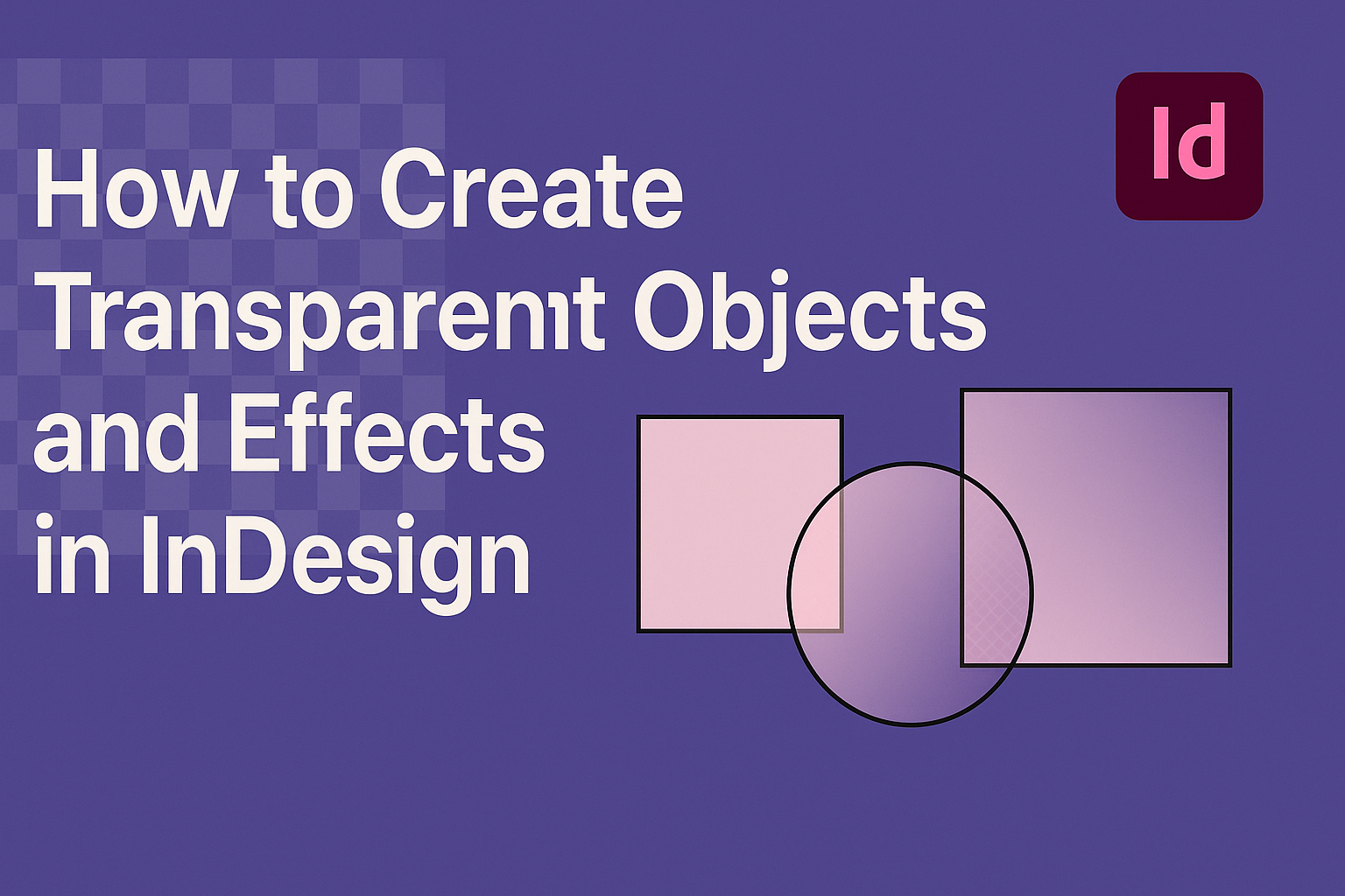
Creating transparent objects and effects in InDesign can enhance the visual appeal of any design project.
Artists and designers can easily adjust the opacity of their elements to make the overall composition more dynamic. This technique allows for blending images and graphics in a way that draws the viewer’s eye.
Many users may not realize how simple it is to incorporate transparency using built-in tools like the Effects panel and Transparency palette.
With just a few clicks, they can make objects semi-transparent or apply different blending modes to achieve the desired effect. This versatility can bring a fresh look to any layout or publication.
In this blog post, readers will discover step-by-step instructions and helpful tips for mastering transparency in InDesign. By exploring these techniques, they can elevate their designs and captivate their audience with stunning visuals.
Understanding Transparency in InDesign
Transparency in InDesign allows designers to create visually appealing effects by controlling the visibility of elements. This feature enables the blending of images and graphics in unique ways, adding depth and interest to layouts.
Concepts of Transparency
Transparency is essential in graphic design as it can enhance the visual impact of projects. In InDesign, transparency works by adjusting the opacity of an object.
A value of 100% means the object is fully opaque, while 0% makes it completely transparent.
Designers can also use blending modes to dictate how transparent objects interact with the layers beneath them. Choosing the right blending mode can lead to various artistic effects, such as making text or images blend smoothly into backgrounds.
Understanding these concepts helps in effectively using transparency to achieve the desired look and feel of a design project.
Transparency Effects Panel Overview
The Transparency Effects panel in InDesign is a key tool for managing opacity and blending options. To access it, navigate to Window > Transparency or press Shift + F10.
In this panel, users can adjust the Opacity slider to change how transparent an object appears. Clicking the triangle next to “Object” reveals more options to apply various effects.
It also allows for the use of preset effects or custom settings, making it versatile. Designers can apply transparency settings individually or to multiple objects at once for efficiency and consistency in their work. These tools enable precise control over how transparency is applied in a design.
Creating Transparent Objects
Transparency in Adobe InDesign can greatly enhance the visual appeal of design projects. This section explores how to effectively adjust opacity and use blending modes to create transparent objects.
Working with Opacity
To adjust the opacity of an object, a user should select the object and navigate to the Effects panel. Here, they can find the opacity setting, which ranges from 0% (completely transparent) to 100% (completely opaque).
To change the opacity, simply enter a value or use the slider. This allows for precise control over how transparent the object appears in relation to the background.
It’s important to remember that lowering the opacity will let background colors or images show through. This effect can help create a sense of layering and depth in the design.
Using Blending Modes
Blending modes change how colors interact between layers. To access blending modes, a user can go to the Effects panel after selecting an object.
There are several options to choose from, such as Multiply, Screen, or Overlay. Each mode affects the object differently when layered over others. For instance, Multiply darkens colors, while Screen brightens them.
Using these modes can create stunning visual effects that enhance a design. Experimenting with different blending modes can lead to unique and unexpected results in the overall composition.
Applying Effects to Enhance Transparency
Using effects can significantly improve the visual appeal of transparent objects in InDesign. This section will focus on techniques like drop shadows, feather effects, and glow or inner shadows. Each effect adds depth and dimension, enhancing the overall design.
Drop Shadows
Drop shadows create a sense of depth for transparent objects. To apply a drop shadow, select the object and navigate to Object > Effects > Drop Shadow. Here, the user can adjust settings such as Opacity, Angle, and Distance.
- Opacity controls how visible the shadow is. A lower opacity looks softer.
- Angle sets the direction of the shadow. For example, a 120-degree angle casts a shadow towards the upper left.
- Distance determines how far the shadow appears from the object.
Experimenting with these settings allows for custom effects tailored to the design.
Feather Effects
Feather effects soften the edges of an object, creating a blur that enhances transparency. To apply a feather, select the object and go to Object > Effects > Feather. Adjust the Feather Radius to control how much the edges blur.
Options for feathering include:
- Amount: This dictates how much feathering occurs around the edges.
- Preview: Checking this box helps visualize adjustments in real time.
Using feather effects gives a smooth transition into the background, making the object appear more natural and less rigid.
Glow and Inner Shadow
Glow effects add a halo around transparent objects, while inner shadows give depth to their interiors. For glow, go to Object > Effects > Outer Glow. Here, adjust settings such as Opacity and Blur.
- Opacity controls how bright the glow appears.
- Blur impacts how spread out the glow looks.
Inner shadows can be added via Object > Effects > Inner Shadow. Similar adjustments can be made for opacity and angle, but the key here is to explore how these two effects can complement each other. The combination of glow and inner shadow creates an eye-catching and dynamic look.
Tips and Best Practices
Creating transparent objects in InDesign requires careful attention to details. By managing settings effectively and ensuring proper output, users can achieve great results. Here are some helpful strategies.
Managing Transparency Flattener Presets
When working with transparency, using the right flattener presets is crucial. These settings control how transparent elements are handled during printing or exporting.
-
Access Flattener Settings: Go to Edit > Transparency Flattener Presets.
-
Choose the Right Preset: Use High Resolution for print output. This setting maintains quality.
-
Custom Settings: If needed, create custom presets based on the project’s requirements. Adjust options like Raster/Vector Balance and Line Art/Gradients to fit specific needs.
-
Preview Before Finalizing: Always preview the results in Separation Preview to catch any issues. This step allows for adjustments before printing, ensuring better quality.
Ensuring Consistent Print Outputs
Consistency is key when producing printed materials with transparent elements. Proper preparation can help avoid unexpected results.
-
Use ICC Profiles: Make sure to use the correct ICC profiles for the printer and paper. This ensures color accuracy.
-
Check Color Settings: In Edit > Color Settings, choose settings that match the output method.
Keeping these consistent helps avoid differences between screen and print.
-
Test Prints: Run a test print to evaluate how transparency looks on paper. This helps catch any problems early.
-
Communicate with Printers: When handing off files, discuss transparency settings with the printing team.
Clear communication can prevent issues and improve the final product.