Creating stunning designs in InDesign can be greatly enhanced with the use of gradient swatches.
Gradient swatches allow designers to add depth and visual interest to their projects by blending colors in a smooth transition.
This blog post will guide readers through the steps to create and customize gradient swatches, making it easier to bring their ideas to life.
Understanding how to use the Gradient panel is essential for any designer looking to make an impact. It offers control over aspects like angle, color, and mid-points, which can transform a simple design into something eye-catching.
As they explore the process, readers will discover tips to save their favorite gradients for future projects.
With the right techniques, anyone can master the art of gradients in InDesign. This post will provide practical advice and resources to ensure that designers can take their skills to the next level.
Whether they are beginners or seasoned professionals, there is always something new to learn about creating and customizing gradients.
Understanding Gradients in InDesign
Gradients add depth and interest to designs by transitioning between colors smoothly. They can enhance visual appeal and create a more dynamic composition.
Below are key aspects of gradients, including their definitions, types, and practical applications in design.
Definition of Gradients
A gradient is a gradual transition between two or more colors. This transition can either be linear, moving from one color to another in a straight line, or radial, spreading outward in a circular pattern.
In Adobe InDesign, gradients enrich graphic elements, making them visually appealing. They can be applied to shapes, text, and images, offering a professional look to any design project.
Gradient Types
There are several types of gradients commonly used in InDesign:
-
Linear Gradients: Transition smoothly from one color to another in a straight line. These are great for creating sleek designs or backgrounds.
-
Radial Gradients: Begin from a central point and spread outwards. This type is useful for spotlight effects or focal areas in a design.
-
Diamond Gradients: Create a diamond-shaped color transition. They add a unique flair to graphics and can enhance certain design elements.
-
Freeform Gradients: Allow for more complex color arrangements. This enables designers to place color stops anywhere, creating custom looks.
Applications of Gradients in Design
Gradients serve various purposes in design, making them versatile tools. They can create depth, highlight important areas, or lead the viewer’s eye across a layout.
Designers use gradients in backgrounds to add texture without overwhelming the design. They are also popular in branding, where subtle color transitions can convey a specific feel or theme.
Incorporating gradients into illustrations can enhance realism. Additionally, they can provide visual interest in charts and infographics, making data easier to interpret.
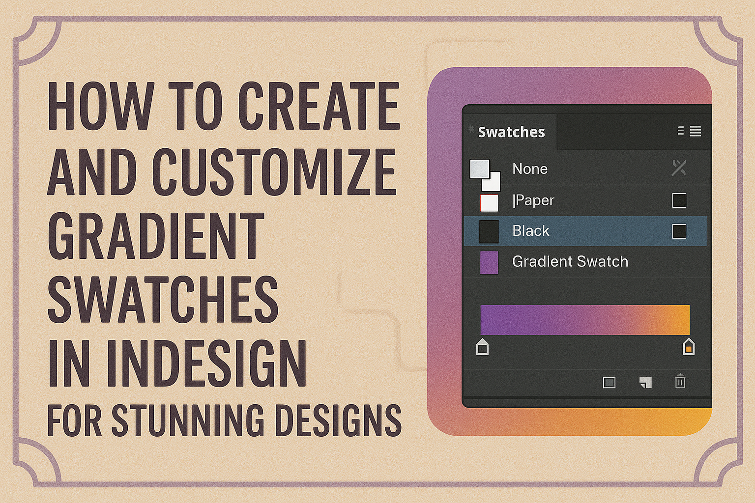
Creating Gradient Swatches
Creating gradient swatches in InDesign allows designers to add depth and visual interest to their projects. By understanding how to access the gradient panel, add colors, and adjust settings, anyone can create stunning gradients that enhance their designs.
Accessing the Gradient Panel
To start creating gradient swatches, the designer must open the Gradient panel. This can be done by selecting Window > Color > Gradient from the top menu.
Once the panel is visible, it will show default gradient options. The designer can also find a Gradient Tool in the Toolbox.
If the panel is not visible, using the Show Options command from the panel menu makes additional tools available.
This panel is essential for editing gradients and will become a key part of the design workflow.
Adding Colors to Gradients
After opening the Gradient panel, the next step is to add colors. The designer needs to select the object they would like to apply the gradient to.
In the Gradient panel, the color stop menu shows where colors can be added.
To add a color stop, simply click below the gradient bar. This action will create a new color stop that can be customized.
The designer can double-click the color stop to open the color picker and choose a new color. Layering different colors brings variety and makes the gradients more interesting.
Adjusting Gradient Direction and Angle
Once colors are added, adjusting the gradient’s direction and angle is crucial for achieving the desired effect.
The designer can change the angle by entering a degree value in the Angle box located in the Gradient panel.
Another option is to use the Gradient Tool, which allows clicking and dragging across the object to set the gradient’s direction.
This hands-on approach provides immediate visual feedback. A well-placed gradient can significantly impact the overall look of the design, drawing the viewer’s eye to specific areas.
Customizing Gradients
Customizing gradients in Adobe InDesign allows for greater control and visual appeal. By modifying existing gradients, saving unique combinations, and managing gradient libraries, designers can enhance their projects with personalized touches.
Modifying Existing Gradients
To modify existing gradients, a user can select the object with the gradient applied to it. They can then use the Gradient panel or the Gradient Swatch tool for adjustments.
This includes changing the direction and position of the gradient by clicking and dragging.
Additionally, they can alter the colors by selecting the gradient stops. By double-clicking on each stop, a color picker will appear, allowing for precise color adjustments.
These simple steps help create gradients that perfectly fit the design’s needs.
Saving Custom Gradients
When a new gradient is created, it’s essential to save it for future use.
To do this, the user should select the object with the desired gradient applied. Next, the Swatches panel must be opened, and the user should click on the New Swatch button.
By default, this saves the gradient as “New Gradient Swatch.” The user can rename it for easier identification later.
This process ensures that favorite gradients are readily accessible for future projects, saving time and ensuring consistency.
Managing Gradient Libraries
Managing gradient libraries in InDesign can streamline the design process. Users can organize their gradients in clearly labeled libraries for quick access.
To do this, they should go to Window > Color > Swatches and use the options available.
It’s also possible to import or export gradient libraries for use across different projects. This can be done by saving custom libraries in formats that InDesign recognizes.
By keeping gradients organized, designers can enhance their workflow and maintain a cohesive design style.
Effective Use of Gradients
Gradients can enhance designs when used thoughtfully. They add depth and dimension, but their effectiveness relies on the right techniques and avoiding common missteps.
Best Practices for Gradient Use
To achieve the best results with gradients in InDesign, consider the following tips:
-
Choose a Color Scheme: Select colors that complement your design. Analogous colors often work well together.
-
Limit Color Transitions: Using too many colors can create a chaotic look. Aim for a smooth transition that is pleasing to the eye.
-
Understand Gradient Types: Familiarize yourself with linear, radial, and freeform gradients. Each type serves a different design purpose.
-
Adjust Opacity: Experiment with the opacity of different colors in the gradient. This creates interesting effects and layers.
Following these guidelines can lead to more engaging and professional designs.
Common Mistakes to Avoid
There are pitfalls to watch for when using gradients.
Recognizing these can save designers from distractions.
- Overusing Colors: Applying gradients to every element can overwhelm viewers.
Use gradients selectively for emphasis.
- Ignoring Readability: If text is placed over a gradient, it may become hard to read.
Ensure there is enough contrast to maintain clarity.
- Neglecting Consistency: Different gradient styles can clash.
Stick to a consistent style that fits the overall theme of the project.
- Skipping Testing: Colors may look different on screens and in print.
Always test the gradient in the final output to ensure it looks as intended.