Mastering stroke and fill in Adobe InDesign can elevate any design project. Customizing these elements allows designers to enhance shapes, paths, and text, making their work stand out.
By understanding how to apply and adjust stroke and fill settings, they can easily create visually appealing layouts.
With the right techniques, changing colors and adjusting stroke weight becomes a simple task. Tools like the Stroke panel provide essential controls that help in defining how edges appear.
Whether creating elegant outlines or vibrant fills, these features can transform ordinary designs into captivating visuals.
This blog post will guide readers through the steps to apply and customize stroke and fill settings effectively. By following these tips, anyone can add a unique touch to their InDesign projects and improve their design skills.
Getting Started with Strokes
Strokes are lines that outline objects, helping to define shape and emphasis in design. Understanding how to choose and apply strokes can greatly enhance any project in InDesign.
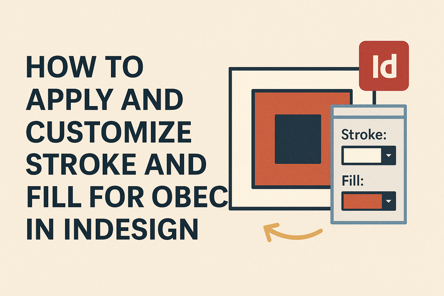
Understanding Stroke Options
In InDesign, strokes have various options that can drastically change their appearance. Users can select stroke color, weight, and style from the Stroke panel.
The weight refers to the thickness of the stroke, which can be adjusted in points.
Additionally, stroke styles include solid, dashed, or dotted lines. Users can also modify how stroke ends appear, like choosing between rounded or square caps. These options allow for a wide range of creative expression, making it easy for designers to achieve the desired look.
Applying Strokes to Objects
To apply strokes, users first need to select an object, such as a shape or a text frame. Once selected, they can open the Stroke panel by going to Window > Stroke.
From there, users can choose the color and weight of the stroke.
It’s important to note that strokes can also be applied to text outlines. After converting text to outlines, it can receive strokes just like any shape. This feature allows for unique design possibilities by highlighting specific areas of text or adding decorative elements.
Adjusting Stroke Weight and Type
Adjusting stroke weight is simple. In the Stroke panel, users can enter a specific value or choose from a drop-down menu.
The stroke will change in real-time, allowing users to see how different weights affect the overall look.
For stroke type, users can choose from solid lines, dashed patterns, or custom styles. Users can access more options by clicking on the panel menu.
Such options include corner styles, which control how strokes appear at angles. Fine-tuning these settings helps in crafting precise designs.
Exploring Fill Settings
Understanding fill settings is key for creating vibrant and visually appealing designs in InDesign. This involves selecting colors, gradients, and patterns to enhance objects effectively.
Applying Color and Gradient Fills
To apply a solid color fill, select the object and choose a color from the Swatches panel or the Control panel.
These options allow for quick changes. Users can also define new colors using the Color Picker, making it simple to personalize designs.
Gradients add depth and interest. Click on the gradient fill option to create a smooth transition between colors.
Adjust the gradient type, angle, and distribution to fit design needs. The Gradient panel offers options like linear or radial gradients, giving users control over how colors blend within an object.
Using Patterns and Effects for Fills
Patterns can provide texture and visual appeal. In the Swatches panel, there are various pre-defined patterns available.
Users can apply these patterns to objects to make them stand out. Custom patterns can also be created for a unique touch.
Effects like transparency and blending modes enhance how fills interact with objects. These can be accessed in the Effects panel.
Adjusting opacity or using different blending options helps achieve desired effects, allowing for creative freedom in design projects.
Customizing Objects with Advanced Techniques
Customizing objects in InDesign can significantly enhance design quality. Using advanced techniques, designers can apply unique transparencies and effectively incorporate stroke and fill into text, creating visually appealing graphics.
Working with Transparencies and Overlays
Transparencies are powerful tools in InDesign. They can add depth and interest to designs.
Designers can apply transparency effects to any object by selecting the object and adjusting the settings in the Effects panel.
- Opacity: Adjust the opacity to make an object see-through.
- Blend Modes: Choose from various modes like Multiply, Screen, and Overlay. These blend modes allow layers to interact differently, affecting how colors and images appear.
When working with overlays, placing semi-transparent colors on top of images can create a striking effect. Using overlay colors lets designers draw attention to specific parts of their design without losing the background detail.
Incorporating Stroke and Fill in Text Design
Stroke and fill are crucial for enhancing text in a document. Applying these attributes helps make text stand out and aligns with the overall design.
-
Stroke: Designers can add strokes to text by selecting the text frame and adjusting the settings in the Stroke panel. This includes choosing stroke weight, color, and style (solid, dashed, etc.).
-
Fill: To fill text with color, designers highlight the text and select a fill color from the Swatches panel. They can even use gradients for a more dynamic look.
Using strokes and fills creatively can transform ordinary text into eye-catching elements. This helps convey the message more effectively while maintaining a polished design aesthetic.