Creating business cards can feel overwhelming, but it doesn’t have to be. With the right tools and tips, anyone can design a professional card that stands out.
Using Adobe InDesign for this task is a powerful choice, as it offers flexibility and precision to bring unique designs to life.
When designing a business card, it’s essential to start with the proper dimensions and layout. Setting up the document correctly ensures that the final product aligns with industry standards.
With clear guidance on design elements, users can easily craft an eye-catching card that reflects their brand identity.
In this article, a variety of practical tips will be shared to help improve business card designs in InDesign. From layout basics to effective use of color and typography, readers will gain insights that can transform their card from ordinary to exceptional.
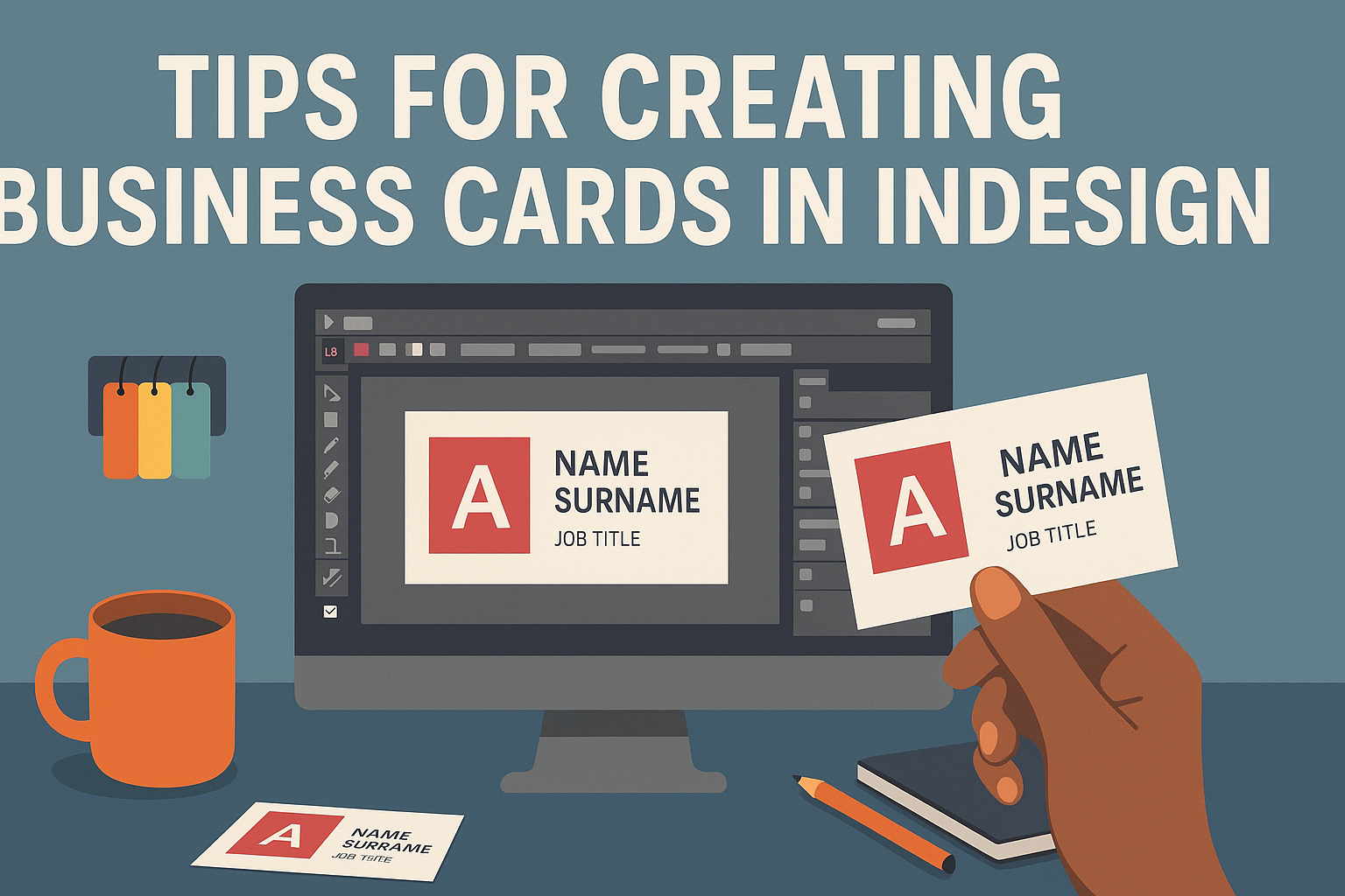
Understanding InDesign’s Interface
Navigating InDesign’s interface is essential for creating effective business cards. Key features include workspace setup and utilizing various panels and tools for design.
Setting Up Your Workspace
To create a comfortable workspace, the user should adjust the layout to fit their needs. InDesign allows for a customizable workspace, making it easy to access the tools they use most often.
The user can access workspace options by navigating to Window > Workspace. From there, they can choose from presets such as Essentials or Typography.
They can also create a new workspace by selecting New Workspace. This is helpful for organizing frequently used panels, which reduces clutter and improves efficiency during the design process.
Working with Panels and Tools
InDesign is packed with various panels and tools that streamline design work. Familiarity with these features significantly enhances productivity.
Key panels include the Layers, Swatches, and Tools panels. The Tools panel, located on the left, holds essential tools like the-selection and text tools.
Users should explore the Window menu to access additional panels as needed. For example, they can open Color or Paragraph Styles to their workspace.
Using shortcut keys can speed up the workflow as well. For instance, pressing V selects the Selection Tool, making it quick to switch between different tasks.
Designing Your Business Card
Creating a business card involves careful planning and attention to detail. The choices made in dimensions, fonts, colors, logos, and layout can impact how the card is perceived.
Choosing the Right Dimensions
The standard size for a business card in the United States is 3.5 inches by 2 inches. This size fits well in wallets and cardholders. However, there are options to customize the dimensions to stand out.
Consider a vertical orientation or unique shapes for a memorable look. If choosing a different size, ensure it remains compatible with printing standards. Always add a bleed area of at least 0.125 inches to account for any cutting mistakes during printing.
Selecting Fonts and Colors
Fonts and colors convey the personality of a brand. When selecting fonts, prioritize readability. A clean, simple font works best for contact information.
For titles or logos, a more distinctive font can add flair. Limit the number of different fonts to two or three to maintain a cohesive look.
Color choice is equally important. Pick colors that reflect the brand and evoke the right emotions. A good rule of thumb is to use a maximum of three colors for balance. Consider using darker colors for text against lighter backgrounds for better visibility.
Adding Logos and Graphics
Logos play a significant role in branding. When adding a logo, ensure it is clear and of high quality. Position the logo on the front of the card, typically in the top left or center.
Graphics should complement the overall design without overwhelming the text. It’s best to avoid overly complex images. Simple, clean graphics can enhance aesthetics while keeping the focus on the essential information.
Using vector graphics ensures that the quality remains sharp when printed. This way, logos and graphics will look professional and polished.
Organizing Contact Information
Clearly organizing contact information is crucial. Start with the name prominently at the top. Below that, include the job title and company name.
Next, add phone numbers and email addresses. Make sure the font size for the contact information is legible.
Using a hierarchy in font sizes can help guide the reader’s eye. For instance, the name could be the largest, followed by the title, and so on. Also, use icons next to contact information for quick reference. Icons for phone, email, and website can enhance visual appeal while making information easy to find.
Finalizing Your Design
At this stage, attention to detail is crucial. The way elements are aligned, the considerations for printing, and the final export process can greatly impact the quality of the business card. Here’s what to keep in mind.
Aligning Elements for Balance
Ensuring elements are balanced creates a visually appealing card. Start by using guides to align text, logos, and images. This helps maintain even spacing and makes the card look organized.
He or she can use the Alignment Tools in InDesign. These tools help to align objects centrally or distribute them evenly.
It’s also important to check margins. A standard margin is 0.1875 inches. Keeping elements within this range ensures nothing is cut off during printing.
Printing Considerations
Before printing, it’s essential to check the color mode. CMYK is ideal for print jobs because it ensures colors appear as intended.
The choice of paper can also affect the final product. A thicker paper may feel more professional. Consider a glossy finish for vibrant colors or a matte finish for a sleek look.
He or she should also check for bleed. Adding a 0.125-inch bleed prevents white edges. It’s best to review the printer’s specifications for paper size and bleed requirements.
Exporting Your Business Card
Exporting correctly ensures high-quality results.
InDesign allows users to export as a PDF, which is preferred for printing.
When exporting, select High Quality Print in the PDF settings. This option preserves image quality and colors.
Before finalizing, check the export preview.
You can zoom in to spot any issues.
Finally, save the PDF with a clear name that reflects the content, making it easier to find later.