Nunito is a modern sans-serif typeface known for its balanced and rounded design. Created by Vernon Adams, it was initially designed to bring a friendly and approachable feel to digital displays. Over time, Jacques Le Bailly expanded Nunito to include a full set of weights and introduced a more versatile version called Nunito Sans.
The design of Nunito was intended to provide clarity and readability, making it ideal for digital use. Its versatility comes from the variety of styles it offers, available through platforms like Google Fonts and Adobe Fonts. This makes it a popular choice among web designers looking for a consistent and appealing font.
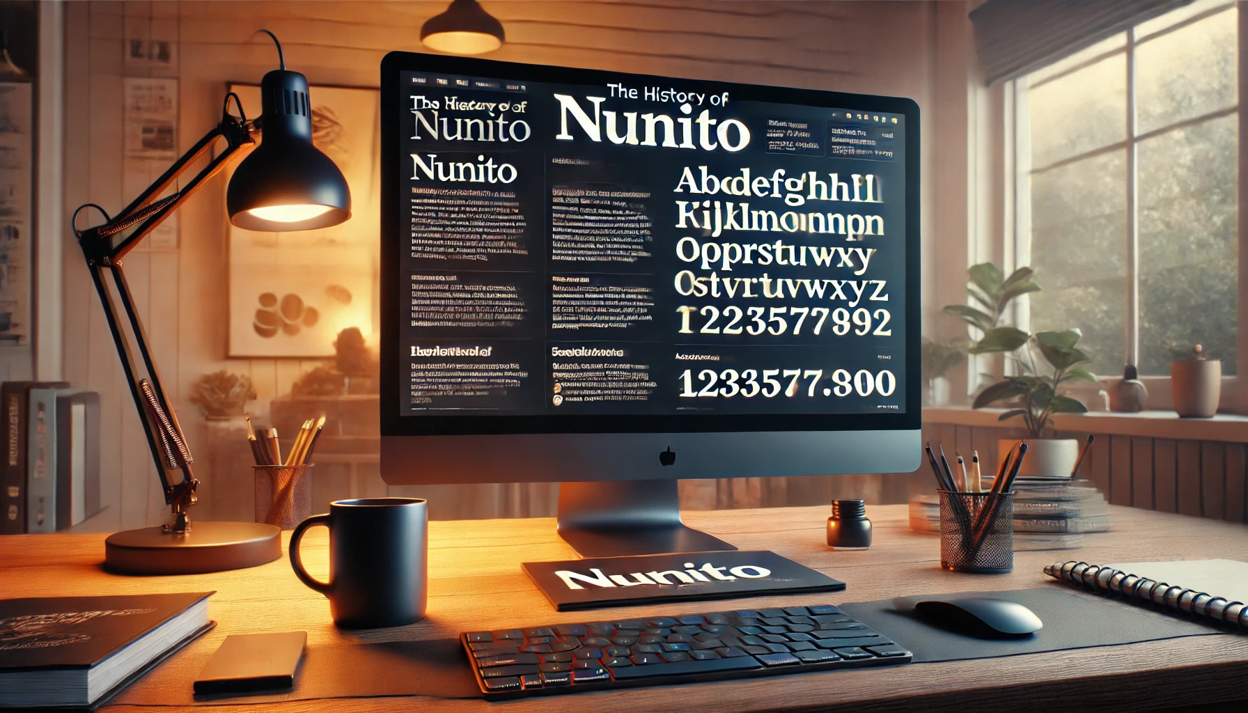
Nunito’s journey from a simple concept to a comprehensive font family is fascinating for anyone interested in typography. By offering a range of options, including the non-rounded Nunito Sans, it remains a favorite in creative and professional projects. This history of development and adaptation sets Nunito apart in the world of digital fonts.
Origin of Nunito
Nunito is a popular sans-serif typeface that combines a rounded, approachable look with versatility. It was initiated as a display font with unique characteristics. The story of Nunito begins with its creator and its initial launch.
Creator Vernon Adams
Vernon Adams was the creative mind behind Nunito. He designed it in 2011, aiming to produce a friendly and balanced typeface for display typography. His design focused on rounded terminals, which gave Nunito its distinctive, soft appearance.
Adams envisioned a font that was both modern and accessible, fitting various design needs. His thoughtful approach to typeface design is evident in the balanced letterforms and uniform stroke widths. This made Nunito a widely appreciated choice for a variety of digital and print applications.
Initial Release
Initially released in 2012, Nunito offered a limited set of weights. The font quickly gained popularity, thanks to its smooth, approachable design. Users appreciated its versatility and readability across different mediums.
In 2017, Jacques Le Bailly expanded the typeface to include more weights and styles, further enhancing its appeal. This update also introduced Nunito Sans, a version without the rounded terminals. This expansion broadened Nunito’s usability, making it a staple in typeface collections. For more insights into this expansion, check out the Google Fonts page.
Design and Characteristics
Nunito is a sans-serif typeface known for its smooth, rounded design and variety of weights. It offers a modern look that works well in different media. This section explores its sans-serif nature, rounded corners, and font weight variations.
Sans-Serif Nature
Nunito is part of the sans-serif family, which lacks the small lines at the ends of letters, known as serifs. This gives it a clean and modern appearance. Sans-serif fonts like Nunito are often used in digital formats because they are easy to read on screens. Nunito’s design makes it suitable for both display and text applications, appearing crisp at various sizes.
Its sans-serif nature contributes to its versatility. Whether used in web design or print, Nunito’s minimalistic style complements various layouts. The absence of serifs makes it a popular choice for contemporary designs, ensuring text remains clear and unobtrusive.
Rounded Corners
Nunito is known for its rounded terminals, which give it a friendly and approachable feel. These rounded edges create a soft impression, making the font visually appealing. This characteristic distinguishes it from more traditional sans-serif fonts, adding warmth to its appearance.
Rounded corners in Nunito contribute to its readability. This design aspect ensures that letters connect smoothly, reducing visual tension. As a result, Nunito maintains a balanced and harmonious look, making it suitable for branding, websites, and other user interfaces where a welcoming tone is desired.
Font Weight Variations
Nunito offers a wide range of weights, from light to extra bold. This variety allows users to create contrast and emphasis within their text. In design projects, having multiple weights provides flexibility to distinguish different sections or elements, such as headings and body text.
The multiple weights of Nunito make it a versatile tool for designers. Whether in a professional document or a casual project, the different weights can enhance readability and visual interest. This adaptability makes Nunito a reliable choice for designers who need a comprehensive font family that can handle various tasks.
Evolution Over Time
Nunito has grown from its original design to include more variations and wider accessibility. The updates have made it versatile, while its inclusion in major platforms like Google Fonts has increased its popularity tremendously.
Updates and Expansions
Nunito started in 2012 as a rounded terminal sans-serif typeface. Designed by Vernon Adams, its smooth and approachable look quickly gained attention. Over time, Jacques Le Bailly expanded Nunito to include a wider range of weights, offering more flexibility for designers.
A notable update was the creation of Nunito Sans. This version removed the rounded terminals, appealing to a different audience while maintaining the balance and proportions of the original. These expansions have ensured that Nunito can meet diverse needs.
Google Fonts Inclusion
The inclusion of Nunito in Google Fonts significantly boosted its accessibility to designers around the globe. Google Fonts is a widely-used platform offering free fonts for web and print projects.
Having Nunito available on this platform opened up new opportunities for its use in various design projects. Its downloading and usage became straightforward, making it a popular choice for web designers and developers. The ease of access contributed to its reputation as a reliable and attractive typeface.
Usage and Applications
Nunito is a versatile font with a friendly look, making it suitable for various uses. It is great for both digital and print mediums and plays a significant role in creating a brand’s identity.
Web and Print
Nunito’s readability makes it ideal for websites and printed materials. With its uniform stroke widths and clear letterforms, it ensures text is easy to read on screens and paper. Its rounded design provides a warm feel, which works well for body text and headlines.
Web developers often use Nunito because it adapts to different screen sizes without losing clarity. This quality helps in maintaining a consistent look across various digital platforms. Meanwhile, magazines and brochures benefit from its ability to present information clearly while still looking modern.
Branding and Identity
Nunito is often chosen for branding due to its approachable appearance. Its two styles, rounded and regular, offer flexibility in expressing different brand personalities. The rounded style conveys warmth, making it perfect for brands aiming for a friendly image.
Brands needing a clean and professional look might prefer the regular style. Nunito Sans, the non-rounded version, is also popular in branding. It’s often used for logos, business cards, and other identity pieces. This adaptability makes Nunito a go-to choice for businesses wanting to establish a strong and welcoming presence.
Technical Aspects
Nunito is known for its versatility across different platforms and its capacity to support a vast range of languages. Understanding its technical specifications helps users make the most of its capabilities in diverse settings.
File Formats
Nunito is available in several file formats, making it compatible with various design and document applications. Typically, it can be found in TrueType Font (TTF) and OpenType Font (OTF) formats. The TTF format ensures broad compatibility with both Windows and Mac systems. OTF, on the other hand, offers advanced typographic features like ligatures and alternate characters, which can be particularly useful for designers seeking more creative control. Both formats allow Nunito to maintain its smooth and rounded features across different software environments, ensuring consistent display regardless of the application.
Language Support
One of Nunito’s strengths is its comprehensive language support, a testament to its global usability. It covers the Latin script extensively, making it suitable for languages such as English, Spanish, and French. Additionally, it supports extended Latin characters, which are essential for various European languages. This wide range of character support ensures that Nunito is a reliable choice for international projects, providing accurate representation of text across many languages. This makes it particularly attractive for web developers and graphic designers working in multilingual contexts, offering flexibility without compromising on style.
Licensing and Distribution
Nunito is distributed under the SIL Open Font License, which allows users to freely use, modify, and distribute the font. This license supports both commercial and personal projects, providing flexibility for different types of users. Designers and developers especially appreciate the ability to integrate Nunito into both print and digital projects without additional licensing fees. The font is easily accessible via platforms like Google Fonts, facilitating straightforward download and integration into websites and software. This ease of access encourages widespread use, making it a popular choice for many creative professionals.
Reception and Critiques
Nunito and Nunito Sans have found favor in many design communities for their rounded, approachable aesthetic. They are popular among web and graphic designers for their versatility and clear readability.
Design Community Feedback
Designers often praise Nunito for its balance between style and functionality. It has a modern, clean look that works well in various contexts, from professional settings to more casual designs. The rounded terminals of Nunito give it a friendly appeal that stands out without being overpowering.
Some designers feel limited by the lack of more adventurous weights, but the typeface’s adaptability makes it a favorite for projects needing a soft yet professional touch. Nunito Sans, in particular, wins points for its simplicity and versatility.
Comparison to Similar Fonts
When compared to other sans-serif fonts, Nunito often competes with typefaces like Open Sans and Lato. While Open Sans is known for its neutrality, Nunito brings in a warmth through its rounded shapes. Lato, on the other hand, offers a bit more variety in its range of weights.
Visually, Nunito holds its own due to its balanced proportions and smooth curves. This gives it an edge in projects where approachability is a priority. The font family, while not as extensive as some, is appreciated for its consistency and ease of use in digital and print media.
Notable Use Cases
Nunito and Nunito Sans are popular choices in modern design, thanks to their friendly and approachable look. These fonts have been widely used in various digital platforms and publications.
Many designers choose Nunito for websites and apps. It’s often seen in interfaces where readability and style are important. For example, it’s used in educational platforms for its clear and inviting appearance.
Nunito Sans is often used in printed materials. Brochures, flyers, and marketing campaigns frequently feature this font. Its clean lines make it a suitable option for professional settings.
Businesses use Nunito in presentations and reports. It adds a friendly yet professional touch without sacrificing clarity. This makes it a great choice for corporate communications.
Typography enthusiasts appreciate the versatility of Nunito when creating branding materials. Its balanced design allows it to adapt to various visual identities easily.
Non-profit organizations also favor Nunito. Its warm appearance can help convey messages of trust and community effectively.
Key Features of Nunito and Nunito Sans:
- Readability: Easy to read on screens and in print.
- Versatility: Suitable for many applications, from web to print.
- Friendly Appearance: Invokes warmth and approachability.
Whether in web design or printed materials, Nunito proves to be a versatile tool in a designer’s arsenal. Its adaptability and appealing style make it a notable choice in many creative projects.
Accessibility Considerations
When choosing fonts for accessibility, Nunito and its variant, Nunito Sans, offer benefits. Their simple, rounded design improves readability, making it easier for users with visual impairments or dyslexia. The design reduces eye strain when reading longer texts.
Font Size: Use a minimum size of 16 pixels for body text to ensure clarity. Larger text helps users with low vision and makes it easier to read on screens.
Contrast and Color: Nunito’s clear design pairs well with a strong background contrast. This helps those with color blindness or visual impairments. Testing contrast ensures text stands out clearly.
Consistency: Nunito keeps a consistent style through its various weights. This predictability supports readability for people who find sudden style changes confusing or distracting.
Licensing: Nunito Sans is freely available under the SIL Open Font License, making it easy to use for different projects.
Examples of Use: A sample of Nunito Sans shows how handy this font can be for accessible designs. Check out how it’s used on accessible websites to streamline readability.
Good Practices:
- Keep line spacing generous for better readability.
- Use Nunito in headers and body texts for a cohesive look.
- Test your designs with users for feedback.
Nunito and Nunito Sans are thoughtful choices to enhance accessibility without sacrificing design appeal, providing a friendly read to every user.