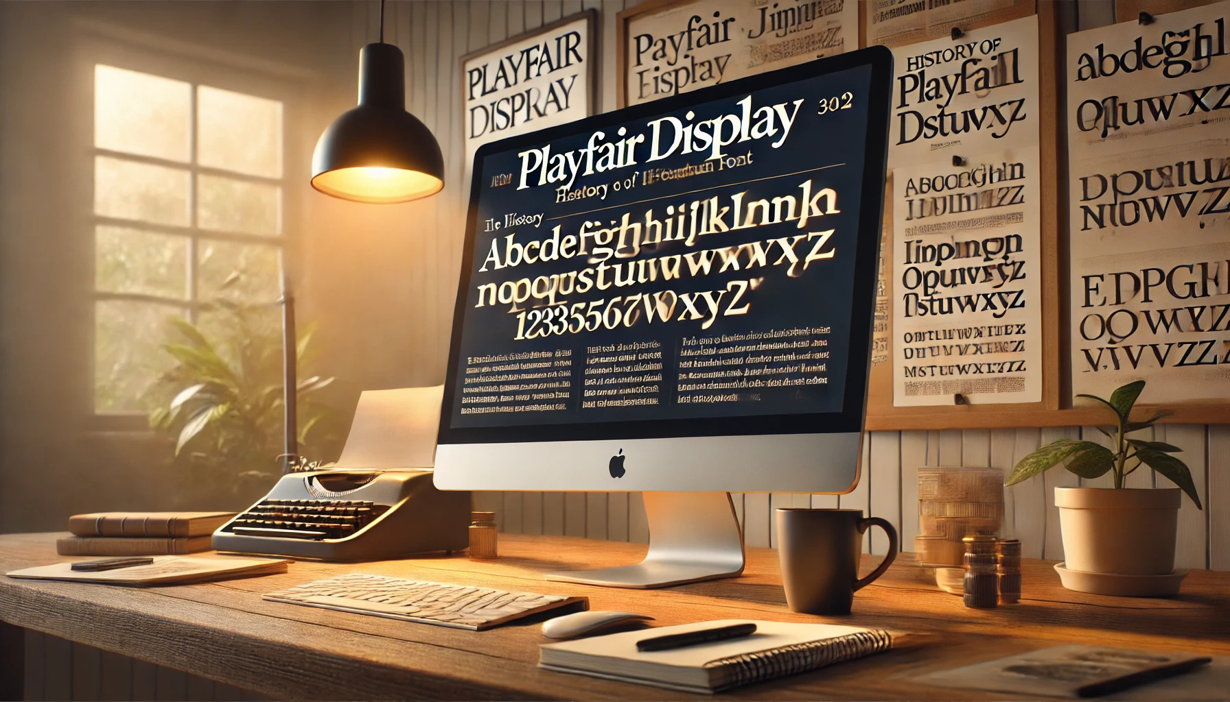
Playfair Display is a remarkable serif typeface that blends elegance with functionality. Originally designed by Claus Eggers Sørensen, this typeface has found its place in both digital and print media. Its transitional style makes it ideal for fashion and editorial content, where a sophisticated look is desired.
The font’s design carries a rich history with roots tracing back to the late eighteenth century styles like Bodoni. It is admired for its high contrast and graceful letterforms, which stand out in titles and headlines. The modernized version has become a staple on platforms like Google Fonts and Adobe Fonts. This versatility ensures designers keep gravitating towards it for various creative projects.
As an open-source font, Playfair Display offers flexibility and access to a broad audience. Available under the SIL Open Font License, it invites innovation and adaptation. This has helped it thrive across both personal and professional projects, encouraging a wider embrace of its aesthetic charm.
Origins of Playfair Display
Playfair Display is a typeface known for its elegance and is inspired by designs from the late 18th century. It reflects elements of traditional serif fonts while also incorporating a modern twist.
Design Inspiration
Playfair Display draws its inspiration from the transitional period of serif fonts, which emerged in the late 1700s. During this time, fonts like Bodoni and Scotch Roman were gaining popularity. These fonts were characterized by high-contrast letterforms and delicate lines, which gave them a sophisticated look. Playfair Display captures this elegance, making it well-suited for fashion and editorial use. Its design serves as a homage to these earlier styles, yet it introduces a unique, modern finesse that sets it apart from its predecessors.
Creator of Playfair Display
Playfair Display was developed by Claus Eggers Sørensen in 2011. Sørensen sought to create a typeface that honored classic designs while making it accessible for modern use. He released it under the Open Font License, which means it can be used freely by anyone. This decision has allowed Playfair Display to become widely used on digital platforms, including Google Fonts. Sørensen’s efforts made Playfair Display a beloved choice for designers who value both tradition and contemporary design.
Design Characteristics
Playfair Display is known for its elegant and classic look, making it a popular choice in fashion and editorial design. Its design showcases the transition from quills to steel pens, reflecting the influences of Enlightenment and neoclassical movements.
Typeface Anatomy
Playfair Display features a high contrast between thick and thin strokes, giving it a dramatic appearance. This characteristic enhances its readability and visual appeal. The uppercase letters have an almost calligraphic style, making them stand out.
Ball terminals add to the sophistication of the font. This design aspect is common in transitional serif fonts, which are situated between old-style and modern typefaces. These attributes enhance the overall readability, especially in print formats.
Unique Features
The uniqueness of Playfair Display lies in its sophisticated, elegant style. Influenced by fonts like Bodoni, it conveys a graceful aesthetic. Its high contrast strokes demand attention, making it a favorite in fashion branding.
Another distinct feature is its availability in multiple weights, from regular to bold. This range allows designers to create hierarchies and emphasis in their works. Playfair Display is also free to use, thanks to its Open Font Licence, making it accessible to designers worldwide.
Usage and Applications
Playfair Display is a versatile serif font that shines both in print and digital formats. Its high contrast and elegant details make it ideal for many applications, especially in design projects. This section explores its usage in different media and popular font pairings to enhance its appeal and readability.
Print vs. Digital Media
In print media, Playfair Display is often used for magazines, book covers, and brochures. Its strong contrast and classic serifs create an impression of elegance and authority, making it a great choice for titles and headings. When placed on glossy paper, it adds a sophisticated touch to any publication.
For digital media, Playfair Display is well-suited for websites and online articles. It captures attention in large text sizes, such as headings and banner text. When used on high-resolution screens, the details of the font are sharp and clear. It’s also legible at smaller sizes due to its distinct letterforms. Websites looking to convey a sense of tradition and professionalism often choose this font for their headers.
Popular Pairings
Playfair Display pairs beautifully with sans-serif fonts, creating a balanced contrast that enhances readability. One highly recommended combination is pairing it with Lato, which creates a clean and modern look.
Another popular pairing is with Roboto, offering a sleek and contemporary feel. These combinations complement the classic elegance of Playfair Display, making it versatile for different styles. Using complementary fonts in a design project adds texture and interest, ensuring a harmonious and engaging visual experience.
Technical Specifications
Playfair Display is a serif typeface with a classic and elegant look. It offers flexibility in both design and usage. This section explores its formats and the languages it supports.
Font Formats
Playfair Display comes in various formats, making it versatile for different applications. It is available as a variable font, which includes multiple styles such as regular, italic, and bold within one file. This format allows designers to adjust styles easily without needing separate files for each.
For those using Adobe products, Playfair Display can be synced directly through Adobe Fonts, which is convenient for seamless integration into design projects. Additionally, the typeface is distributed as open source under the SIL Open Font License, which means it can be freely used and modified.
Language Support
Playfair Display supports a wide range of languages, making it suitable for international projects. It includes characters for Latin script, which covers most Western languages.
The font also features small caps and ligatures that enhance its typographic capabilities. This rich character set ensures that it adapts well to various linguistic needs, from English to other European languages. With such diverse language support, it’s a reliable choice for multilingual text settings.
Availability and Access
Playfair Display is widely accessible and can be used in various projects. With clear licensing terms and easy downloading options, it offers flexibility for designers and publishers looking to incorporate a classic serif look.
Licensing
Playfair Display is available under the Open Font License 1.1, which allows for both personal and commercial use without charge. This means individuals and companies can freely use the font in their projects.
Users are encouraged to modify the font to suit their specific needs under this license. It’s important to adhere to the terms, such as avoiding selling the font on its own. This ensures users can make the most of Playfair Display while respecting the creator’s permissions.
Downloading and Installation
Playfair Display can be downloaded from multiple platforms. The font is available on Google Fonts, making it easy for web developers to integrate through a simple import link.
Additionally, users can find Playfair Display on Adobe Fonts for desktop and web use. Installing the font is straightforward; after downloading, users simply add it to their system’s font library. This provides versatility in using Playfair Display across different software applications and environments.
Impact on Typography
Playfair Display has left a significant mark on the world of typography. It is valued for its classic elegance and modern versatility. Its influence is visible both in how it is received by the design community and in its effect on the development of new typefaces.
Reception by the Design Community
The design community has warmly received Playfair Display. Designers appreciate its blend of historical charm and modern flair. This combination makes it suitable for various applications, such as fashion branding and editorial work.
The high-contrast serif design of Playfair Display gives it a luxurious feel that attracts those looking to make a bold statement. It successfully balances sophistication with readability, making it a favorite choice for magazines and high-end print media. Several designers often cite it as a versatile option that can elevate the aesthetic of any project due to its blend of tradition and innovation.
Influence on Modern Typeface Design
Playfair Display has significantly influenced modern typeface design. Its style, inspired by transitional serif fonts from the late 18th century, has paved the way for other designers to blend historical elements with contemporary design.
It injects a modern twist into traditional serif fonts, inspiring new creations that focus on both elegance and functionality. Playfair Display’s adaptation of Bodoni characteristics demonstrates how classic design can evolve to meet today’s needs. This approach has encouraged designers to experiment with high-contrast styles and intricate details. As a result, many new typefaces reflect Playfair Display’s influence, showcasing a blend of old-world sophistication with modern usability.