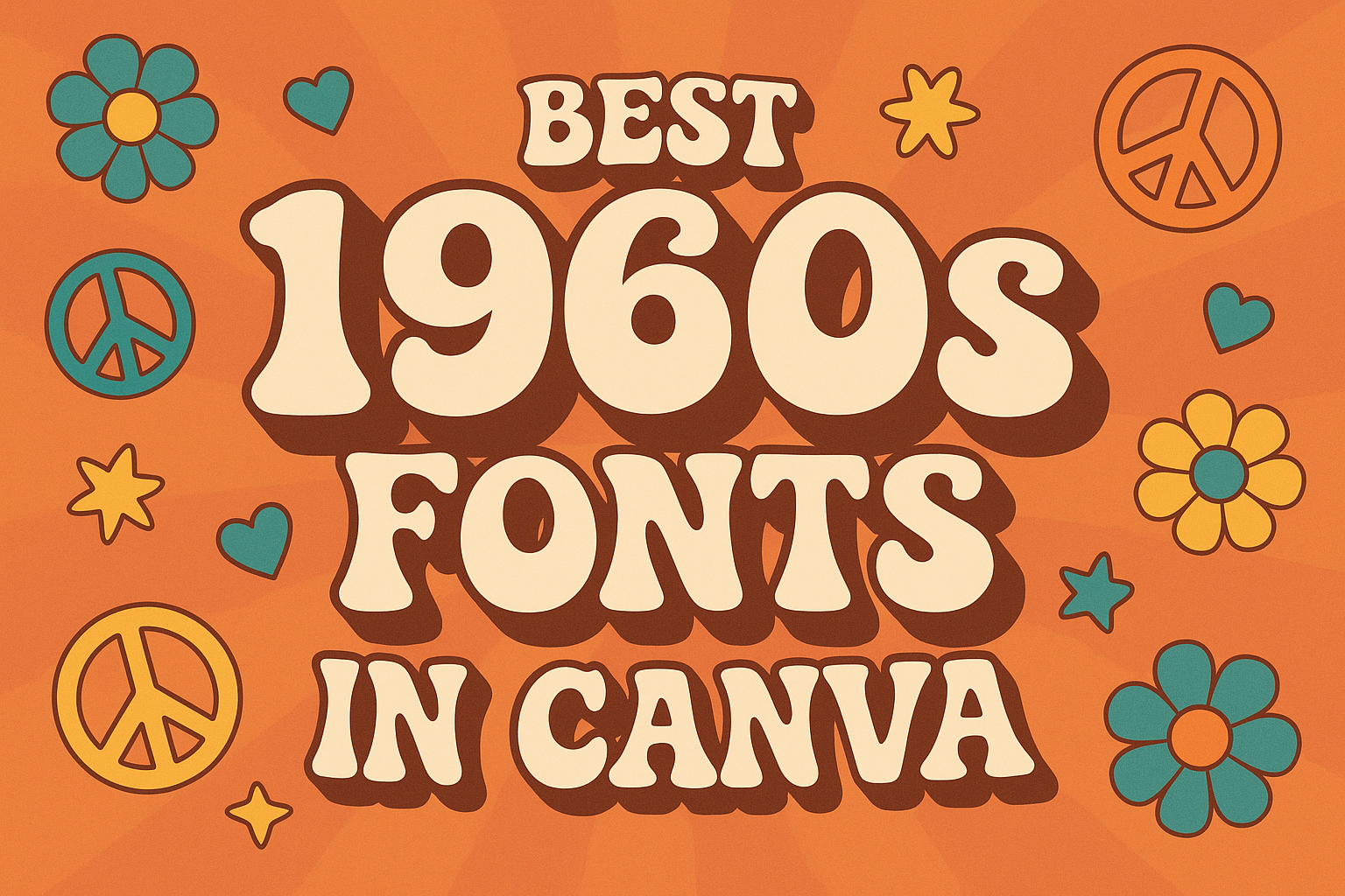
The 1960s was a vibrant decade full of creativity and change, influencing art, music, and design. For anyone looking to capture that retro spirit in their projects, Canva offers a fantastic selection of 1960s fonts that can bring any design to life.
These fonts reflect the playful and bold styles of the era, perfect for anyone wanting to evoke nostalgia or add a unique flair.
Designers can easily find various fonts in Canva that echo the spirit of the sixties, from funky bubble letters to elegant scripts. Each font carries the essence of the time, making them ideal for vintage posters, album covers, and more.
This article will explore some of the best fonts available and how they can enhance modern designs.
Whether for personal projects or professional use, incorporating 1960s fonts can add a special touch that stands out. Readers will discover a range of options that provide both aesthetic appeal and versatility for any creative venture.
The Rise of Typography in the 1960s
The 1960s was a pivotal decade for typography, marked by cultural shifts and the emergence of innovative typefaces. Designers experimented with style and expression, creating fonts that reflected the changing attitudes of society.
Cultural Revolution and Typeface Innovation
During the 1960s, the cultural revolution influenced many aspects of life, including graphic design. The rise of youth culture and countercultural movements led to bold and expressive typography.
New typefaces like Bodoni and Copperplate Gothic emerged, characterized by their clean lines and striking contrasts. These fonts were widely used in advertising, music, and pop art, creating a visual language that connected with the people.
Additionally, psychedelic styles and flowing cursive fonts became popular. Fonts like Brush Script captured the carefree spirit of the era, while decorative typefaces added a touch of whimsy and fun.
Influential Designers and Their Legacies
Several designers from the 1960s left a lasting impact on typography. They pushed boundaries and changed how people viewed fonts.
One notable figure was Herb Lubalin, known for his innovative use of typography in advertising and magazine design. His work emphasized the emotional connection between words and images.
Another important designer was Milton Glaser. He created iconic posters, including the famous “I ♥ NY” logo. Glaser’s bold use of color and playful typography influenced countless designers.
These designers helped shape a new understanding of typography that continues to resonate today. Their legacies inspire modern designers to explore creativity and self-expression through type.
Top 1960s Inspired Fonts in Canva
Canva offers a range of fonts that capture the vibrant spirit of the 1960s. This era was known for its creativity and bold designs. The following sections highlight some of the best fonts inspired by this colorful time.
Groovy Script Fonts
Groovy script fonts are all about flow and personality. They often feature rounded letters and playful curves that reflect the carefree attitude of the 1960s.
One great option is Niconne, which mimics personal handwriting. This font has a vintage flair that adds charm to any project. Another popular choice is Pacifico, known for its smooth, connected letters that convey a lively, fun vibe.
These fonts work well for invitations, posters, and social media graphics aiming for a retro feel. Their unique designs make them easily recognizable and visually appealing.
Psychedelic Display Fonts
Psychedelic display fonts are striking and full of energy. They often use bold colors and swirling shapes to create an eye-catching look.
Harlow is a standout example, celebrated for its retro aesthetic that truly captures the essence of the 60s. It pairs well with vibrant designs and graphics.
Monoton is another stunning choice, featuring lines that evoke a neon-like glow. This makes it great for attention-grabbing headlines. These fonts can transform any design to reflect the spirit of the psychedelic movement.
Modernist Sans-Serif Fonts
Modernist sans-serif fonts offer a clean and sleek look while still channeling the 1960s vibe. They emphasize simplicity and geometric shapes, common during this transformative decade.
Metropolis is a fantastic choice, showcasing elegant lines and a geometric style influenced by the Art Deco movement. It’s perfect for modern designs that want a nod to vintage styling.
Another option is Fjalla One, known for its boldness and readability. It combines a modern feel while fitting well in any retro-themed project. These fonts are versatile and can suit various design needs.
Using Vintage Fonts in Modern Design
Incorporating vintage fonts into modern design can create a unique and appealing look. By thoughtfully mixing design elements and considering colors, one can effectively highlight the charm of vintage styles.
Mixing Old and New Elements
Combining vintage fonts with modern elements can create striking visuals. Designers often pair retro typefaces with clean, contemporary layouts. This contrast draws attention and adds character to the design.
To achieve this, one approach is to use vintage fonts for headlines while keeping body text in a sans-serif font. This method allows the vintage font to stand out.
Another effective technique is to incorporate modern graphics, like geometric shapes or minimalistic icons, alongside vintage fonts. This fusion results in eye-catching designs that are both fresh and nostalgic.
Color and Background Combinations
Color choice plays a crucial role in using vintage fonts effectively. Many vintage fonts thrive on warm, earthy tones like browns, oranges, and yellows. These colors evoke a sense of nostalgia and work well with retro designs.
Backgrounds also matter. A simple, textured background can enhance a vintage font’s appeal. For instance, using a subtle floral pattern or aged paper texture can complement the old-fashioned styling.
It is essential to ensure sufficient contrast between the font and background colors. This helps maintain readability while showcasing the design’s vintage flair. By carefully selecting colors and backgrounds, designers can bring out the best in vintage fonts.
Tips for Choosing the Right 1960s Font
Selecting the ideal 1960s font can enhance a project’s visual appeal and ensure the message comes through clearly. It’s essential to consider both readability and how the font pairs with other design elements.
Considering Readability and Context
Readability is crucial when picking a font. The 1960s had many unique styles, but some can be hard to read.
When designing, he should think about where the font will be used. For signs or titles, bolder and larger fonts often work best.
For body text, simpler fonts may be better. Fonts like Compacta or Swiss Interlock provide distinct looks without sacrificing clarity. He must also consider the audience. A younger audience might appreciate funkier designs, while a more mature audience may prefer classic styles.
Font Pairing Strategies
Pairing fonts effectively can create a professional look.
He should mix a bold header font with a simpler body font.
For example, combining a fun 1960s font like Harlow for headlines with a clean sans-serif font for text could provide balance.
It’s also essential to limit the number of fonts used.
Generally, using two contrasting fonts keeps the design clean.
He might consider using one font for headlines and another for body text.
This approach creates visual interest without overwhelming the viewer.
Adjusting the sizes and weights can add depth to the design without confusion.