Choosing the right font is essential for creating a strong visual identity.
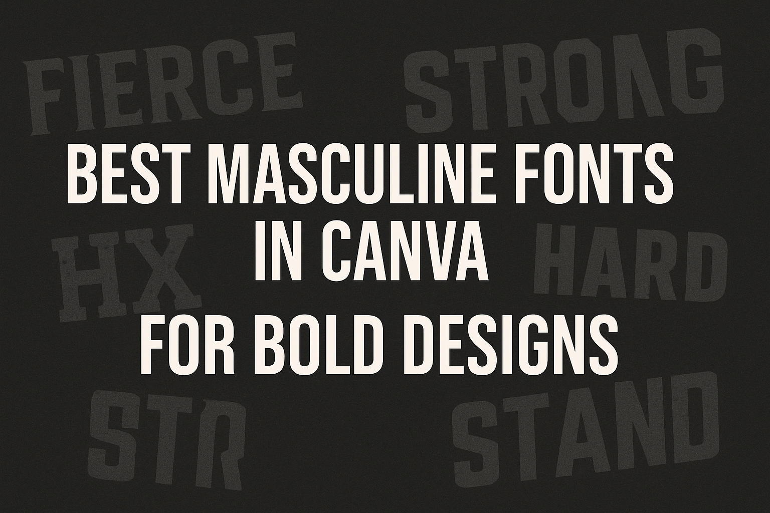
The best masculine fonts in Canva can convey confidence, strength, and style, making them perfect for various projects.
Whether it’s for branding, personal projects, or marketing materials, a good font can make all the difference.
Canva offers a wide selection of masculine fonts that cater to different tastes and themes. From bold and modern to classic and sturdy, there is a font for every design need.
With options like Archivo Black and Hammersmith One, users can find the perfect match for their creative vision.
Exploring the best masculine fonts in Canva can inspire ideas and elevate any project. These fonts not only enhance aesthetics but also express the intended message clearly.
The right choice can effectively connect with the target audience and leave a lasting impact.
Understanding Font Styles
Font styles play a crucial role in shaping the identity and feel of designs.
By knowing what makes a font masculine, designers can choose typefaces that better reflect their brand’s voice.
Different typographic choices can significantly impact a viewer’s perception.
What Makes a Font Masculine?
Masculine fonts often display bold and sturdy characteristics. They typically feature strong lines, thick strokes, and geometric shapes.
Fonts like Archivo Black and Alfa Slab One offer a robust appearance, making them suited for designs that aim to convey strength.
Besides thickness, the overall style matters. Fonts with angular or straight edges tend to look more masculine than those with soft, rounded forms.
Additionally, serif fonts, such as Madelin Serif, can provide an air of sophistication while still feeling powerful. This combination of features helps create visuals that reflect confidence and assertiveness.
The Impact of Typography on Design
Typography holds the power to influence how a message is received. It can set the mood and tone for any project.
For instance, a strong font can communicate professionalism, while a playful one may convey creativity.
In branding, specific font choices like Carter One can soften a strict image or enhance a casual vibe.
Fonts create a visual language that connects with an audience. Designers must consider line weight and spacing to achieve balanced typography.
A well-chosen font can elevate a brand and make it memorable.
Top Masculine Fonts in Canva
When designing with a strong and bold message, the choice of font plays a major role. Masculine fonts can convey power and confidence effectively. Here are some standout options to consider.
Bold and Assertive Typefaces
Bold typefaces are ideal for those looking to make a strong impact. Fonts like Helvetica Bold and Bebas Neue grab attention instantly. They are perfect for headings, posters, and marketing materials.
Another excellent choice is Archivo Black. Known for its thick letters, it works well in both print and digital designs. This font pairs nicely with images and backgrounds, making it a versatile option for various projects.
Sleek and Modern Selections
Sleek fonts offer a contemporary vibe while maintaining masculinity. Gotham Black is a popular option for its clean lines and modern aesthetic. It works great for tech-related designs and professional settings.
Rubik One is another modern font that features geometric shapes. This makes it friendly yet professional, suitable for brands aiming for a modern and approachable look. These fonts can elevate any design with their polished appearance.
Vintage-Inspired Choices
Vintage fonts often bring a unique charm to designs. Hammersmith One displays a semi-geometric style reminiscent of classic lettering. This font adds a touch of nostalgia while remaining functional in today’s designs.
Rundeck is another vintage-inspired option, featuring crafted letterforms with retro flair. It works well for creative projects where an artistic touch is needed. These fonts can help convey a story or a brand’s heritage effectively.
Using Masculine Fonts Effectively
Masculine fonts can enhance design projects when used appropriately. They convey strength and confidence. To make the most of these fonts, proper pairing and establishing a brand identity are crucial.
Pairing Fonts and Visual Elements
When selecting masculine fonts, consider how they pair with other design elements. A bold font can work well with minimalistic graphics.
For instance, combining a strong serif font with clean visuals can create a striking effect.
Tips for pairing:
- Choose one bold font for headlines.
- Use a lighter font for body text to maintain readability.
- Ensure color contrasts are sharp to enhance visibility.
Try fonts like Archivo Black, which has thick letters that stand out, making it great for headings. For body text, consider using a simple sans-serif font like Rubik. These combinations provide a balanced look, perfect for branding projects.
Creating a Brand Identity
Masculine fonts play a key role in building a brand’s identity. They evoke feelings of reliability and strength, giving a sense of professionalism.
It’s important to select fonts that reflect the core values of the brand.
Focus on fonts like Helvetica Bold or Bebas Neue for a strong impression. These fonts work well in various settings, from marketing materials to social media.
Key considerations:
- Ensure the chosen font aligns with brand values.
- Test different font sizes for impact.
- Use consistent font choices across all platforms for a unified brand look.
This attention to detail will help create a memorable brand identity that stands out in a crowded market.
Design Tips and Tricks
Creating striking designs with masculine fonts in Canva requires attention to detail. By adjusting font weight and spacing, and choosing the right colors, anyone can enhance their designs. Below are specific tips to maximize visual impact.
Adjusting Font Weight and Spacing
Font weight plays a crucial role in design. A heavier weight can convey strength, while a lighter weight offers elegance.
When using masculine fonts, finding the right balance is essential.
Spacing between letters, known as kerning, can also make a significant difference. Tight spacing creates a bold, compact look, while wider spacing can add a sense of openness and clarity.
Adjusting line height helps improve readability, especially in longer text blocks.
For example, use a strong font weight for headings and a lighter weight for body text. This contrast draws attention to important information while ensuring smooth reading.
Color Choices for Maximum Impact
Color can transform a simple design into an eye-catching creation. When selecting colors, consider the emotions they evoke.
Darker colors like navy, charcoal, or deep green often provide a masculine feel. Combining these darker tones with brighter accents can create an engaging design.
For instance, a dark background can be paired with bold yellow or orange text for high visibility.
Using a color palette generator can help find complementary colors. Stick to a limited palette to maintain consistency.
A good rule of thumb is to use 2-3 main colors and 1-2 accent colors. This approach keeps the design clean and focused.