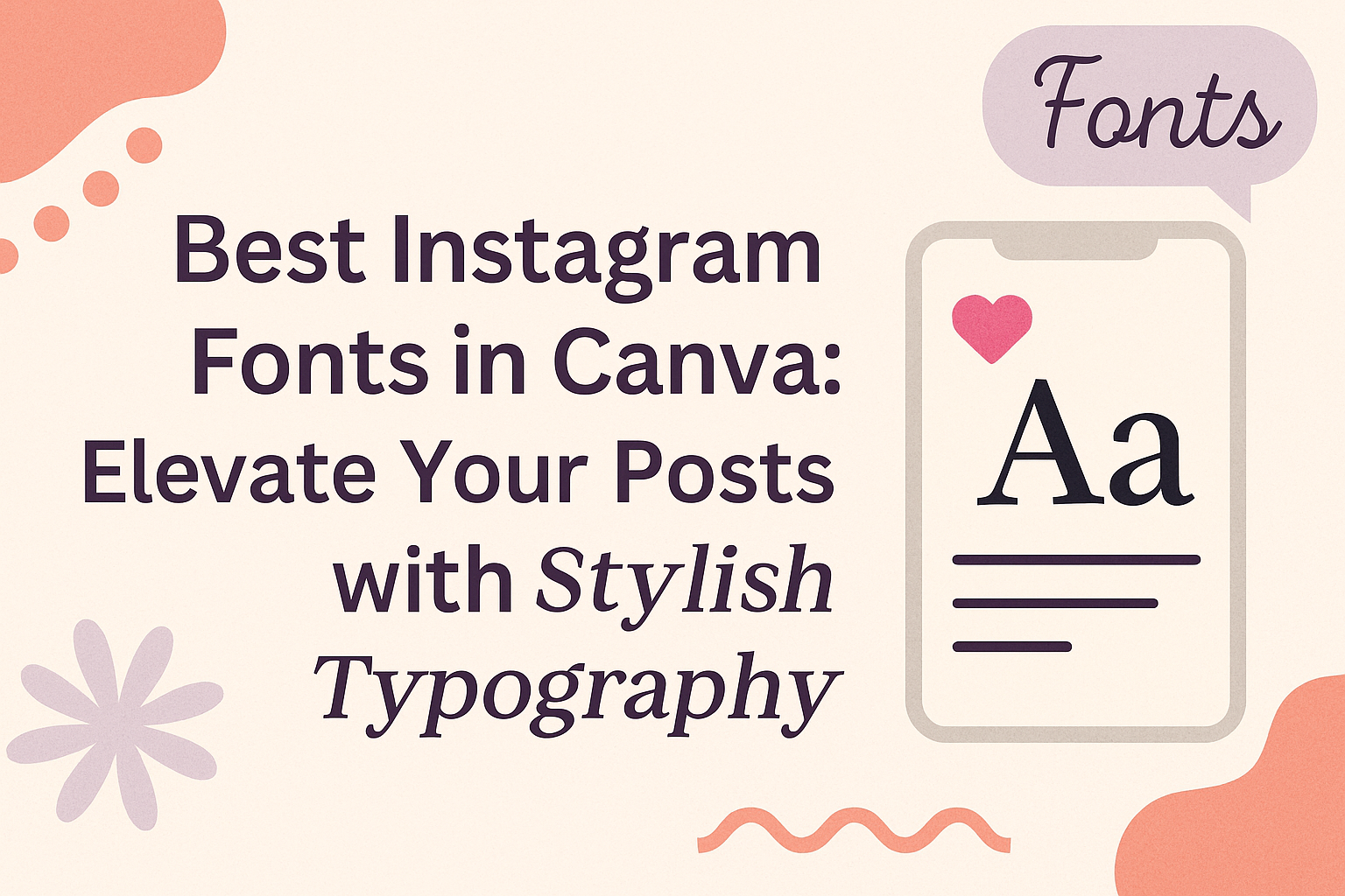
Finding the right font can make a big difference in how posts stand out on Instagram.
The best Instagram fonts in Canva are those that capture attention and convey the right message, helping users express their unique style. With a mix of readability and creativity, these fonts can elevate any visual content.
Canva offers a range of fonts that cater to different aesthetics and themes.
From elegant scripts to bold sans-serifs, choosing the right font can set the tone for a brand’s identity. Exploring these options not only enhances visual appeal but also engages followers more effectively.
In a world where visuals dominate, the font choice can help convey the personality behind the content. With the right guidance, anyone can find the perfect fonts that resonate with their audience and make their posts memorable.
Getting to Know Canva
Canva is a powerful design tool that allows users to create stunning visuals easily. Understanding its features and the role of fonts can enhance any design project he or she undertakes.
The Basics of Canva
Canva is an online graphic design platform.
It provides a user-friendly interface that helps users create designs for various purposes, such as social media, presentations, and marketing materials.
Users can access thousands of templates, images, and elements, making it easy to start a project. He or she can simply drag and drop items onto the canvas. Canva also offers collaborative features, allowing multiple users to work together in real-time.
To use Canva, one needs to create a free account. There are also premium options that unlock additional features and resources. Whether for personal or professional projects, Canva simplifies graphic design for everyone.
Importance of Fonts in Design
Fonts play a crucial role in visual communication. The right font can express a brand’s identity, set the tone of the message, and grab attention.
On Canva, users have access to a wide variety of fonts. Mixing and matching fonts creatively can enhance a design’s appeal. For example, a bold typeface may convey strength, while a script font can evoke elegance.
Using the right font ensures that the text is not only stylish but also legible. It is essential to consider the audience and context when selecting fonts in designs. A thoughtful font choice can impact how the message is received.
Top Instagram Fonts in Canva
Choosing the right font for Instagram posts is essential to create visually appealing content. Bold, elegant, and playful fonts can help convey the mood and message effectively. Here are some top picks across different styles.
Bold and Impactful Fonts
Bold fonts grab attention quickly and work well for headlines or important messages.
Montserrat is a popular choice for its modern appeal. It combines a classic look with a contemporary twist, making posts stand out.
Another great font is Roca One. It is strong and clear, perfect for conveying key information. This font also has several styles, such as Black and Thin, allowing versatility in design.
Lastly, Maragsa is a clear and legible option. Its boldness makes it excellent for logos and announcements, ensuring that messages are easily readable.
Elegant Script Fonts
For a sophisticated touch, elegant script fonts can add charm to any post. Charm is one such font that combines beauty with readability. Its stylish strokes make it suitable for invitations or special announcements.
Julius Sans One also stands out. Although it is a sans-serif font, it has a graceful layout that can enhance quotes or captions. Using it all in caps creates a neat and classy feel.
Another option is Cormorant, which has a classic look. It brings a touch of elegance to any design, making it ideal for brands looking for a refined appearance.
Fun and Playful Fonts
Fun fonts bring a light-hearted vibe and can make posts more relatable. Nove is a favorite for its rounded edges and friendly appearance. It’s perfect for casual settings, such as children’s content.
Squada One provides a geometric style that is both trendy and unique. This font is great for brands that want to stand out with a modern twist.
Lastly, Rochester is a playful script font ideal for social media. It adds a whimsical touch, making narratives and captions engaging.
How to Customize Fonts on Canva
Canva allows users to personalize fonts to fit their unique style. Adjusting sizes, colors, and effects can make text stand out and communicate messages more effectively.
Adjusting Font Sizes and Colors
To change the font size, first, select the text box. On the toolbar at the top, there is a dropdown menu where users can choose various sizes.
The size can be adjusted by clicking on the number or dragging the slider for more control.
For colors, select the text and click the color palette icon. Canva offers a wide range of colors, and users can even create custom shades.
It’s important to pick colors that align with the brand’s identity or theme. Using contrasting colors can make the text more readable.
Adding Effects to Text
Canva provides several text effects to enhance visual appeal.
Users can find options such as shadow, lift, and outline by selecting the text and clicking on the “Effects” button in the toolbar.
For example, adding a shadow can create depth, while an outline can make the text pop against busy backgrounds. Users should experiment with these effects but remember not to overdo it. Simple changes often yield the best results, making text bold but still legible.
Tips for Pairing Fonts
Choosing the right font pairings can enhance the visual appeal of Instagram posts. He or she should focus on combining different font styles and ensuring readability to attract followers.
Combining Serif and Sans-serif
When pairing fonts, mixing serif and sans-serif styles can create a nice contrast.
Serif fonts, like Times New Roman, have small lines at the ends of their letters, giving a classic feel. Sans-serif fonts, such as Arial or Open Sans, appear cleaner and more modern.
A popular combination is using a serif font for headers and a sans-serif for body text. This strategy helps to maintain hierarchy and guides the reader’s eye.
For instance, one can use a bold serif font for post titles and a lighter sans-serif font for captions.
Consider choosing two fonts that complement each other in weight and style. This balance is key for creating a cohesive look on Instagram.
Font Readability on Instagram
Readability is crucial for engaging an audience on Instagram. It’s important that the selected fonts remain clear and easy to read on mobile devices.
Fonts that are too decorative may lose clarity at smaller sizes.
A good rule of thumb is to use a maximum of two or three different fonts in a single post. This prevents the design from becoming chaotic.
Always ensure that the font size is large enough to be read easily. Keeping a contrast between text color and background increases visibility.
Lastly, testing different combinations is beneficial. He or she should view the design on various screens to check readability and overall appeal.