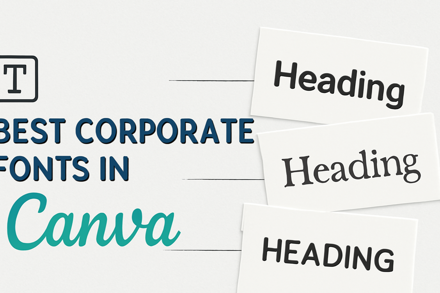
Choosing the right font for corporate designs can greatly impact the professionalism of any project. It helps convey the brand’s identity and ensures the message is clear and engaging.
The best corporate fonts in Canva combine readability, elegance, and style, making them perfect options for business presentations, reports, and marketing materials.
In Canva, there are numerous font choices that can elevate designs. Some favorites include classic serifs that offer sophistication and modern sans-serifs that provide a clean look.
Understanding what makes a font suitable for corporate use can guide anyone in making the best choice for their specific needs.
Understanding Font Selection in Corporate Design
Choosing the right font is essential in corporate design. It not only reflects the brand’s identity but also influences how it is perceived by the audience.
The following points highlight the importance of typography in branding and offer guidance on selecting the right font.
The Role of Typography in Branding
Typography plays a significant role in shaping a brand’s image. It helps convey the personality and values of a business.
For instance, a modern sans-serif font might suggest innovation, while a classic serif font can evoke trust and tradition.
Fonts also impact readability. A clear, easy-to-read font ensures that the message is delivered effectively.
Companies often select fonts based on their target audience. For example, tech firms might prefer contemporary fonts, while law firms might lean towards more traditional styles.
Criteria for Choosing the Right Font
When selecting a font for corporate design, several criteria should be considered:
- Readability: The font must be easy to read across different mediums.
- Versatility: It should work well in various sizes and formats.
- Brand Fit: The font should align with the brand’s personality and industry.
- Pairing Potential: Consider how the font pairs with other fonts for a cohesive look.
Testing font combinations can reveal what works best. Tools like Canva provide useful insights into font pairing.
A mix of bold and lighter fonts can enhance the overall design, making it more visually appealing.
Top Picks for Corporate Fonts in Canva
Choosing the right font is essential for creating a strong corporate identity. Here are some of the best options available in Canva that offer a mix of professionalism and style.
Classic Serif Fonts
Serif fonts are known for their timeless appeal. They often provide a sense of tradition and reliability.
-
Georgia: This font combines readability with elegance. It’s perfect for online content, making it a favorite for websites and blogs.
-
Merriweather: Known for its versatility, Merriweather works well in both small and large sizes. It’s a fantastic choice for body text, especially in printed materials.
-
Playfair Display: With its high contrast and distinctive style, Playfair Display is ideal for headings. It adds a touch of sophistication to any design.
Sleek Sans-Serif Fonts
Sans-serif fonts are clean and modern. They give a fresh look to corporate materials.
-
Avenir: This versatile font features a contemporary design. It’s suitable for both print and digital media, making it widely used in many corporate settings.
-
Poppins: Poppins offers geometric simplicity and usability. Its friendly curves make it great for body text and easy to read on various platforms.
-
Saira Condensed: This font features a range of weights and widths. It’s perfect for bold headings and clear subtext in professional documents.
Contemporary Script Styles
Script fonts add personality and warmth. They can soften the corporate feel while still being professional.
-
Alex Brush: This elegant font is great for invitations or presentations. Its flowing style captures attention without overwhelming the content.
-
Dancing Script: With its bouncy style, Dancing Script adds a cheerful touch. It works well in branding and marketing materials, where a friendly vibe is essential.
-
Pacifico: This fun and casual script font is excellent for logos or creative projects. It brings a relaxed feel while maintaining readability.
Font Pairing Strategies
Choosing the right font pairings can enhance a design’s clarity and appeal. Effective strategies involve using complementary fonts and creating contrast, which helps maintain a professional look in corporate materials.
Complementary Pairings
Complementary pairings involve fonts that harmonize well together. These fonts share similar characteristics but differ in style. For example, a serif font can be paired with a sans-serif font for a balanced look.
Examples of complementary pairings:
- EB Garamond (serif) with Montserrat (sans-serif)
- Playfair Display (serif) with Open Sans (sans-serif)
These combinations help create a cohesive design. They allow the headlines to stand out while the body text remains readable. It is essential to maintain font size and weight consistency to enhance readability.
Contrast in Font Pairings
Contrast in font pairings uses fonts that differ significantly, drawing attention and adding visual interest. This strategy can create a dynamic look when done correctly.
Best practices for contrast:
- Use a bold display font for headings, like Bebas Neue, paired with a clean, simpler body font like Roboto.
- Combine a cursive font, such as Pacifico, with a straightforward sans-serif font like Lato.
Contrast should not be overwhelming. Instead, it should guide the viewer’s eye naturally through the content. Maintaining visual balance is key to a successful design.
Licensing and Usage Rights
When using fonts in Canva, understanding licensing and usage rights is crucial. Canva provides a mix of free and premium fonts, each with specific rules about how they can be used. Knowing these rules helps users avoid potential issues.
Understanding Canva’s Font Licenses
Canva offers two main types of font licenses: Free and Pro.
- Free Fonts: Anyone can use these fonts without cost. They are accessible to all users and can be used in various projects, both online and print.
- Pro Fonts: These are exclusive to Canva Pro subscribers. Users must have a subscription to access and use these fonts.
It’s essential to check the license type before selecting a font for a project. This ensures that users comply with the necessary guidelines and avoid restrictions on their designs.
Commercial vs. Personal Use
When it comes to usage, knowing the difference between commercial and personal use is important.
- Personal Use: Users can freely use fonts for projects that are not for profit. This can include personal invitations, social media posts, or casual graphic design work.
- Commercial Use: This applies to projects intended for profit, like marketing materials or products sold to customers. Users must ensure they have the right licenses for fonts used in commercial projects to avoid legal issues.
To summarize:
- Personal use is generally more flexible.
- Commercial usage will require compliance with licensing agreements.
Optimizing Legibility and Readability
Optimizing legibility and readability is essential for effective communication. Two critical factors to consider are font size and spacing, as well as color and background choices. These elements can significantly impact how easily content can be read and understood.
Font Size and Spacing
Choosing the right font size is crucial. A minimum size of 12pt is recommended for body text. This size helps ensure clarity, especially for online content.
Line spacing is another important aspect. Adequate spacing between lines can make text easier to read. A line height of 1.5 times the font size is often ideal.
Margins also contribute to legibility. Proper margins around text create a comfortable reading area. Keeping margins consistent across documents can help maintain a professional look.
Color and Background Considerations
Color choice dramatically affects readability. High contrast between text and background is key. For example, dark text on a light background is easier to read than light text on a dark background.
Avoid using too many colors. Stick to a simple palette for a clean look.
It’s also important to consider color blindness. Using patterns or textures can enhance readability for colorblind users.
Test the selected colors to ensure they work well together. This ensures that the text remains clear and accessible on different screens and devices.
Incorporating Brand Personality
Incorporating brand personality into font choices helps businesses connect with their audience. This can enhance brand recognition and loyalty while making designs more appealing.
Choosing Fonts That Reflect Brand Identity
Choosing the right fonts is crucial for conveying a brand’s identity. For a modern brand, sleek sans-serif fonts send a clean and innovative message, while serif fonts can suggest tradition and reliability. Quirky, fun fonts might appeal to a younger audience, reflecting creativity and playfulness.
When selecting fonts, consider the emotions they evoke. Ask questions like:
- What feelings should the brand inspire?
- Who is the target audience?
Creating a shortlist of fonts that resonate with these values can help narrow down the best choices.
Tools like Canva allow users to experiment with font pairings. They can also preview how fonts look together. This practice aids in finding the right combination that reflects the brand’s true voice.
Consistency Across Various Mediums
Consistency is key when using fonts across different mediums. Whether it’s a website, social media, or printed materials, the same fonts should be used to strengthen brand identity. This creates a cohesive look that customers recognize instantly.
To ensure consistency, businesses can:
- Use a brand guidelines document that specifies font choices.
- Set default fonts in design tools like Canva for easy use across teams.
When teams work with brand fonts, it helps maintain a professional appearance. Employees should be trained to use these fonts correctly in all marketing materials. This attention to detail enhances the brand’s overall image and message.
Canva Pro Exclusive Fonts
Canva Pro offers a selection of exclusive fonts that enhance design options. These fonts provide a unique flair for branding, marketing, and various creative projects. Here, readers can learn about the advantages of a Canva Pro subscription and the variety of exclusive fonts available.
Advantages of Canva Pro Subscription
Subscribing to Canva Pro unlocks several benefits. First, users gain access to a wider array of fonts, including unique styles not available in the free version. This makes it easier for designers to find the perfect typeface that aligns with their brand identity.
Additionally, Canva Pro allows for unlimited folders to organize designs. It also offers features like the Magic Resize tool, enabling quick adjustments for different formats.
The combination of exclusive fonts and enhanced organizational tools supports a more efficient design process.
Exploring Exclusive Font Choices
Canva Pro presents a variety of exclusive fonts. Some options include Avenir, a sleek sans-serif font known for its modern feel.
Users can also find fonts like Prisma, which features a distinctive geometric design.
- Gotham: A bold, professional font suitable for headings.
- Cinzel: Offers a classic, elegant touch for formal designs.
These exclusive font selections can elevate projects, ensuring they stand out.
By utilizing these fonts, designers can create visually appealing materials that capture attention and convey the desired message effectively.