Didone fonts are known for their elegant and timeless style, making them a favorite among designers.
The best Didone fonts in Canva offer a stunning way to elevate any project, whether for print or digital use.
With their high contrast and sharp serifs, these fonts create a sophisticated look that captures attention and enhances readability.
Many people appreciate how Didone fonts can blend classical charm with modern design elements. This versatility makes them suitable for a variety of applications, from invitations to branding.
Designers can easily find both classic and contemporary options within Canva, allowing them to express their creativity without limitations.
Exploring the top choices available in Canva can inspire new ideas and elevate design projects.
With a range of styles to choose from, individuals can discover the perfect Didone font that aligns with their vision and adds a touch of elegance to their work.
Understanding Didone Fonts
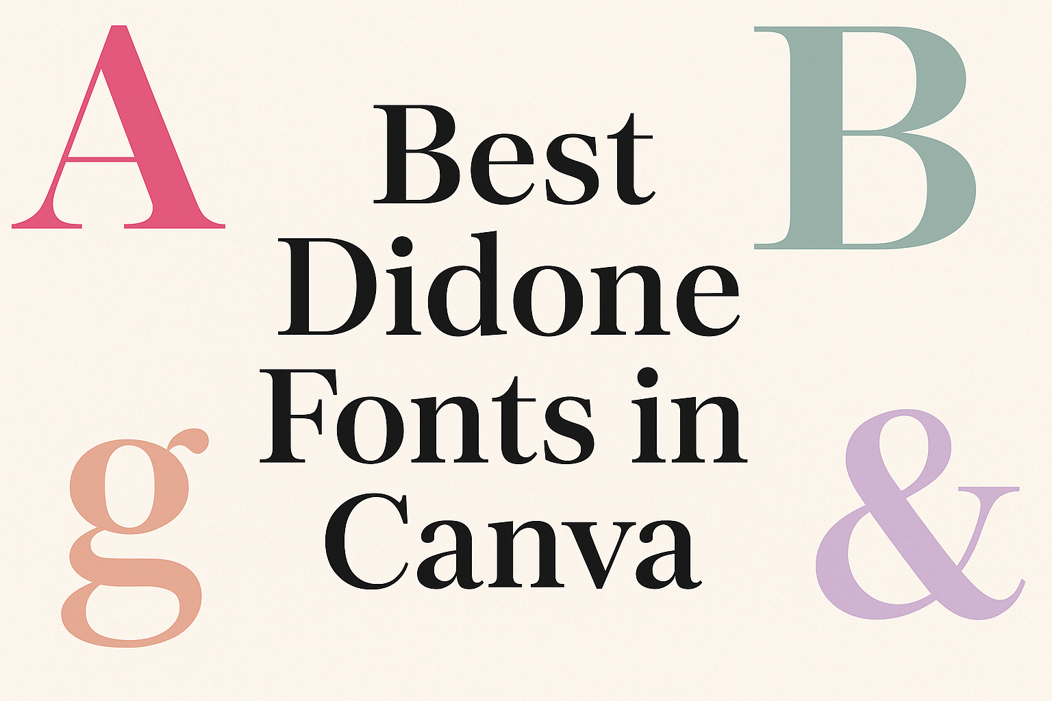
Didone fonts are a group of serif typefaces known for their elegant and modern appearance. They are characterized by high contrast between thick and thin strokes.
This design style reflects a blend of classic influences with contemporary elements.
History of Didone Fonts
Didone fonts originated in the late 18th century with designers like Giambattista Bodoni and Firmin Didot. These pioneers took inspiration from earlier serif fonts but introduced a more refined and geometric style.
Bodoni’s work focused on clarity and balance, while Didot emphasized elegance. These fonts quickly became popular in print, especially in high-end publications and fashion industries.
Over time, Didone fonts have evolved but still maintain their timeless feel, making them a favorite among designers.
Characteristics of Didone Fonts
Didone fonts stand out for their distinct features. Key traits include:
- High Contrast: There’s a sharp difference between thick and thin lines, giving a striking look.
- Geometric Shapes: The letters often have a clean, modern appearance due to their geometric influences.
- Vertical Stress: Letterforms are usually upright, which enhances their readability.
These characteristics contribute to their elegance, making them suitable for fashion, branding, and headlines. Didone fonts provide a sense of sophistication and style, often paired with sans serif fonts for contrast.
Why Choose Didone Fonts for Your Canva Designs
Didone fonts bring a unique style to designs, combining elegance with clarity. Their striking appearance makes them popular for various projects in Canva. Here are key reasons why they stand out.
Elegance and Style
Didone fonts are known for their sophisticated appearance. With their high contrast between thick and thin strokes, they add a touch of class to any design.
These fonts work well in both headings and body text. Designers often use them for invitations, branding, and editorial layouts. Their distinct style enhances visual appeal.
In a world where first impressions count, Didone fonts can elevate a design. The sleek look creates a sense of professionalism and attention to detail. Thus, they are a preferred choice among many designers looking to impress their audience.
Readability and Versatility
While Didone fonts are stylish, they remain highly readable. Their clear structure ensures that messages come across effectively.
These fonts adapt well to various sizes and contexts. Whether used for digital screens or printed materials, they maintain legibility.
Moreover, Canva offers numerous Didone font options. This range allows designers to find the perfect fit for their projects. The versatility adds to the overall effectiveness of the design.
Impact on Audience Perception
Choosing the right font can significantly impact how an audience perceives a brand. Didone fonts convey a sense of luxury and elegance, making them ideal for upscale projects.
When used effectively, these fonts can create an emotional connection with viewers. They signal quality and refinement, helping brands stand out in competitive markets.
Designers who want to communicate sophistication often turn to Didone fonts. Their unique characteristics help portray a brand’s values and enhance its identity. By using Didone fonts, designers can leave a lasting impression on their audience.
Top Didone Fonts Available in Canva
Canva offers a variety of elegant Didone fonts. Each of these fonts has unique features and styles, making them perfect for different design needs. Here are some of the top choices:
Bodoni
Bodoni is a classic Didone typeface known for its striking contrast between thick and thin strokes. It features geometric shapes and refined serifs, giving it a timeless appeal.
Designers often use Bodoni for headlines, titles, and invitations. Its elegant style enhances any project, from modern to vintage themes.
Bodoni’s versatility makes it suitable for both print and digital use. In Canva, it can be easily sized and styled to fit any design project. Many users appreciate its readability and aesthetic charm.
Didot
Didot is another iconic font in the Didone family, recognized for its sophisticated look. It has a high contrast between horizontal and vertical lines, which adds to its elegance.
This font works well for fashion designs, branding, and editorial titles.
In Canva, Didot stands out in both large and small sizes. It complements various styles and colors, making it a popular choice among designers. The chic appearance of Didot makes it perfect for conveying luxury and refinement in any design.
HTF Didot
HTF Didot is a modern twist on the traditional Didot font. It maintains the classic elements while bringing a contemporary feel.
This font is perfect for creative projects that require a touch of sophistication without losing modernity.
In Canva, HTF Didot is easy to use and versatile. It works beautifully for logos, invitations, and more. Designers will find that HTF Didot adds a unique flair to their layouts, ensuring their work stands out.
ITC Fenice
ITC Fenice offers a fresh perspective on Didone fonts. This typeface has a softer, rounder structure, giving it a unique character.
ITC Fenice is ideal for branding and advertising, providing clarity and elegance.
In Canva, it shines in both large headers and smaller text. Designers can use it across various applications, from web design to printed materials. Its distinctive look helps create visually appealing graphics that capture attention.
Ambroise
Ambroise combines traditional Didone traits with modern aesthetics. This font has playful curves and a stylish appearance, making it suitable for both casual and formal designs.
Using Ambroise in Canva is simple, and it suits many design themes. From invitations to posters, this font brings a fresh feel to any project. Its unique personality helps designers express their creative vision while maintaining readability.
Design Tips for Using Didone Fonts in Canva
Using Didone fonts in Canva can enhance design projects. These elegant fonts work well in pairing, establishing hierarchy, and utilizing color effectively. These tips can help anyone create polished and professional designs.
Pairing with Other Fonts
Didone fonts often feature high contrast and thin serifs, making them sophisticated choices. When pairing with other fonts, it’s important to choose complementary styles.
- Serif Fonts: Pairing Didone with another serif font can create harmony. This works well for print materials like invitations or brochures.
- Sans-Serif Fonts: Combining Didone with a sans-serif font can provide a modern touch. This is especially useful for websites or social media graphics.
- Script Fonts: A cursive or script font can balance Didone’s formal nature. Use these for emphasis in headings or highlighted text.
Experiment with sizes and weights to find the right balance in your design.
Hierarchy and Emphasis
Establishing hierarchy helps audiences quickly grasp the content. Didone fonts can create a striking visual presence when used strategically.
- Headlines: Use larger sizes for headlines in Didone fonts. This captures attention immediately.
- Subheadings: For subheadings, consider a lighter weight or size. This allows the eye to flow naturally down the page.
- Body Text: Instead of using Didone for body text, opt for a simpler font. This makes the main content easier to read.
Remember to keep emphasis consistent across designs to avoid confusion.
Color and Contrast
Color plays a key role in how Didone fonts are perceived. Ensuring good contrast is crucial for readability.
- Background Color: Light backgrounds with dark text enhance visibility. This is especially true for Didone fonts.
- Accent Colors: Use color for headings or important text. This draws attention without overwhelming the design.
- Avoid Busy Patterns: Pairing Didone fonts with busy backgrounds can reduce readability. Keep backgrounds simple to maintain focus on the text.
Using color thoughtfully helps highlight important information while keeping designs clean.
Creative Ways to Incorporate Didone Fonts into Your Projects
Didone fonts offer elegance and sophistication, making them perfect for various design projects. They can enhance branding, magazine layouts, invitations, and marketing materials. Below are some creative ways to use Didone fonts effectively.
Branding and Logo Design
Incorporating Didone fonts in branding helps businesses stand out. Their high contrast and refined style convey a sense of luxury.
Using Didone fonts in logos, such as Bodoni or Didot, lends an upscale feel. They work well for fashion brands, beauty products, and upscale services. When designing a logo, it’s important to consider the font’s readability at different sizes. Pairing Didone fonts with simpler fonts can create a balanced look.
For brand identity, consistency is key. Choosing specific Didone styles for all branding materials ensures a cohesive message. This includes business cards, packaging, and website headers.
Editorial and Magazine Layouts
Didone fonts are great for editorial designs, offering a classic yet modern appeal. They shine in magazine headlines and articles, drawing readers in with their refined appearance.
When designing a magazine cover, bold Didone fonts stand out effectively. They can be used for main titles while a contrasting sans-serif font can provide clarity in body text. This combination aids readability and keeps the layout visually appealing.
Additionally, Didone fonts often work well with imagery. A strong visual paired with an elegant font enhances the overall aesthetic. Designers should consider spacing and alignment to ensure that the text flows naturally with the visuals.
Wedding and Event Invitations
Didone fonts add a touch of elegance to wedding and event invitations. Their sophisticated style reflects a formal occasion, making them an ideal choice for such projects.
For wedding invites, lettering like Camila provides a delicate touch. It creates a beautiful contrast with simple backgrounds, enhancing the overall design. Pairing it with muted color palettes makes the text pop elegantly.
In event invitations, Didone fonts can be used for both headers and body text. Combining a bold Didone font for the event name with a lighter version for details creates hierarchy. This ensures that important information is easily accessible to guests.
Advertising and Marketing Collaterals
Didone fonts are effective in advertising, helping brands communicate their identity clearly. They can evoke emotions and attract attention when used correctly.
In print ads, using a Didone font for the main headline captures attention immediately. Brands can complement this with a clean sans-serif for additional information. This helps maintain focus on the main message while keeping it easy to read.
For online marketing materials, Didone fonts can enhance social media graphics and email newsletters. Using them strategically in CTAs or highlights can effectively guide viewer engagement. Bright colors against Didone fonts will ensure the message stands out in crowded feeds.
Best Practices for Typography in Canva
Using typography well in Canva can greatly enhance any design. Achieving a polished look involves focusing on consistency and prioritizing legibility. Below are key practices to keep in mind.
Consistency is Key
Maintaining a consistent typography style throughout a design is crucial. This means using the same font choices, sizes, and colors for similar elements.
Tips for consistency:
- Create a style guide that outlines font choices.
- Limit the number of fonts used to two or three. This helps avoid a cluttered look.
Using consistent typography not only strengthens the visual identity but also makes the material appear more professional.
Legibility Over Decorative
While decorative fonts can be eye-catching, legibility should always come first. If the audience struggles to read the text, the message may get lost.
Best practices for ensuring legibility:
- Choose fonts with clear letterforms, especially for smaller sizes.
- Avoid using overly ornate typefaces in body text. Instead, save them for display or accent use.
Proper contrast between text and background is also vital. A high contrast makes text easier to read. For instance, dark text on a light background or vice versa can improve clarity.
By focusing on these aspects, designs in Canva can effectively communicate messages and engage viewers.
How To Access and Use Didone Fonts in Canva
Accessing Didone fonts in Canva is simple and fun.
Users can start by opening Canva and either creating a new design or selecting an existing one.
To add text, they should click the Text button on the side panel. Once there, they can see options like “Add a heading” or “Add a subheading.”
This is where they can search for Didone fonts. Canva provides a variety of Didone fonts. Some popular ones include:
- Bodoni
- Didot
- Playfair Display
To find these fonts, users can type the font name in the search bar. They can also browse through the Font options to discover new styles.
After selecting a Didone font, users can customize text size, color, and spacing. They can also add effects like shadow or lift to make the text stand out.
For those who want to save favorite fonts for future projects, Canva allows users to create a brand kit. This feature helps keep all preferred fonts in one place for easy access.
Customizing Didone Fonts for Unique Designs
Customizing Didone fonts can add a personal touch to any design project.
By incorporating textures and layering with shapes, designers can create eye-catching typography that stands out.
Adding Custom Textures
Textures can enhance the elegance of Didone fonts. They add depth and interest, transforming plain text into a stunning visual element.
Designers can choose from a variety of textures, including:
- Paper: Mimics a classic look and feels natural.
- Metal: Provides a sleek, modern touch.
- Wood: Adds warmth and character.
To add a texture in Canva, select the text and use the “Effects” panel. Then, choose “Textures” to apply the preferred style.
Custom textures make fonts unique, elevating the overall design. A well-chosen texture can also convey the mood and theme of the project, helping to grab the viewer’s attention.
Layering with Elements and Shapes
Layering shapes under Didone fonts can create striking contrasts and enhance visual appeal.
Using geometric shapes or abstract elements allows fonts to pop.
Here are some tips for effective layering:
- Use Contrasting Colors: Bright colors can make darker text stand out.
- Incorporate Shapes: Circles or rectangles can frame text, drawing focus.
- Experiment with Opacity: Fading a shape can provide a subtle background that complements the text.
In Canva, designers can easily create layers by dragging shapes to the canvas and positioning them behind the text.
This technique adds dimension and can help convey the message more effectively.