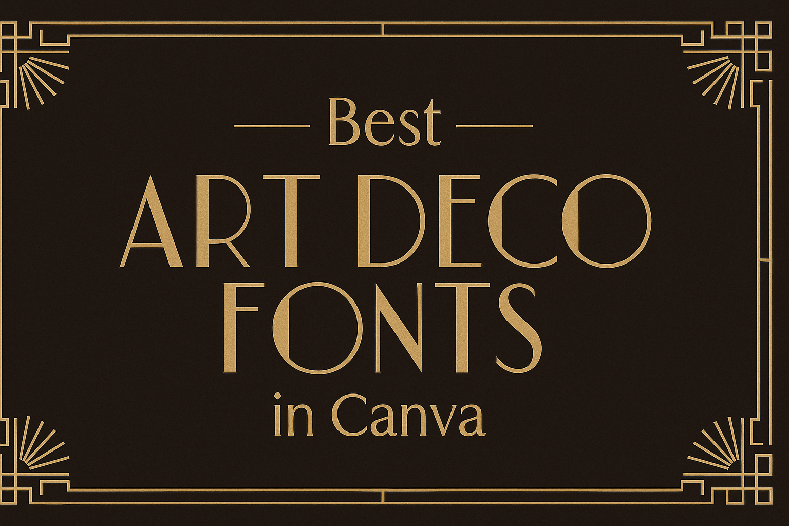
Art Deco fonts bring a touch of elegance and nostalgia to any design project. These fonts, inspired by the lavish styles of the 1920s and 30s, are perfect for those looking to create visual pieces with a hint of sophistication.
Canva offers a range of stunning Art Deco fonts that can enhance any modern design. This makes it easy for anyone to capture the allure of this iconic style.
Choosing the right font can be daunting, especially with so many options available. From bold and geometric to sleek and stylish, Art Deco fonts in Canva cater to various tastes and projects.
Designers and non-designers alike will find that using these fonts can elevate their work, adding character and flair that stand out.
In this blog post, readers will discover some of the best Art Deco fonts available in Canva. Whether they are working on invitations, posters, or branding elements, these selections will provide inspiration and guidance for creating captivating designs.
Exploring the Charm of Art Deco Fonts
Art Deco fonts carry a unique blend of elegance and modernity. Their design captures the spirit of a vibrant cultural movement, making them popular in various creative projects.
History of Art Deco Typography
Art Deco emerged in the 1920s and 1930s as a reaction to the ornate styles of the previous era. It reflects the excitement of the Roaring Twenties and the advancements in technology and design.
This typography style incorporates influences from various sources such as Jazz Age culture, Cubism, and Surrealism. Designers sought to express optimism and glamour, using bold shapes and geometric patterns.
Notable examples include spectacular buildings and iconic designs of the time. The aesthetic remains influential, as it has been revived in contemporary art and design, establishing its enduring appeal.
Features of Art Deco Fonts
Art Deco fonts are known for their striking characteristics. They often feature bold lines, geometric shapes, and sharp angles.
Many of these fonts have a vintage feel, but they also present modern elements that make them adaptable. They are generally sans-serif, providing a clean and stylish look.
Common features include:
- Thick and thin contrast: Adds depth and visual interest.
- Distinctive ligatures: Enhance creativity in design.
- Decorative elements: Often inspired by nature and machinery.
These traits make Art Deco fonts suitable for branding, posters, and more—perfect for those looking to evoke a sense of luxury and sophistication.
Top Art Deco Fonts in Canva
Art Deco fonts add a touch of elegance and style to any design. Here are some popular choices available in Canva that stand out due to their unique characteristics.
Metropolis
Metropolis is a prominent sans-serif font that captures the essence of the Art Deco movement. Designed by Ludwig Goller in 1927, it features geometric shapes and clean lines that reflect the glamour of the 1920s.
This font is versatile, suitable for various designs like posters, invitations, and branding. What makes Metropolis special is its ability to create a strong impact while maintaining readability.
Artists often use it to evoke a sense of sophistication in modern layouts. Its clean appearance highlights important elements without being overwhelming, making it a favorite among designers looking for a stylish font.
Atlantis
Atlantis is another striking Art Deco font that can elevate design projects. This font is known for its fluid lines and bold presence, making it eye-catching.
Designed with elegance in mind, Atlantis blends geometric shapes with artistic flair. It is perfect for headlines and logos, where it can create visual interest.
Using Atlantis can help convey a sense of luxury, making it ideal for projects related to fashion, beauty, or upscale events. The font’s distinctive character helps catch the viewer’s eye and adds a unique touch to any artwork.
Park Lane
Park Lane stands out with its unique combination of classic and modern styles. This font features sharp angles and smooth curves that reflect the Art Deco aesthetic beautifully.
Designers appreciate Park Lane for its versatility. It works well in a variety of applications, from elegant invitations to striking social media graphics.
This font also excels in branding, as it communicates sophistication and exclusivity. Using Park Lane can set a project apart, giving it a polished look that draws attention and engages viewers effectively.
Using Art Deco Fonts in Your Designs
Art Deco fonts can bring a unique and stylish touch to a variety of designs. They evoke a sense of elegance and vintage charm that can elevate projects. It’s important to know how to effectively use these fonts to achieve the desired effect.
Creating a Vintage Feel
To create a vintage atmosphere, Art Deco fonts shine through their geometric shapes and bold lines. Fonts like Limelight and Lempicka can instantly transport viewers to the 1920s.
When using these fonts, consider applying them in headings or logos where their impact is strongest. Pairing them with muted colors or art deco patterns enhances the vintage look. Ornamental elements, like frames or borders, can complement the fonts, making the text pop even more.
Modern Design with a Twist
Art Deco fonts can also be used in contemporary designs to add an unexpected twist. Fonts such as Metropolis offer a clean, streamlined look that fits well with modern aesthetics.
They can be utilized in websites, social media graphics, or packaging to blend the old with the new. Utilizing a bold Art Deco font for titles while keeping body text more minimalist can create a balanced design.
Incorporate modern colors, such as pastels or metallics, to refresh the classic look, making it relevant for today’s audience.
Combining Fonts
Mixing Art Deco fonts with other styles can create a dynamic visual experience. For instance, pairing a sans-serif font with an Art Deco display font can maintain legibility while keeping the design interesting.
It’s best to choose fonts that share similar characteristics, like line thickness or geometric elements, to ensure they complement each other.
A suggested combination could be Mak for body text with a bold Art Deco font for headings. This creates a clear hierarchy in the design, making important information stand out while maintaining a cohesive look.
Tips for Choosing the Right Art Deco Font
Selecting the right Art Deco font can greatly enhance a design project. Key considerations include how the font pairs with other text, ensuring it remains readable, and making sure it fits the overall theme of the design.
Font Pairing Insights
When choosing an Art Deco font, pairing is essential. A decorative font can shine as a headline but may overwhelm in body text.
For balance, combine a bold font like Limelight, which has thick lines, with a simpler sans-serif font. This way, the design remains visually appealing without competing elements.
Consider using Badhorse for titles paired with a clean, modern font for supporting text. This mix maintains clarity while adding a unique flair.
Readability and Legibility
Readability is crucial in any design. Art Deco fonts often have decorative elements that can affect legibility, especially in smaller sizes.
For body text, stick with fonts known for clarity, like Rockwell. It balances the vintage style without sacrificing ease of reading.
Make sure to test the font size. Thicker fonts may look fantastic at larger sizes but can become difficult to read in smaller formats. Always prioritize clarity to keep the message strong.
Complementing Your Design’s Theme
The chosen font should enhance the theme of the design. Art Deco fonts evoke a sense of luxury and nostalgia.
When relating to a vintage theme, styles like Bogart Deco can effectively capture that classic feel. For modern designs, a cleaner Art Deco font might work better.
Consider the project’s goal. Is it for a wedding invitation or a modern website? Selecting the right font is vital for meeting those themes. A little context can help choose wisely!
Customizing Fonts in Canva
Canva offers several ways to customize fonts, making designs unique and tailored to individual needs. Adjusting colors, sizes, spacing, and adding effects can enhance the overall look of any project. Here are some important aspects to consider when customizing fonts in Canva.
Altering Font Colors
Changing the font color can dramatically affect the mood and readability of a design. Canva provides a simple color palette that allows users to choose from a wide range of hues.
To alter font colors:
- Select the Text Box: Click on the text box containing the font you want to change.
- Choose Color: In the toolbar, find the text color option represented by a letter “A” with a color bar underneath.
- Pick Your Color: Click on it and select a color from the palette or use a custom color code.
Using contrasting colors can make text stand out, while similar shades may create a softer look. Experimenting with different colors can help convey the right message visually.
Adjusting Font Size and Spacing
Adjusting font size can improve readability and impact. Canva allows users to easily modify the size of any font to fit their design needs.
To adjust size and spacing:
- Select the Text: Click on the text box to highlight the font.
- Use the Size Slider: Move the size slider in the toolbar or enter a specific size number for precision.
- Modify Spacing: Use the letter spacing and line spacing options to create the desired effect.
Tighter spacing can create a compact look, while increased spacing can enhance elegance and clarity. Finding the right balance is key for effective design.
Adding Effects
Adding effects to fonts can elevate a design and make it more eye-catching.
Canva offers various text effects such as shadows, outlines, and highlights.
To add effects:
- Select the Font: Click on the text to modify.
- Navigate to Effects: In the toolbar, choose the “Effects” button, which opens additional options.
- Choose Your Effect: Select from drop shadows, lifted text, or outline effects to enhance visibility and style.
These effects can give text depth and character, making it stand out on the page.
It’s advisable to use them sparingly to maintain clarity and emphasis.