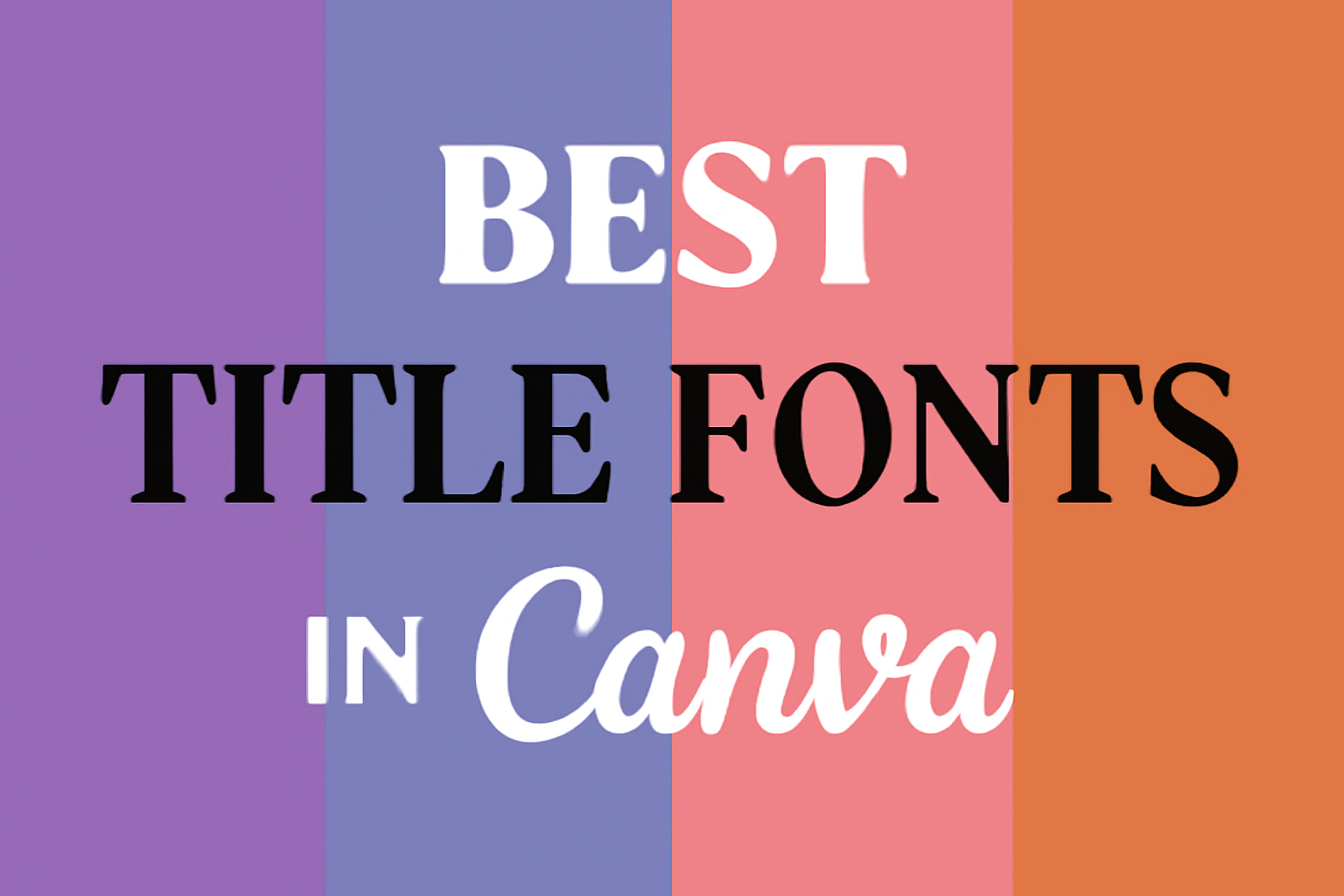
When creating stunning designs in Canva, the choice of font can make a big difference.
The best title fonts in Canva combine style and readability, helping to grab attention and convey a message effectively.
With a variety of fonts to choose from, finding the right one for a specific project can be overwhelming.
Many designers seek options that enhance the visual appeal of their titles. Fonts like Josefin Sans and Lovelace offer a modern twist while remaining easy to read. These fonts can elevate a design, making it more engaging and professional.
This blog post aims to guide readers through some of the top title fonts available in Canva, showcasing their unique features and ideal uses. By the end, creators will be equipped with the knowledge to choose the perfect font for their next project.
Understanding Font Psychology
Fonts play a significant role in how designs communicate with audiences. The right font can evoke specific emotions and reinforce brand identity. Recognizing these effects helps in making informed design choices.
Emotional Impact of Fonts
Different fonts can trigger various emotions and responses. For instance, serif fonts often convey tradition and reliability. In contrast, sans-serif fonts tend to appear more modern and approachable.
- Playful Fonts: Fonts like Comic Sans create a fun and informal vibe, suitable for children’s products.
- Elegant Fonts: Scripts like Pacifico evoke feelings of sophistication and romance, perfect for weddings or luxury brands.
These emotional connections influence how the audience perceives a brand or message, making font choice crucial for effective communication.
Font Styles and Brand Personality
Font styles can greatly affect how a brand is seen. A brand’s personality can be highlighted through its typeface selection.
- Professional: Fonts that are clean and straightforward, like Montserrat, fit corporate settings well.
- Creative: Whimsical fonts such as Oregano showcase creativity and fun, ideal for artistic brands.
Choosing a font aligned with the brand’s voice helps to create a cohesive image. This visual consistency makes it easier for customers to recognize and trust the brand over time.
Popular Fonts in Canva
Choosing the right font can bring designs to life. Here are some notable font choices in Canva that cater to different styles and needs.
Sans Serif Favorites
Sans serif fonts are known for their clean and modern look. They are often used in professional and corporate settings.
-
Arial: This versatile font is widely recognized and suitable for various applications. It provides clarity and is easy to read.
-
Roboto: Featuring a geometric yet friendly style, Roboto works well for both headings and body text.
-
Montserrat: This font combines classic and contemporary features, making it a perfect choice for bold titles.
These fonts improve readability while maintaining a simple aesthetic. They are excellent for branding and promotional materials.
Serif Selections
Serif fonts have small lines or extensions at the ends of letters. They are often associated with tradition and elegance.
-
Times New Roman: A classic font that is widely used for formal documents. Its timeless feel makes it a favored choice.
-
Merriweather: This font is designed for easy reading on screens. Its balanced structure helps it stand out in digital designs.
-
Noto Serif: Known for its friendly appearance, Noto Serif works well in a wide range of projects, from websites to print materials.
Serif fonts create a more formal tone, making them ideal for professional presentations or academic papers.
Decorative Delights
Decorative fonts are playful and designed for impact. They can add personality and flair to any project.
-
Pacifico: This script font has a relaxed vibe, perfect for a casual atmosphere. It’s a great choice for invitations or posters.
-
Oregano: With its whimsical curves, Oregano brings a touch of fun. It works well for creative pieces like greeting cards.
-
Bebas Neue: A bold and condensed font, Bebas Neue attracts attention. This makes it suitable for striking headlines.
Decorative fonts should be used sparingly to avoid overwhelming the viewer. They excel in projects where creativity is key.
How to Choose the Right Font
Choosing the right font is essential for effective design. A font can convey a message, attract attention, or set the mood for any project. Understanding the relationship between your message and audience will help narrow down the perfect font.
Considering Your Message
When selecting a font, it’s crucial to think about the message it will convey. Different fonts can evoke various emotions and meanings. For instance, serif fonts like Times New Roman often look more traditional and formal.
In contrast, sans-serif fonts like Arial feel modern and clean.
Consider the context of your design. A playful font works well for children’s events, while a more straightforward font suits professional documents.
Additionally, font weight and style can influence perception. Bold fonts attract attention, while italic styles can indicate emphasis or style. Using fonts that align with your message ensures your audience understands and engages with your content.
Target Audience Considerations
Understanding the target audience is vital when choosing a font. Different demographics respond to various styles. For a younger audience, trendy or playful fonts may resonate better. For a mature audience, more classic fonts might appeal to their tastes.
Research the preferences of your audience by considering their interests. For example, tech-savvy individuals might prefer sleek, sans-serif fonts. On the other hand, an audience interested in art might appreciate more creative typefaces.
Moreover, readability is essential. Ensure the chosen font is easy to read on various devices. Testing the font across platforms will help ensure clear communication with the audience. Choosing the right font based on the target audience enhances overall design effectiveness.
Font Pairing Principles
Font pairing is crucial for creating visually appealing designs. Understanding how to combine fonts can enhance the message and style of a project. It involves knowing how to select fonts that work together harmoniously or create interesting contrasts.
Complementary Pairings
Complementary pairings involve using fonts that have similar styles to create a cohesive look. This could mean pairing a serif font with another serif font or matching a sans-serif with a similar sans-serif. The key is maintaining readability while adding visual interest.
Tips for Complementary Pairings:
- Choose Fonts from the Same Family: Fonts within the same family often have matching characteristics, which can create a unified design.
- Size Variation: Use different sizes to create hierarchy. For example, a large, bold title paired with a smaller, lighter body text can guide the reader through the content.
- Limit to Two Fonts: Sticking to two complementary fonts helps prevent a cluttered look and keeps the focus on the message.
Contrast in Typography
Contrast in typography focuses on using different font styles to create visual interest. This can involve pairing a bold font with a thin one or mixing script fonts with sans-serifs. Such contrasts can draw attention to important elements of the design.
Tips for Contrast in Typography:
- Mix Font Types: Combine a decorative font with a clean sans-serif for a dynamic contrast that captures attention.
- Play with Weight: Using a heavy font alongside a light font helps emphasize key parts of the text.
- Keep it Balanced: While contrast is important, too much variety can be overwhelming. Aim for balance to ensure a clear message without confusion.
Formatting for Readability
When creating titles in Canva, formatting plays a key role in ensuring readability. Key aspects like font size, spacing, and the hierarchy of text help draw attention and make the information easy to digest.
Font Size and Spacing
Choosing the right font size is essential. Titles should be larger than body text to stand out. A typical size could range from 24pt to 36pt for titles, depending on the design. Avoid sizes below 18pt to maintain legibility.
Spacing also matters. Line spacing should be set at 1.2 to 1.5 times the font size to ensure the text doesn’t feel cramped.
Adequate letter spacing can also enhance readability. A slight increase, like 1-2 pts, can improve clarity, especially for bold fonts.
Lastly, consider the surrounding elements. Leave enough margin space around the title to prevent it from feeling cluttered. Clear, breathable design helps retain focus on the content.
Hierarchy and Layout
Establishing a clear hierarchy in titles is crucial. Use different font styles, weights, or colors to indicate levels of importance. For example, a main title could be bold, while a subtitle might be italicized or in a lighter weight.
Lay out text logically. Positioning the main title at the top draws immediate attention, while subtitles can go directly below. This order guides the reader naturally.
Using bullet points or lists within titles can also aid clarity. For instance, if a title lists features, organizing them into concise bullet points helps break up the information, making it more engaging and easier to scan through.
Maintaining Consistency
When creating titles in Canva, maintaining consistency is key. This helps in making designs look professional. Here are some tips to achieve that:
-
Use the Same Fonts: Stick to one or two fonts throughout the project. This creates harmony. Mixing too many fonts can confuse the reader.
-
Limit the Font Styles: Choose a maximum of three styles, like bold or italic. Too many styles can make titles appear cluttered.
-
Establish a Color Palette: Select a consistent color scheme. Using the same colors for titles helps in brand recognition.
-
Set Title Sizes: Keep title sizes similar across designs. This balance makes the content more readable.
-
Align Text Consistently: Decide on a text alignment style, like left or center aligned. This gives a neat appearance.
-
Create a Style Guide: Document your choices. A style guide helps in keeping all future designs aligned with the same format.
Trends in Typography
Typography is evolving with new styles and preferences. Many designers are exploring both modern trends and classic styles to create appealing visuals.
Current Popular Trends
Bold and expressive fonts are currently very popular. Designers are using these fonts to make titles stand out and grab attention. Bright colors and unique shapes also play a significant role.
Mixing different font styles is another trend. Combining serif and sans-serif fonts can create an interesting look. Layered text and 3D effects add depth, making designs more engaging.
Script fonts are also making a comeback. These fonts have a personal, handwritten feel. They are perfect for adding a warm touch to a design. As seen in many projects, like those using Pacifico, they help convey friendliness and creativity.
Timeless Typographic Styles
Some font styles never go out of fashion. Classic serif fonts like Times New Roman are known for their readability. They work well in professional settings, ensuring clear communication.
Sans-serif fonts are also beloved. They offer a clean and modern look, great for websites and apps. Fonts like Segoe are versatile and can fit many contexts, from corporate to casual designs.
Lastly, minimalist typography remains strong. Simple, uncluttered fonts ensure a focus on content. This style is ideal for clear messaging, making it popular among many brands.
Canva’s Font Library
Canva offers a wide variety of fonts that users can explore and utilize for their designs. This section covers how to navigate the vast collection and the option to add custom fonts.
Navigating the Collection
Users can easily browse through Canva’s extensive font library. They can access this by clicking on the Text option in the left toolbar of a design.
From there, selecting the font dropdown menu reveals a list of different styles.
- Categories: Fonts are grouped into categories like Serif, Sans-Serif, Display, and Script.
- Search Bar: Users can also type in keywords to find specific font styles quickly.
This interface makes it simple to try out different fonts and see how they look. Each font displays a preview, allowing users to visualize how text will appear in their design.
Adding Custom Fonts
Canva allows users to upload their own custom fonts, enhancing their design flexibility.
To do this, users need a Canva Pro account for access to this feature.
- Upload Fonts: Navigate to the “Brand” section in the side menu.
- Select “Upload a font.”
Users can then browse their device for the font files to upload.
Once uploaded, these fonts become available in the user’s font library for all designs.
This feature is especially useful for brands that want to maintain specific typography styles consistent across their materials.
By using custom fonts, users can elevate their designs and ensure brand identity.