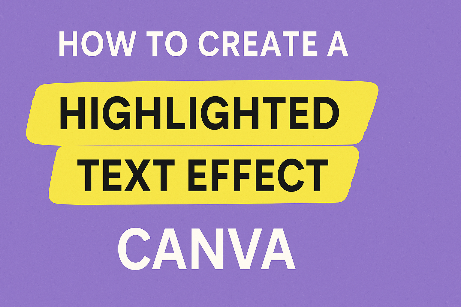
Creating eye-catching designs in Canva is easier than ever with the use of highlighted text effects. These effects can make your words stand out on social media posts, presentations, or any other graphic design project.
To create a highlighted text effect in Canva, simply select your text box, go to the “Effects” menu, and choose the “Background” option for a bold, colorful highlight.
Anyone looking to enhance their design skills will find this feature incredibly useful. Highlighting text not only emphasizes important parts of your message but also adds a pop of color that grabs attention.
Whether you are a designer or just getting started, experimenting with these highlights is a great way to add flair to your work.
With a few simple clicks, you can transform ordinary text into something memorable and engaging. Canva’s user-friendly interface makes it simple enough for beginners, while offering advanced options for experienced users.
Dive in and see how highlighted text can enhance your designs today!
Getting Started with Canva
Exploring Canva begins with creating an account and familiarizing yourself with the dashboard. These initial steps will set a strong foundation for using Canva’s creative tools effectively.
Signing up for an Account
To begin using Canva, the first step is to sign up for an account.
Users can go to Canva’s website or download the app on their devices. Signing up is simple and can be done using an email address, Google account, or Facebook.
New members might benefit from the free version initially, which offers a variety of tools and templates. Alternatively, they can explore the paid version for enhanced features.
Once signed up, users should verify their account via email to ensure full access. This process is straightforward and quick, making it easy for anyone to start creating designs right away.
Overview of Canva Dashboard
After signing up, the next step is to understand the Canva dashboard. It presents a user-friendly interface with various features.
On the left, there’s a menu offering templates, elements, uploads, and more. This menu helps users access the vast library of design resources that Canva provides.
The top of the dashboard includes buttons to create new designs, check saved projects, and explore premium features. Every design project started is saved here, allowing users to manage their work seamlessly.
The dashboard is designed for easy navigation, helping users to efficiently find the tools they need to bring their creative visions to life.
Understanding the Basics of Text in Canva
When working with text in Canva, understanding how to add text and choose the right fonts is essential. These skills will help your designs look polished and professional.
Adding Text to Your Design
To add text in Canva, users can start by selecting the Text tab on the side menu. Here, three options are available: Add a Heading, Add a Subheading, and Add a Little Bit of Body Text. These options provide flexibility in organizing text on a design.
Another quick way to add text is by pressing “T” on the keyboard. This brings up a text box that can be moved and resized to fit the design.
Canva’s text editing tools also allow users to change font size, color, and alignment, ensuring that text stands out and complements the visual elements of the project.
Font Types and Text Styles
Canva offers a variety of font types and styles to match any design need. Fonts range from classic serif and sans-serif to more decorative styles, catering to different themes and purposes.
Picking the right font type is key in conveying the right message and tone.
Text styles in Canva go beyond just fonts. Users can adjust properties like bold, italic, and underline to add emphasis.
Additionally, Canva provides pre-designed text styles, which are combinations of font, color, and size that give designs a unique look with minimal effort.
Mixing styles and fonts can create visually appealing compositions while maintaining readability and coherence.
Creating a Highlighted Text Effect
To create a highlighted text effect in Canva, users begin by choosing the appropriate text box, adjusting text size and color, and exploring highlighting options. It’s easy to make text pop with a bit of creativity and some simple tools available in Canva.
Selecting the Right Text Box
Choosing the correct text box is a crucial first step.
Users should click on the text they want highlighted. If only one word needs a highlight, it must be in its own separate box. This ensures the highlight is applied only where needed.
Creating multiple text boxes for different parts of a message makes the design flexible. This helps individuals make changes later without editing the entire text block.
Organizing text in this way is especially useful for creating engaging designs. Users should take a moment to plan where highlights will enhance the message most effectively. Using separate boxes can prevent any accidental text highlights on unintended parts.
Adjusting Text Size and Color
After selecting the right text box, adjusting text size and color is next.
Canva offers various options to set the mood and emphasis through font size and hues.
Selecting an appropriate font size ensures the highlighted text stands out. Often, larger sizes work best for emphasis.
Color is equally important. Choosing a contrasting highlight color can make the text more visible.
Canva’s color wheel is a valuable tool for finding complementary colors. Users should aim for high contrast between the text and the highlight color. This contrast ensures readability while providing the desired emphasis.
Highlighting Options in Canva
Canva offers different ways to add highlights.
Once a text box is ready, users can click on the Effects button in the toolbar. This opens up a panel with several text effects to explore.
By choosing the Background option, users can apply a solid color behind the text. This creates a simple highlighted effect.
The program also allows users to adjust the transparency and thickness of the highlight. Exploring these options can help achieve the perfect look.
Using a bold font can add extra emphasis when combined with highlighting.
Taking advantage of these features allows everyone to effectively draw attention to key words or phrases in their designs.
Designing with Highlighted Text
Using highlighted text in Canva helps to emphasize important information and makes designs more visually appealing.
Choosing the right elements to layer, colors for emphasis, and pairing fonts effectively can greatly enhance the overall design.
Layering Elements Behind Text
Layering elements behind highlighted text can add depth and interest to a design. When done right, it creates a professional look.
Start by selecting shapes or images that complement the text. For instance, a subtle geometric pattern or soft color gradient can be placed behind the text to make it pop.
Keep in mind the spacing between the text and the background elements. This ensures that the text remains easy to read while still showcasing the layered design. A good balance is key.
Experimenting with transparency can also provide a unique effect. Adjusting the opacity of the background elements can allow the text to stand out more prominently without overwhelming the viewer.
Choosing Colors for Emphasis
Selecting the right colors for highlighted text can draw attention to important messages in your design.
Bold, contrasting colors work well to make the text stand out. Consider using a bright color like neon green or vibrant orange against a neutral background.
For a more subtle approach, choose tones that are different but still harmonious with the overall design palette. This creates contrast without clashing. Canva offers a wide range of colors to choose from.
Color psychology plays a role too. Bright colors like yellow can evoke positivity, while cooler shades like blue suggest calmness and trustworthiness.
Choosing colors that align with the message can enhance the design’s effectiveness.
Pairing Fonts with Highlighted Text
Fonts are crucial when working with highlighted text. They affect both readability and the design’s mood.
Bold fonts often work well because they complement the strong emphasis of the highlight. Sans-serif fonts are typically easier to read in highlighted text.
Mixing fonts can also add style. Pair a bold headline font with a simpler body font to maintain balance.
Keeping at most two or three font styles is recommended to avoid clutter.
Consistency across the design is important. If using highlighted text in multiple places, ensure that your font choices remain the same throughout. This keeps your design cohesive and professional.
Applying Effects for Enhanced Highlights
In Canva, applying effects like shadows, glows, and incorporating transparency can make highlighted text stand out even more.
These effects can be used in a variety of creative ways to add depth and interest to text highlights, helping them draw attention while maintaining readability.
Using Shadows and Glows
Adding shadows to text in Canva gives it a three-dimensional look. This is especially effective for making text pop against a busy background.
To add a shadow, select your highlighted text, click on the “Effects” button, and choose “Shadow.” Adjust the direction, blur, and color to fit your design.
Glows add a soft, luminous boundary around text. This effect is ideal for making text visible in dark scenes.
To apply a glow, go to “Effects” and choose “Glow.” You can modify the size, transparency, and color of the glow to match your design needs.
Combining shadows with glows can further enhance the text, giving it a vibrant, standout appearance that is eye-catching and professional.
Incorporating Transparency
Transparency allows text highlights to blend more naturally with the background.
To use this feature, select the text, go to the “Effects” option, and choose the transparency settings.
Adjust the slider to control how see-through or opaque the highlight is.
This technique is great for subtle text highlights that need to be prominent yet harmonious with other design elements. It creates a sophisticated effect that doesn’t overpower the visual message.
By playing with transparency, designers can ensure the highlighted text effectively complements the rest of the design.
Tips for Professional-looking Text Highlights
Creating highlighted text in Canva can greatly enhance your design. To achieve a polished look, focus on keeping your design consistent and balancing the text with other visual elements. These tips will help you create standout text highlights effortlessly.
Consistency in Design
Maintaining consistency across your design elements ensures a cohesive and professional look.
Choose a color scheme that aligns with your overall design aesthetic. Stick to a palette of no more than three to five colors to keep it visually appealing.
Consider the font you use for your highlighted text. It should complement the fonts used in other parts of your design. Avoid mixing too many font styles, as this can make the layout look cluttered.
Pay attention to alignment and spacing. Consistent spacing between text blocks and highlights keeps the design neat. Use Canva’s grid features or alignment tools to ensure everything lines up properly. This results in a clean and organized appearance.
Finally, use uniform shapes for your highlights. Whether you choose rectangles, circles, or other shapes, using the same style will tie the design together.
Balancing Text and Visuals
Balancing text with other visual elements is key to an appealing design.
Make sure the highlighted text doesn’t overpower the other elements.
Keeping a good proportion between text and images helps maintain a balanced look.
Use white space to your advantage.
It helps separate different design elements, allowing the highlighted text to stand out without clashes.
Also, ensure images and text are not crammed together, which can make the design feel overwhelming.
Another tip is to match the highlight’s intensity to the design’s tone.
For instance, if the background is bold and vibrant, a subtle highlight might work best.
Conversely, on a minimalist background, brighter highlights can capture attention effectively.
Consider using visual hierarchy to guide the viewer’s eyes.
This means arranging your elements so the most important parts, like highlighted text, draw the viewer’s attention first.