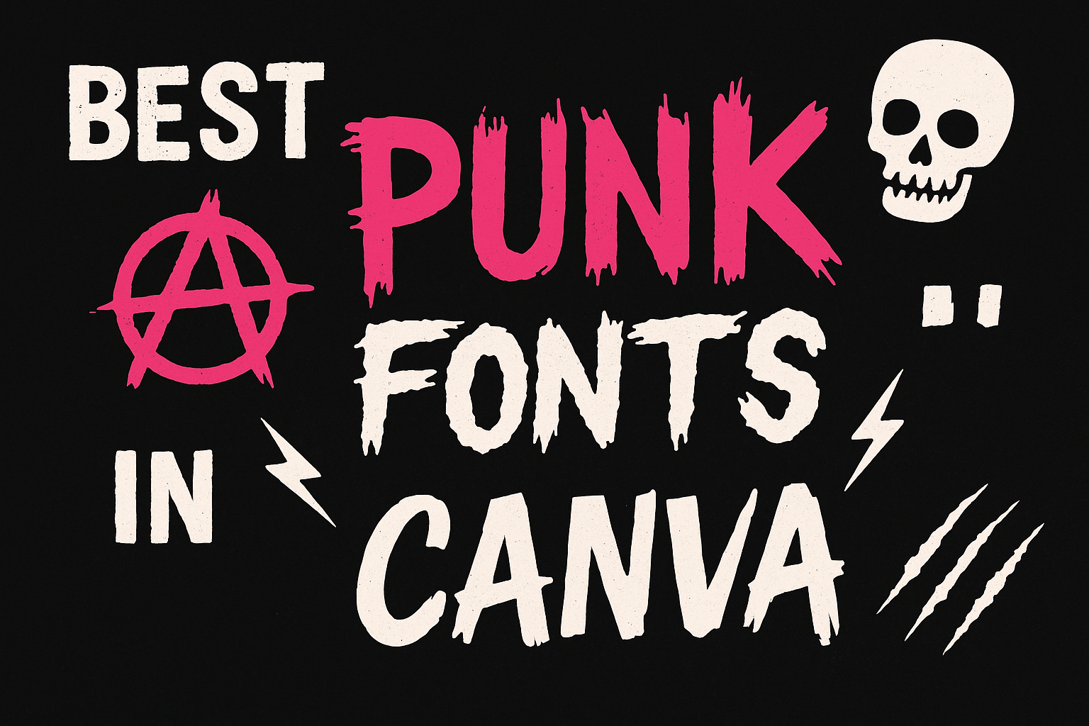
In the world of graphic design, punk fonts bring an edgy and rebellious vibe to projects. Whether it’s for album covers, posters, or logos, these fonts make a bold statement.
Using the best punk fonts in Canva can transform any creative work into something vibrant and attention-grabbing.
Canva offers a variety of punk fonts that capture the raw energy of punk culture. Fonts like Walls Rough and others inspired by graffiti give designs a unique and daring look.
They are perfect for anyone wanting to channel the spirit of punk into their work without much hassle. For more insights on some of these options, exploring lists such as those available on Design Shack can be quite helpful.
Designers can experiment with these fonts to convey a sense of defiance and boldness. With so many choices, it’s easy to find the perfect style that matches the project’s needs.
Choosing the right punk font is key to creating designs that stand out in a crowd and leave a lasting impression.
What Are Punk Fonts?
Punk fonts are bold, edgy typefaces inspired by the punk rock movement. They often feature distressed textures, irregular lines, and a raw aesthetic. This style captures the rebellious spirit and energy that punk culture is known for.
Key Characteristics:
- Distressed Appearance: Many punk fonts have a worn or grungy look.
- Irregular Lines: Fonts may include uneven strokes or jagged edges.
- Bold Aesthetic: These fonts stand out with thick lettering and striking designs.
Punk fonts are often used in graphic design projects for band logos, album covers, and posters. They’re perfect for creating visuals that need to be eye-catching and convey a sense of defiance.
Notable punk fonts include Walls Rough, which has a street art vibe, and Misfit, influenced by the 1990s punk scene. These options are great for designs that need a touch of rebellious flair.
The History of Punk Typography
Punk typography has its roots in the rebellious spirit of the 1970s. The punk movement, known for its anti-establishment views, found its visual expression in bold and unconventional designs.
The style features rough, jagged lines and irregular shapes, echoing the DIY ethic of punk culture.
Typography became an essential part of punk identity. Flyers, fanzines, and album covers used fonts that screamed defiance and non-conformity. Bands used these distinctive styles to convey their raw energy and unique sound.
Graphic designers often drew inspiration from street art and graffiti. The chaotic look of punk fonts matched the loud music and aggressive imagery, creating a complete visual and auditory experience.
Popular punk fonts, like ransom note styles, mixed different typefaces and sizes in a single design. This created a layered, almost chaotic look that has become iconic.
Characteristics of Punk Typography
- Bold and Edgy: Fonts often feature sharp angles and thick lines.
- Distressed and Rough: Designs mimic a worn or hand-drawn appearance.
- Mix and Match: Combining different fonts and elements to create visual tension.
Today, punk typography still influences modern design. It’s used in fashion, advertising, and music to evoke a sense of rebellion and authenticity. Whether for an album cover or a social media graphic, these fonts continue to capture the spirit of punk’s past.
Why Punk Fonts Matter in Design
Punk fonts bring an edgy and rebellious feel to any project. They are often inspired by underground music and street culture. These fonts can give a vibrant and unique look to designs, making them stand out.
Key Benefits of Punk Fonts:
- Expressive Style: They add personality and character to the design.
- Attention-Grabbing: Their bold look captures the viewer’s eye.
- Versatility: Useful for various projects like album covers, posters, and merchandise.
When using punk fonts, designers can reflect a theme or mood effectively. For example, a gritty texture in a font can evoke thoughts of urban landscapes and graffiti.
Creating merchandise like jackets or patches can become more appealing with punk fonts. A classic font such as Walls Rough has a distressed texture that fits perfectly for this purpose.
Band websites or social media posts use punk fonts to capture the spirit of the movement. By doing so, they convey strong emotions and energy. This can resonate well with audiences interested in punk culture.
Top Punk Fonts in Canva
Punk fonts in Canva bring a bold and unconventional style to any design. They are perfect for those looking to add a rebellious or edgy flair. This section covers several standout fonts: Anarchy, Dead Postman, Riot Squad, Destroy, and Sidewalk, each offering unique attributes and potential uses.
Anarchy
Anarchy is a classic punk font known for its gritty, distressed appearance. This font gives a strong impression with its jagged edges and bold lines, reminiscent of rebellious protest art. Anarchy is ideal for designs that seek to evoke a sense of disobedience or counterculture vibes.
Designers often choose it for projects that need a loud and proud style. It’s great for themed posters, music albums, or any creative project highlighting a rebellious spirit.
Anarchy makes every project stand out with its raw energy and defiant look, perfectly encapsulating the punk aesthetic.
Dead Postman
Dead Postman delivers a unique handwritten style that aligns well with punk’s DIY ethos. It has a rough and slightly chaotic feel, often used in designs that aim to seem spontaneous or handcrafted. This font offers a personal touch, adding character to anything from flyers to album covers.
Its quirky aspects make it perfect for projects that need a human touch. The uneven lines provide an authentic flair, making it suitable for brands or artists wanting to convey originality. Dead Postman remains a favorite for those looking to break away from the polished and conventional.
Riot Squad
Riot Squad embodies the chaotic energy associated with punk rock. This font is characterized by its bold letters and sharp angles, making it perfect for grabbing attention. Riot Squad is often used in designs aiming to express movement and agitation.
The font’s aggressive style lends itself to posters and merchandise that need to convey a rebellious attitude. It works well in larger sizes, where its impactful presence can be fully appreciated. Riot Squad speaks volumes with its striking appearance, often preferred for projects that demand loud visual statements.
Destroy
Destroy features a fragmented design that adds an element of disarray to any text. This font is perfect for those who want their design to mimic the raw energy of punk culture. Its broken and scattered letters catch the eye, ideal for edgy and creative projects.
It’s often seen on album art and promotional materials where traditional styles fall short. Destroy allows designers to break free from uniformity and embrace a wild, unrefined look. Its scattered arrangement brings dynamic movement to text, ensuring a striking visual impact.
Sidewalk
Sidewalk offers a gritty, street art-inspired look that ties closely to urban punk scenes. With its rough texture and uneven baseline, Sidewalk adds a distinct flair reminiscent of graffiti. This font works wonders for designs that aim to capture a streetwise and contemporary aesthetic.
It’s often used in digital art and posters where a bit of urban edge is desired. Sidewalk provides a realistic, raw touch, making it a go-to choice for those wanting to infuse their work with city life energy. Its connection to street culture makes it a standout in punk-related projects.
How to Choose the Right Punk Font
Choosing the right punk font can be a fun and creative process. Here are a few tips to help make the decision easier:
Consider the Mood: Think about the overall vibe. Is it more rebellious and energetic or raw and edgy? Fonts like Thicker Destroy offer a bold, grungy texture that might suit energetic projects well.
Context Matters
Understand where the font will be used. For instance, if designing for a concert poster, a font that grabs attention like those used in gig posters can be ideal.
Balance is Key
Punk fonts often have strong visual impacts. While bold choices can enhance a design, too much can be overwhelming. Using punk fonts in moderation ensures they highlight key elements without overpowering the entire piece.
Audience Awareness
Different groups might connect with different styles. A clean punk font might appeal more to wider audiences, while grungier options suit hardcore fans of the punk aesthetic.
Personal Expression
Let the design reflect personal style. Fonts like Boardslide that echo skateboarding culture could be a great choice for someone looking to merge punk with street style.
Using Punk Fonts in Your Projects
Punk fonts bring a raw, edgy vibe to any design project. These fonts can make your work stand out, capturing the rebellious spirit often associated with punk culture. Perfect for projects needing a bold statement.
Bold Choices for Bold Designs
-
Walls Rough: This font’s irregular lines and distressed texture make it great for album covers or posters.
-
Misfit: Influenced by the 1990s punk scene, this all-caps typeface works well for headlines and apparel designs.
Tips for Effective Use
-
Contrast: Use punk fonts for titles while keeping the body text simple. This creates a visual hierarchy, drawing attention to the most important parts.
-
Mix Styles: Combine different weights or styles to differentiate elements in your design.
Common Uses
- Band logos
- Gig posters
- Merchandise
When using these fonts in Canva, make sure they align with the project’s theme and message. Check out collections like Best Punk Fonts or Edgy Punk Fonts for inspiration.
Considerations
It’s important to balance readability with style. Ensure that the text is legible from a distance, especially if used in larger prints like banners.
Incorporating punk fonts can add a touch of uniqueness and energy to your design projects, making them memorable and engaging.
Tips for Pairing Punk Fonts With Other Styles
When mixing punk fonts with other styles, it’s important to strike the right balance. Punk fonts are bold and edgy, while other fonts can be more traditional or clean. Combining these can create eye-catching designs.
1. Contrast is Key
Pair punk fonts with a simple sans-serif font. This helps maintain readability while allowing the punk style to stand out. For example, using a bold punk font for headlines and a simple, clean font for body text can work well.
2. Align Visual Styles
While punk fonts are often rough and textured, it’s still important to match them with fonts that don’t clash. Avoid pairing them with fonts that have drastically different themes, like overly ornate scripts.
3. Color Coordination
Use colors that complement each other. Punk fonts can benefit from contrasting or vibrant colors, making them pop against neutral tones.
| Element | Punk Font | Neutral Font |
|---|---|---|
| Headline | Chunky Edge | Sans Serif |
| Body Text | Clear Sans | Basic Serif |
4. Size Matters
Punk fonts can serve as the focal point, so using them in larger sizes for titles is effective. Keep other font sizes smaller to guide the reader’s attention.
5. Experiment and Adjust
Don’t be afraid to try different pairings. Experiment with combinations until the design feels right. Trust your eye to guide what combinations work best for each project.
The Impact of Punk Fonts on Branding
Punk fonts bring a rebellious and edgy vibe to branding. They are perfect for businesses that want to stand out and make a bold statement.
These fonts deliver a sense of defiance and individuality.
Emotional Appeal:
Punk fonts evoke strong emotions. They can convey feelings of angst, rebellion, and freedom, aligning well with brands aimed at youth and alternative culture.
Versatility in Design:
Punk fonts are versatile. They fit well on posters, album covers, and merchandise.
Imagine a band logo designed with an edgy font like Nightcore, resonating with fans of punk and metal music.
Visual Interest:
The unique design of punk fonts captures attention. Fonts like Walls Rough use distressed textures to create a raw and urban look that draws the eye.
Alignment with Brand Identity:
For brands that embrace nonconformity, punk fonts are perfect. Fonts like Misfit can help communicate a brand’s ethos, intertwining style with message.
List of Popular Punk Fonts:
- Edo
- Riotiks
- Pink Punk
Using punk fonts in branding requires careful selection to ensure they align with brand values and aesthetics.
They aren’t for every brand, but when used thoughtfully, they can enhance identity and connect deeply with the intended audience.
Creating Custom Punk Fonts in Canva
Creating custom punk fonts in Canva can be a fun and creative process. Even if Canva has a selection of punk fonts, users can modify existing fonts to achieve a unique punk style.
One way to customize fonts is by adding a distressed or grungy effect. This can be done through Canva’s text options, where users can play with shadows, outlines, and effects to give fonts a gritty look.
Another approach is to combine different font styles. By layering fonts or mixing a bold font with a more casual, handwritten one, designers can create a distinct punk vibe.
Experimenting with spacing and alignment also adds a rebellious touch.
Using elements like chains, skulls, or spikes around the text enhances the punk aesthetics. Canva provides a wide array of graphic elements that can be paired with text for this purpose.
Lists are useful when showing steps to enhance a punk font:
- Choose a base font in Canva.
- Adjust font effects like shadows or blur.
- Add graphic elements around the text.
Custom colors can also emphasize a punk look. Bright and contrasting colors or the classic black and white combo work well.
Use Canva’s color wheel to select colors that complement or clash as needed.
By exploring these tools, anyone can create punk-style fonts that fit their projects. This invites creativity while keeping the edgy feel punk is known for.
Best Practices for Punk Font Typography
Punk fonts are known for their bold, edgy, and rebellious vibes.
When using them, it’s crucial to make sure they enhance your design effectively.
1. Choose Legible Fonts:
Even though punk fonts tend to be bold and distinct, it’s essential that they stay readable.
Avoid overly complicated designs that may detract from the message you wish to convey.
2. Pair with Simple Backgrounds:
To let punk fonts shine, consider using simple or muted backgrounds.
This helps ensure that the text remains the focal point. Bright and busy backdrops can clash with detailed font styles.
3. Limit Use of All Caps:
While all caps can make a statement, using them excessively can be overwhelming.
Mixing upper and lower case letters can add a dynamic feel without being too harsh.
4. Maintain Consistency:
Stick to one or two punk fonts throughout a design.
Consistency helps create a cohesive look. Frequent changes in typeface can make the design seem scattered and unorganized.
5. Use for Headings or Short Texts:
Punk fonts work best for headlines, names, or short phrases.
When used for longer text, they might become hard on the eyes. It’s best to use more straightforward fonts for body text to balance the design.