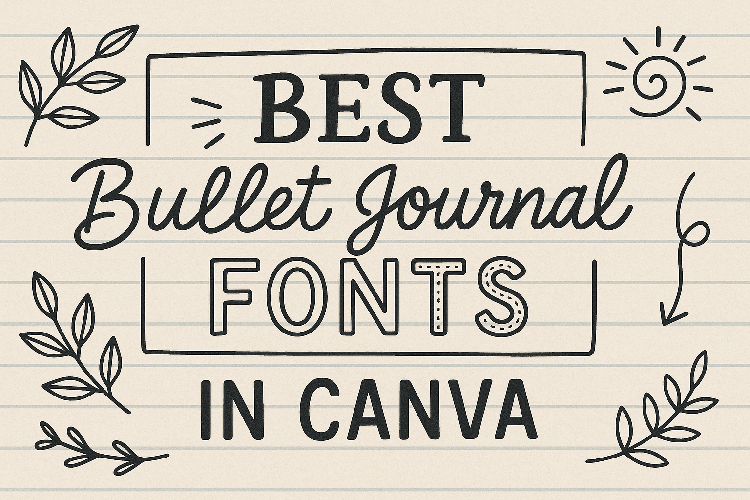
Exploring the world of bullet journaling can be both exciting and creative. One of the best ways to add a personal touch to a bullet journal is by using unique fonts.
Canva offers a variety of fonts that can transform a simple journal into an expressive masterpiece, providing both style and functionality.
Fonts like “Over The Rainbow” bring whimsy and fun to the pages, making planning more engaging. For those looking for a modern look, options like “Zen Kurenaido” provide sleekness and sophistication.
These fonts not only enhance the visual appeal of a journal but also reflect the personality and mood of the writer.
Using the right type of font can change the entire vibe of a bullet journal, turning it from a regular planner into a creative canvas.
Experimenting with different fonts on Canva can inspire new ideas and keep journaling fresh and interesting for anyone getting into this fun hobby.
Exploring Bullet Journal Fonts
Choosing the right fonts for a bullet journal can make a big difference. Fonts set the tone and style of the journal, and there are many options to suit different tastes and needs.
Why Font Choice Matters
Font choice impacts both readability and the overall feel of a bullet journal. A well-chosen font can highlight important information, making it stand out on the page. This enhances the organization, helping journal users quickly find what they need.
A playful, handwritten font can add a personal touch, while a sleek and modern option might suit those with a minimalist style.
Users are more engaged with their journals when they feel a connection to the aesthetic, which is greatly influenced by fonts.
In addition to aesthetics, font choice affects space usage. Some fonts take up more room, which might be a concern in a bullet journal where space is limited.
Font Styles Overview
Bullet journal fonts offer a variety of styles, from simple print to intricate cursive. Each style has its own charm and usage.
Simple print styles are clean and easy to read, ideal for listing items or planning schedules.
Handwritten styles like “Over the Rainbow” bring warmth and personalization. Meanwhile, geometric or block fonts provide a strong visual impact, often used for titles or headers.
Brush lettering is another popular option. It gives a fluid and artistic touch to the pages.
Experimenting with styles can help users discover what fits their personality and journal needs best. Tools like Canva provide numerous bullet journal font choices to explore these possibilities.
Navigating Canva for Fonts
Canva offers a wide variety of fonts that can enhance any bullet journal design. Understanding how to access and use these font features can help users personalize their journals effectively.
Getting Started with Canva
To begin using fonts in Canva, users first need to create an account or log into an existing one. Once inside the Canva platform, they should select a project type, such as a journal or notebook. This allows the user to access Canva’s editing tools.
Users can then open a blank canvas or choose a pre-designed template.
Clicking on the “Text” tab on the left panel is the first step to adding fonts. Here, they can add headings, subheadings, and body text.
It’s important to explore the “Text” options fully. Users should experiment with different text styles and adjust them within their design.
Important features like font size, color, and alignment can all be easily modified to fit the journal’s aesthetic.
Using the Search and Filter Features
Inside Canva’s text panel, users can utilize the search bar to find specific fonts. Typing in keywords such as “handwritten” or “modern” helps narrow down font results, making it easier to find those ideal for bullet journals.
Canva provides filter options to organize fonts by style. This includes categories like serif, sans-serif, and script, which help users find what suits their design best.
Users can also filter by free and premium fonts, depending on their subscription level.
By exploring these search options and filters, users can efficiently browse through Canva’s vast font library. This makes it easier to find and implement the best fonts for their unique bullet journal style, from playful to sleek options.
Top Fonts for Bullet Journals
Choosing the best fonts for bullet journals can make your pages stand out and reflect your style. These fonts can vary from elegant scripts to quirky handwritten designs, offering a range of options to suit different personalities and journal themes.
Elegant Script Fonts
Elegant script fonts bring a touch of sophistication to bullet journals. These fonts mimic the look of cursive handwriting and are perfect for headers or special sections.
Fonts like Over The Rainbow offer a playful yet refined look, adding an artistic flair to journal pages. They work well when paired with simple layouts and minimalistic designs.
When using script fonts, it’s important to balance them with clear and readable text for the main content, as they can be harder to read if overused.
Many find that mixing a script font with a basic sans-serif font creates a visually pleasing contrast. This way, important notes remain legible while the overall design stays stylish.
Modern Sans-Serif Fonts
Modern sans-serif fonts are clean and easy to read. Fonts like Zen Kurenaido provide a sleek and organized look, perfect for those who prefer a minimalist style.
Benefits:
- Clarity: Easy to read.
- Versatility: Suitable for any journal theme.
- Contemporary Feel: Gives a modern touch.
Using sans-serif fonts ensures that information is straightforward and accessible, maintaining clarity in busy layouts without sacrificing style.
Classic Serif Fonts
Serif fonts bring a traditional touch to bullet journals. These fonts have small lines or strokes at the end of larger strokes in a letter, like Times New Roman. They are often used for longer text entries as they assist with readability by guiding the reader’s eye along the text.
Their use can give a formal and organized look to journals, making them ideal for lists or long-form writing within the journal. Pair serif fonts with simple designs to help them shine and provide a calming effect to the journal layout.
Quirky Handwritten Fonts
For those who want a unique touch, quirky handwritten fonts are a fun option. These fonts often have a playful, informal character that can add personality to sections like personal notes or creative entries.
Hero font offers a balance between whimsy and readability.
These fonts are perfect for personalizing a journal, reflecting the writer’s mood or theme of a particular section. It’s best to use them sparingly in headers or side notes to keep the main content clear and easy to read.
Sturdy Display Fonts
Display fonts stand out with strong, bold features. They are ideal for creating eye-catching headers or highlighting important sections in a journal.
These fonts often feature thicker strokes and distinct characteristics that draw attention and make certain parts of the journal pop.
While great for emphasis, display fonts should be used selectively to maintain balance in the journal’s layout. They provide an exciting visual break but should not be overwhelming, ensuring that the necessary information remains the main focus.
Pairing Fonts Effectively
Pairing fonts in a design is about combining styles that complement each other while enhancing readability and visual appeal. This involves selecting fonts that balance unique characteristics, sizes, and weights.
Combining Fonts for Readability
When selecting fonts for a project, picking types that are easy to read is crucial.
Using a sans-serif font for headings and a serif font for the main text can create a nice contrast. Some designers prefer pairing clean fonts like Montserrat and classic ones such as Times New Roman.
It’s also important to consider the purpose of the text. For instance, strong and bold fonts can be great for headings, while lighter fonts may suit body text.
Ensuring text is legible at various sizes is key to effective font pairing.
Mixing Font Weights and Sizes
Using different font weights and sizes can add emphasis and structure to your design.
Mixing bold fonts with lighter ones can guide the reader’s eye and emphasize key points. This method is effective in creating a hierarchy within your text.
Keep in mind that too many different weights or sizes can overwhelm the design. Sticking to two or three variations usually works best.
For example, using a bold font for titles, a regular weight for subheadings, and a light version for body text maintains clarity and organization.
Customizing Fonts
Customizing fonts in Canva can make your bullet journal unique and personal. By adjusting line spacing and alignment, modifying color and opacity, and adding text effects and borders, users can transform simple text into something special.
Adjusting Line Spacing and Alignment
Line spacing and alignment are important for creating clear and readable pages.
Line spacing helps with text clarity. It separates lines just enough to make reading comfortable. Canva allows users to fine-tune this spacing to their preference.
Alignment adjusts the position of text within a line. Text can be aligned left, right, center, or justified.
Choosing the right alignment affects how information is presented. For example, centered text works well for titles, while left-aligned text is easier for reading longer paragraphs.
Modifying Color and Opacity
Color and opacity add personality to fonts. Canva’s color palette offers a wide range, from bold and bright to soft and pastel shades.
Selecting the right color can set the tone and mood of a journal page.
Opacity lets users manage transparency levels. Adjusting opacity can make text stand out or blend into the background.
A lower opacity might be used to create watermarks or subtle layering effects. This can be especially useful when layering text over images or patterns.
Adding Text Effects and Borders
Text effects and borders can add flair and impact.
Canva’s text effects include shadows, glows, and outlines that offer depth and dimension. Using these effects correctly makes text pop from the page, grabbing attention where needed.
Borders frame the text, creating a polished look. They can be customized in terms of thickness and color.
Borders can separate different sections and emphasize certain text areas within your bullet journal. Experimenting with these can yield creative results that make a bullet journal truly personalized.
Tips for Consistency
When creating a bullet journal, using consistent fonts can give your pages a cohesive look. This involves careful selection and maintaining a clear visual order with your text.
Creating a Font Palette
Selecting a few fonts to use consistently can make a big difference. A font palette ensures that your journal has a uniform appearance while allowing for variety.
To start, choose about three to five fonts. This might include one for headings, one for body text, and one for accents.
Mixing serif, sans-serif, and decorative fonts can add interest without overwhelming.
For instance, Hero can be paired with lighter fonts for contrast.
Keeping a balance between bold and subtle is key. Remember to test your font choices on a sample page to see how they interact together.
Maintaining Visual Hierarchy
Visual hierarchy is essential for guiding the reader’s eye. This is achieved by varying font sizes and weights.
Use larger, bolder fonts for titles and headings to make them stand out. Something like Over The Rainbow can bring a whimsical touch to headers.
For body text, a simpler, smaller font works best.
Break up information using lists, bullet points, and headers to keep content organized. Consistent use of spacing and alignment also supports the hierarchy, ensuring clear and easy navigation through the journal.
Canva Pro Font Features
Canva Pro offers exclusive font features that can enhance personal design projects. Users have access to premium fonts and can also upload custom fonts to match their unique styles and branding needs.
Accessing Premium Fonts
Canva Pro subscribers can explore a wide range of premium fonts that are not available in the free version. These fonts are marked with a crown icon in the font library, making them easy to identify.
Offering a variety of styles, from elegant serif options to modern sans-serif types, these premium fonts allow users to elevate their designs with unique typographic choices.
The ability to access such a diverse array of fonts can be a significant advantage for those looking to create distinctive and professional-grade work. Users benefit from an extensive selection, ensuring they can find the perfect match for headers, body text, or decorative elements in their projects.
Uploading Custom Fonts
A standout feature of Canva Pro is the ability to upload custom fonts. This enables users to maintain consistent branding across all their projects.
Users can upload any font file they own, such as a unique typeface that represents their brand identity. This feature supports various font file types, including TTF, OTF, and WOFF.
Uploading custom fonts is straightforward. Users simply navigate to the ‘Brand’ area in Canva, where they can manage brand assets.
This function is particularly useful for businesses, bloggers, or designers who aim to integrate their personalized typography into digital content, ensuring that every project reflects their distinctive style.