Finding the right font can transform a design, giving it personality and flair.
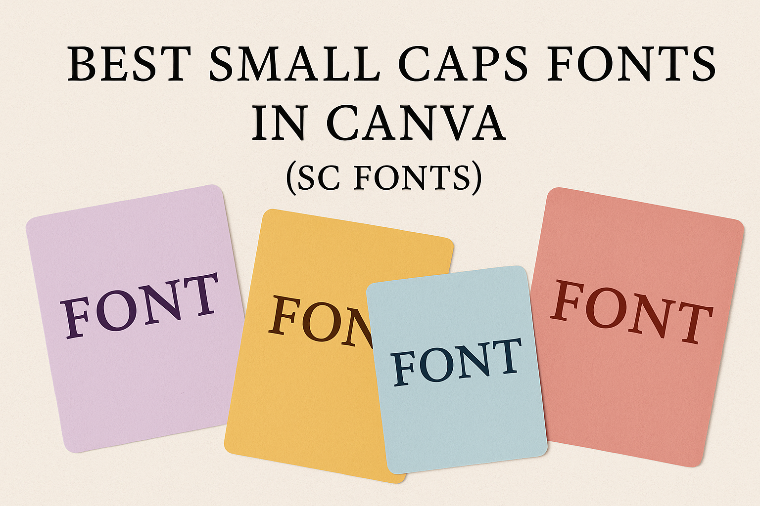
Small caps fonts in Canva are gaining popularity among designers for their ability to create refinement and style in various projects. Whether designing book covers, signage, or digital platforms, these fonts can add a unique touch to any work.
Choosing the best small caps fonts in Canva can elevate your designs by blending classical Roman influences with modern aesthetics.
Fonts like Cinzel, Montserrat, and Proxima Nova showcase the elegance and versatility that make them stand out in both print and digital formats. Such fonts not only enhance readability but also contribute to a sophisticated and polished look.
For those diving into web design or branding, small caps fonts offer clarity and modern appeal. They maintain readability across different devices, ensuring that your message gets across effectively.
Fundamentals of Small Caps Fonts in Canva
Small caps fonts can enhance the aesthetics of design projects by adding elegance and clarity.
In Canva, small caps fonts are available in a variety of styles, making them a versatile choice for users. The following sections explore what small caps fonts are, why they matter in design, and how they can be accessed within Canva’s interface.
Defining Small Caps Fonts
Small caps fonts use uppercase letters that are of a smaller size than regular capitals. They maintain the same stroke weight, ensuring a consistent look.
This style is often used for decorative text, titles, or to emphasize words without using bold or italics.
In design, small caps can make text more readable and give it a polished appearance. They are especially effective in printed materials, where they offer a traditional look. Designers often choose small caps for subtitles and captions to create visual harmony.
In the context of Canva, popular small caps fonts include Cinzel which is inspired by Classical Roman letterforms and provides a sophisticated feel.
Importance of Font Choice in Design
Font choice is crucial in conveying the tone and message of any design. Using small caps can impart a sense of professionalism and elegance, perfect for corporate branding or formal invitations.
Fonts that match the brand’s personality help in communication and brand recognition.
Small caps often create an understated elegance that works well for minimalist designs. They complement other font styles without overshadowing them, making the overall design cohesive. Designers should consider the audience and purpose when selecting fonts to ensure the message is clearly communicated.
Choosing small caps fonts in Canva can be particularly useful for projects requiring impact without extra ornamentation, such as book covers or professional presentations.
Small Caps in Canva’s Interface
Canva’s interface makes selecting and using small caps fonts straightforward. Users can find small caps fonts by searching the font library, which includes a blend of both free and premium options.
To apply a small caps font, simply select the text and choose the preferred font style from the library.
Customizing small caps includes adjusting font size, color, and effects directly within Canva, offering flexibility in design. For those learning about font pairing, resources like Canva’s guide to font pairing can be invaluable.
Through user-friendly tools, Canva enables both beginners and experienced designers to create visually appealing projects using small caps fonts.
Top Small Caps Fonts in Canva
Small caps fonts add a touch of elegance and professionalism to any design. They are perfect for formal invites, business materials, and creative posts. The right font can make a significant impact on how a message is perceived.
High-Quality SC Fonts for Professional Use
For professionals looking to create a polished and sophisticated impression, Cinzel stands out. This font, inspired by Classical Roman letterforms, features strong serifs and curves, making it ideal for book covers or official documents. Its timeless appeal is perfect for projects that require a serious tone.
Andada SC is another high-quality typeface. With a variety of weights, this serif font offers versatility while maintaining a professional look. It works well for branding materials where clarity and elegance are essential. Small caps in Andada SC retain the classiness of serif fonts with a modern twist.
Both Cinzel and Andada SC provide a reliable choice for businesses and professionals who want to convey authority and refinement in their design work. Choosing these fonts ensures that materials not only stand out but do so with style and grace.
Popular SC Fonts for Social Media Content
In social media, standing out is crucial. Spinwerad offers a clean and modern design, making it great for eye-catching posts. This small caps font is ideal for lively brands aiming to communicate both style and ease.
Datalegreya is another favorite. As a sans serif small caps font, it’s great for conveying information clearly. Its simplicity and readability make it suitable for captions and quotes.
These fonts are excellent choices for social media content because they blend legibility with visual appeal, ensuring the brand message is both clear and stylish. Using these fonts can enhance engagement by making posts more visually appealing while effectively conveying the desired tone.
Elegant SC Fonts for Invitations and Announcements
For invitations and announcements that demand a touch of elegance, Cinzel fits perfectly. This font’s classic design adds a timeless touch to wedding invitations and formal announcements. Its refined style ensures that messages are conveyed with grace.
Moonshine is a distinctive option for rustic-themed invitations. Its vintage, Western-inspired look is perfect for themed events, adding character and charm.
Both Cinzel and Moonshine bring a level of sophistication to invitations and announcements. Their unique styles help set the right tone for events, ensuring that each piece of correspondence feels personal and thoughtfully designed.
Tips for Using SC Fonts Effectively
Small caps fonts bring a unique and stylish touch to any design. When used right, they can enhance readability and reflect brand identity. The following sections cover critical points on effective usage.
Pairing SC Fonts with Other Font Styles
Pairing small caps fonts with other styles can create balance. They match well with serif fonts, providing a clean and sophisticated look. For instance, combine a small caps font like Avenir with a serif font for elegance and clarity.
Using contrasting weights or styles also adds interest. Choose a lighter small caps font with a bolder sans-serif for striking contrast. This ensures the design is not too uniform or dull.
Keeping the design cohesive is key. Aligning styles and sizes helps maintain unity. For consistent spacing, adjust settings like kerning and leading to achieve balance across the design.
Best Practices for Readability
Readability is vital when using small caps fonts. They should be clear and easy to distinguish, especially in professional contexts.
Selecting a font with a strong baseline and even spacing can improve legibility. Consider the font size carefully. Small caps should be at a size that is easily readable, especially for important text like headers. Avoid using small caps for long paragraphs, as this can make reading tiring for viewers.
Proper contrast between text and background can also enhance readability. Dark text on a light background or light text on a dark background provides clarity. This ensures the audience can read the text without strain.
Incorporating Brand Identity with SC Fonts
Small caps fonts also play a vital role in brand identity. They can convey mood and style, matching the brand’s message and personality.
Choosing a font style that aligns with the brand’s core values helps in presenting a consistent image.
Color is another key aspect of brand identity. Using the brand’s color scheme with small caps can strengthen this connection. Integrating brand-specific colors into the text ensures visual harmony and brand recognition.
Finally, consistency across all branded materials is critical. Use the same small caps fonts in logos, print materials, and digital content to maintain a unified look. This helps in building brand trust and recognition among audiences.
Customizing SC Fonts in Canva
Customizing small caps fonts in Canva can make any design stand out. This involves changes to font color and size, adding effects, and layering text elements for a dynamic look.
Altering Font Color and Size
Changing the color and size of small caps fonts in Canva is simple and can greatly enhance readability and aesthetic appeal.
Users can choose from a wide range of colors by selecting the font, clicking on the color palette, and picking the desired shade.
Adjusting the size is just as easy. By selecting the text box, users can drag the corners to resize or use the font size dropdown menu.
These options allow for easy adjustments to better fit the design’s goals, whether that’s creating emphasis or maintaining consistency across a project. Colors can set the mood of the design, while sizes ensure the text is clear and draws attention where needed.
Adding Effects to SC Fonts
Adding effects to small caps fonts in Canva can give the text more personality.
Canva offers a variety of text effects such as shadow, lift, and outline that can add depth to the font.
To apply these effects, users click on the text box, find the “Effects” button in the top toolbar, and choose the desired effect. Each effect has settings that can be adjusted for intensity and style, allowing for customization to suit any design.
These effects can help make the text pop, create a focal point, or match the overall design theme. Experimenting with different combinations can lead to unique and engaging text presentations.
Layering Text Elements with SC Fonts
Layering text elements in Canva is a creative way to add dimension and interest to any design using small caps fonts.
It involves placing text on top of images, shapes, or other text elements.
Users can click and drag text boxes to reposition them. By right-clicking and selecting “Bring to front” or “Send to back,” they can layer the text accordingly.
This helps in emphasizing specific parts of the text or creating a structured hierarchy.
Layering is particularly useful for creating posters or social media graphics where visual impact is key. With careful alignment and layered text, designs can convey messages more effectively while also being visually appealing.
Creative Projects Using SC Fonts
Small caps fonts bring a unique touch to various creative projects. These fonts are ideal for projects that need elegance and clarity such as logos, posters, and business cards. They provide a blend of style and simplicity, making them a popular choice for designers looking to enhance their work.
Logo Design with Small Caps Fonts
Using small caps fonts for logo design can create a strong visual impact. These fonts offer a clean and professional look that works well for both modern and traditional brands.
Their ability to stand out makes them perfect for logos that need to convey authority and sophistication.
Designers often use fonts like Cinzel for its classical look, which suits brands in luxury or high-end markets. Another great option is Montserrat, which is modern and versatile, making it adaptable to various industries. Small caps fonts are also great for logos because they maintain readability across different sizes, ensuring clarity on both business cards and billboards.
Dynamic Typographic Posters
Small caps fonts can add dynamic elements to typographic posters. These fonts help emphasize key messages without overshadowing the design’s overall aesthetic.
Their distinct appearance catches the eye and maintains engagement, making them perfect for event promotions and artistic displays.
For instance, the use of small caps in a poster for a music festival can highlight artists’ names while adding an artistic flair. Fonts like Proxima Nova offer a modern feel that complements vibrant and bold designs often used in posters. Meanwhile, Avenir provides a sleek look suitable for minimalist poster layouts, maintaining focus on the main message.
Personalized Business Cards
Business cards benefit greatly from the sophistication of small caps fonts. These fonts can give cards a polished and professional appearance, making a lasting impression in networking situations.
Their clear and legible typeface enhances the overall look and ensures essential details are easily read.
Small caps fonts like Montserrat provide a contemporary look that suits various professional fields, while Cinzel lends a touch of elegance ideal for creative industries.
Customized business cards with these fonts help highlight key information, such as names and titles, with elegance and ease, ensuring recipients remember the connection.