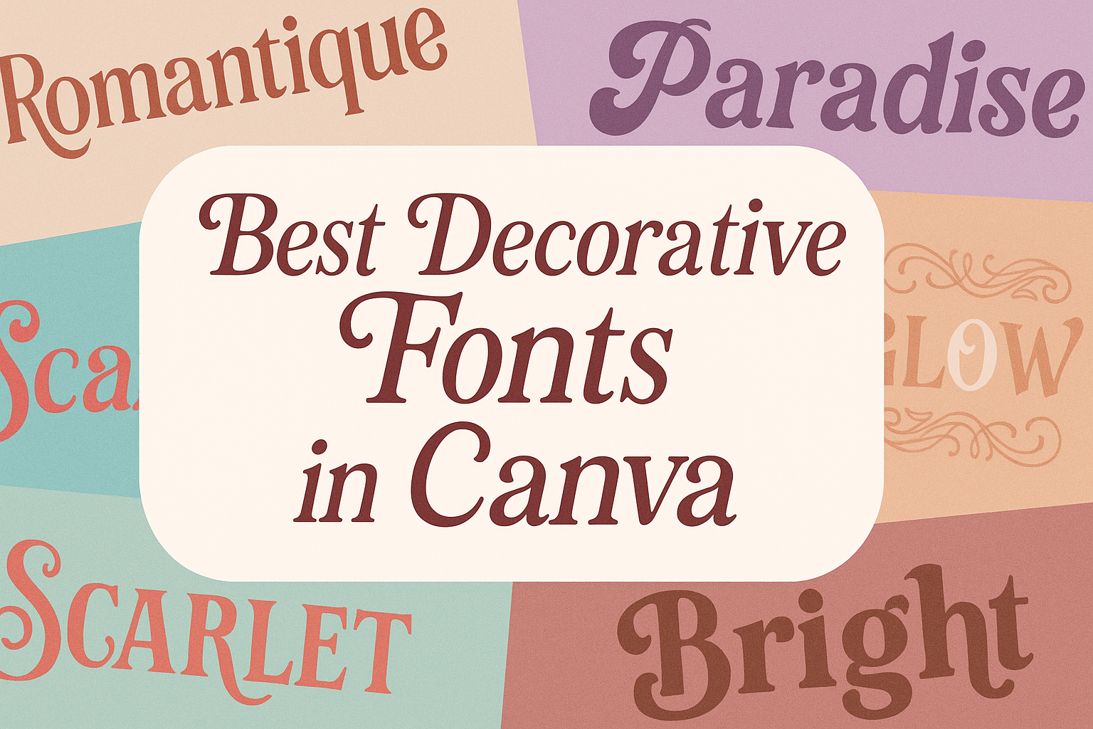
Choosing the right font can completely change the look of a design. Decorative fonts in Canva add style, personality, and visual interest that plain text cannot achieve. The best decorative fonts in Canva help make titles, logos, and graphics stand out with unique shapes and creative details.
They often feature bold lines, elegant curves, or playful strokes that catch attention right away. Whether someone wants a classy script for wedding invitations or a bold display font for posters, Canva offers a wide range of options.
This guide explores what decorative fonts are, highlights the top picks available in Canva, and shares ideas for pairing them effectively. It also offers practical tips to make sure each font fits the style and purpose of the design.
What Are Decorative Fonts in Canva?
Decorative fonts in Canva stand out because they focus on style and visual appeal rather than plain readability. They often include unique shapes, detailed strokes, and creative spacing that make text look more like design elements than standard lettering.
Definition and Characteristics
Decorative fonts are typefaces designed to catch attention. Unlike body text fonts, they are not meant for long reading but for short phrases, titles, or logos.
They often feature ornamental details, such as swirls, curves, or textured effects. Some use unusual spacing or kerning to create a distinct look. Others rely on varied stroke widths or bold geometric shapes.
In Canva, decorative fonts may appear as script styles, blocky displays, or highly stylized sans-serifs. Their main role is to add personality and make text visually memorable.
Why Use Decorative Fonts in Design
Designers use decorative fonts to highlight important text. They work best in headers, invitations, posters, and branding where a strong visual impression is needed.
These fonts help set the tone of a project. For example, a flowing script font can create a romantic feel, while a bold block font can look modern and strong. Using them carefully ensures the design feels polished instead of cluttered.
In Canva, decorative fonts are especially useful for projects like wedding invitations, event promotions, or social media graphics. They allow users to create a unique style without needing advanced design skills.
Types of Decorative Fonts Available
Canva offers many decorative font options, each with its own style. Some common categories include:
- Script Fonts: Flowing and elegant, often used for invitations.
- Display Fonts: Bold and eye-catching, ideal for headlines.
- Geometric or Modern Fonts: Clean shapes with
Mixing Elegant and Script Fonts
Elegant fonts often feature thin strokes and refined details, while script fonts add a handwritten or flowing style. When combined, they can create a refined yet approachable look. Canva offers options like TAN Mon Cheri, which pairs nicely with elegant serif fonts for wedding invitations or event flyers.
The key is to avoid using two fonts that compete for attention. If the script is highly decorative, choose a more restrained serif to balance it. For example, pairing a script like The Artist Script with a softer serif creates contrast without clashing.
Designers should also pay attention to hierarchy. Use the script for highlights such as names or short phrases, and let the elegant serif handle longer text.
Tips for Harmonious Typography
To create balance between decorative fonts and other styles, it helps to focus on hierarchy, spacing, and contrast. Decorative fonts should be used in moderation, usually for titles or callouts, while simpler fonts handle body text.
A quick checklist can help:
- Limit to 2–3 fonts per design
- Adjust line spacing for readability
- Use contrast in weight or size to guide the eye
Experimenting in Canva with combinations like decorative display fonts and clean sans serifs can reveal which pairings feel natural. Adjusting colors and letter spacing further improves harmony and ensures the final design looks cohesive.
For more pairing examples, see this guide on Canva font combinations.
Tips for Using Decorative Fonts in Canva Designs
Decorative fonts in Canva can add personality, set the tone of a project, and make designs stand out.
Readability and Accessibility
Decorative fonts often look striking but can be harder to read in longer text. Designers should reserve them for short phrases, such as titles, headers, or logos, instead of body text.
Accessibility also matters. Text should remain easy to understand for people with vision challenges. Choosing high-contrast colors and avoiding overly thin strokes improves legibility. Canva makes testing this simple by allowing quick previews on different backgrounds.
Pairing decorative fonts with simple sans-serif or serif fonts creates balance. For example, a bold display font for a header works well with a clean font like Open Sans for supporting text.
Branding and Visual Identity
Fonts play a key role in shaping brand identity. Decorative fonts in Canva should reflect the mood and values of the project. For instance, a playful script font may suit a children’s event flyer, while a strong block style may work better for a sports brand.
Consistency is important. Using the same decorative font across different Canva templates helps create a recognizable look.
Designers should also consider tone. A romantic script like TAN Mon Cheri fits wedding invitations, while a modern geometric style like Forma feels more professional. Matching font style to brand message builds trust and clarity.
Common Mistakes to Avoid
One common mistake is overusing decorative fonts. Too many styles in one design can feel cluttered and distract from the message. Limiting designs to two or three complementary fonts keeps layouts clean.
Another issue is poor sizing. Decorative fonts often contain fine details that disappear when text is too small. In Canva, scaling up titles ensures the design’s style remains visible.
Finally, ignoring spacing can hurt readability. Decorative fonts sometimes have unusual kerning. Adjusting letter spacing in Canva helps maintain balance and avoids awkward gaps or overlaps.