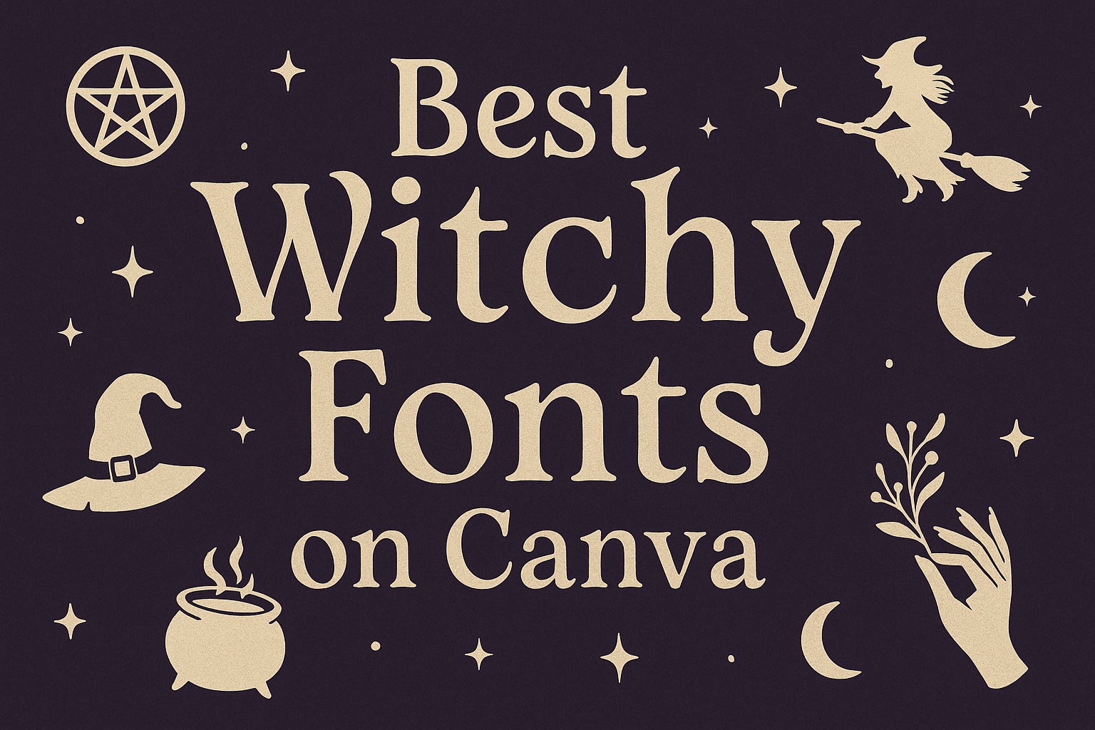
Finding the right font can transform a simple design into something that feels magical and mysterious. The best witchy fonts on Canva add instant charm, making projects stand out with a touch of gothic, spooky, or mystical style. Whether it’s for party invitations, social media graphics, or creative branding, these fonts set the perfect mood.
This guide highlights the top witchy fonts available on Canva and shows how to use them effectively. It also explores practical tips for pairing fonts, choosing the right style for different projects, and making sure designs look polished.
From eerie handwritten scripts to bold gothic typefaces, the following sections break down how each font works best and where it shines. With clear examples and usage ideas, anyone can bring a witchy aesthetic to life in their Canva designs.
Top Witchy Fonts on Canva
Canva offers a wide range of fonts that capture gothic, spooky, and mystical styles. Some stand out for their popularity, while others bring unique personality or serve as underrated treasures for creative projects.
Most Popular Witchy Fonts
Some fonts appear again and again in witchy-themed designs because they balance style with readability. ITC Blackadder, for example, has an inky, hand-drawn look that feels old-world and mysterious. It works well for invitations, posters, and social media graphics.
Another favorite is Butcherman, a rough, jagged typeface that instantly signals horror or Halloween. Its distressed edges make it ideal for scary event flyers.
Witching Hour is also widely used. With its elegant curves and slightly twisted shapes, it gives off a dark but stylish vibe that suits book covers or party invites. These fonts remain popular because they’re versatile and easy to recognize as “witchy.”
Unique Witch-Inspired Font Choices
Designers often look for fonts that feel fresh while still fitting a magical theme. Arsenica adds sharp, pointed serifs that resemble inked manuscripts. It feels refined but still mysterious, making it a good fit for spellbook-style projects.
Beast takes a bolder approach with heavy strokes and a rough texture. It suggests primal energy and ancient magic, which can work for music posters or fantasy branding.
For those who want a modern twist, Croogla blends sleek, clean lines with subtle mystique. It avoids cliché horror styles while keeping a witchy undertone. These unique options let designers stand out without losing the magical mood.
Hidden Gems for Magical Designs
Some fonts don’t get as much attention but can create striking results. Scary Stories has a handwritten, uneven style that looks like notes from an old journal. It adds authenticity to projects tied to folklore or ghost tales.
Ravenholm Inline uses hollow, stencil-like letters that build a sense of eerie suspense. It’s especially effective for game covers or thriller posters.
Another overlooked gem is Shlop, with gooey, dripping letters that feel unsettling and playful at the same time. Fonts like these, highlighted in collections of enchanting witchy fonts on Canva, give designers more variety when creating magical or spooky themes.
How to Find and Use Witchy Fonts in Canva
Designers can explore Canva’s font library to locate witchy styles, apply them directly to templates, and adjust details like size, spacing, and color. These steps help create text that feels mystical, readable, and well-suited for seasonal or magical themes.
Searching for Witchy Fonts
Users can start by opening the font menu in Canva’s editor. The search bar makes it easy to type keywords like gothic, vintage, or witchy to filter relevant options. Fonts such as Arsenica or Scary Stories appear under decorative or themed categories, making them simple to locate.
Browsing curated lists can also save time. For example, collections of best witchy fonts on Canva highlight styles with gothic details, distressed textures, or mystical flourishes. These guides help identify fonts that fit Halloween graphics, book covers, or spiritual branding.
It’s also useful to preview fonts directly on sample text. This allows users to see how ornate capitals, uneven strokes, or decorative swirls appear in practice. Fonts with too many flourishes may look better in headers than in body text.
Applying Fonts to Your Projects
Once a font is chosen, Canva lets users apply it to any text box with one click. Designers can then adjust size, boldness, and alignment to match the layout. For example, a bold serif font like Beast works well for titles, while lighter decorative fonts can enhance invitations or posters.
Using multiple fonts can create contrast. A witchy header paired with a clean sans-serif body font improves readability while keeping the theme consistent. Canva’s font pairing suggestions are helpful for balancing ornate and simple styles.
Text effects add extra impact. Shadows, glowing outlines, or gradient fills can emphasize the mystical mood. Applying these effects sparingly ensures the design stays clear and professional.
Customizing Font Styles
Customization makes witchy fonts more versatile. Adjusting letter spacing can make text feel airy and ethereal, while tighter spacing gives a dense, gothic look. Line height also affects readability, especially when using fonts with elaborate strokes.
Color choices matter too. Dark purples, deep blacks, and muted grays reinforce a spooky theme, while metallic gold or silver can add a magical touch. Canva’s color picker allows exact hex codes for consistent branding.
For added creativity, users can combine fonts with icons or symbols. Some witchy fonts already include decorative glyphs, but Canva’s graphic library adds runes, stars, or crescent moons to complement the text. This combination helps create more engaging and thematic designs.
Best Use Cases for Witchy Fonts
Witchy fonts work best when paired with projects that need a balance of mystery, charm, and a slightly eerie tone. They help designs stand out by adding personality that feels both creative and thematic.
Halloween Designs
Halloween is one of the most common times people use witchy fonts. Fonts like Butcherman or Shlop add a dripping, spooky effect that works well on party invitations, haunted house flyers, or themed posters. Their rough edges and unusual shapes instantly create a chilling atmosphere.
Designers often mix bold witchy fonts for headlines with simpler fonts for body text. This keeps the design readable while still giving it a strong seasonal theme. Using color combinations like black, orange, and purple makes the font effects even more striking.
Some fonts, such as Jeepers or Scary Stories, give off a playful but creepy vibe. These are especially useful for family-friendly events where the design should feel spooky but not too intense. Pairing these fonts with cartoon-style graphics can create a lighthearted Halloween look.
Spiritual and Mystical Branding
Witchy fonts also fit well in branding for businesses tied to spirituality, tarot, or alternative wellness. Fonts like Arsenica or ITC Blackadder carry a more elegant, handwritten style that suggests mystery without being overly dark. This makes them suitable for logos, product packaging, or website headers.
Many shops selling crystals, candles, or herbal products use fonts that look handwritten or vintage. This style helps create an authentic connection to traditions and rituals. A font like Megrim, with its geometric design, can also work for brands that want a modern mystical feel.
Choosing the right font depends on the audience. While sharp, gothic fonts may appeal to those drawn to darker aesthetics, softer script styles often work better for spiritual guidance or wellness-focused brands. The font choice sets the tone for how people view the business.
Witchcraft Social Media Graphics
Social media posts about witchcraft, astrology, or spellwork often rely on fonts that feel both stylish and thematic. Fonts like Witching Hour or Ravenholm Inline bring a mystical edge that makes graphics eye-catching in crowded feeds.
Creators often use these fonts for quotes, ritual tips, or moon phase updates. Pairing them with simple backgrounds, such as star patterns or textured paper, helps keep the focus on the text. Bold fonts make short phrases stand out, while lighter script fonts work well for captions.
For community groups or personal accounts, mixing fonts can give posts variety. A dramatic headline font combined with a clean body font keeps posts readable while still feeling magical. This mix ensures the design looks polished without losing the witchy theme.
Font Pairing Ideas for Witchy Aesthetics
Pairing fonts for witchy themes works best when balance is the focus. Strong decorative styles often need a calmer partner, while script fonts can add movement and personality when matched with more structured typefaces.
Combining Witchy Fonts with Serif Fonts
Serif fonts bring a grounded, traditional feel that pairs well with dramatic witchy lettering. A bold option like Butcherman or Shlop can stand out as a headline, while a serif such as Times New Roman or Cormorant Garamond keeps body text readable.
This balance works well for invitations, posters, or book covers. The serif font provides clarity, while the witchy font sets the tone. Designers often use serif fonts in smaller text to avoid overwhelming the design.
A simple pairing might look like this:
| Witchy Font | Serif Font Partner | Best Use Case |
|---|---|---|
| Butcherman | Cormorant Garamond | Halloween posters |
| Witching Hour | Times New Roman | Event invitations |
| ITC Blackadder | Playfair Display | Fantasy book covers |
Mixing Script and Decorative Fonts
Script fonts add flow and elegance, making them a great match for sharp or eerie decorative styles. For example, Arsenica or Ravenholm Inline can be paired with a script like Great Vibes or Allura to create contrast between structured and fluid letterforms.
This pairing works well for projects that need both drama and charm. A script font can soften the edges of a bold decorative font, making the design feel more balanced.
Designers often use the decorative font for titles and the script for accents. This keeps the design legible while still adding personality. A wedding invite with a gothic theme, for example, could use Arsenica for the names and a script for smaller details.
Tips for Enhancing Witchy Typography
Designers can create stronger witchy themes by pairing fonts with subtle decorative details and carefully chosen colors. Small touches like mystical icons or moody palettes help text feel more intentional and visually aligned with the theme.
Adding Magical Elements
Simple graphic accents can make witchy fonts feel more authentic. Stars, crescent moons, crystals, or vines placed near text add context without overwhelming the design. These elements work well as corner decorations, dividers, or small icons beside headings.
Texture also plays a role. A light grain, paper effect, or smoky overlay behind the text can make typography feel aged or mysterious. These effects should be subtle so the font remains readable.
Spacing and layout matter, too. Wide letter spacing in titles can create an airy, mystical tone, while tighter spacing can make text feel more intense. Pairing fonts with symbols like pentagrams or potion bottles can reinforce the theme when used sparingly.
A quick checklist for magical details:
- Icons: stars, moons, candles
- Textures: parchment, smoke, stone
- Accents: borders, frames, runes
Color Schemes for Witchy Designs
Color choices strongly affect how witchy fonts look. Dark shades like black, deep purple, and forest green set a moody tone. Lighter accents such as silver, gold, or muted cream balance the darkness and keep text legible.
Contrast is important. A pale font on a dark background highlights the letters, while dark text on parchment textures gives a vintage feel. Designers should avoid overly bright neon colors, which can clash with the mystical style.
Complementary palettes often work best. For example:
- Black + Gold for elegance
- Purple + Silver for mystery
- Green + Brown for nature-based themes
Using gradients or layered tones can also add depth. A title in dark violet fading into black feels more dynamic than a flat color, while subtle highlights around letters can make text glow slightly without overpowering the design.
Licensing and Usage Considerations
When using witchy fonts in Canva, designers need to understand how licensing works. Canva offers both Free and Pro content, and each comes with its own rules on how it can be used.
Free fonts can be used without cost, while Pro fonts require either a Canva Pro subscription or a one-time license purchase. According to Canva’s own licensing guide, once a font is applied to a design, it can be used for both personal and commercial projects.
However, there are limits. Fonts and other elements cannot be used as-is or resold separately. For example, a font cannot be redistributed as a standalone file, but it can be included in a finished design like posters, social media graphics, or merchandise.
Some designers may also want to create templates. Canva’s rules state that Pro content, including fonts, cannot be used in templates that are sold outside of Canva.
Here’s a quick breakdown:
| Content Type | Allowed Uses | Restrictions |
|---|---|---|
| Free Fonts | Personal & commercial designs | Cannot be resold as standalone |
| Pro Fonts | Personal & commercial designs with Pro license | No use in external templates |
| Fonts in Logos | Allowed | Cannot trademark Canva library elements |