Creating eye-catching posters is a vital skill for designers, and CorelDRAW is an excellent tool to master this art. With its array of features, CorelDRAW allows users to bring their creative visions to life, whether they are designing for personal projects or professional needs. By utilizing CorelDRAW, designers can produce stunning and effective posters that capture attention and convey messages clearly.
The software provides various tools and templates to make the designing process both efficient and enjoyable. Beginners and experienced designers alike can benefit from experimenting with different elements such as color, typography, and layout. Exploring the different options within CorelDRAW helps users enhance their skills and creativity, leading to more memorable poster designs.
For those eager to learn, numerous resources are available to guide you through the steps of creating outstanding posters. Tutorials like this one provide valuable insights into using CorelDRAW’s features effectively. These guides serve as a handy starting point for anyone interested in producing professional-looking designs effortlessly.
Understanding CorelDRAW Basics
CorelDRAW is a powerful graphic design software that offers robust tools for creating high-quality posters. Knowing your way around the workspace and essential tools will streamline your design process. Setting up your document correctly ensures everything runs smoothly.
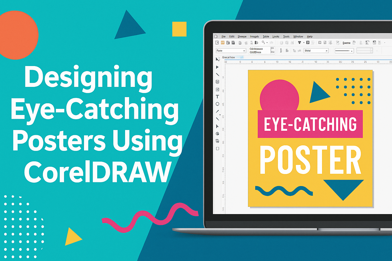
Workspace Overview
The CorelDRAW workspace is designed to be intuitive yet comprehensive. It features multiple dockers, toolbars, and a customizable interface to help tailor the workspace to fit personal preferences. Users can easily access commonly used features.
The Property Bar changes contextually, showing options based on the selected tool. This adaptability allows users to make quick adjustments. The Color Palette is on the right, offering quick color selection. Navigation is straightforward, with a zoom tool and pan options to focus on details.
Toolbox Essentials
CorelDRAW’s toolbox is packed with tools necessary for crafting designs. The Pick Tool is fundamental, allowing users to select, position, and transform objects. The Shape Tool provides options for adding curves, lines, and shapes, with customizable properties.
Text manipulation is crucial in poster design. The Text Tool allows insertion and editing of text with various font and size selections, vital for designing eye-catching messages. Another significant tool is the Fill Tool, offering color, gradient, and pattern fills to enhance designs dynamically.
Setting Up a New Document
When starting a new project, setting up your document properly is key. Begin by selecting File > New to open the New Document dialog. Choose the appropriate size for your poster; standard is 18″ x 24″, but custom sizes can be set.
Resolution is also important, typically set at 300 DPI for high-quality prints. Users can select from different units of measurement, like inches or millimeters, for precision. Adjusting the color mode to CMYK is recommended for printing purposes, ensuring color accuracy. Proper setup paves the way for a more efficient and effective design process.
Planning Your Poster Design
Creating an impactful poster in CorelDRAW involves three main areas: understanding the audience and purpose, choosing a theme and color scheme, and organizing content. Each part helps ensure the poster communicates its message clearly.
Defining the Purpose and Audience
The first step is to clearly define the purpose of the poster. Is it for promoting an event, educating an audience, or advertising a product? Knowing the goal helps guide design decisions.
Identifying the target audience is equally important. Are they teenagers, professionals, or families? Understanding their preferences allows the designer to tailor visuals and messages to grab their attention. For instance, bright colors and dynamic layouts might appeal to a younger audience, while more subdued designs might be suitable for professionals.
Gathering this information provides a strong foundation for the poster’s design, ensuring it speaks to the intended viewers.
Choosing a Theme and Color Scheme
Once the audience and purpose are set, selecting a theme and color scheme comes next. The theme should align with the poster’s goal. For example, a poster promoting a music festival might use a vibrant and energetic theme.
Colors help convey emotions and attract attention. A good choice of colors is essential. Cool shades like blue and green can create a calming effect, while warm tones like red or orange generate excitement. Combining colors that complement each other enhances the visual appeal.
Ensuring a cohesive theme and color scheme helps keep the design consistent and attractive.
Organizing Content Hierarchy
Organizing the content in a clear hierarchy ensures the message is communicated effectively. The most important information should be the most prominent, guiding the viewer’s eye naturally through the poster.
Using headings, subheadings, and bullet points can help arrange information logically. CorelDRAW tools can be used to adjust text size and placement, ensuring readability.
Balancing text with images ensures nothing appears cluttered. Using visuals to highlight key details, such as dates and locations, can draw the viewer’s attention.
A well-organized hierarchy makes it easy for the audience to quickly grasp the poster’s message.
Creating Eye-Catching Layouts
Creating appealing layouts involves careful planning. By using grids and alignment, balancing elements effectively, and incorporating white space, designers can make posters stand out.
Using Grids and Alignment
Grids are essential for creating organized layouts. They provide a framework that helps ensure consistency. CorelDRAW offers tools for setting up grids, making it easy to align text and images perfectly.
Using alignment strategically can lead to a more polished appearance. Employ left, center, or right alignment based on the overall design. Aligning elements properly not only enhances readability but also leads the viewer’s eye smoothly across the poster.
Visual appeal increases when elements are aligned with intent. Consistent spacing keeps the layout tidy, preventing any chaotic look. This technique ensures that the poster looks professional and engaging, drawing the audience in effortlessly.
Balancing Elements for Impact
Balance plays a crucial role in effective poster layouts. It involves distributing elements evenly to create harmony. CorelDRAW enables designers to adjust elements, ensuring a balanced design.
Visual harmony keeps viewers engaged without overwhelming them. Symmetry can be useful for formal designs, while asymmetry can add interest. Balancing colors, shapes, and sizes adds depth to the poster.
Contrast helps differentiate important elements. Highlight key messages by balancing bold colors or large images with more subtle elements. This approach helps maintain focus where it’s needed most, increasing the overall impact on the audience.
Incorporating White Space
White space is a powerful design tool that should not be overlooked. It doesn’t mean leaving parts of the poster empty. Instead, it refers to using empty spaces strategically to improve structure.
White space enhances readability by giving the eyes a place to rest. It can emphasize important information, making the poster look less cluttered. In CorelDRAW, designers can resize elements to create effective white spaces.
Using white space wisely adds elegance to the design. It ensures the essential parts stand out, encouraging viewers to pay attention to the key message. A well-balanced use of white space can greatly enhance the overall visual appeal.
Working with Text and Typography
When designing eye-catching posters with CorelDRAW, text and typography are key elements. It’s important to select the right typefaces, adjust text properties for clarity and impact, and create engaging text effects to make your poster stand out.
Selecting Typefaces
Choosing the right typeface is essential for setting the tone of your poster. Different fonts evoke different emotions and messages. For a formal look, serif fonts are often the go-to choice. On the other hand, sans-serif typefaces can give a modern and clean feel. CorelDRAW offers a wide selection of fonts. It’s beneficial to try combinations of fonts to see which pair well together.
Avoid using too many fonts, as it can make the design look cluttered. Typically, sticking to two or three fonts is a good rule of thumb. Also, ensure the chosen fonts are readable from a distance, especially for key messages on the poster.
Adjusting Text Properties
Once you’ve selected your fonts, it’s time to fine-tune their appearance. CorelDRAW provides several text property options. These include adjusting size, kerning, tracking, and leading. Text size should vary based on importance. Headlines might need larger sizes to attract attention, while body text should remain readable and not overpower the main message.
Kerning and tracking ensure that letters are spaced correctly. This avoids overcrowding or excessive space between characters. Leading, the space between lines of text, can be adjusted for better readability and layout balance. Playing with these settings helps create a polished and professional look.
Creating Text Effects
Text effects can add an exciting element to your poster. In CorelDRAW, designers can apply various effects, such as shadows, outlines, and gradients. Applying a shadow can make the text pop off the page and create depth. Using outlines can highlight specific words or phrases, making them stand out.
Another effective technique is using gradients to give color transitions to the text. This effect can make the text eye-catching without being overwhelming. CorelDRAW also allows users to transform text into shapes or incorporate text within other design elements, adding a unique flair to the overall design. Experimenting with these effects can enhance visual appeal and draw viewers in.
Utilizing Colors and Effects
In CorelDRAW, using colors and effects can dramatically enhance the appeal of a poster. Choosing the right colors can attract attention, while gradients and transparencies add depth. Special effects can make a design stand out even more.
Choosing Colors
Colors are crucial in setting the mood and tone of a poster. When selecting colors, think about the message that the poster needs to convey. For example, vibrant colors can be used to draw attention and energize the viewer.
CorelDRAW offers tools to help choose the right color palette. The color wheel is a fantastic resource for exploring complementary and contrasting colors. This can be especially effective in creating eye-catching designs.
Keep in mind the psychological effects of colors. For instance, blue might evoke calmness, while red can signal urgency. Choosing the right colors ensures the poster communicates its message clearly.
Applying Gradients and Transparencies
Gradients can add a smooth transition between colors, providing depth and interest to your poster. CorelDRAW allows users to apply linear or radial gradients easily. These gradients can create a sense of movement and texture that captures attention.
Transparencies can also enhance a design. Use them to blend images or elements into the background subtly. This technique can highlight key content on the poster without overwhelming the viewer. Adjusting the transparency levels can enhance the poster’s style and sophistication.
Experimenting with different gradient and transparency levels helps achieve the desired visual effect. This not only makes the poster appealing but also keeps viewers engaged.
Using Special Effects
Incorporating special effects can give the poster a unique flair. CorelDRAW includes a variety of effects such as shadows, glows, and reflections. These can make elements pop and create visual hierarchy.
Drop shadows can help key text stand out from the background. Similarly, glow effects can make certain elements look luminous or more pronounced. Reflections can add a three-dimensional feel to the images or text.
Using special effects effectively can transform a simple design into an extraordinary one. It’s important to keep the effects balanced to maintain the poster’s overall readability and focus.
Incorporating Graphics and Images
Graphics and images are crucial for creating engaging posters. They enhance visual appeal and effectively convey the message. Different tools in CorelDRAW aid in inserting, creating, and optimizing these visual elements.
Inserting and Editing Images
Adding images to a poster in CorelDRAW is a straightforward process. Users can import images by selecting the File menu and choosing Import. Once added, the software provides various tools to adjust and edit the images.
Basic edits include resizing, cropping, and rotating. For more advanced adjustments, the Image Adjustment Lab lets designers change brightness, contrast, and color balance. These tools ensure that images fit seamlessly with the overall poster design, maintaining balance and harmony.
Designers can also apply filters and effects to enhance the picture quality or give it a unique look. It’s important to ensure that the images used are of high resolution to avoid pixelation.
Creating Custom Illustrations
CorelDRAW offers powerful tools for creating custom illustrations. The Bezier tool and Shape tools allow designers to draw detailed designs easily. These can be used to create unique shapes and patterns, adding a special touch to the poster.
Using layers helps manage complex designs by separating different elements. This makes it easier to edit specific parts without affecting others. They can use the Color Palette to experiment with different color schemes that match the poster’s theme.
Custom illustrations can make a poster stand out with personalized elements that aren’t found in stock images. It adds a level of creativity and originality that captures the audience’s attention effectively.
Optimizing Image Quality
For a poster to have a professional look, image quality is key. CorelDRAW offers several tools to ensure images are sharp and clear. The Resample feature allows users to change the image size without losing resolution.
Using the Bitmap effects, designers can enhance image details and remove noise that might affect the quality. It’s essential to monitor file size because large images can slow down processing and cause printing issues.
Before finalizing the poster, performing a proof helps spot any issues with image quality. Adjustments can be made as needed to ensure that the final print is crisp and visually appealing.
Finalizing Your Poster
After designing your poster, the next steps involve ensuring everything is polished and ready to go. This includes checking for errors, preparing the file for print, and choosing the right format to export your design. These processes help maintain the quality and effectiveness of your poster.
Proofreading and Revising
Proofreading is a crucial step in finalizing your poster. It’s important to check for spelling, grammar, and consistency in text and design elements. Look for typos in headlines, body text, and any smaller print areas. Ensuring that the text is easy to read and that all information is accurate prevents confusion for the audience.
In addition to text, check the design elements. Ensure alignment, spacing, and colors are consistent. This helps create a harmonious and professional look. Reviewing these details helps in making the finished product appear clean and well-organized.
Getting feedback from others can be very helpful. They might spot errors you missed or provide suggestions to improve the design. A fresh set of eyes can make a significant difference.
Preparing for Print
Before printing, make sure you’ve chosen the right size and paper type for your poster. Standard poster sizes like 18″ x 24″ or 24″ x 36″ are common choices. By setting the right dimensions and orientation early, the print quality will be clearer and more vibrant.
Opt for quality paper, such as glossy or matte finishes, depending on the look you’re aiming for. This not only affects how the colors appear but also how the poster feels when held. Talk to your print provider about these options for the best results.
Check the color settings. It’s often best to use CMYK color mode for printing to ensure colors come out as expected. This setting aligns with most printers, keeping the design’s colors vibrant and accurate.
Exporting Your Design
Once the design is finalized, it’s time to export it. In CorelDRAW, exporting is simple but presents several choices. Ensure that you select the right file format, such as PDF, TIFF, or JPEG, depending on how and where your poster will be used.
Choose a high-resolution setting to maintain image quality. This ensures that no pixelation or blurring occurs. A minimum of 300 DPI (dots per inch) is recommended for prints to appear sharp and clean.
Consider the file’s size. Large files can slow down the printing process or cause issues when sharing digitally. Compress the file if necessary, but ensure that the quality isn’t reduced to avoid a loss in clarity or detail.