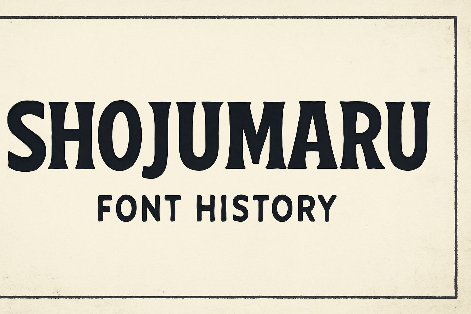
Shojumaru is a display font with a unique blend of classic and contemporary design elements. It is inspired by a movie poster from the 1957 film “Sayonara,” starring Marlon Brando. This font mixes traditional Japanese woodblock printing with modern typography, creating bold, geometric letterforms.
Created by designers Brian J. Bonislawsky and Jim Lyles, Shojumaru offers a powerful and distinctive look. Its sharp angles and thick strokes make it stand out, capturing attention in any design setting. Shojumaru breaks away from typical chop suey styles by combining them with classic letterforms, resulting in a font that is both traditional and fresh.
Shojumaru is free for commercial use, making it accessible for various projects. It can be downloaded from platforms like Google Fonts and 1001 Fonts, where it has been popular among designers and enthusiasts. For more details on Shojumaru, visit its page on Google Fonts or check out 1001 Fonts to see how it has been added to numerous collections.
Origins of Shojumaru
Shojumaru is a font with a rich history, shaped by both traditional Japanese aesthetics and influences from mid-20th-century pop culture. Behind this creative endeavor are designers Brian J. Bonislawsky and Jim Lyles, who have blended these unique elements into a typeface that stands out.
Influences and Inspiration
Shojumaru draws its inspiration from diverse sources. One key influence is an advertisement for the 1957 film “Sayonara” starring Marlon Brando. The font creators wanted to evoke the feeling of traditional Japanese woodblock printing but with a modern twist. This resulted in bold, geometric shapes and sharp angles that mimic the style of wooden carvings.
The design also breaks away from the typical chop suey style by incorporating traditional Japanese letterforms with a Western twist. The goal was to create a font that feels both historical and contemporary. This combination has made Shojumaru both unique and memorable, capturing the attention of designers looking for something that stands out.
Creator Background
The creative minds behind Shojumaru are Brian J. Bonislawsky and Jim Lyles. Each designer brings a wealth of experience to the project. Brian J. Bonislawsky is known for his work in graphics and typography, which is influenced by historical and cultural elements.
Jim Lyles, on the other hand, has an extensive background in typeface design. His collaboration with Bonislawsky blends technical skill with creative vision. The partnership aimed to create a font that meets modern typographic needs while honoring traditional styles. Their combined expertise ensured that Shojumaru is more than just a display font; it’s a statement of artistic collaboration and cultural storytelling.
Design Elements
Shojumaru is a unique font that draws inspiration from both traditional and modern letterforms. It stands out with bold features while maintaining legibility and versatility, ideal for eye-catching designs.
Characteristics of Shojumaru
The Shojumaru font is known for its bold and striking appearance. Its design includes strong lines and sharp edges, inspired by a 1957 movie poster for “Sayonara” featuring Marlon Brando. The typeface mixes chop suey and traditional letterforms, creating a distinctive look.
The font offers clear differentiation between characters due to its spacing and x-height, contributing to legibility. It includes small capitals and a full set of inferiors, making it suitable for a variety of uses from posters to headlines.
Comparison with Similar Fonts
When compared to other bold display fonts, Shojumaru sets itself apart with its unique mix of styles. Unlike typical chop suey fonts, it integrates more traditional letterforms, which makes its aesthetic unique. This combination results in a font that is both bold and classic.
Shojumaru excels in contexts where an impactful typeface is needed. Similar fonts may lean more towards one style, either chop suey or traditional. However, Shojumaru successfully bridges these styles, making it a versatile choice for designers looking for something different and striking Shojumaru – Google Fonts.
Usage of Shojumaru
Shojumaru is a bold font that draws attention, making it perfect for headlines and posters. Its unique style blends traditional and modern elements, providing a striking appearance suitable for various media.
Popular Implementations
Shojumaru is often used in places where strong visual impact is required. It is a favorite for movie posters, capturing attention with its unique style. Originally inspired by a 1957 film poster, it continues to be a top choice for those looking to create a retro feel.
This font is also commonly seen in advertising material where a bold statement is necessary. Designers utilize it to break away from ordinary looks, giving their projects a unique edge.
Appropriateness for Various Media
Shojumaru’s design works particularly well in print and digital formats. Its legibility, thanks to its spacing and x-height, makes it a good fit for headlines in magazines, newspapers, and websites. This makes the text clear and easy to read from a distance.
When used in online content, Shojumaru adds a touch of uniqueness without overwhelming other design elements. Additionally, the font is available for free under the SIL Open Font License, encouraging its use in commercial projects without extra cost.
Technical Specifications
Shojumaru font offers a mix of bold design and adaptability, making it appealing for various design projects. Knowing the file formats helps users integrate it with different software. Understanding licensing ensures correct use and distribution.
File Formats and Compatibility
Shojumaru is available in popular file formats like TTF and OTF. These formats ensure it works with most design and word processing software. Users can easily download and install these files on both Windows and Mac systems. Its broad compatibility makes it suitable for both personal and commercial projects. Additionally, the font’s geometric design enhances readability on both digital and print media.
Shojumaru supports a wide range of character sets, which makes it adaptable for many languages. This flexibility helps designers when working on multicultural projects. Because of these features, Shojumaru is a versatile choice for those needing a robust, stylish font.
Licensing and Distribution
Shojumaru is released under the SIL Open Font License, version 1.1. This license allows users to freely use, modify, and distribute the font. Such flexibility is great for those wanting to personalize or enhance the font for their projects. Users can even sell modified versions, fostering creativity and innovation.
It’s important to follow the licensing terms to avoid legal issues. If using Shojumaru in a commercial product, ensuring it complies with licensing is crucial. This friendly license structure encourages widespread use while protecting the creators’ work.
Community and Reception
Shojumaru has captured interest both critically and within design communities. Its unique blend of traditional and modern design elements make it memorable in various creative spaces.
Critical Acclaim and Reviews
Shojumaru’s design has received positive attention from font critics and enthusiasts. Designed by Brian J. Bonislawsky and Jim Lyles, the typeface is praised for its ability to fuse traditional Japanese woodblock influences with a modern twist. Many designers admire its bold geometric shapes and sharp angles, noting its effectiveness in capturing attention.
Reviewers often appreciate Shojumaru’s versatility in graphic design projects, particularly in posters and branding. The font’s usage in various mediums showcases its adaptability. Critics also acknowledge its historical inspiration, tying it to a 1957 film starring Marlon Brando, enhancing its cultural depth.
User Adoption
Shojumaru has seen widespread use since its creation. Available on platforms like 1001 Fonts and FontSpace, it is free for commercial use, encouraging designers and businesses to incorporate it into their projects. Its popularity is evidenced by thousands of downloads and inclusion in numerous font collections.
Users appreciate its distinctive look that stands out, especially in bold titles and headings. Designers have embraced its strong style for both personal and professional projects, further cementing its place within the font community. Shojumaru continues to be a popular choice for those seeking a unique and energetic typeface.