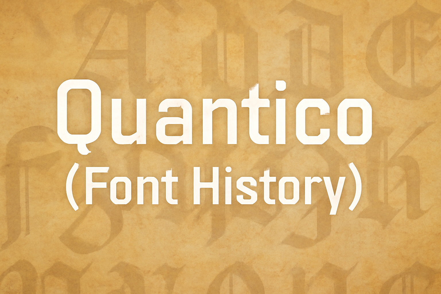
Quantico is a unique typeface that combines historic inspiration with a modern twist. Developed by MADType, the font finds its roots in old beer packaging and military lettering. Its distinct character comes from the angular shapes created by 30-degree angles and straight lines.
The font family offers multiple weights, from regular to bold, which allows designers to play with emphasis and visual hierarchy. Quantico shines in both text and display settings, making it versatile for various design projects. The advanced OpenType version even includes alternate characters and ligatures.
Quantico’s aesthetic is marked by a sense of discipline and modernity, appealing to those who want a strong and structured look in their designs. If you’re intrigued by typefaces and design, exploring Quantico offers a glimpse into the balance of history and contemporary style. Discover more about Quantico and its characteristics on platforms like Font Squirrel.
Origins and Inspiration
Quantico is an angular typeface family inspired by unique design elements. Its development draws from both historical and modern influences, creating a font that is visually distinctive and versatile.
Design Philosophy
Quantico features a design that prioritizes sharp angles and straight lines. Inspired by old beer packaging and military lettering, it uses 30-degree angles for its distinct character shapes. This design philosophy ensures a disciplined and modern appearance, making it suitable for various contexts requiring a strong visual impact. The choice of angles and lines gives it a bold and assertive style, appealing to a wide range of design projects. Its geometry lends itself well to projects that need a touch of strength and innovation.
Typeface Influences
The influences behind Quantico stem from historical design approaches. Notably, the aesthetic of military lettering and the angular forms seen in vintage beer labels shaped its creation. These influences contribute to the font’s unique appearance, emphasizing both tradition and modernity. By blending these elements, Quantico bridges the gap between historical significance and contemporary design needs, providing options for designers to create with a sense of heritage and style. This blend of influences makes Quantico an adaptable choice for various visual communication tasks. Quantico has careful kerning and spacing to maintain readability and visual appeal, making it a favorite among designers.
Development and Design
Quantico stands out for its military-inspired design and unique geometric features. This section explores how the font’s initial ideas evolved into a digital typeface and the process of expanding its character set.
Initial Concept and Sketches
Quantico’s design originated from a desire to create a typeface that captures the essence of military lettering. The inspiration came from old beer packaging and military markings, blending functionality with a bold aesthetic. Designers focused on creating sharp, angular shapes that convey strength and precision.
Sketches showed a mix of straight and slightly curved lines, adding depth to the letters. The goal was to make each character strong yet readable. This step laid the groundwork for a font that would later become known for its geometric look.
Digital Creation Process
Bringing Quantico to life digitally involved translating those initial sketches into a fully functional typeface. Designers had to ensure that the sharp angles and straight lines were accurately represented. The process required careful attention to detail, especially in maintaining the balance and proportion of each character.
Using software tools, the designers converted hand-drawn sketches into digital formats. This allowed for precise control over line angles, with many letters featuring distinct 30-degree angles. The digital phase also enabled fine-tuning of spacing and alignment to enhance readability and visual appeal.
Character Set Expansion
Expanding Quantico’s character set was crucial for its versatility. Initially, the font featured a basic Latin alphabet, but demand for more characters led to the inclusion of additional glyphs and symbols. This expanded its usability in different languages and contexts.
The expanded set included accented characters and punctuation marks, making it suitable for a wider range of applications. This increased its appeal in global markets where diverse character sets are essential. The expansion maintained the original design elements, ensuring consistency across all characters.
For more on Quantico and its features, visit this guide to Font Characteristics.
Quantico Typeface Characteristics
Quantico is a unique and angular typeface inspired by old beer packaging and military lettering. This typeface features characteristic angular shapes and offers strong readability and versatility in various styles and weights.
Distinctive Features
Quantico stands out due to its use of 30-degree angles and straight lines, creating unique character shapes. The angular design captures the essence of its vintage inspiration. This makes it ideal for creative projects that need a bold and distinct look.
It combines both traditional and modern elements, giving it a timeless appeal. The design works well in both large and small sizes, which is crucial for adaptability in different contexts, like branding or editorial work.
Readability and Legibility
Quantico boasts good legibility, making it effective for text or display settings. It has a balanced x-height, which helps with readability in smaller text. The well-proportioned spacing ensures that letters are easy to distinguish, reducing the risk of misreading.
With its clear character differentiation, Quantico is user-friendly for readers. The font works well on both digital and print mediums. It maintains its clarity and style across various resolutions and sizes, making it an excellent choice for diverse applications.
Font Weights and Styles
Quantico offers a variety of weights and styles, making it versatile for different design needs. It includes alternate characters and ligatures, adding to its flexibility in creative compositions. This diversity allows designers to emphasize certain elements or maintain consistency throughout a project.
The advanced OpenType version of Quantico provides additional options, such as different character variations. This variety supports creative expression, letting designers customize typography to fit their vision without losing the distinctive Quantico touch.
Usage and Applications
Quantico is a typeface known for its bold and modern design. It’s often used where a strong presence is needed. From impactful branding to versatile digital use, Quantico offers flexibility.
Branding and Identity
Quantico’s unique style makes it a great choice for branding. Its angular and commanding look lends itself well to logos and company identities. Brands in the tech and military sectors, in particular, find its modern design appealing. The sharp edges and clean lines of Quantico can help convey attributes like strength and innovation. Businesses looking to make a bold statement or present a forward-thinking image often turn to Quantico as their typeface of choice.
Print and Digital Media
This font is highly versatile in both print and digital media. In print, its clear lines and distinct shapes ensure legibility in various sizes, making it suitable for everything from brochures to posters. In digital media, Quantico is utilized in video game interfaces and app designs. Its design was inspired by military lettering, and it often appears in contexts requiring a confident and modern appearance. Whether on screen or paper, Quantico maintains its distinct, impactful character.
Webfont Considerations
Quantico is also available as a webfont, making it a popular choice for websites that want to create a dynamic look. When using Quantico as a webfont, developers should consider the font’s weight and size options to maintain readability across devices. Ensuring that it loads quickly is important for user experience since web performance can be affected by font size. Sites that employ Quantico often focus on high-impact visuals, using the font to complement bold colors and striking images.
Technical Details
Quantico is a sans-serif font with a military-inspired look, featuring distinct angular lines and geometric shapes. Understanding its file formats and licensing is key to effective use.
File Formats and Compatibility
Quantico is available in several file formats, making it versatile for different uses. The most common formats include TrueType (TTF) and OpenType (OTF). These formats ensure the font works on both Windows and macOS, providing broad compatibility.
TTF files are widely supported across many applications, while OTF offers additional typographic features. Both formats ensure high-quality text rendering. Quantico’s angular design is well-suited for print and digital media, allowing for consistent appearance across platforms.
Being a web-friendly font, it can also be utilized in web design projects thanks to its compatibility with web fonts like Google Fonts. This makes it easy to integrate into websites, ensuring consistent typography for online content.
Licensing and Usage Rights
Quantico is distributed under the Open Font License, which allows for both personal and commercial use. This license promotes collaboration and sharing while preventing unauthorized proprietary modifications.
Users can freely download and incorporate Quantico into multiple projects without additional costs. However, it is important to adhere to the terms of the license, which typically prohibits selling or distributing the font as a standalone product.
This flexibility makes Quantico an attractive choice for designers who need a reliable font for both personal endeavors and professional work. Always check specific licensing details to ensure compliant use.
Reception and Critiques
Quantico has found a special place in the world of typefaces. Designers appreciate its unique blend of angular shapes and straight lines. The inspiration from old beer packaging and military lettering gives it a bold, distinctive appearance. This has made it popular among those looking for a font with a modern yet classic feel.
With multiple weights available, such as regular to bold, Quantico offers versatility. Designers enjoy using it for both text and display settings. These different weights help in creating emphasis and hierarchy in design projects. The font’s kerning and spacing are praised for ensuring excellent readability.
Critiques of Quantico often mention its niche appeal. While many love its strong lines, others find it too specific for certain projects. Some users feel its angular nature can make it less suitable for softer, more elegant designs. Yet, its ability to convey discipline and modernity is undeniable.
Future of Quantico Typeface
Quantico is likely to remain a popular choice for design projects due to its unique character shapes. Its angular style, with 30-degree angles and straight lines, gives it a distinct appearance. This makes it suitable for both text and display settings, adding versatility to its use.
As technology evolves, typefaces like Quantico can broaden their applications. Designers may find new ways to integrate Quantico into digital media, such as websites and apps. Its bold and disciplined look adds a touch of modernity and order, which appeals to many creators.
Quantico’s adaptability ensures it thrives in various design environments. From traditional print to innovative digital platforms, it can enhance visual communication. With its multiple weights and meticulous kerning, designers can achieve both emphasis and readability effectively.
Recent interest in vintage and retro styles may also boost Quantico’s popularity. Inspiration from old beer packaging and military lettering appeals to those seeking nostalgic aesthetics. This trend can lead to more creative uses and variations of the typeface.
The future of Quantico lies in its combination of tradition and innovation. As design trends change, its blend of history and modern features keeps it relevant and appealing. This ensures Quantico’s continued place in the diverse world of typography.