Podkova is a unique slab serif font known for its monoline structure and diagonal terminals. The name comes from the Russian word for “horseshoe”, highlighting its wide proportions and distinct letterforms. This font stands out for its legibility at smaller sizes while maintaining a strong presence in display typography.
Originally designed for print, Podkova has adapted over time to become a variable font. This flexibility allows users to customize the weight and style as needed, making it versatile for both digital and print media. The font’s ability to convey both simplicity and elegance makes it a favorite for many projects.
Podkova’s open-source nature encourages font enthusiasts to contribute and adapt it further. This collaborative approach has helped maintain its popularity and relevance in design communities. Whether used in body text or headings, Podkova brings a touch of character and charm to any work.
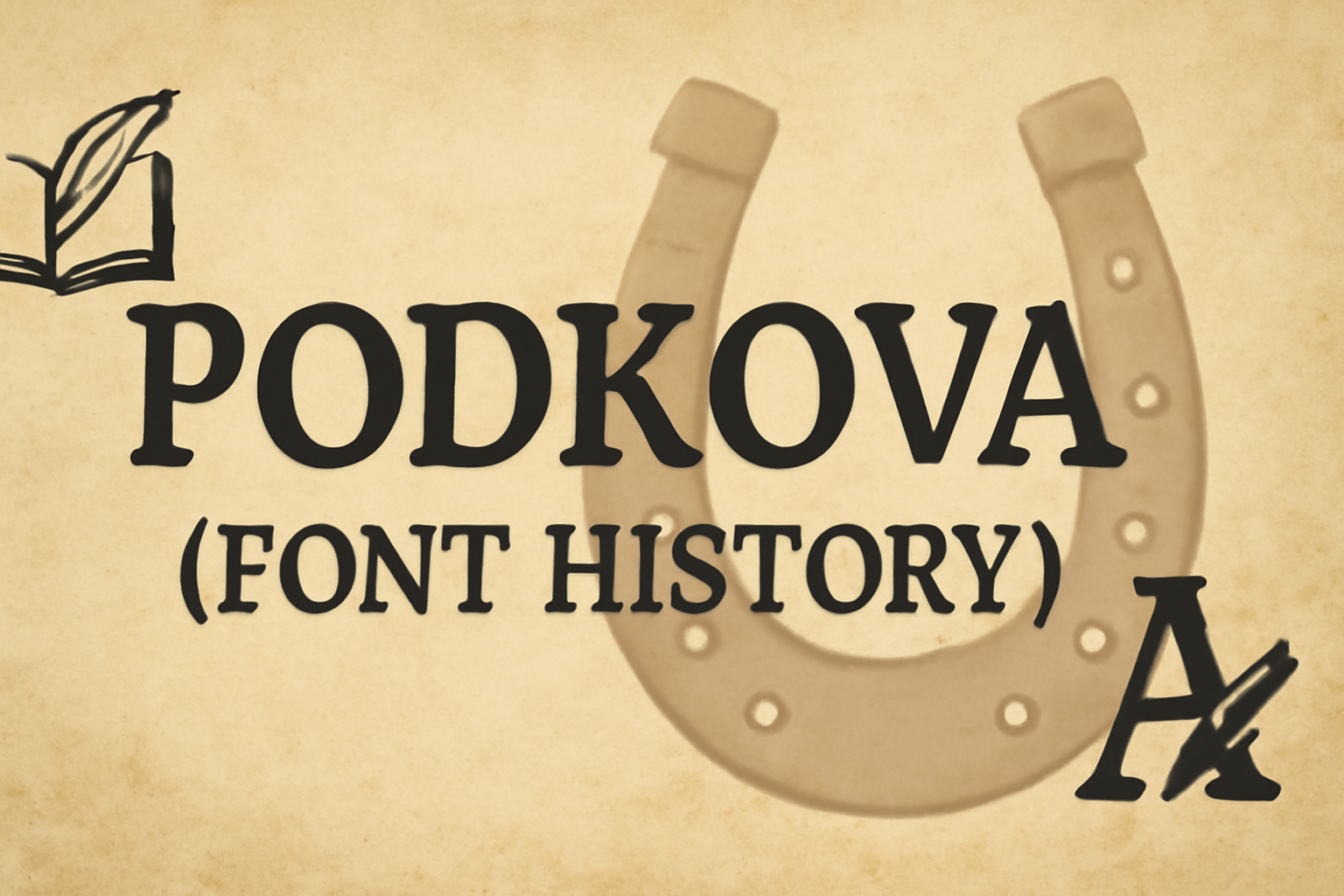
History of Podkova
Podkova is a monoline slab serif font known for its wide proportions and clean features. It’s especially useful for both small text and display typography.
Origin and Designers
Podkova, meaning “horseshoe” in Russian, was first designed by Ilya Yudin in 2010. The font initially gained attention for its distinctive slab serif appearance, featuring bold and square serifs. Yudin’s design emphasized simplicity, ensuring legibility while maintaining a unique style. The creation of Podkova was influenced by traditional Eastern European typography, which reflects in its strong and sturdy features that have become its defining characteristic.
Early Usage and Adoption
After its initial release, Podkova quickly found a niche in projects requiring clear but distinctive text. It was often used in headlines and short text blocks due to its ease of readability. Graphic designers appreciated its adaptability across different sizes. Its use in display typography provided an option that balanced modern simplicity with a nod to classic design elements, attracting diverse creatives who sought both function and form.
Evolution Over Time
Over the years, Podkova has undergone several updates to enhance its versatility. This includes modifications to its counters and terminals, which improved its functionality in various design contexts. Each update aimed to refine its appearance and maintain its relevance in evolving design trends. The open-source nature of Podkova has allowed a community of designers to contribute to its development, ensuring that it remains a popular choice for both digital and print media.
Design and Characteristics
Podkova font stands out with its bold and readable design. It’s characterized by wide proportions and unique serifs. The font maintains clarity at small sizes while also offering distinctive elements for display use.
Typography and Style
Podkova is a monoline slab serif. It features bold, square serifs that give it a strong and stable look. The diagonal terminals add a touch of modern style, enhancing its attractiveness for various projects. The font’s wide letters make it easy to read even when used for body text.
Designed by Ilya Yudin in 2010, Podkova combines traditional and modern elements. This balance makes it versatile enough for both web and print designs. Its clean and structured appearance suits professional and creative contexts alike.
Special Features and Glyphs
One of Podkova’s highlights is its wide range of weights, from Regular to Extra Bold. This variety offers flexibility in design, allowing users to adjust the mood and emphasis as needed. The font has open counters which improve its legibility, especially at smaller sizes.
The unusual letterforms, like the diagonal terminals, make Podkova distinctive for display typography. These features ensure a unique presence on the page, making it appealing for headlines and titles. The blend of classic serif features with modern touches sets it apart.
International Character Support
Podkova supports extended character sets, catering to multiple languages. This makes it an excellent choice for international projects. Its design ensures that each character maintains clarity, regardless of linguistic variation.
The font accommodates accents and special characters, expanding its usability. This comprehensive support enables designers to maintain consistency and style across different languages, enhancing Podkova’s role in creative endeavors. Its adaptability to diverse languages without losing style is a key benefit for global use.
Usage and Applications
Podkova is a versatile font, popular in various settings due to its legibility and distinctive letterforms. Its use spans everything from media and brands to digital platforms and community projects.
Popular Media and Brands
Podkova’s unique style has found its way into numerous media and brand identities. Its monoline slab serif design and diagonal terminals make it stand out, catching the eye in both logos and advertisements. Brands prefer its wide proportions for clear readability, making it a popular choice for companies looking for a strong yet friendly expression. Used in everything from tech to lifestyle, Podkova offers a blend of traditional and modern appeal.
Digital and Print Mediums
The font’s clean features and strong readability make it an excellent choice for both digital and print media. Its design ensures that text remains clear on screens and paper, even at smaller sizes. This versatility allows it to be effective in various contexts, including websites, ebooks, flyers, and magazines. Its wide letterforms and unique aesthetics contribute to a modern yet traditional look, suitable for editorial content and user interfaces alike.
Community Projects and Open Source
Podkova is also valued in community projects, thanks to its open-source nature. Designers often contribute to its development, making it adaptable to various needs. By being freely accessible on platforms like GitHub, it empowers creative collaboration and innovation. These features have made it a favorite among grassroots organizations and educational initiatives looking to integrate high-quality design without financial constraints.
Technical Details
Podkova is a monoline slab serif font that offers wide proportions and clean features for readability across sizes. It is designed to work on various platforms and supports different file types, enhancing its compatibility and rendering quality.
File Types and Font Weights
Podkova is available in multiple file formats, including TTF (TrueType Font) and OTF (OpenType Font). These formats ensure that users can implement the font across various software and web platforms with ease.
The font family also comes with different weights to suit various design needs. These weights typically include regular, bold, semi-bold, and extra-bold, giving designers flexibility and options for emphasis or style variations in typography. This range helps ensure that Podkova can be used in both text and headline settings effectively.
Compatibility and Rendering
Podkova is compatible with most modern operating systems and browsers, allowing for seamless integration across different platforms. Its design with diagonal terminals and wider letterforms makes it easy to read at small sizes, ideal for both digital and print media.
Effective rendering is a key feature of Podkova, ensuring clear text on all devices. This font has been optimized to maintain its integrity across varying screen resolutions, enhancing user experiences whether viewed on computers, tablets, or smartphones. This attention to detail makes Podkova a reliable choice for many design applications.
Cultural Impact
The Podkova font reflects its roots by merging traditional and modern design. Its influence has grown, impacting how people learn and interact with typography. Below, the focus is on how Podkova contributes to design trends and education.
Typography Trends
Podkova has become a notable name in typography due to its unique design elements. Its broad, monoline slab serif features offer a modern twist on classic fonts. This versatile typeface adapts well to both digital and print media. It stands out with its wide proportions and diagonal terminals, making it suitable for headlines and body text. Designers often use Podkova to give a clean, polished look to projects, enhancing readability and style.
Many consider it a trendsetter in the growing popularity of slab serif types. It balances readability with distinct character, which appeals to a wide audience in graphic design. As designers seek fonts that merge tradition and innovation, Podkova continues to make waves, influencing typography trends worldwide.
Educational Influence
Podkova’s design also plays a role in education, particularly in typography and graphic design courses. Its clear, bold strokes help students understand the impact of font choice on readability and visual aesthetics. Learners can explore Podkova’s features to see how letterforms impact design.
This font encourages students to experiment with typefaces, enhancing their skills in creating balanced, appealing designs. By using Podkova, educators showcase practical examples of effective design techniques. It serves as a tool to teach legibility and design principles, helping students grasp the importance of choosing the right font for their projects. It is thus a valuable resource in design education, supporting the development of future designers.
Future of Podkova
The future of Podkova looks bright with ongoing developments focused on improving its functionality and engaging the community. These efforts aim to enhance versatility and ensure the font remains a popular choice.
Developments and Updates
Podkova is set to continue evolving through modern updates. These updates focus on enhancing readability and expanding the font family with additional weights and styles. The intention is to cater to more diverse design needs.
Developers are working on refining its design elements. This includes improving the clarity of its distinct serifs and optimizing it for digital displays. By doing so, they maintain compatibility with a wide array of devices and platforms.
Accessibility improvements are also in the pipeline. New updates aim to ensure the font remains legible across different screen sizes and resolutions. This ongoing adaptation guarantees Podkova’s relevance in changing technological landscapes.
Community Engagement
Community involvement is pivotal to Podkova’s future. Through open-source platforms, users can contribute to its development and suggest features. This ensures the font evolves based on user feedback and growing needs.
Regular workshops and discussions are planned to encourage active participation. These initiatives aim to foster a solid community of designers and typographers who rely on Podkova in their projects.
Furthermore, collaboration with design schools and professionals will be encouraged. This enhances its use and encourages fresh ideas that can lead to innovative developments.