Palanquin is a uniquely crafted text type family that integrates both Latin and Devanagari scripts. It’s designed by Pria Ravichandran to fit the digital age, with a style that suits a variety of modern uses. This makes it a favorite for those who appreciate clean and versatile design.
The typeface offers seven text weights and includes a special variant known as Palanquin Dark, which is ideal for creating striking headings or highlights. The balance between the light and more robust elements in Palanquin and Palanquin Dark can be pivotal for designers seeking flexibility. Its subtle design details provide a touch of elegance while maintaining readability.
Those who use this font enjoy the seamless way it adapts to different scripting needs. This adaptability has boosted its popularity, as shown by its availability on platforms like Google Fonts and Adobe Fonts, making it accessible to both amateur and professional designers.
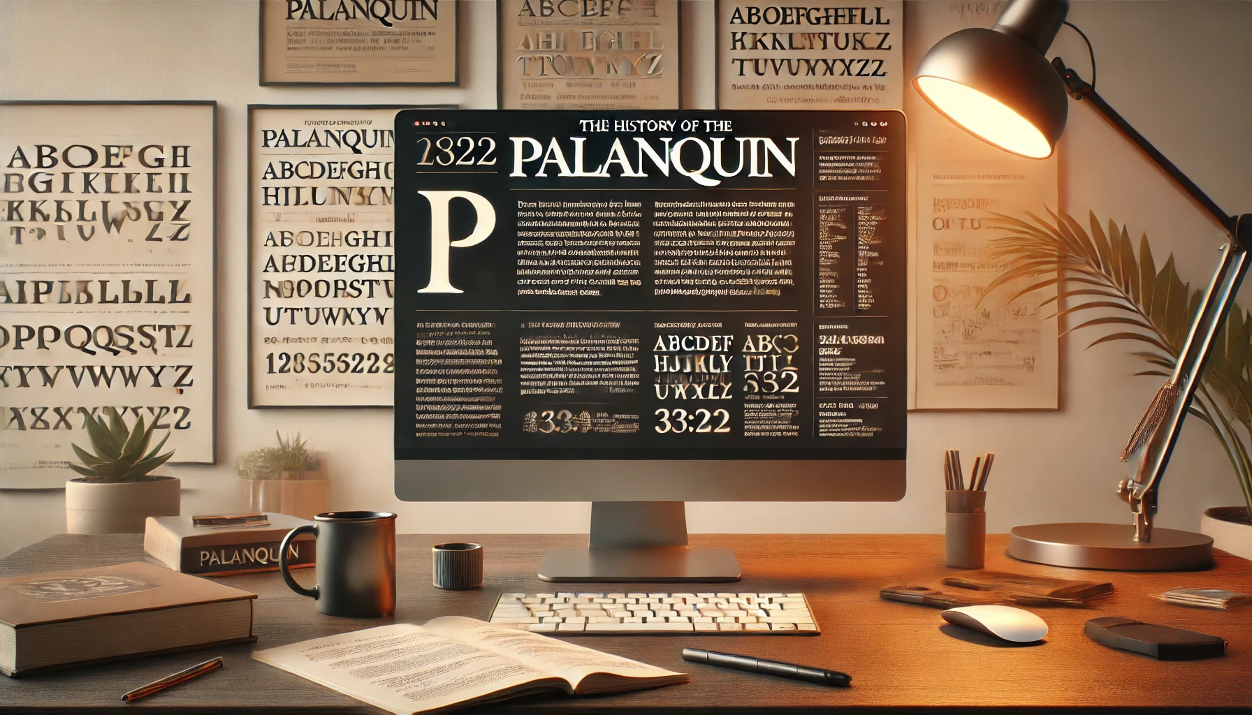
History of the Palanquin Typeface
The Palanquin typeface, designed for flexibility and aesthetic appeal, plays a significant role in modern typography. Its creation by Indian designer Pria Ravichandran highlights the blend of functional design with digital technology. Over time, Palanquin has developed diverse variations, making it suitable for various digital and print applications.
Design Philosophy and Aesthetics
Palanquin was made with a focus on simplicity and readability. It features a sans-serif style, which gives it a modern look. The typeface suits digital interfaces, offering clean lines that improve legibility on screens. Its seven text weights add versatility, making it adaptable for both body text and headings.
When used in digital design, Palanquin maintains clarity across different devices. The attention to monolinear design elements ensures that the letterforms remain consistent and easy to read. This balance of function and form caters to users looking for a seamless reading experience.
Creator and Foundry Origins
Palanquin was created by Pria Ravichandran, a designer from India. She first released the font in 2016 under the SIL Open Font License. Her work reflects a deep understanding of both Latin and Devanagari scripts as Palanquin is Unicode-compliant, supporting multiple languages.
The design comes from the wider family of Latin and Devanagari typefaces, which offers a global reach. Palanquin was developed with attention to cultural nuances in script design, ensuring its relevance in different contexts. This approach emphasizes the global nature of typography today.
Evolution and Variations
Palanquin has seen various adaptations since its release. It began as a versatile typeface for digital use and quickly evolved to include Palanquin Dark, a bolder version aimed at more prominent text use cases. This variant features heavier strokes, useful for headings or display text as described here.
The development of Palanquin shows its ability to meet modern demands. Ongoing updates and community feedback ensure that it continues to serve both aesthetic and functional needs in a rapidly changing design landscape. The typeface remains popular for those looking for clarity and adaptability.
Technical Characteristics
Palanquin is a versatile font family designed for modern digital platforms. It offers various font weights and styles, ensuring legibility and adaptability across different media types.
Font Weights and Styles
Palanquin includes a range of seven text weights, from light to bold, to cater to different design needs. These weights provide flexibility, allowing designers to create a hierarchy and emphasize important text. Its accompanying variant, Palanquin Dark, includes four additional weights for display purposes. The design of Palanquin is sleek and monolinear, ideal for both body and headline text. Each weight maintains a clean finish, ensuring consistency across different font sizes.
Legibility and Readability
Palanquin’s sans-serif style ensures excellent legibility, especially in digital environments. The uniform stroke width and simple letterforms help text remain clear, even in small sizes. The font is optimized for screens, reducing strain on the eyes during extended reading. Palanquin supports Devanagari script alongside Latin, broadening its usability for multilingual contexts. These characteristics make it fitting for interfaces where reading comfort is paramount.
Usage in Print and Digital Formats
Palanquin excels in both print and digital formats, with design adjustments allowing seamless transitions between media. In digital platforms, its clean lines and adaptable weights make it suitable for websites and apps. In print, Palanquin’s straightforward design ensures clarity in brochures and banners. The heavier Palanquin Dark is perfect for grabbing attention in headings or standalone displays. Whether online or offline, Palanquin retains its consistency and appeal.
Cultural Impact and Reception
Palanquin is a typeface that has gained recognition for its modern design and adaptability in digital contexts. As a sans-serif font, it has found a niche in various creative projects and has been received positively by designers and users alike.
Influential Uses of Palanquin
Palanquin has been widely adopted in digital interfaces due to its readability and clean look. Its versatility makes it suitable for websites, mobile apps, and other online platforms. Companies often choose Palanquin for its ability to deliver information clearly without distractions.
The typeface’s Unicode compliance allows it to support both Latin and Devanagari scripts, broadening its appeal. As digital content grows more diverse, Palanquin is embraced for its ability to meet multilingual needs effectively.
Design Community Feedback
Designers appreciate Palanquin for its balance of aesthetics and function. The typeface’s seven text weights offer flexibility, making it easily adaptable to various design requirements. It is particularly favored for its legibility in smaller sizes, which is crucial for web content.
Feedback from designers highlights its modern look, which fits well with current design trends. Palanquin’s development under the SIL Open Font License has encouraged its widespread use, allowing designers to incorporate it into both personal and commercial projects without restrictions.
Accessibility Features
Palanquin font offers a variety of accessibility features that make it a strong choice for different uses. It supports multiple scripts and provides design elements that aid those with visual impairments.
Support for Various Scripts
Palanquin is known for its support for multiple scripts, which makes it highly versatile in multilingual environments. It covers both Latin and Devanagari scripts, catering to a wide range of users. This feature allows designers to use one font family consistently across different languages, ensuring uniformity and coherence in design projects.
By accommodating diverse scripts, Palanquin helps bridge language barriers, particularly on international platforms. Its ability to handle multiple writing systems makes it indispensable for projects aiming for linguistic inclusivity. Moreover, the font’s Unicode compatibility guarantees that characters are displayed correctly across different devices and platforms.
Accommodations for Visual Impairments
Palanquin incorporates several design features to aid those with visual impairments. The font’s distinct letter shapes and clear character spacing enhance readability, making it suitable for people who struggle with standard fonts. Designers have emphasized the font’s legibility, ensuring that it can be easily read in both digital and print formats.
Palanquin has characteristics that align well with accessibility guidelines. Rounded shapes and distinct character forms contribute to user-friendly reading experiences. Such features make it a recommended choice for projects requiring accessible typography, ensuring content is approachable for individuals with different visual needs. Visually impaired users benefit from these thoughtful design elements, as they minimize confusion and reading difficulties.
Licensing and Distribution
Palanquin is an open-source typeface offering flexibility in usage. This section covers important details about its licensing and usage rights.
Open Source Status
Palanquin is distributed under the SIL Open Font License, which promotes sharing and collaboration in font design. This license allows users to freely use, modify, and distribute the font.
The open-source nature of Palanquin makes it a popular choice for designers who want creative control. It supports both commercial and non-commercial projects, provided that any derived works are also shared under the same license.
Additionally, by using Palanquin, individuals can avoid the need for costly licenses found with many proprietary fonts.
Usage Rights and Restrictions
The font can be used in various digital and print projects without any additional fees. Designers can implement Palanquin across websites, apps, and printed materials.
Though flexible, the license has some conditions. Users must not sell the font on its own and should give credit when redistributing it. Any modifications should carry a different name to avoid confusion.
For detailed guidelines, users can visit specifically tailored resources like the Comprehensive Guide to Font Characteristics and Licensing.