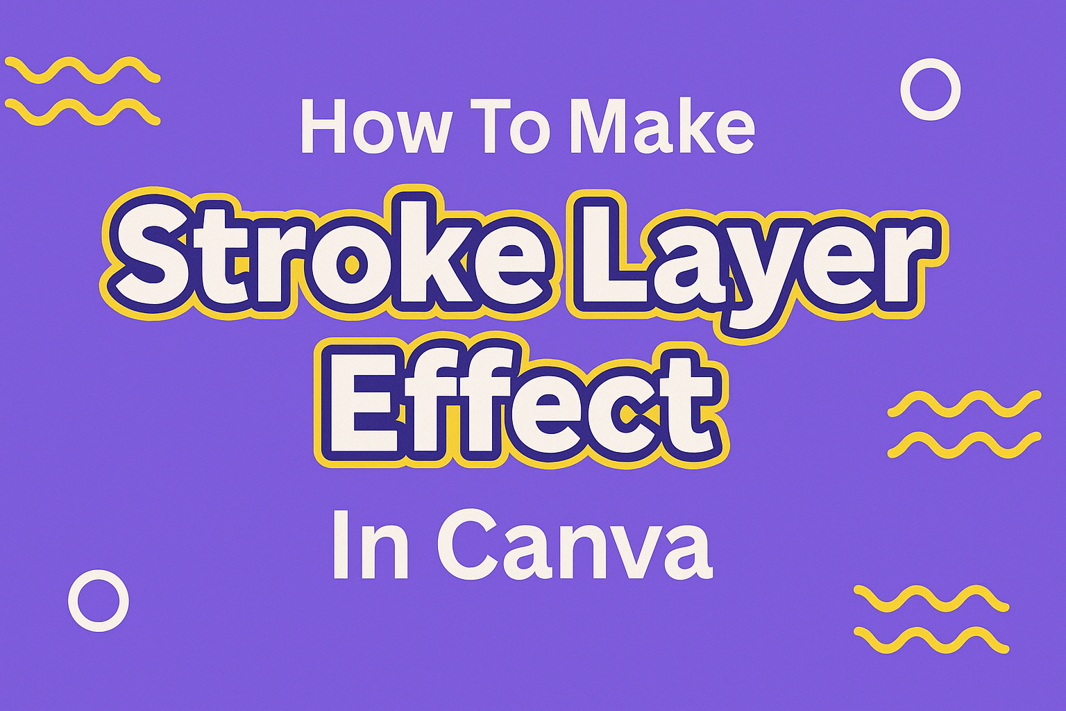
A stroke layer effect adds a colored outline around text, images, or shapes in Canva designs. This simple technique makes elements stand out more and creates a polished, professional look. Many designers use stroke effects to improve readability and add visual interest to their projects.
Creating stroke layer effects in Canva involves selecting elements and applying outline settings through the effects panel, which can transform ordinary designs into eye-catching graphics. The process works with different types of content including text, uploaded images, and built-in shapes. Users can customize the stroke color, thickness, and style to match their design goals.
Learning how to make stroke layer effects in Canva opens up many creative possibilities for social media posts, logos, and marketing materials. The technique helps create better contrast between design elements and backgrounds. Advanced users can even combine multiple stroke effects and brush elements to achieve unique artistic results.
Understanding Stroke Layer Effect in Canva
A stroke layer effect creates an outline around text or images, similar to drawing
Preparing Your Canva Design
Getting your Canva workspace ready is the first step to creating amazing stroke effects. The right canvas size, properly imported files, and well-organized text layers will make your design process smooth and professional.
Choosing the Right Canvas Size and Resolution
The canvas size directly affects how crisp your stroke effects will look. Creating a custom size gives you full control over your final design quality.
For social media posts, these sizes work best:
- Instagram posts: 1080 x 1080 pixels
- Facebook posts: 1200 x 630 pixels
- Twitter headers: 1500 x 500 pixels
Small canvases like 200 x 200 pixels are perfect for testing stroke effects. They load faster and let designers experiment quickly with different settings.
Image size matters for print projects. Designs meant for printing need at least 300 ppi (pixels per inch). Digital designs only need 72 ppi since screens display at lower resolutions.
The canvas shape affects how stroke effects appear around text. Square canvases work great for logos and profile pictures. Rectangle canvases suit banners and social media covers better.
Importing Images and Files
Canva accepts many file types including JPG, PNG, SVG, and PDF files. Users can upload images by clicking the “Uploads” tab in the left sidebar.
File size limits apply to uploads. Free Canva accounts can upload files up to 25MB each. Pro accounts get 100MB per file, which helps when working with high-quality images.
Organizing uploaded files saves time during design work. Canva lets users create folders to sort different project images and files together.
PNG files work best for images with transparent backgrounds. This file type keeps the transparency intact, making it easier to layer images with stroke effects.
Images should match the canvas resolution for the sharpest results. Low-resolution images will look blurry when enlarged, especially around stroke edges.
Setting Up Text Layers
Each piece of text in Canva exists on its own layer. This setup lets designers apply different stroke effects to individual words or phrases.
Bold fonts show stroke effects better than thin fonts. Thick letterforms give the stroke effect more space to display properly around each character.
Text layers can be duplicated to create multiple stroke effects. Designers often copy text layers and apply different stroke colors or sizes to each copy.
The text layer order affects how strokes appear. Layers higher in the stack appear in front of lower layers, which matters when overlapping multiple stroke effects.
Text size impacts stroke visibility. Small text needs thinner strokes to avoid looking cluttered. Large headlines can handle thick, bold stroke effects without losing readability.
Applying Stroke Effects to Text Layers
Text strokes create bold outlines that make letters pop against any background. Users can control the stroke size, adjust opacity levels, and pick custom colors to match their design needs.
Step-by-Step Guide to Adding Stroke Around Text
First, users need to add their text to the Canva canvas. They should click on the “Text” tab in the left sidebar and choose any text style.
Once the text is on the canvas, they need to select it by clicking directly on the text element. The text will show selection handles around it when properly selected.
Next, users should look for the “Effects” button in the top toolbar. This button appears when a text layer is selected and active.
After clicking “Effects,” a panel opens on the left side of the screen. Users need to scroll through the available effects to find stroke options.
The stroke effect in Canva appears as an outline option in the effects menu. Users click on this effect to apply it to their selected text layer.
The stroke immediately appears around the text once selected. Users can see the outline effect applied to all letters in their text element.
Adjusting Stroke Size and Opacity
The stroke thickness can be changed using the slider that appears after applying the effect. Moving the slider to the right makes the outline thicker and bolder.
Users can make the stroke thinner by moving the slider to the left. This creates a more subtle outline effect around the text layer.
Opacity controls how see-through the stroke appears on the design. Higher opacity values make the stroke more solid and visible against backgrounds.
Lower opacity settings create a softer, more transparent stroke effect. This works well when users want the outline to blend naturally with their design elements.
The opacity slider typically ranges from 0% to 100%. Users can experiment with different values to find the perfect balance for their text layer effects.
Customizing Stroke Color
The default stroke color may not match the user’s design theme. They can change this by clicking on the color picker next to the stroke settings.
A color palette opens with preset color options. Users can click on any color square to instantly change their stroke color.
For custom colors, they can click on the color wheel or enter specific color codes. This gives users complete control over their stroke appearance.
Color contrast is important when choosing stroke colors. Dark strokes work well on light backgrounds, while light strokes stand out on dark backgrounds.
Users should test different color combinations to ensure their text remains readable. The stroke should enhance the text without making it harder to read.
Using Stroke Effects on Images and Shapes
Stroke effects create clean borders around images and add professional outlines to custom shapes. These layer effects help elements stand out and create visual separation in designs.
Outlining Images in Canva
Adding strokes to images makes them pop against backgrounds and creates professional-looking borders. Users can apply stroke effects to images by selecting their image first.
The process starts by clicking on the image they want to outline. Next, they click the Effects button in the top toolbar. From the effects menu, they select Stroke to add an instant border.
Customization options include:
- Stroke thickness (thin to thick borders)
- Color selection from the color palette
- Opacity adjustments for subtle effects
The stroke appears immediately around the image edges. Users can adjust the thickness by moving the slider left for thinner strokes or right for bolder outlines.
Color changes happen by clicking the color box next to the thickness slider. This opens Canva’s full color palette where they can choose any shade that matches their design.
Adding Stroke to Custom Shapes
Custom shapes benefit from stroke effects that define their edges and create visual interest. Canva allows users to add strokes to shapes through the same effects panel.
After selecting a shape element, users follow similar steps as with images. They click Effects then choose Stroke from the available options. The stroke wraps around the shape’s perimeter instantly.
Shape stroke techniques:
- Matching colors: Use stroke colors that complement the shape fill
- Contrasting outlines: Create bold borders with opposite colors
- No fill shapes: Remove shape fill to create outline-only designs
Layer effects work differently on shapes compared to images. Shapes can have both fill colors and stroke outlines at the same time. This creates more design flexibility for logos and graphic elements.
Users can experiment with thick strokes on simple shapes to create bold graphic elements. Thin strokes work well for delicate designs that need subtle definition without overwhelming the content.
Advanced Stroke Techniques in Canva
Advanced stroke techniques let users create complex visual effects by stacking multiple stroke layers and using different blending modes. These methods help designers achieve professional results that make text and images stand out.
Layering Multiple Stroke Effects
Users can stack several stroke effects on the same text or image to create depth and visual interest. The key is adding each effect as a separate layer and adjusting them individually.
To start, they select their text and apply the first stroke effect through the Effects panel. Then they duplicate the text element to create a second layer. On this new layer, they apply a different stroke with varied color, size, or transparency settings.
The most effective approach involves making the bottom layer stroke thicker and darker. The top layer stroke should be thinner and lighter. This creates a natural shadow effect that adds dimension.
Users can also experiment with different stroke colors on each layer. A white outer stroke with a colored inner stroke creates a bold, eye-catching look. The transparency settings help blend the layers smoothly together.
For best results, they should keep the stroke sizes different by at least 5-10 pixels. This prevents the effects from competing with each other visually.
Blending Modes for Unique Looks
Blending modes change how stroke layers interact with the background and other elements. Canva offers several blending options that create unique visual effects when applied to strokes.
The multiply blending mode darkens the stroke where it overlaps with other elements. This works well for creating realistic shadow effects. The screen mode does the opposite by lightening areas where strokes meet.
Overlay blending mode combines the stroke with background colors in interesting ways. It makes light areas lighter and dark areas darker. This creates contrast that helps text pop off the page.
Users access blending modes by selecting their stroke layer and looking for blend options in the effects panel. Each mode produces different results depending on the background colors and stroke settings.
Color blend mode preserves the stroke’s hue while adapting to the background’s brightness. Soft light mode creates subtle, natural-looking effects that work well for professional designs.
Testing different combinations helps users find the perfect look for their project.
Exporting and Saving Stroke Layer Designs
Getting stroke layer designs out of Canva requires choosing the right file format and settings to preserve quality. Proper metadata management and resolution settings ensure designs look professional across different platforms.
Best File Types for Export
PNG files work best for stroke layer designs with transparent backgrounds. This format keeps crisp edges around strokes and maintains quality when shared online.
JPEG files suit designs with solid backgrounds but compress stroke details. They create smaller files for email or web use but may blur thin stroke lines.
PDF format preserves vector quality for print projects. Stroke layers stay sharp at any size, making this ideal for business cards or posters.
Users should avoid formats like GIF for stroke designs. These older formats reduce color quality and make strokes look pixelated.
Managing Metadata
Canva automatically embeds basic information into exported files. This includes creation date and software details that help identify design origins.
File names should describe the stroke design clearly. Names like “logo-blue-stroke-v2.png” help organize multiple versions of the same design.
Version control becomes important when creating multiple stroke variations. Adding version numbers or dates to file names prevents confusion later.
Some platforms strip metadata when files are uploaded. Social media sites often remove this information for privacy and file size reasons.
Maintaining Image Quality
Resolution settings affect how stroke layers appear in final exports. Canva defaults to 96 PPI for web designs and 300 PPI for print projects.
Image size directly impacts stroke sharpness. Larger canvas dimensions provide more pixels for clean stroke rendering.
Thin strokes need higher resolution to avoid appearing jagged. Designs with 1-2 pixel strokes should use at least 150 PPI for clear results.
Quality sliders in Canva’s export options balance file size with visual clarity. Maximum quality settings preserve stroke details but create larger files.