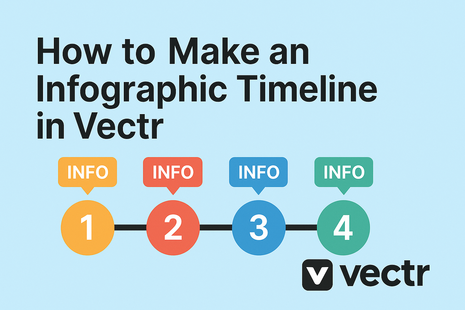
Creating an infographic timeline in Vectr can be a fun and engaging way to present information visually. With its user-friendly tools, anyone can transform data and events into a clear and attractive timeline that tells a story.
Whether it’s for a school project, business presentation, or personal use, a well-designed infographic can capture the audience’s attention.
To start, users can gather their data and organize it chronologically.
Vectr provides various templates and design options that make it easy to customize the timeline according to personal preferences.
By following simple steps, anyone can showcase important milestones effectively.
As the design takes shape, incorporating visuals enhances the overall look of the timeline.
Readers will learn how to utilize elements like colors, shapes, and text in Vectr, making their timeline not only informative but also appealing.
Getting Started with Vectr
To begin using Vectr, it is essential to create an account, understand the interface, and set up the canvas for your design. These steps will help users make the most of the platform and start designing their infographics effectively.
Creating an Account
First, users need to create an account on Vectr. This process is straightforward and only takes a few minutes.
They can visit the Vectr website and look for the “Sign Up” button.
Users can sign up using their email or by connecting their Google account. After entering the required information, they should check their email for a confirmation link.
Clicking on this link will activate their account, allowing them to log in and start creating their designs.
Understanding the Interface
Once logged in, users will see the Vectr interface. The main elements include the menu bar, sidebar, and workspace.
The menu bar at the top provides access to different tools and features.
The sidebar contains essential options like layers, styles, and settings. Users can easily switch tools, change colors, or adjust text.
The workspace is where the design happens, offering a blank area to start creating.
Familiarizing oneself with these components is vital for smooth navigation while designing.
Setting Up Your Canvas
Setting up the canvas is the next important step. Users should click “Create File” to open a new project.
They will then need to choose the size and orientation for their infographic.
The canvas can be adjusted later, but starting with the right dimensions makes it easier.
Users should also consider the number of sections needed for the timeline. Planning the layout helps in visualizing the final product.
Using a grid or guidelines can be helpful for alignment. The canvas setup lays a strong foundation for a well-structured infographic timeline.
Designing the Timeline
When creating an infographic timeline, the design plays a crucial role in ensuring clarity and appeal. The layout, key dates, and design elements all contribute to a well-structured and visually engaging timeline.
Choosing a Layout
Choosing the right layout sets the foundation for the timeline. Vectr offers various templates that users can customize.
A horizontal layout is often preferred for its straightforward flow, but a vertical layout can also work well, especially for long timelines.
Using shapes like lines or arrows helps to connect events. Keeping it clean with enough white space can enhance readability. Users can start with a basic grid layout to organize text and images easily.
Each event should be distinct yet cohesive with the overall design to maintain a visual connection.
Adding Dates and Milestones
Dates and milestones are essential components of a timeline. They provide context and help viewers understand the progression of events.
When adding dates, it’s important to choose a format that is easy to read, such as MM/DD/YYYY or simply the year for clarity.
Milestones should stand out, using bold text or color highlights to capture attention. Placing them chronologically allows users to follow the timeline smoothly.
Consider using icons or small images to represent each milestone visually. This adds interest and engagement for the audience.
Customizing the Design Elements
Customizing design elements can make a timeline unique and appealing. Vectr allows users to modify colors, fonts, and shapes to fit their theme.
Selecting a color palette consistent with the subject matter is crucial. For a historical timeline, muted tones may work best, while vibrant colors can suit more dynamic topics.
Typography should be clear and legible. Using no more than two font styles keeps the design clean.
Adding icons and illustrations can enhance understanding and break up text visually, making the timeline more enjoyable to comprehend.
Adjusting spacing between elements ensures the timeline is not cluttered and maintains a pleasing aesthetic.
Enhancing the Infographic
Enhancing an infographic is essential for making it visually appealing and effective. By focusing on images, colors, fonts, and special effects, the overall impact of the infographic can be significantly increased.
Inserting Images and Icons
Images and icons work wonders in an infographic. They can convey information quickly and attractively.
She can choose relevant images that highlight key events or themes in the timeline. For example, using photographs from historical events adds authenticity.
Icons can simplify complex ideas. They provide visual cues that guide the viewer’s understanding.
When searching for images, it’s important to use high-quality visuals.
In Vectr, she can drag and drop images directly onto the canvas. They can resize and position them easily to fit the design.
Adjusting Colors and Fonts
Colors and fonts set the mood of the infographic. She should select a color scheme that supports the content.
For timelines, using contrasting colors for different events can enhance clarity. A uniform scheme will give the infographic a polished look.
In terms of fonts, readability is key. It’s best to use no more than two or three font types. This helps keep the design clean.
Choosing bold or italic styles for emphasis can guide the viewer’s eye. Vectr offers several font options. She can explore and pick those that best fit her timeline.
Applying Filters and Effects
Filters and effects can add a unique touch to the infographic.
She can use Vectr’s built-in tools to create depth. Shadows, highlights, or transparency can help different elements stand out.
Simple effects such as borders or outlines can also enhance visuals. They can add structure without overwhelming the design.
Adjusting brightness and contrast of images can improve visibility. Filters like blur can be used to create focus on specific sections.
Exporting and Sharing
Once the infographic timeline is complete, it’s time to save and share the work. This process includes saving the project, exporting it in various formats, and sharing it across social media platforms. Each step is important for ensuring the infographic is accessible and easy to distribute.
Saving Your Project
Before exporting, it’s wise to save the project in Vectr. This ensures that all changes are stored, and nothing is lost.
Users should click on the File menu and select Save.
Vectr automatically saves projects to the cloud, making them accessible from any device. For added safety, he or she can also download a copy to their local storage by selecting Download. This creates a backup that can be useful later.
Exporting as an Image or PDF
Exporting is simple and offers various formats, like JPEG, PNG, and PDF. To export, go to the Export menu.
He or she should choose between exporting the entire page or specific selections.
For an infographic, PNG is often preferred for its quality. To export, select Export As and choose the desired format.
It’s recommended to adjust the resolution for the best quality based on use—higher for print and lower for web use.
Sharing on Social Media
Sharing the infographic on social media can enhance its reach. Once exported, users can upload the graphic directly to platforms like Facebook, Instagram, or Twitter.
Using engaging captions helps catch the audience’s attention. Hashtags related to the infographic’s content can also increase visibility.
Additionally, embedding the infographic in blog posts or articles can attract more viewers, leading to wider distribution and engagement.