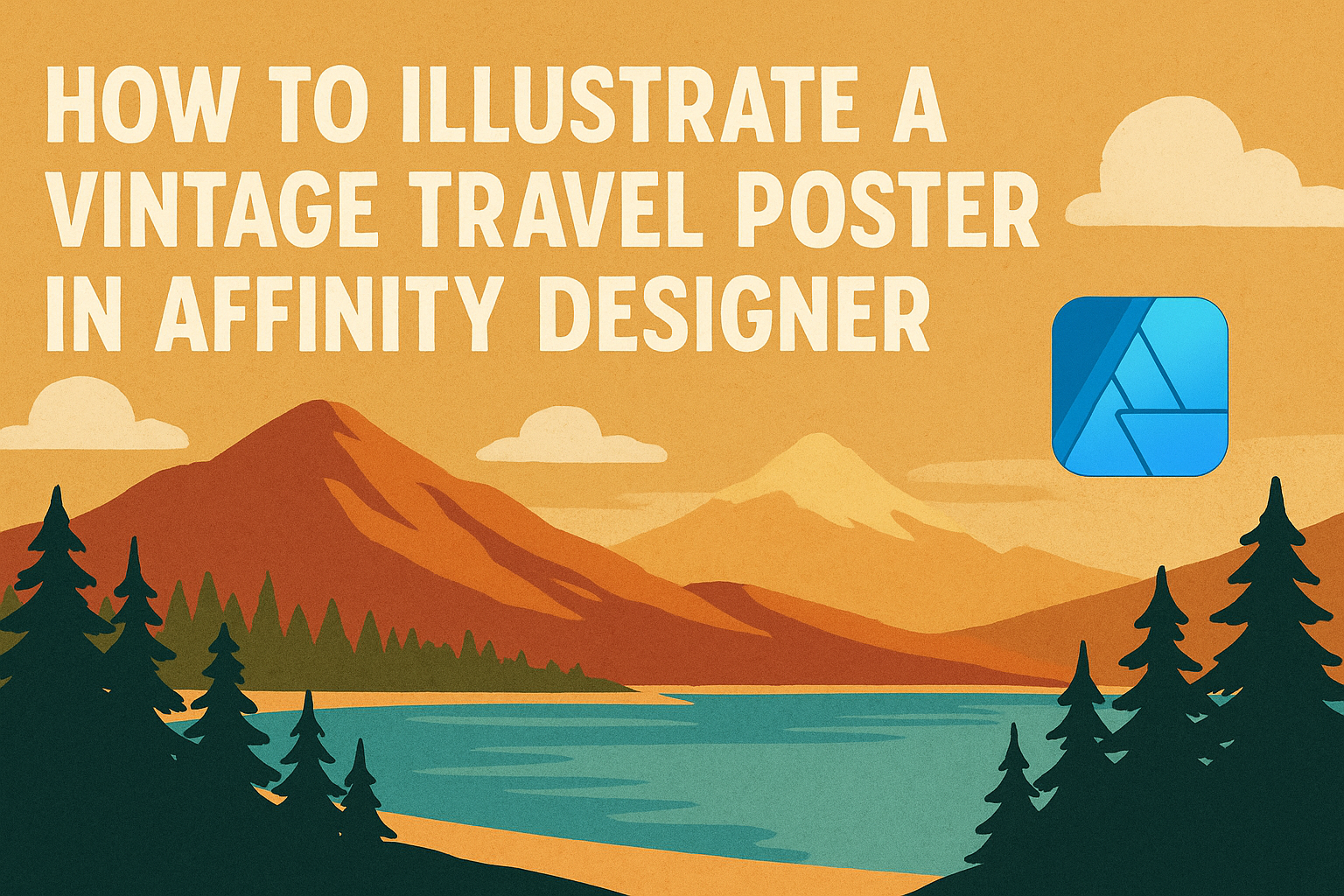
Creating a vintage travel poster can be a fun way to showcase memories or inspire future adventures.
To illustrate a vintage travel poster in Affinity Designer, one can utilize layering, bold typography, and retro color schemes. This process not only boosts artistic skills but also results in a stunning piece of art that stands out.
For those looking to dive into this creative project, the right tools and techniques are essential.
By understanding how to adjust shapes, apply effects, and choose the perfect fonts, anyone can achieve that nostalgic look. Each step offers the chance to experiment and bring personal flair to the design.
As readers explore this guide, they’ll discover tips and tricks that simplify the illustration process. With a little practice and creativity, the dream of crafting a beautiful vintage travel poster can become a reality.
Getting Started with Affinity Designer
Before diving into creating a vintage travel poster, setting up Affinity Designer correctly is crucial. Understanding the workspace, interface, and document settings will provide a solid foundation for the project.
Setting Up Your Workspace
When starting Affinity Designer, it’s important to customize the workspace to fit personal preferences.
He or she can rearrange panels for easy access to tools. To do this, go to the View menu and select Studio. From here, you can enable panels like Layers, Assets, and Color.
Additionally, saving this workspace layout allows for quick setups in future projects. Click on Window > Workspace > Save as New Workspace to preserve the customized layout.
Exploring Affinity Designer’s Interface
Affinity Designer features a user-friendly interface, making it accessible for beginners. The main elements include the Toolbar, Context Toolbar, and the Layers Panel.
- The Toolbar is typically on the left and contains essential tools.
- The Context Toolbar at the top changes based on the selected tool.
- The Layers Panel on the right helps manage project components.
Familiarizing oneself with these parts streamlines workflows. He or she can hover over the tools for brief descriptions to enhance understanding of their functions.
Choosing the Right Document Settings
Selecting the correct document settings ensures the design looks great in print and online.
Start by clicking File > New to create a document. When the dialog opens, choose the desired size. A common choice for travel posters is A4 or A3.
Key settings to adjust include:
- Color Format: Choose RGB for digital, CMYK for print.
- Resolution: A minimum of 300 DPI is ideal for print quality.
- Orientation: Decide between portrait or landscape based on the poster’s design.
Each choice affects the final output. Taking time to set these correctly helps prevent future issues in the design process.
Designing the Poster Elements
In creating a vintage travel poster, selecting a color palette, drawing basic shapes, and effectively using layers are essential. Each of these elements contributes to making the poster visually appealing and organized.
Creating a Color Palette
Choosing the right colors is crucial to set the mood for a vintage travel poster. A palette of muted tones often works well, as it gives an authentic vintage feel. Typically, a combination of two to four colors helps in maintaining balance.
Using tools like the color wheel can help find complementary colors. She can select a dominant color and pair it with secondary shades. For example, soft pastels or earthy tones evoke a nostalgic vibe.
Make sure to save the colors you pick in Affinity Designer. This option will streamline the design process and ensure consistency throughout the poster.
Drawing Basic Shapes and Lines
Basic shapes form the foundation of any poster. In Affinity Designer, she can use the shape tools to draw rectangles, circles, and lines that create a structured layout.
Start with the primary elements like borders or background shapes. Using guides can help align these shapes perfectly. It’s important to experiment with different sizes and placements to see what looks best.
Adding rounded corners can soften the shapes and increase the vintage look. Curved edges can make the design feel more inviting.
Finally, adjusting the stroke and fill of each shape allows for greater customization. This helps create a unique style that stands out.
Working with Layers and Groups
Layers are vital for managing different elements in the design process. She should keep elements like text, shapes, and images on separate layers. This makes adjustments easier later on.
Grouping related elements helps keep the workspace organized. For instance, she can group all text layers together. This way, moving or modifying them becomes simpler and keeps everything neat.
Using the layer opacity tool can add depth to the elements. It allows for textures or overlays that enhance the overall look.
Renaming layers meaningfully can help identify them quickly as the project evolves. This practice prevents confusion and saves time during the design process.
Adding Vintage Effects and Textures
Creating a vintage feel in a travel poster can be achieved through texture overlays and blend modes. Using these techniques can give the design depth and an authentic retro appearance.
Applying Texture Overlays
To start, he can add texture overlays to enhance the vintage look. Using images of paper grain or fabric textures works well. These images can be found online or created from photographs.
-
Import the Texture: He should place the texture on a new layer above his design.
-
Adjust Size: Next, scaling the texture to cover the entire poster is important.
-
Blending Options: The layer’s opacity can be reduced to blend with the underlying artwork. Using a soft brush to erase parts of the texture can highlight certain elements.
When applied correctly, texture overlays can create a warm, nostalgic feel, making the poster more inviting and visually interesting.
Using Blend Modes for a Retro Look
Blend modes play a crucial role in achieving a retro aesthetic. They allow different layers to interact, enhancing colors and adding dimension without losing detail.
-
Experiment with Modes: He should select the texture layer and try different blend modes like “Overlay” or “Multiply.” Each mode changes how the layers mix, creating unique effects.
-
Fine-Tune Opacity: Adjusting the opacity is key. Reducing it can soften the texture, making it more subtle.
-
Layer Order: Changing the order of layers can also impact the final look. He might find a combination that highlights the vintage vibe.
This method can transform simple designs into complex pieces that reflect a classic travel poster style.
Finalizing and Exporting Your Poster
Before finalizing the poster, it is important to review the layout and make any necessary adjustments. Once satisfied with the design, exporting the poster for printing is the next step.
Reviewing and Adjusting the Final Layout
At this stage, they should carefully examine the entire layout. Check for any misalignments, color inconsistencies, or elements that don’t flow well together.
It can be helpful to zoom in on details and zoom out to see the poster from a distance. This way, they can spot any issues that might not be obvious at first glance.
Consider consulting someone else for feedback, as fresh eyes can catch mistakes. Adjustments may include repositioning text, resizing images, or tweaking colors. Make sure the overall composition feels balanced and visually appealing.
Exporting the Poster for Printing
When ready to export the design, choose the appropriate file format. For printing, it is best to use PDF or TIFF formats as they maintain high quality.
In Affinity Designer, go to File > Export and select the desired format.
Set the resolution to at least 300 DPI for optimal print quality.
Before finalizing the export, check the color settings. Using CMYK color mode is recommended for print materials. This ensures colors appear as intended when printed.
After adjusting these settings, click Export. Save the file in a location that’s easy to find.