Creating pastel colors in Canva can be an exciting way to enhance design projects. To get pastel colors, users can adjust color settings by mixing white with their preferred shades or use the color palette generator to create unique combinations.
This easy process allows anyone to add a soft, gentle touch to their graphics.
Canva offers tools that simplify the creation of custom color palettes. By clicking on the “Colors” tab, users can enter specific hex codes or choose colors from pre-made options to find the perfect pastel tones.
This flexibility makes designing with soft hues accessible for all skill levels.
Whether for social media posts, invitations, or presentations, pastel colors can bring a fresh and cheerful vibe to designs. With the right steps, anyone can master the art of pastel in Canva and elevate their creative projects.
Getting Started with Canva
Canva is an easy-to-use design platform for creating graphics, presentations, and more.
Getting started is simple, especially with a user-friendly interface that helps users navigate various features.
Sign Up for a Canva Account
To begin using Canva, one must first sign up for an account. This process is quick and straightforward.
Users can visit the Canva website and click on the sign-up button.
They can register using their email, Google account, or Facebook. After following a few prompts, the account setup is complete.
Once registered, users can explore a variety of free and paid tools and templates. Canva also allows users to collaborate with others, which makes it a great choice for teams.
Navigating the Canva Interface
After signing in, users will find a clear and organized interface. The main dashboard displays recent designs and popular templates for quick access.
On the left side, there’s a toolbar with options for design types, templates, and elements. Users can select their desired category to find the right tools for their project.
The design area is where users can drag and drop elements to create. There are also options for adding text, images, and colors.
By exploring these features, users can start their design journey with pastel colors and much more.
Creating Pastel Colors
Creating pastel colors involves understanding some color concepts and using the right tools in Canva. It’s all about selecting the right hues and adjusting them to achieve that soft, inviting look.
Understanding Color Theory
Color theory helps users grasp how colors interact. Pastel colors are created by adding white to a base color. This softens the color and gives it that light feeling.
For instance, mixing plain blue with white creates a baby blue, a classic pastel shade. Recognizing primary, secondary, and complementary colors can aid in selecting hues that work well together.
Using a color wheel can also let her visualize these relationships better.
Keeping these basics in mind helps in crafting a pleasing palette that embodies the pastel aesthetic.
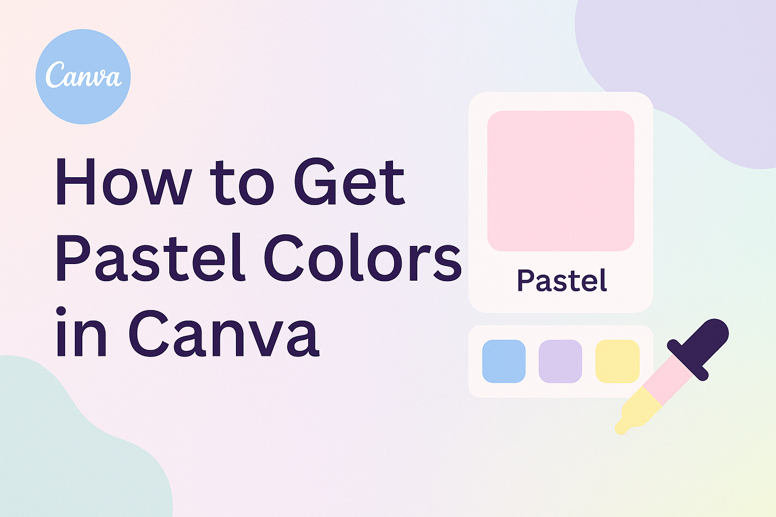
Using the Color Picker
Canva offers a simple color picker that makes finding the right pastel shades easy. To use it, click on the “Color” button in the editor.
From there, users can either select a color directly from the palette or enter a hex code for a specific shade. A tool like the color wheel provides instant visual feedback, allowing for quick adjustments.
When aiming for pastel colors, look for lighter versions of any hue. The more white added, the softer and more pastel the color becomes.
Adjusting The Color Palette
After selecting colors, it’s time to customize the palette. Users can click on the “+” icon to create a new palette. This allows for personalizing colors based on preference.
One way to create balance is by adjusting the opacity of some colors. By lowering the opacity, the colors can become lighter and softer, enhancing that pastel effect.
Users can also try using pre-made pastel palettes available in Canva. These can serve as a foundation for their designs. Adjusting these as needed helps in creating a unique pastel color scheme that stands out.
Designing with Pastel Colors
Pastel colors offer a soft and calming look, perfect for many design projects. When using Canva, designers can easily select the right templates, add text and elements, and create beautiful color combinations.
Selecting Templates
Canva provides a variety of templates that cater to pastel themes. Users can explore options specifically labeled as “pastel” to find designs that already incorporate soft colors.
When choosing a template, consider the purpose of the project. Whether it’s a social media post or an invitation, the right template will enhance the pastel aesthetic.
Filters can also help users narrow down selections based on style, such as minimalistic or floral designs. This makes it easier to find a foundation that aligns with their vision.
Adding Text and Elements
Once a template is chosen, adding text and elements is straightforward.
Users can select fonts that complement pastel colors well, like soft script or clean sans-serif styles. This choice enhances readability while maintaining a gentle look.
Incorporating shapes and icons can add visual interest. Canva’s library offers many graphics that work well with pastel shades.
It’s essential to balance colors and elements so that the design feels cohesive. Experimenting with text sizes and placements can also help create harmony in the overall design.
Pastel Color Combinations
Combining pastel colors can create stunning visuals. For example, pairing soft pinks with light blues adds a fresh feel.
Designers should also consider warmer pastels like peach or mint, which can provide a playful contrast.
Creating a color palette can simplify the design process.
Users can use Canva’s color picker tool to find matching shades. A simple method is to choose one main color and use two or three complementary shades.
This creates a balanced and harmonious look that draws the viewer’s eye without overwhelming them.