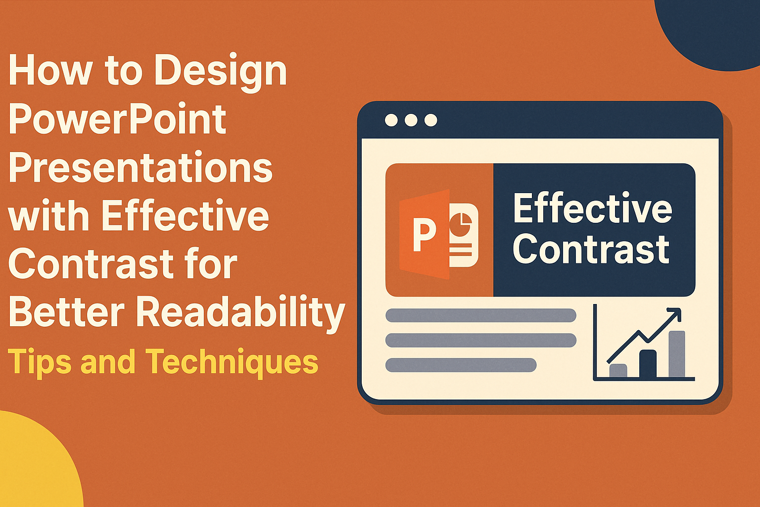
Creating an engaging PowerPoint presentation involves more than just adding text and images.
Effective contrast is key to enhancing readability and ensuring that the audience can easily follow along.
By using contrasting colors, sizes, and fonts, designers can guide attention and emphasize important points.
Many presenters struggle with readability, which can lead to confusion and disengagement.
Choosing the right color combinations and types can make all the difference.
Eye-catching designs not only aid comprehension but also create a more enjoyable experience for the audience.
Understanding how to utilize contrast effectively can transform a basic presentation into a memorable one.
With some simple techniques, anyone can improve their slides and connect better with their viewers.
This article will explore practical tips for designing PowerPoint presentations that stand out and resonate.
Understanding Contrast in Design
Contrast is a crucial element in design that enhances clarity and grabs the audience’s attention.
By using contrast effectively, a presenter can highlight important information and make content more engaging and readable.
The Role of Contrast
Contrast plays a significant role in guiding the viewer’s eye. It helps to emphasize key points in a presentation, making them stand out.
When used right, contrast can create a visual hierarchy, leading audiences through the content effortlessly.
For example, darker text on a lighter background allows readers to focus on the essential details.
Additionally, using varying contrast levels can help separate different sections of a slide, organizing information clearly.
Types of Contrast
There are several types of contrast that designers can use. The most common are:
-
Color Contrast: This is the difference between colors, which can draw attention to specific areas. Bright colors can highlight important data, while muted tones can serve as background elements.
-
Size Contrast: Changes in size can show the importance of different elements. Larger text or images can indicate primary points while smaller items support them.
-
Textural Contrast: Combining different textures can add depth, making certain aspects pop. For instance, pairing a smooth background with a bold, rough-textured font can create a striking effect.
Impact on Readability
The impact of contrast on readability cannot be overstated.
Proper color contrast enhances text visibility, especially for those with visual impairments. A good contrast ratio makes reading easier and helps maintain the audience’s focus.
For example, using black text on a white background is one of the highest contrast combinations.
Avoid color choices that are hard to read together, like light gray on white. This ensures that the message reaches the audience clearly and effectively.
Proper contrast also helps in organizing slides, making it easier for viewers to digest information and remember key points.
Fundamentals of Color Theory
Understanding color theory is essential for creating effective PowerPoint presentations.
He or she can use colors to enhance readability and engage the audience.
The following key concepts provide a solid foundation in color selection and application.
Color Wheel Basics
The color wheel is a visual tool that helps understand color relationships. It typically includes primary, secondary, and tertiary colors.
- Primary Colors: Red, blue, and yellow. These cannot be created by mixing other colors.
- Secondary Colors: Green, orange, and purple. These are made by mixing primary colors.
- Tertiary Colors: These result from mixing a primary color with a secondary color, like teal (blue + green) or magenta (red + purple).
Understanding this structure allows for better choices in color combinations during presentations.
Complementary Colors
Complementary colors are those found directly opposite each other on the color wheel. When paired together, they create a vibrant contrast that can grab attention.
For instance, red and green or blue and orange work well together.
Using these colors can make important information stand out.
When designing slides, it’s crucial to choose complementary colors that enhance readability. Such combinations help ensure that text is easily seen against its background.
Warm vs. Cool Colors
Colors can be categorized as warm or cool, affecting the mood of the presentation.
-
Warm Colors: These include reds, oranges, and yellows. They often evoke feelings of warmth, energy, and excitement.
-
Cool Colors: Blues, greens, and purples are considered cool. They tend to create a calm and relaxing atmosphere.
Choosing the right mix for your presentation can influence audience perception. For example, warm colors might be ideal for motivating the audience, while cool colors can be used to convey professionalism.
Designing for Accessibility
Designing presentations with accessibility in mind helps everyone engage with the content more effectively. Key aspects include considering color blindness, choosing appropriate font sizes and styles, and enhancing visibility for all viewers.
Color Blindness Considerations
Color blindness affects how some people perceive colors. This can make it hard to distinguish between certain color combinations.
To help, use high-contrast colors like dark blue with yellow or black with white.
Avoid using color alone to convey information. Adding patterns or textures can provide additional cues.
For example, stripes can indicate one set of data while dots indicate another.
Tools like online color contrast checkers can assess the visibility of colors used.
Font Size and Style
Choosing the right font size and style is crucial for readability.
It is best to use font sizes of at least 24 points for body text. This ensures that the content is easy to read from a distance, especially in large rooms.
When selecting fonts, stick to simple, sans-serif options like Arial or Calibri. These fonts are cleaner and easier to read compared to decorative styles.
Avoid using too many different fonts in one presentation, as this can confuse the audience.
Consistency is key for maintaining clarity.
Visibility Considerations
Visibility is about ensuring that everyone can see the content clearly.
Background and text colors should have good contrast. Light text on a dark background or dark text on a light background works best.
In addition to color, consider lighting conditions. Test presentations in various lighting environments to ensure visibility.
Large images and diagrams should have labels or descriptions to clarify their purpose.
Keeping slides uncluttered allows the audience to focus on the main message without distractions.
Effective Text Contrast
Using effective text contrast is crucial for enhancing readability in PowerPoint presentations. By carefully selecting font colors and background options, along with optimizing text overlays, presenters can ensure that their message is clear and accessible to all viewers.
Choosing the Right Font Colors
When choosing font colors, it’s important to create a strong contrast with the background.
Using dark text on a light background or light text on a dark background works best. For example, black or dark blue is highly readable on white or light gray.
It is also wise to avoid colors that clash. For instance, red text on a green background can be hard to read for those with color blindness.
Using tools like a color contrast checker can help establish the right balance between text and background colors.
Remember, clarity is more important than creativity.
Background Color Selection
Selecting the right background color can dramatically impact readability.
Neutral colors, such as white, beige, or soft gray, offer a great canvas for text. These colors keeps the focus on the content instead of distracting designs.
Additionally, using a solid color for the background will often work better than a patterned or textured one. Patterns can interfere with text clarity and make it difficult for viewers to concentrate.
Always test your background color with your text colors to ensure they complement each other effectively.
Optimizing Text Overlays
Text overlays, commonly used when adding text to images, can present unique challenges.
The key is to ensure the text remains readable against the backdrop.
Adding a semi-transparent box behind the text can enhance clarity without completely obscuring the image.
Using bold fonts also helps in making text stand out. It draws the eye and makes the content easier to grasp.
Keep text brief and utilize bullet points to convey critical information swiftly. This method maintains engagement and ensures the audience easily retains key points.
Contrast with Visual Elements
Using contrast effectively with visual elements can significantly enhance the readability of PowerPoint presentations. By applying contrasting techniques, presenters can make key information stand out, giving the audience a better understanding of the content.
Using Images and Icons
Images and icons play a critical role in presentations.
To create effective contrast, it’s essential to choose visuals that differ from the background. For example, a dark image on a light background or vice versa can draw attention.
Icons should complement the text and not overwhelm it. Using a consistent color scheme for icons can help maintain a cohesive look.
Simple designs work best; they ensure the audience can quickly grasp their meaning.
Incorporating white space around images will also enhance contrast. This space prevents clutter and allows images to breathe, making them more impactful.
Charts and Graphs
Charts and graphs can simplify complex data when designed well.
Using contrasting colors for different sections of a chart can help viewers quickly distinguish information. For instance, using a bright color for key data points will highlight them against a muted background.
Labels and legends are just as important. They should be clearly visible, using bold text or contrasting colors to ensure readability.
Choosing solid backgrounds for charts instead of busy images can also improve clarity. The focus should be on the data, not the background distractions.
Text and Visual Balance
Maintaining a balance between text and visuals is crucial for comprehension.
Too much text can overwhelm the audience, while too many visuals can distract from the main message.
To achieve contrast, presenters should limit the amount of text on each slide. Bullet points are effective; they break information into digestible pieces.
Text color should contrast with the slide background. For example, dark text on a light background is usually easier to read.
Additionally, using different font sizes between headings and body text emphasizes key points and guides the audience’s attention.
Keeping these elements balanced will help create an engaging and effective presentation.
Practical Design Tips
Designing PowerPoint presentations with effective contrast can significantly enhance readability. Here are some practical strategies to improve layout, utilize space wisely, and maintain consistency across slides.
Slide Layout Strategies
Choosing the right slide layout is key to creating effective presentations.
He should opt for layouts that focus on visual hierarchy. For instance, placing the title at the top and using bullet points for key information can guide the audience’s attention.
Using a grid system helps align text and images, ensuring everything looks neat. He might also consider leaving space between different sections to avoid clutter.
For instance, using a two-column layout can help separate related content, making it easier to read and understand.
Harnessing White Space
White space, or negative space, is crucial in making presentations easy to read.
She should avoid cramming too much information onto one slide. Leaving empty areas around text and images helps direct attention to important elements.
Using white space effectively creates a clean look and enhances focus on key messages. For example, spaces can be used to separate titles from content. This setup reduces visual noise and makes the overall presentation more inviting and engaging.
Consistency Across Slides
Consistency in design creates a cohesive look throughout the presentation.
He should use the same color schemes, fonts, and sizes across all slides. This uniformity ensures that the audience stays focused on the content rather than distractions from varying styles.
In addition, similar layouts for each slide type help in organizing information. Using consistent heading styles and bullet points allows the audience to follow along easily. This attention to detail ultimately strengthens the impact of the message being conveyed.
Applying Contrast to Enhance Messaging
Contrast plays a crucial role in guiding the audience’s understanding of a presentation. When applied effectively, it can highlight key messages, guide attention to important details, and enrich storytelling.
Emphasizing Key Points
Using contrast effectively can make essential information stand out.
For example, presenters can use bold fonts or bright colors for important terms. This draws the audience’s eye immediately to key points.
Tips for emphasizing key points:
- Use larger font sizes for main ideas.
- Choose vivid colors that contrast sharply with the background.
- Avoid using too many colors, which can be distracting.
These strategies help ensure that important messages are not overlooked.
Directing Audience Attention
Contrast helps guide the audience’s focus where it matters most. By varying size and color, presenters can lead viewers to specific elements on the slide.
This technique is helpful when introducing a new concept or detail.
Ways to direct attention:
- Place critical information in a larger, contrasting box or shape.
- Use arrows or lines to point from text to images or charts.
- Alternate text colors to maintain interest and highlight new sections.
These methods can significantly enhance how an audience interacts with the presentation.
Contrast for Storytelling
Storytelling in a presentation can become more impactful with effective contrast. By using contrasting visuals and text, presenters create emotional engagement with the narrative.
For instance, a dark background with light text can set a dramatic tone.
Strategies for storytelling:
- Use images with contrasting colors to evoke emotion.
- Pair contrasting text styles to differentiate between characters or themes.
- Maintain a consistent contrast style to unify the presentation.
These techniques not only clarify the message but also enrich the audience’s overall experience.
Software Tools and Resources
When designing PowerPoint presentations, the right tools and resources can significantly enhance the use of contrast. Understanding the features available in PowerPoint itself, as well as using external tools, can improve readability and audience engagement.
PowerPoint Features and Add-ons
PowerPoint has built-in features that support effective contrast. Users can adjust colors, sizes, and layouts directly within the software.
The Design Ideas feature suggests visually appealing layouts based on the content.
Add-ons such as PowerPoint Labs enhance capabilities with tools for color contrast checking. These add-ons help ensure that text and background elements work well together.
Customizing templates can also provide greater control over contrast, offering various color schemes and font styles to fit presentation needs.
Color Contrast Analyzers
Color contrast analyzers are essential for checking if color combinations are accessible. Tools like the WebAIM Color Contrast Checker allow users to enter foreground and background color values.
This helps determine if they meet accessibility standards.
Another helpful tool is the Accessible Colors website, which provides suggestions for replacing low-contrast colors. These analyzers often highlight combinations that may pose readability issues.
By using these resources, presenters can make informed decisions to ensure their slides are viewer-friendly.
Online Design Resources
Many online resources offer templates and design ideas focused on contrast.
Websites like SlidesCarnival and Canva provide free templates that utilize strong color contrasts. These templates often ensure that text stands out against backgrounds, making content easier to read.
Furthermore, platforms like Envato Elements offer premium designs that can elevate any presentation.
Users can find graphics and layouts emphasizing contrast. Accessing these resources gives presenters a creative edge, enhancing the readability and visual appeal of their PowerPoint slides.