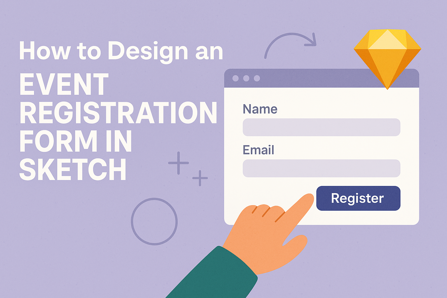
Creating an effective event registration form is essential for any successful event. Using Sketch to design these forms can make the process easier and more visually appealing.
With the right tools and a few essential tips, anyone can create a form that collects necessary information while remaining user-friendly.
To start, it’s important to consider what information attendees need to provide.
Simple layouts that minimize clutter and confusion help gather responses effectively. By focusing on clear visuals and logical flow, he or she can enhance the experience for both organizers and participants.
This article will guide readers through the critical steps involved in using Sketch for designing their event registration forms. From layout ideas to essential fields, this guide aims to provide practical advice that anyone can implement.
Understanding the Sketch Environment
In the Sketch environment, users can bring their design ideas to life through a user-friendly interface and powerful tools.
Knowing how to navigate the workspace, utilize vector editing tools, and manage artboards and layers is crucial for creating effective designs.
Navigating the Interface
When entering Sketch, the first thing to notice is the intuitive interface.
The toolbar at the top offers quick access to essential tools like shapes, text, and symbols. On the left side, the layers panel shows all elements of the design, allowing for easy selection and organization.
The canvas is where the design takes shape. Users can zoom in and out for detail work or a broader view. Using the grid options helps align elements precisely, ensuring designs look clean and professional.
Utilizing Vector Editing Tools
Sketch is renowned for its vector editing capabilities. These tools allow users to create scalable shapes without losing quality.
The pen tool, among others, makes it easy to draw custom vectors.
Editing shapes is straightforward. Users can manipulate points to reshape elements, helping them achieve the desired look. The boolean operations feature lets users combine objects in different ways, creating complex designs from simple shapes.
Sketch also supports the use of styles.
Users can apply gradients, shadows, and borders by tweaking properties in the right sidebar. This feature adds depth and character to the designs.
Managing Artboards and Layers
Artboards serve as the frames for different designs or screens within a project. Users can easily create new artboards using the shortcut “A” or through the menu. Organizing these artboards effectively is crucial for large projects.
The layers panel allows users to manage all components of their design. Each layer can be hidden, locked, or rearranged to achieve the right look. Naming layers is a good practice for keeping everything organized.
Groups can be formed by selecting multiple layers and using the “Group” command. This makes it easier to move and manipulate related items simultaneously without altering the rest of the design.
Design Principles for Event Registration Forms
Creating effective event registration forms requires careful attention to several design principles. These principles ensure a smooth and accessible experience for users while maintaining the event’s branding.
Focusing on User Experience
User experience is vital for encouraging registrations. A clean layout with clear labels makes it easy for attendees to fill out forms quickly.
Key elements to consider:
- Simplify the Format: Use short, straightforward fields. Avoid asking for unnecessary information.
- Guide Users: Offer helpful instructions or examples. Place these tips near relevant fields.
- Responsive Design: Ensure the form works well on all devices. Many users will register using their phones.
By prioritizing user experience, organizers can increase the likelihood of successful sign-ups.
Ensuring Accessibility
Accessibility is crucial in designing registration forms. A well-designed form includes features that accommodate all potential users.
Important practices include:
- Screen Reader Compatibility: Use proper HTML tags so screen readers can convey information effectively.
- Color Contrast: Ensure text is legible against the background. High contrast improves readability for everyone.
- Keyboard Navigation: Allow users to navigate forms using only a keyboard. This helps those with mobility impairments.
Implementing these strategies makes registration more inclusive.
Maintaining Brand Consistency
Brand consistency helps create a professional image. Aligning the form design with the event’s branding reinforces recognition.
Key factors to unify branding:
- Visual Elements: Use the same logos, colors, and fonts as other event materials. This reinforces the brand.
- Tone of Voice: Maintain a friendly and inviting text tone, matching other promotional content.
- Imagery: Incorporate relevant images that reflect the event’s purpose and theme. This can engage users emotionally.
Staying true to brand identity ensures attendees feel connected to the event right from the registration process.
Creating the Form Layout
Designing an effective layout for an event registration form is crucial for user experience. It ensures that attendees can easily navigate and complete their registrations without confusion.
This section will cover the key aspects of structuring the form, selecting input fields, and enhancing it with visual design elements.
Defining the Structure
A clear structure helps users understand how to fill out the form.
Start by organizing the form into sections based on information categories, such as personal details and event preferences. Using headers for each section can guide users through the process.
It’s beneficial to keep the most important fields at the top. For example, the name and email address should be the first items. This prioritization helps users complete the essential parts quickly.
Design the sections to be visually distinct through spacing or background colors. A well-defined structure reduces cognitive load and makes the form feel less overwhelming.
Choosing Input Fields
Selecting the right input fields is essential for data collection.
Use text boxes for open-ended responses like names and emails. For straightforward choices, such as event type, use radio buttons or dropdown menus.
It’s important to include mandatory fields clearly marked with an asterisk. This discourages incomplete submissions. Additionally, offering optional fields can enhance user engagement by allowing attendees to share more if they wish.
Consider using checkboxes for selections like meal preferences. This simplicity encourages quick decision-making and completion.
Incorporating Visual Elements
Visual design can greatly improve the form’s appeal.
Use colors that match the event branding, as cohesive designs attract attention. A clean layout with sufficient white space helps prevent clutter.
Incorporate icons next to input fields for intuitive understanding. For instance, a calendar icon can signify the event date field. This small detail can make the registration feel more interactive.
Finally, adding a confirmation message or success pop-up after submission provides users assurance. It creates a friendly user experience, making attendees feel valued.
Prototyping and Testing
Creating an event registration form is just the beginning. Prototyping and testing are crucial steps to ensure the form is user-friendly and effective.
This section covers the development of interactive prototypes and the importance of usability testing.
Developing Interactive Prototypes
When designing an event registration form, it’s important to develop interactive prototypes.
Tools like Sketch offer prototyping features that allow designers to create links and hotspots between different sections of the form. This helps users navigate smoothly.
To create an interaction in Sketch, a designer can select a layer and press W or go to the Prototype tab. They can then attach links to Artboards, which makes it easy to visualize how users will move through the form.
By incorporating overlays, menus, and interactive elements, designers can mimic the real experience. Using the prototype tools effectively enhances clarity in the design.
Conducting Usability Testing
Usability testing is essential for gathering feedback on the registration form. This involves presenting the prototype to real users and observing their interactions.
Through this process, designers can identify areas where users may struggle or get confused. Testing can be done in various ways, such as using remote testing tools or in-person sessions.
It’s beneficial to ask participants to complete specific tasks, such as filling out the form or navigating between sections. Their feedback can highlight issues that need fixing, ensuring the form is clear and user-friendly.
By focusing on their experiences, designers can refine the prototype before finalizing it.